ZBrushCentral

Sketchbook - Mine.

Thanks guys! Pats on the back are always accepted here.

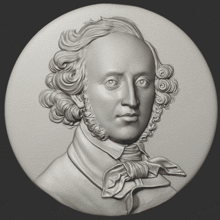
I just found out that the guy I freelance for has a website (he didn’t have one before and failed to mention it when I asked about pictures of the finished pieces).
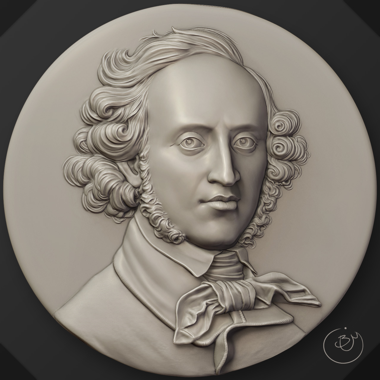
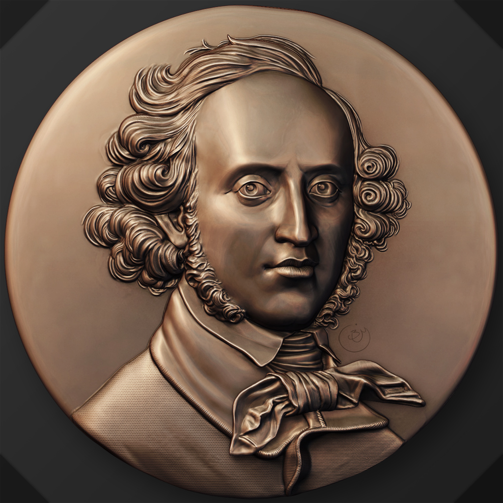
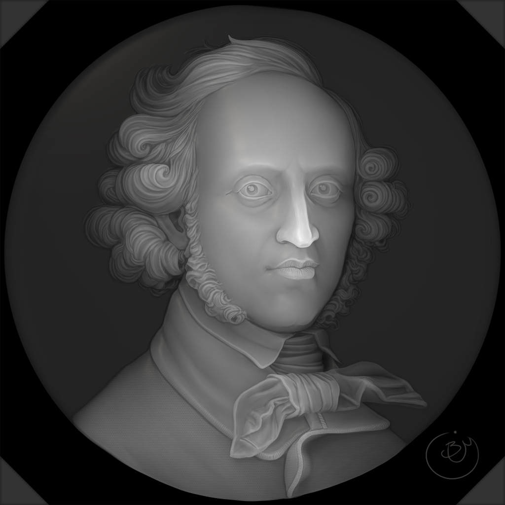
This is good news as he has pictures of my composers in their finished glass with whatever gold coating he’s using now (the examples he sent me were early tests and not as nice…).
Anyway, the ones that I made are Bach, Beethoven (front and side), Stravinsky, Schubert, and Verdi. The rest are done by other artists.

Here’s a link to his site, have a look through them. They aren’t nearly as detailed as the 3d prints or the sculpts but they’re nice to see:
http://robinlehmanglass.com/GlassWork/composers.html

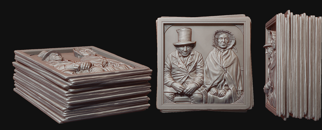
You can find my sculpts in my portfolio if you feel like comparing.
http://www.coroflot.com/ThisLandisDigital/Composer-Portraits
Or a very quick preview of all of them:
http://s3images.coroflot.com/user_files/individual_files/original_463401_jyckygvrkiisukzqs5ehxocjk.jpg

yes, it is like gem carving, i have carved portrait into gemstone, and it is same as with glass. it just does not read so well as it would do in wood or “dull” stone…
thanks for sharing,but a big pity is that he left the impression on his site that he has also created the 3dmodels used for casting the glass… would have been nice to mention that this underlying (most artistic part) was done by you and not him… i am glad to know however that you did a wonderful job :slight_smile:

Yeah, I was a bit miffed by that as well but I suppose it doesn’t matter that much at this point in my career. There are quite a few artists working with him and none of us are mentioned. I mainly want to get my portfolio and resume built up.

I did like seeing how many places he’s donated the composer series to though. I kind of want to go track one down.

Moving my composers to this thread:
Last time I tried Mendelssohn I lost the likeness between the layers of interpretation. I used three or four very different likenesses to come up with the full bust then I interpreted it yet again to make it into a relief which was just too many conversions to hold the likeness.

None of the portraits of Mendelssohn really line up but the one I liked least happened to be the one my employer liked best so I decided to avoid all confusion and sculpt directly in relief from that image.

The image, to me, has already been distorted for its own medium so that the features are enlarged and placed in such a way as to read well but be confusingly off.
I tried my best to distort it again for relief which hopefully comes off well. It was much faster and easier for me to sculpt directly in relief but there’s less originality in the completed piece.

The original, for comparison, can be found here.


A more metallic render I was experimenting with. Shows off the detail a bit differently.
Mendelssohn2_Metal_Small.jpg
A (mostly) depth render to give an idea where things are.
Mendelssohn2_Depth_Small.jpg

klass !!!

very nice! which way to create reliefs do you prefer, the first you did or sculpting relief directly? just curious how you feel about it …

dmitriy - Thanks!

Kokoro-
I definitely prefer sculpting directly in relief now. It’s much easier to get the depth right which is the important part and working directly off a photo is best for detailing too.
The main drawback is that you can’t change the composition and you can’t really make it as original (for me).

Working with a full bust on the other hand lets me choose my own angle and add my own interpretation to the bust. Bach, for example, was definitely better as a result of that.
There’s only one painting of him to work with and a facial reconstruction that was done off his skull so it was really helpful to be able to capture his entire bust before I chose a
direction. Still, flattening is difficult and it’s always an uphill battle to fight the depth against the topology which might be excessive in areas. I always hated having the back side
of the head but if I had cut it off the division levels wouldn’t have worked.

In the end, for me, it comes down to which one is easier to work with once flattened and I think the retopologized faces that I had flattened restrict it to what I had planned before.
It’s much easier to make major changes when the topology is even everywhere than when the cheekbones and eyes are already built in.

It also doesn’t seem to help to have a million different tools. Reliefs of the type I do look much better if they seem to be one piece than if they have hard edges all over, like along
the hair line.

Nice work on your “Daniel in the Park” by the way! Just looked through your blog and really liked the portraits you did to challenge yourself. I’ve had a browser window open to Faraut’s site for awhile. I really need to take up another round of courses or challenges like that.

Your work is a pleasure for the eyes !

thank you for explaining your preference so clearly… you might love to create relifs in clay, or wood, i think… and, thank you for checking out my blog :slight_smile: … yes, challenges like these are very good for learning, and the timelimit i gave myself, helped to not worry too long over a difficult part, but try at best, and move on… yes farraut, one of my favourite sculptors. wonderful expression even in the eraliest stages in his sculpts…i learn each time i look at his work :slight_smile:

My employer was interested in using the Couple for his glass work but decided after seeing the base I prepared for it that the details were just too fine and the piece too small for the scale he works (about 3.5 inches). Thankfully I almost never get to see my work anyway so there’s little disappointment there.

Anyway, here’s a quick render to show how it looked. I placed it on a stack of photos as if it were sunken into the top. I used an old photo matte for reference but shrunk it down to give the actual portraits more space.
Framed_VeteranWithHisWife.jpg

In Mendelssohn news, I think I’m finally done with him. I spent way too long on the first version (though I did get it in the turntable gallery so it was worth it!) and redid it. I panicked when my employer sent me an email in response to this one saying he still seemed to be a problem and proceeded to send me what he saw to correct it with sharpie lines drawn all over. I had overlaid the image directly throughout and knew that the majority of it wasn’t necessary (not even mentioning that we’re dealing with a 3.5 inch piece of glass which has lost a lot of detail in the casting) so after pulling my hair out wondering what needed fixing I created a GIF fading between the two and sent it to him along with my usual wall of text explaining the small changes I made. He was really happy with it and gave it the go ahead.
tldr: Don’t panic. It doesn’t help.

Here’s the animation (sorry for the low quality). It’s interesting seeing what aspects of the depth stay the same (the features of the face) and what gets flattened most (the hair) as well as the impact of the shading. The eyelids cast the darkest shadow which gives him oddly massive eyes which don’t translate into relief.
Compare_Animation_mini.gif

you mean, you did change nothing after his many complaints, and just made the gif? wow, that is clever :-)… i think, why he was thinking your sculpt was off, is because of the irises. in the painting they are very dark, while in the relief they are very light, and this alone gives a complete different impression of the portrait… i like the gif animation, very nice to see it this way. i often do for checking of my sculpts overlays too, it is often amazing how subtle mistakes can break a likeness. that is what is the fun in portraits, for me…

Well he didn’t really complain but he wasn’t very encouraging about it (considering the first attempt flopped). I did make some changes, mainly softening up the brows and cheeks which I had sharpened to make them appear better in glass, but most of the extra time I spent just staring at it and lining up every single edge I could. He was eyeballing it and yes, I tried to point out that the eyes are way too dark but he doesn’t read my emails so I don’t know if that made a difference. Really I just took the interpretation out of the equation by sending that gif.

I sat down last week and decided to do a study of drapery. It’s one of those things I tell myself I need to do to master the world but never actually do.
The majority of the relevant practice was in the upper portion of the piece where there’s tension, twist, and patterns. Once I got down to the bunched up
folds I realized I probably should have tried to get rid of them when I set up the cloth because they are just a pain. I had been keeping my dynamesh
pretty low so I guess I probably fought the geometry more than I needed to but, for the sake of an interesting piece, I kept on until I finished the whole
thing.


Pardon my rendering, it’s definitely something that would have worked better with a physically accurate material and nice lighting rather than layering dozens
of zbrush passes. I had a hard time deciding on the render because my eyes picked up on all the tiny creases in the geometry where simulated cloth would
have been folded over instead. As a thumbnail it looks perfect so I’m happy how it turned out.

:+1:small_orange_diamond:+1:small_orange_diamond:+1:small_orange_diamond:+1:small_orange_diamond:+1:

No words! Excellent!

Amazing study … looks perfect to me! :smiley:

Cheers, David

wonderful study! i admire your patience to push this through!

This is really great. It might seem funny to say this about a lump of cloth, but if ever there was a cloth sculpt that belonged in the Top Row, this is it.

:+1:

Excellent study! I recommend this to people who wanna know and study this subject. It’s helped me out tons (when drawing that is).

Dynamic-Wrinkles-and-Drapery-9780823015870.jpg

Excellent job on this. Looks very much like cloth.

Splendid study! Much to be applauded in these days of Marvellous Designer insta-cloth! Were you frustrated or did you enjoy the process? I find cloth modelling strangely therapeutic!

Rory