ZBrushCentral

Scared Silly Entry by Lyle Moore

It looks cool, this is one I have had my eye on since the start of the contest an I am very inpressed.

one crit, the creature jumping down, needs to have a more actiony pose. his arms could be flung up as if he is trying to slow his desent or is trying to aim his landing. Just my opinion.

Other than that, this is amazing work.

Who is this kids mother to have goblin creatures working for her, Satans wife! :slight_smile:

Looking very good. I should try to keep the room darker (more like the first render on its own or even darker), but as you say you haven’t started lighting you probably haven’t thought about that yet.

Thanks so much for the great notes.

I will start addressing them today.

They are a big help!!!

Lyle

This is so crazy! (That’s a compliment) :wink:

Looks like you have a good opportunity to play up a lot of dramatic shadows with all that stuff.

I Sure hope I do!!!

Littlededder,

Been watching this one for a bit among the many others. You are very talented and shows in your sculpt on this piece. For the most part I enjoy the idea, the gigantic suit on the crying child sadly is funny. I wasn’t sure what the gremlins where going to be doing and how they would add to the overall image. After seeing them as much as I like how they are sculpted I was hoping for them to add bit more funnies to the image. At the moment they look like they just helping to terrorize the kid which I suppose could be construed as funny in a twisted kind of way hehe. Though I was hoping more for like maybe a few of them kinda of fearful of the kid, maybe some bowing to him paying him homeage as one of there own or something. At any rate I’m sure this will look great can’t wait to see more!! :+1: :+1:

I added the airbrush, kneedles, and thread tonight.

They are actually putting the kid in the suit.

Lyle

LittleDedder,

Ahh okies, thanks for clarifing that for me. Hrmm I’m sure you’ll be able to sell that aspect as it moves closer to the final render. You got da skillz!

P.S.

Maybe a few gremlins can have some thread, maybe a tape measure and the like to add to the idea they are helping him “into” the suit?

New Room

RoomToshow1b.jpg

Attachments

RoomToshow1a.jpg

I hope this doesn’t come across too harsh, but your image has, in a way, become the kid in that picture; unable to function under the weight of what’s added.

Compare
Story 1:
Ambitiously creative parents go overboard trying to make their kid the best costume ever, oblivious to the idea that they’ve ruined the holiday for him.
Story 2:
A small child is eaten alive by a giant monster as five demons watch impassively.

Okay, 2’s probably not what’s going on in your picture, but it’s as likely an explanation as any. You’ve lost sight of your story, and while it might retain some details from before, the central relationship you abandoned is what made the thing funny.

Take a step back and remember why you’re doing this. It’s not too late to turn things around


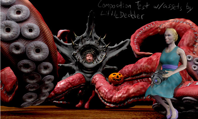
  • Focus your lighting. Two renders ago, the kid was brighter than the tentacles in front of him. That was better, and could stand to go further. See, huge tentacles can show the ridiculous scope of his costume without taking over the whole image. That kid and his reaction are the single most important thing thing in this picture. If we don’t notice him for the oversized costume, you’ve failed to communicate any part of your idea.
  • -
  • Crop in closer. You can lose a good third of your width without hurting the image, which will in turn make the kid 30% more prominent.
  • -
  • Make the Krakken green. It’s further from flesh tone and will make both the kid and his pumpkin stand out a lot more.
  • -
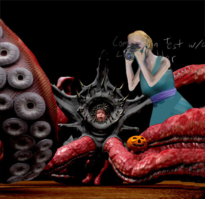
  • Lose the demons. Put Mom in the scene. She’s probably off to the right, kneeling into frame with a camera, a huge smile on her face. Or else, she’s handing him the pumpkin and patting him on the head. (I don’t think you’re going to be able to convey “working on the costume” strongly enough in the time remaining, but these other poses will get the point across)
  • -
  • Consider cutting sleeves for his hands and feet. This will help convey that it’s only a costume, and break up the color a little. You’ve got a whole lot of red goin’ on.
  • -
  • I’m not sold on the T-Stance for his arms. I get that overly thick layes of clothing (as in a snowsuit) will force you into such a pose, but I’m not seeing that thickness in his sleeves. That either needs to be exaggerated further, or else dropped so he can flail around helplessly.
  • -
  • Why are they in an industrial warehouse? Put some color on the walls, maybe throw in a doorway to another room. Lose the ceiling fixture – it doesn’t say “home”. Instead, make a lamp of some sort, which the costume is pushing over. These details you’re adding should serve a purpose. Which in this case is to establish a contrast between the traumatic scene and the loving household it takes place in.
Relatively simple changes will make a world of difference.

You’ve got a great idea. You’re telling a great story. So, get back to it already!

Much improved! But still the wrong setting. :wink:

(see notes in previous post. you don’t need a creepy mansion any more than you needed an industrial warehouse)

Actually,

I was thinking a lot of the same thing.

This is my first time doing something like this and I am looking at it as a time to learn.

Most of what I do is put with live action.

This is what I needed and as I said I was feeling much of the same thing.

Mom isn’t ready to go In and I don’t have time by friday. I will just do what I can.

As I said I was thinking of much of what you wrote over the last couple days.

I think I have an idea that will make it better and keep much of what I wanted.

Dedder, I agree that your original story is a bit lost, but I can’t say much because I totally changed mine from day one


I love the concept of the giant costume. As I said in an earlier post, my wife and I had a similar overzealous costume making for our son.

I hope you are not getting discouraged with all the recent comments. The scale of your costume is great because it really exaggerates the frustration of the kid, but I do agree that you can come in closer to the kid
the tentacles can go off screen more so that you can focus on the boy more. Ctrl-Z suggestion that the color scheme takes focus away from him is also a valid point. Angel’s tip that some sewing elements would help convey your theme is helpful, too.

As a whole, I think you are doing great. Definitely someone to watch out for!!!

I am going to do all I can to finish strong.

I threw a few of your images into Photoshop to see how your original idea might have turned out, but my test comes across sad rather than funny. Maybe if the characters were more exaggerated and over-the-top, it could work. Or maybe whatever you have in mind now is a much better idea.

Anyway, here’s that:
maybe.jpg


Don’t be discouraged, and don’t forget to sleep. You’ve built some really great assets, and you’re going to tie them together into a really great image.

Worst case, forget the deadline – you’ve pushed your work into a new realm, and you owe it to yourself to keep the momentum going. But, it hasn’t come to that, and there’s no reason it has to.

Just get your bearings, and decide which way is forward. We’ll all follow you there.

Don’t knock yourself LittleD! you’ve done an amazing job! Just take a couple of hours breather, ask a friend to help you look at the image a fresh and go for the finish line! The image is there, I can see it and it’s awsome! A winner!

You’re an excellent artists who deserves a winning entry, and I know with a little reordering you’ll do it! :D:+1:

I’m haveing a blast doing this.

All I was saying is that the comp needs a change.

Will see how it looks on Friday.

it may be ok or it may be :o .

This is a great piece, I love it too. I agree with a lot of what Ctrl-Z said earlier.
I know that you are probably reluctant to crop your image because you don’t want to lose all of the detail and work you’ve done with the tentacles, but in the end, it may help to frame the child better.
I know it would be painful to do, but sacrifice is sometimes needed to create great art
remember Vincent van Gogh! Of coarse he was nuts, but that’s another story.

Maybe if the mom was bigger and in behind one of the tentacles leaning over to take a picture of the boy’s face would help in conveying the loving yet crazy family and the distraught child.

Here’s a very quicky example

Just an idea to help. I hope you’re not offended by my taking liberties with your jpeg.

example.jpg