Great ideas all.
I think I have another angle I want to try, so that you can see the little guys face better.
I still don’t know about the mom.
We will see.
Great ideas all.
I think I have another angle I want to try, so that you can see the little guys face better.
I still don’t know about the mom.
We will see.
Try this!  :eek:
:eek:
Regards,
Aleksander
It looks like everyone is waiting to see what I will do.
I may not post until Friday.
I have a final comp I like and am rendering passes.
I will post it on Friday.
Way to keep us in suspense!
Let me just say that it is better than I ever imagined;)  confused:
since you feel good it about then it will look good … good work n best luck
Ive been silent on this thread, as the picture was clearly in good hands. I would like to say now, before the thread is locked that I too am much looking forward to seeing the completed image, particularly after the thoughts you’ve had on the composition.
Good luck!
R
I was able to get all of the render passes I wanted done last night.:rolleyes: :o
This is not my final image.
Just a comp test.

Very cool lighting and depth blur! Great color too. 
Just another color test.
Not final
I am experiencing a big color shift between my computer and Zbrush central.
Does anyone know if a LUT and ICC profile is applied when uploaded.
I am creating a Lut to fix the problem.
If some can post what each image looks like it would be a help.
I am pritty happy with the second one.
Great job, I was worried. I couldn’t figure out how you could possibly make the composition work after seeing some earlier posts. But you did it! Fabulous decision…
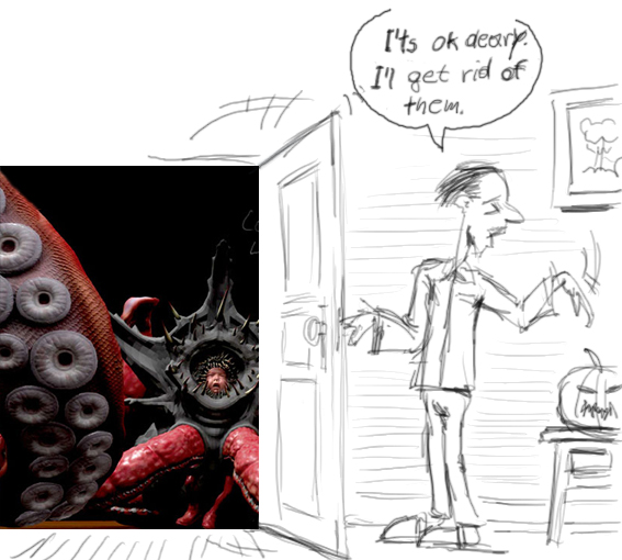
please have a look at the images above.
wow that’s awesome love the texturing and the tentacles.
Very cool dude, love the materials used. the lighting is pretty good, and i love how the depth of field has drawn you into the face of the kid.
I’m still working with my render passes.
can you try and tell me what the two images look like on your side.
I am having a little color managment problem that I think I fixed.
Oh, and thanks for the kind comments.
WOW!
Love the lighting, love the angle, love the render quality.
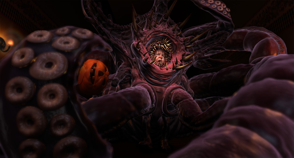
My only suggestion at this point would be to cut holes at the end of his sleeves for human hands and feet to stick through. I know I’m repeating like a broken record, but… The stitching you added (to clue us in that it’s only a costume) is all but cropped out now, and you’ve done such a great job of making the thing frightening that it’s hard to believe this is not a real monster, rising from the ground to swallow the kid whole.
I think the story at this point might be that his costume came to life, or that we’re seeing through the eyes of a little boy who is afraid of his halloween costume. Either way wouldn’t be harmed by faking-up the sleeves.
Then again, it’s a very striking image, and anyone who glances upon it will probably stare long enough to figure out what’s going on. The laugh doesn’t come immediately, but it’s definitely there.
shrug
I’m sort of torn between the two renders. #1 is more dramatic, and feels like a better picture. But his feet are lost in shadow, and they’re pretty important. Which is a problem I’d probably solve like so:

Hope this helps?
Actually, disregard a lot of that. I just installed new video drivers on my PC, and everything’s displaying very dark. Just checked things out on my Mac, and nothing’s lost in shadows. Though, I do still prefer the first pic there.
My problem was on my screen and my screen at work it looks like image 2, but when uploaded looks like image 1.