ZBrushCentral

Floyd's Sketchbook

Still trying to learn as I go, is she looking any better, or worse? :wink:

At some point I’d like to get faster and more precise with my strokes - anatomy knowledge will surely help that. Bridgman, at the moment, is my main source of refference.

[attach=229543]MFC2010_female_head_preview4.jpg[/attach]

[attach=229544]MFC2010_female_head4.jpg[/attach]

Timelapse continuation

Attachments

MFC2010_female_head_preview4.jpg

MFC2010_female_head4.jpg

OKAY I think It’s comin.

Any advice would be appreciated.

MFC2010_female_head_preview4.jpg

Attachments

MFC2010_female_head4.jpg

I really like your work! Can you like me know what mat you used for the female head? Or is that a render?

Muchlove: Hello! Thank you for the comment. The female head is straight out of ZBrush (no rendering). I mainly use the basic gray materials that respond to lights (the bottom row of materials). You can change many values of these materials within the material > modifiers menu. These basic materials can be very powerful, as you can customize them to your liking.

A really quick sketch from last night. He’s got sand in his beard, im sure.

MFC2010_caravanguard_preview.jpg

//youtu.be/YQaHjdRXKbw

Attachments

MFC2010_caravanguard_turn.jpg

MFC2010_caravanguard_mat.jpg

Sat down with that male study some more. Gave him a face among some reworking - not sure how to go about his feet (?).

Would love some crits on this guy…

Hope ya like!

MFC2010_man_study_preview4.jpg

//youtu.be/egQPH-v5KHE

Attachments

MFC2010_man_study4.jpg

Pushin’ it - trying to learn some sh*t. Working along with Giovanni Civardi’s male anatomy as refference this time. Think he’s lookin’ a little better.

C&C most welcome.

MFC2010_man_study_preview5.jpg

//youtu.be/1XlGsOKXvvw

Attachments

MFC2010_man_study5.jpg

Any help on that study would rock.

Just some real quick orthographic views for my update today - trying to get a handle of using dam standard. Little by little…

Focused on his arms and more on his torso.

C&C would be cool.

MFC2010_man_study6.jpg

//youtu.be/kAokQiXktP8

Hi, you are definitely going some where with this study and I think it’s always good to know some basic human anatomy before rushing too much on those alien creatures just because it’s so easy and fun with zbrush! :slight_smile: So you are on the right track! )

I’m not going too detail what is wrong or right with this subject, because I’m still learnign some anatomy my self but I can point out some most major issues that you are having here.

I think that the most obvious weirdness is the overall shape. Especially with the legs.

It’s some times hard to see the overall shape from all the details so my advise is that you test how the models silhouet looks like from differenet angles.

Example like this (I just quiclky made it with photoshop from your posted image so it’s not exactly following the shape)

silhouet.jpg

Now just go to lower subD levels and correct the shape to look right. You can try to search some drawings from human body, because they usually exaggerate and stylize the forms to help understand and see the shapes better.

You can have the model 100% anatomically correct (All the muscles & bones are somewhat there where they should) but if the overall shape is off, then it is much more obvious for the viewer to spot that there is something weird going on than when the anatomy isn’t that accurate but the silhouet looks convincing.

Hope this help, and good luck with your project! :slight_smile:

Whoops, sorry, didn’t remember to edit the text so it doesn’t display the image at the front page. My bad, sorry! :rolleyes:

Thanks Jouko! Awesome of you to drop by and gimme a one two! :sunglasses:

This kind of feedback is what I need and why I started posting here. You know, Im going real slow on this so Im constantly reworking and reworking. I need to check out that sil with some more refference. I’ll get on that tonight - thank you again VERY much!

It’s okay, BTW, if you do stuff like that I do NOT mind. :+1:

Alright! Went back and chewwed on the silhouette of this ongoing male study. I think the basic shape is looking better, thanks again Jouko, but im going to have to clean up the sculpt whenever I get there. If anyone has the time, I would love your opinion.

Did the speedy as a cooldown before I went to bed - gatta try and pace the study so I dont get burned out. Thanks for looking!

MFC2010_oddheads_preview.jpg

//youtu.be/ZREbTawIHGc

Attachments

MFC2010_man_study7.jpg

MFC2010_man_study7b.jpg

MFC2010_oddheads.jpg

Tweaked it a little more and felt a profile would help if anyone has some crits for me. See y’all tomorrow!

MFC2010_man_study7c.jpg

Nice to see your progress - I’m still learning anatomy myself.

Two things I noticed:

His hands seem too big and the male thoracic arch is wider / not as narrow.

You also could give him a more relaxed, natural pose. In my opinion, it’s easier to notice anatomical errors if the figure looks relaxed (in your case, this means, I’d adjust the arms to a more “comfortable” pose).

Hi, now when I see those changes, it kinda looks like that you just “thinned” him down. I think that the earlier upper torso looked better, and the new legs are kinda better than the old ones.

When I keep looking at it, I kinda get lost that what is wrong there, because when I compare the silhouet (Old one) to some anatomy reference (The one that is on the image below) the bumps and shapes and stuff are all there but they are a little bit off. I thkin it misses that continuity and “Archness”. I think you understand it better if you search some “how to draw human” resources from the web. You see how they build up the human shape from few simple curves that are placed the right way.

I also made (The two most right images) compare to your old model, tweaked a bit the upper torso and took the legs from the anatomy reference. So the left is new and right is old version. And as you see, there arent much difference but enough to see that something isn’t right.

The most right one tries to illustrate those “arches” that creates the shapes.

And don’t be afraid to just smooth stuff out and start to sculpt again. I constantly start over as I progress. This is zbrush, that’s what it’s made for. :slight_smile:

And also good advice is to achieve as much shapes as possible at the lowest subD level as possible. Then you won’t get any weird lumpines on your shapes and they look smooth and clean.

Hope this helps!

Whoops, and that reference image was taken from “Human Anatomy for artists” book cover.

Jouko: I cant thank you enough for this kind of input. Keep this up and im going to have to start paying you, lol. :+1:

Really appreciate the graphic, especially the chart relating to the crests and valleys of the human silhouette (invaluable dude!) - those red lines give me some added clarity as to where all the breaks are and the muscles/bones they correspond to. Speaking of, since I enjoyed Scott Spencers ZBrush workshops in past issues of ImagineFX so much - I’ve ordered myself his book on sculpting human anatomy (the one with the super hero project). Really stoked about it getting here.

Well. More mulling over my study brought me to reduce the amount of muscles - I thought the build was a bit much. I hope he looks more natural now, and that the breaks that were mentioned are more accurate. This is at subdivision level 1/one. I can only keep trying!

No other stuff though - maybe tonight!

Please, ZBrushers, share your opinions if you can (no matter what skill level) - this is shaping up to be a very fun and educational thread, and I hope it’s helping more people other than myself.

Thanks for looking!

MFC2010_man_study8.jpg

Chris: Dah, I missed ya! I did change his pose, and worked on the hand size.

Hope these changes are closer to a solid base. :+1:

Heh. It’s christmas, time to give and share! :slight_smile:

Good to hear that you take this as a learning curve rather than just another tryout and moving on that I’ve seen too many times happened here.

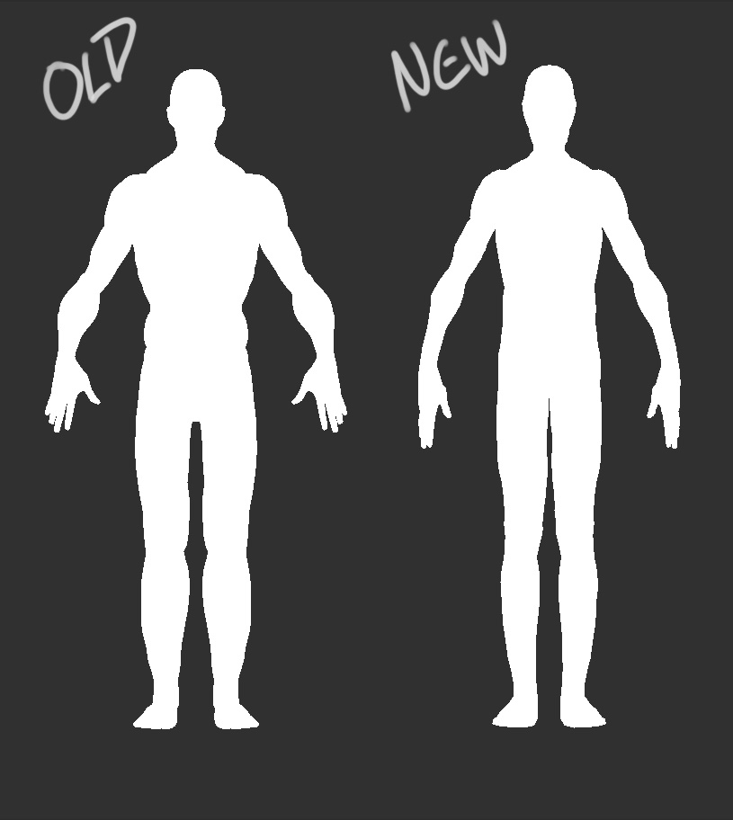
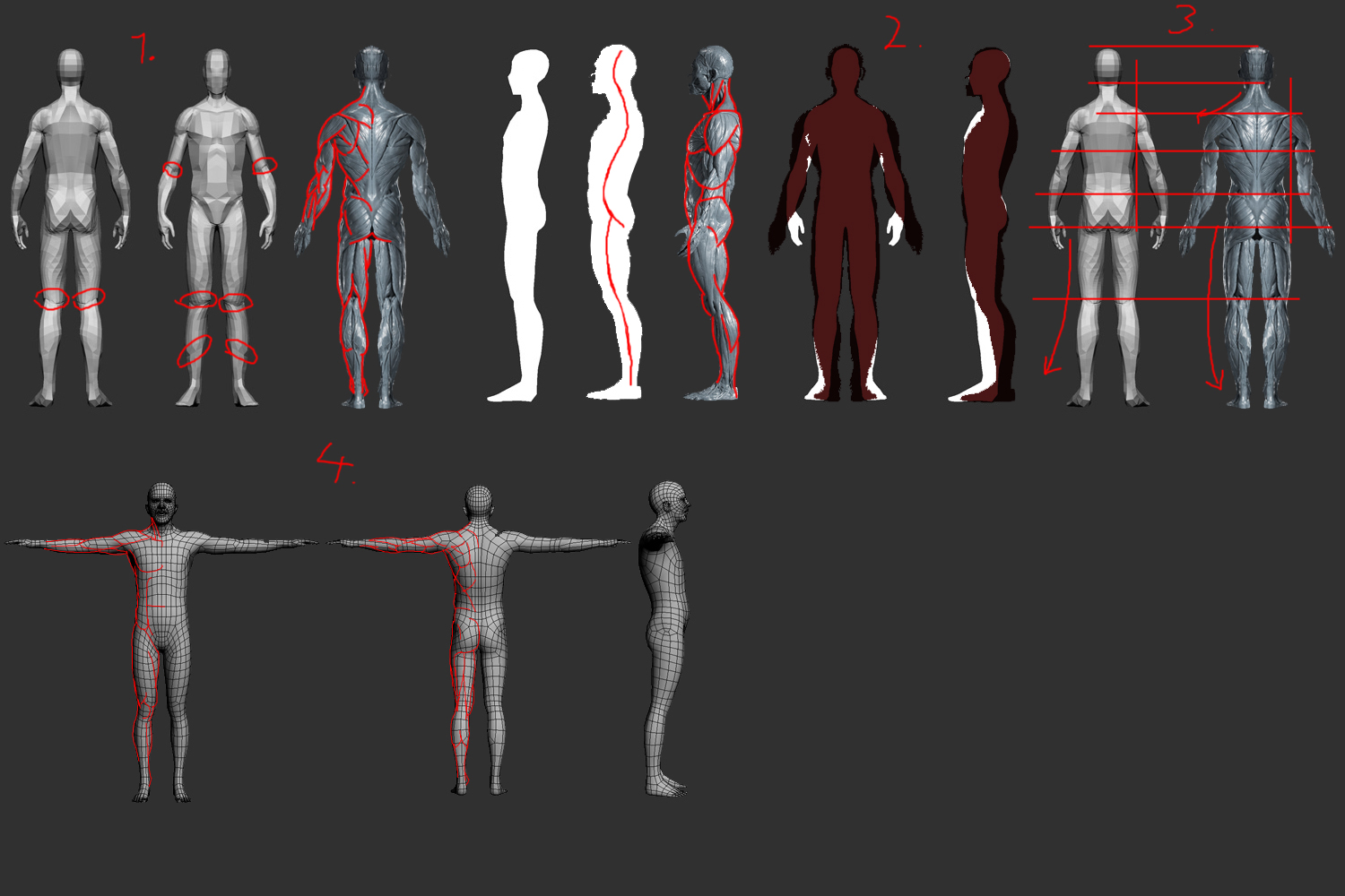
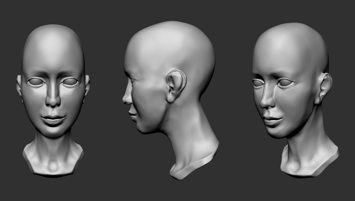
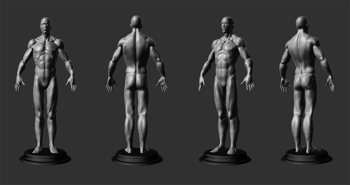
But anyway, it starts to have the shape but there’s still some minor “offsets” about lenghts, volume and curvatures.

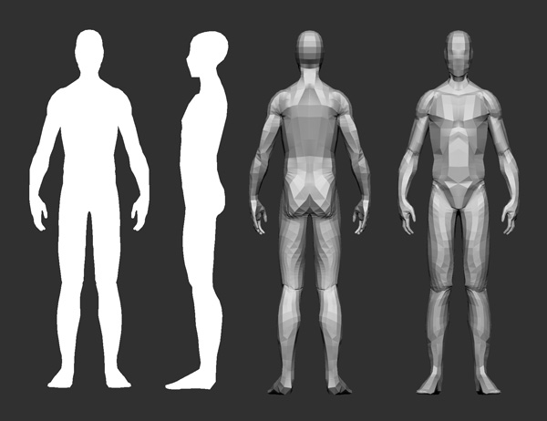
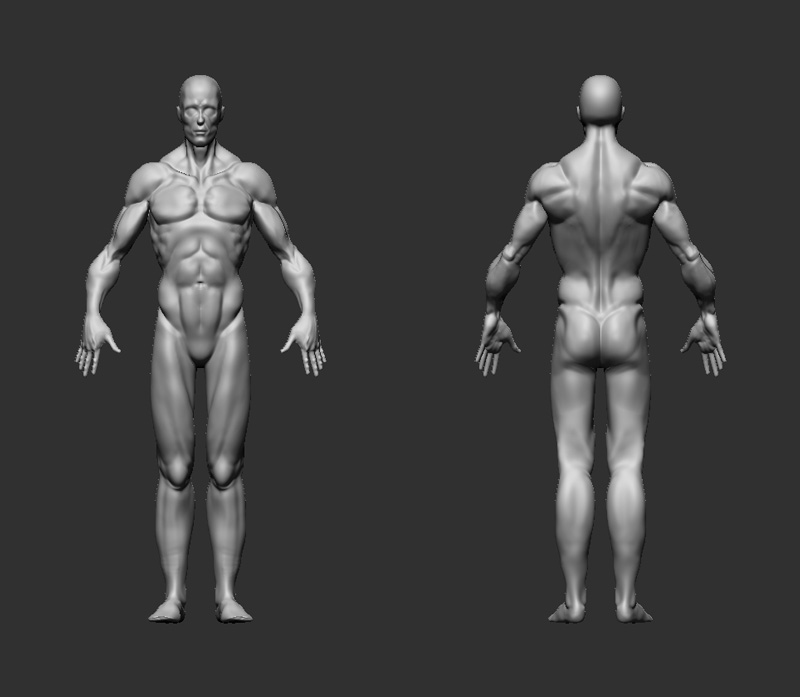
I made a quick example where you can compare your model to one I found from the web. If anyone can point out who’s model that is, would be super because I couldn’t find the original author for this.

But to the point.

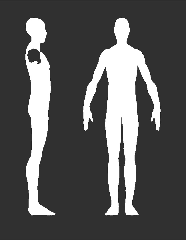
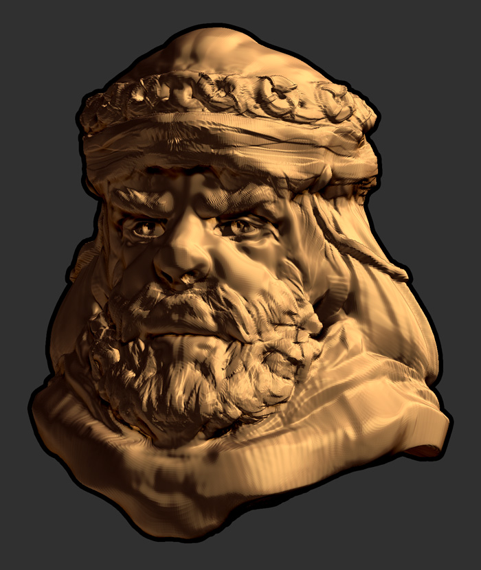
  1. I marked some pinching issues you should take care of before moving on because those are going to make your life harder later on. I’m also not so sure about that topology you are using on your model. It also can make your life harder to have wrong kind of topology to start with.

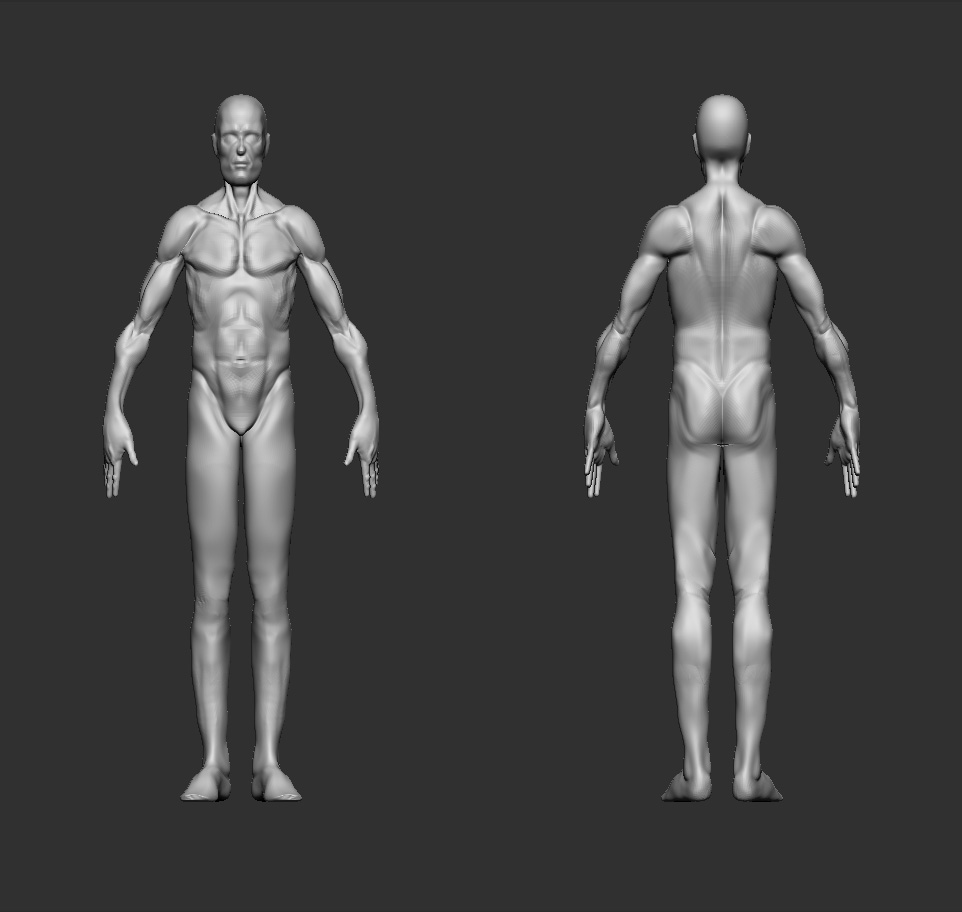
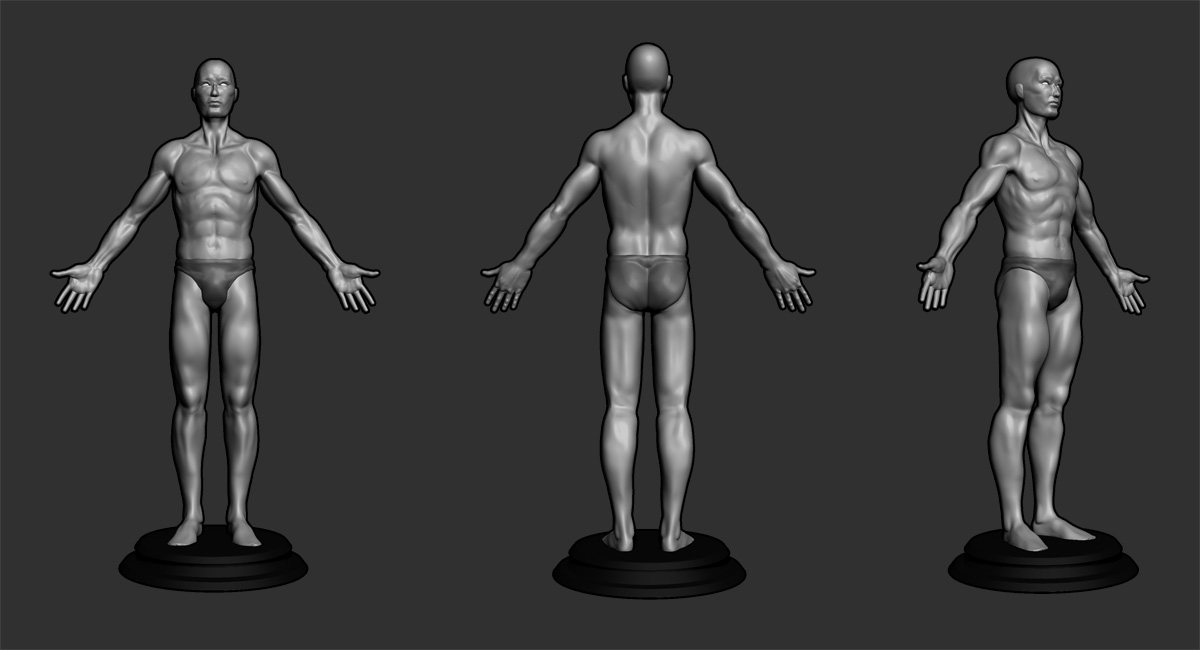
I posted (4.) an example of good start point where basicly all the needed forms are already in the topology, that helps a lot while sculpting cause basicly you only need to “push” the shape out. And it’s much more easier to see where you are going at. With wrong topology, it can throw you off from the right course cause you don’t have any clear landmark where you are going at.

(4. is a model that can be downloaded some where here in zbc, I just can’t remember where.)

And I wouldn’t worry too much that fact that “This isn’t my original model” because it is much more easier to learn from a good subject than making thousands of wrong ones. After you have played around, the key elements about topologies and shapes have burned in your memory and then it is the time to start making your own one with clear and solid knowledge of the basic stuff.

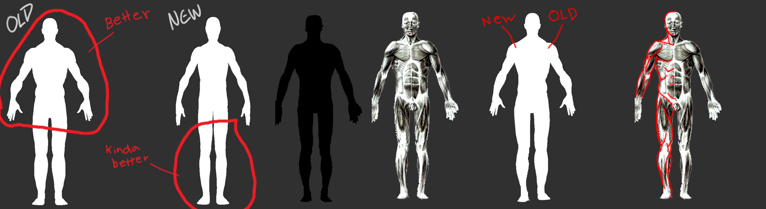
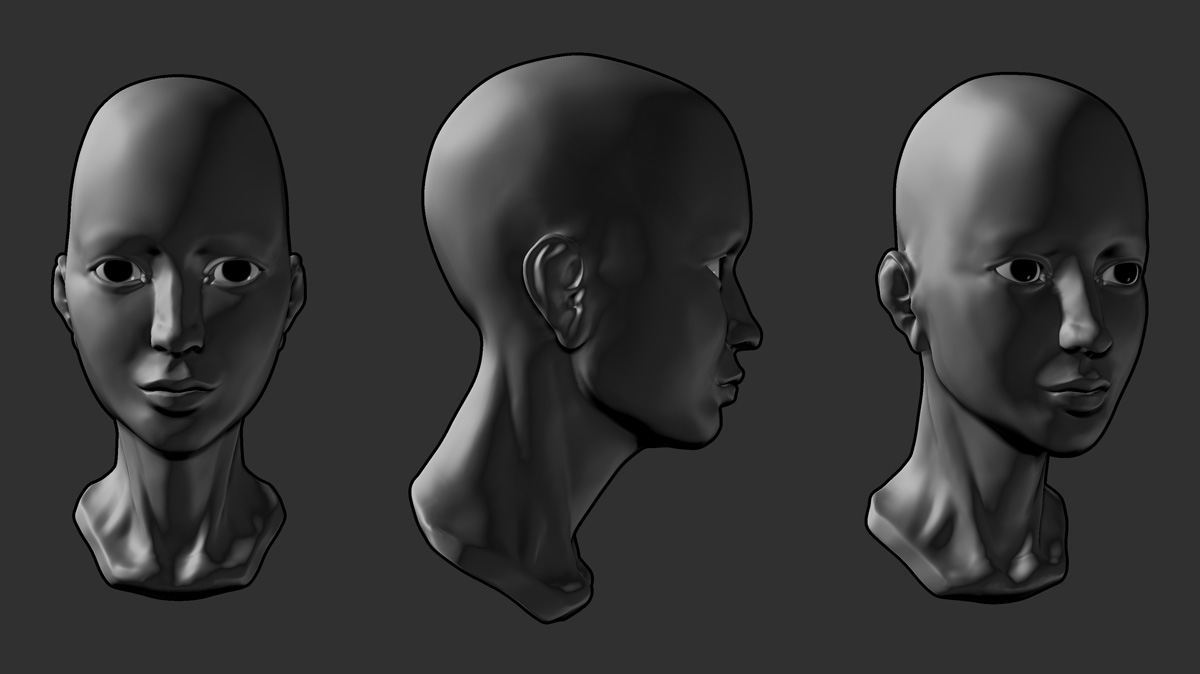
I also marked some key shapes from other angles to help and guide about those biggest forms that builds up the shape.

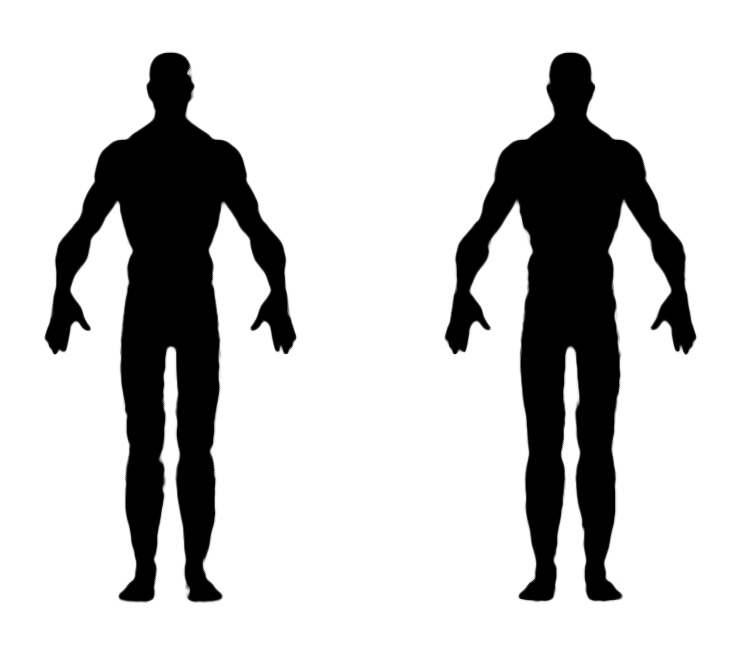
I also put those silhouets on top of each other to see the difference on forms.

The quality isn’t the best but it’s darn hard to draw with a mouse! :slight_smile:

Lastly I also made this grid to compare your model to the other one to see some mismatches by that. I think that the most obvious ones are the shape/ wideness of the shoulders and the arch of the legs. Normaly the legs kinda archs inwards and yours pulls outwards.

Your arms actually looks good, and I think that the mismatch has something to do with the poses that they differ from each other. Not sure. But those shoulders need some tweaking.

Phew! So there’s my ten cents! Hope this isn’t too overwhelming, but I wouldn’t bother to put this much effort on helping some one if I wouldn’t see the potential to one actually evolve and become better in this subject.

And almost forgot, I usually exaggarate the shapes and forms to see them better while i’m sculpting and when I’m done, I just start to smooth them out if necessary. But I think that everybody has their own methods that suits for their workflow.

So good luck and cheers! :slight_smile:

Also, you can check out some breakdowns from my own projects where you can get a little bit sense of how I do stuff myself:
http://www.zbrushcentral.com/showthread.php?t=86595&page=2&pp=15

Jouko: Thank you kindly for the ongoing support in the form of both encouragement and constructive criticism - you just dont know how much that means. Im saving all the awesome visual information you’re kind enough to share. I did check out your SB after the first crit you gave - your work is very very good - the kind of stuff that makes me honored to have you here giving me a hand this holiday season.

I’ve been a little busy with some other things the past few days, both personal drama and new art ventures, so I havnt had the chance to work on my male study recently - that will change soon. Im sure it’s a good thing to take extended breaks now and then to freshen your perspective when you do return to a study, however.

I do have this to share though…

MFC2010_mrmoon_preview.jpg

//youtu.be/m0x9Gqd7BFs

Again, thanks, ZBrushers, for coming here and sharing all of your options.

Attachments

MFC2010_mrmoon.jpg

MFC2010_mrmoon_turn.jpg

IT CAME!

Haha - well yeah! I’ve spent the last couple of nights working along with this wonderful book. It has already enlightened me to some things I’ve been pretty pig ignorant of. So, I wanted to share my progress with this new project as it the same subject, yet it starkly contrasts the last one that I was pushing and pulling on for almost two weeks - way less work in other words. The only difference is knowledge gleaned from this new data.

Look at the difference in this basic form/silhouette compared to the last.

Also, since the text is centered on a pretty much cookie cutter eight head heroic figure, I want to try and make it my own as much as possible when/if I can. We’ll see how that goes.

As always, C&C are most welcome.

To be continued…

MFC2010_man_study9.jpg