ZBrushCentral

beginning a sketchbook

This is coming along nicely. Keep it up!

I can see where you’re going with his expression and pose now, and I like it. I can still see a completely different emotion with the same expression and the figure standing though.

Oh, and I wouldn’t pay any attention to the star-rating - it appears to be a completely useless feature at ZBrushcentral that often has no relevance to the respective content. I ignore the stars now - wish there was an option to turn them off as I find them subliminally distracting when perusing thread listings. Anonymous unqualified voting leaves it too open to abuse, even here where petty squabbles and flaming are much less prevalent than on any other forum I’ve witnessed.

hey there guys,

a little update. i think the modeling-part of the guy is done… the feet still suck, but i don’t get them look correctly. i think, it is ok.

of course he will get some new horns, this are only placeholders.

i detailed the chair a little bit and thought about the scene.

and the texturing… hell, i dunno what to do… i’ll see tomorrow or the day after ^^
i hope i’ll finish this piece. i like this guy… and i hope i’ll reach this time the quality, i am after!
but at first: finish the sculpting… i never can wait with the texturing, so you see my first color-layer on him…

[Progress7.jpg](javascript:zb_insimg(‘139329’,‘Progress7_closeup.jpg’,1,0))

Attachments

Progress7_closeup.jpg

I’m loving the sculpt. Not sure I like it with the rock wall as much, it doesn’t really seem very balanced, but you’ve really got his fat folds down.

Fun! I think the lower part of the body need more work. The relation between the legs and the belly is a bit strange.

Attachments

fatOne.jpg

Man I’ve read trhough your thread from beginning to end , and man… what a hell of a progress! It’s mind blowing
Congratulations!

On the latest pic I think the feet need more work
Alsa the cave background looks like too much too me. It drags the attention out of your character.
Keep it up !

Hi wethand, I can only agree with bohemond, your evolution in your work is amazing keep up the good work.

Bests, Daniel

The fat devil looks great,
like some people said before: you’re improving very fast man !

Keep it up

hey there boys and girls!

many many thanks for your superkind replys!!!
never thought to read such posts in my thread! thanks!

here is my progress. i am texturing him.
i am not sure about the table. he needs a table, but i don’t like my design too much.
i tried to make it like the chair… but i am not even sure about the chair-design…
only the white-mat. because all the other materials have their own color and i want to render it in 3ds max in the end.

here is the update:

[

](javascript:zb_insimg(‘139778’,‘progress8.jpg’,1,0))

I like the texturing on his knees, but otherwise it seems kind of blurry. This goes for the chair as well. I’m definitely loving the sculpting though, I really think the fat folds came out nicely and the chair looks appropriately dilapidated.

Where’s the ashtray? :slight_smile:
Nice work.

Bizarre! I was really hoping you were going to go for the albino look (irrespective of the fact that I’m reading Elric of Melnibone at the moment and therefore may have a predilection to such). And lo and behold …

Needless to say, I like where you’re going with this! I look forward to your next update.

hey there,

many thanks for your kind words! :slight_smile:

i started to build up a scene in 3ds max and tried the sss-shader.
i think all together looks alright.

but there are some things i am working on. big problems with the smoke. if someone has an idea how to render nice smoke inside 3ds, please let me know.

and he still has no eyes. i don’t know if he gets some. i will see.

so, here is the progress until now:

[progress9.jpg
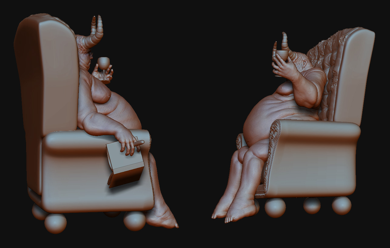
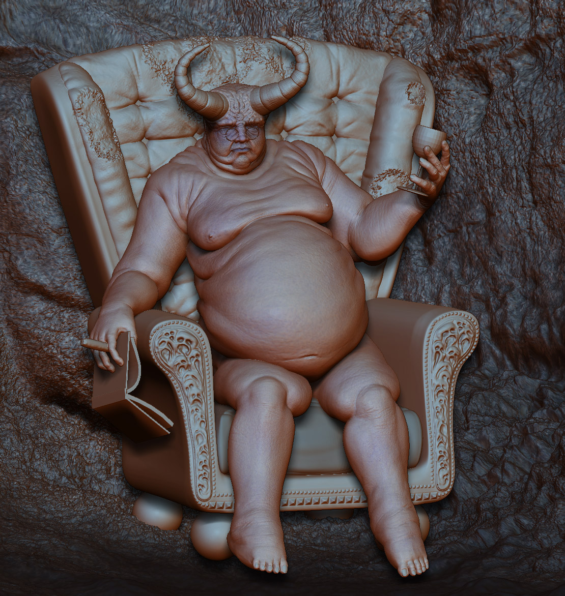
](javascript:zb_insimg(‘139885’,‘progress9.jpg’,1,0))

Hey wethand - making some awesome progress through the thread - good work man … last one is very cool - keep it up :smiley: :+1:

Yes I agree – awesome progress, wethand!
Looks really good so far. Can´t wait to see the final scene.

Does this help?

http://www.freeitsolutions.com/3ds/viewTutorial.aspx?id=414

I like the scene, looks like an old lady’s house, but the foreground is bothering me. It just looks too set up, like he’s posing for a portrait. If that’s what you were going for great, but otherwise putting a coffee table or something in the foreground would make the scene look a lot more natural.

Hi wethand, progress is comin’ along fine I see. Can’t help you on the smoke thing. You might wanna’ try a light set up with a standard lamp a bit behind and above the character, might make him scarier/more mysterious. Might wanna keep much of the room covered in darkness. And a bit of the cigar smoke coming into the light of the standard lamp. Lookin’ forward to the updates! :+1: !

Very disturbing. But lookin good. Nice job on the folds. Some more specularity on the skin might be good. Lookin forward to more :+1:

hey there.

many thanks for the comments, guys!

further work on the lighting. btw. this are all low-res meshes with BUMP. i ever used displacement and wondered, why it takes so long to render ^^

i decided to cut out the feet, because they doesn’t look good and teke a lot of resolution to show the face and hands.

i think the “scene” itself is ok. i need to experiment with the lighting some more.
there is still some work to do, but i think this one is coming to an end!! finally.
and i think in the end it could look not bad.

next things to do:
smoke, the book, some lighting-tuning, some work on the skin, and photoshop-post-work

i like it much better with the lighting from behind… but i don’t like how the wall looks… yeah, i am still such a noob in 3ds max…
and i am goingt after a portrait-style. i would like to make it like an oil-paint or something like that.

[test2.jpg]

Definitely reduce the bump on the wall. It’s quite a bit too much.

The lighting doesn’t work for me personally, but if you like it, go with it. To me it looks like you’ve got a red spotlight pointed at him. I think placing some small lights where you initially had the lamps would serve to make the lighting set up more natural and perhaps conceal some parts of his body, adding more depth and interest to the portrait.

Some nice skin textures you have going on. And those tables have a really cool leg design. Be nice if you could include them in the final render.