Definitely more moody!  ! Are you gonna’ try out some more light set-ups? Might give some weird / interesting images.
hey there guys,
thank you for your comments 
i am trying some more light setups and so on.
i think i am going further with this one you see below.
the smoke is painted and a little bit color correcion inside PS.
i am still working on this. it still needs a little bit
c&c is welcome
[ ](javascript:zb_insimg(‘140416’,‘devil_lasttest.jpg’,1,0))
I think this lighting set-up is a hundred times better than either of your previous two attempts. Really inspired, feels like you’ve entered into some topsy turvy redneck hell with the kitschy wallpaper and askew perspective. If anything, it feels too saturated to me, I liked the original look because the colors looked more natural, but if you are going for a portrait look as you said, I suppose a bit more saturation is to be expected. Really like it though.
I think he should have one solitary reading light or small table lamp similar to the wallpaper, leaving him lit from below and mostly in the dark on one side (the dark side).
Hi wethand, I’m looking forward to seeing some more lighting experiments, cause they seem to pay of. I included a pic of a 2 models of standard lamps you could use (the standard lamp/table combination does exist!). You could reuse the table foot you made. 2 little sketches on the right show how you could move the chair more to the front and the lamp a bit more behind him. The arrow shows the general direction of the light.
Keep goin’! !
[attach=140423]Wethand_Lamp.jpg[/attach]
Attachments

hey there.
thanks etcher for the sketches ^^
but i don’t want to work further on it… maybe i’ll give it another PS pass, but with 3ds max it is done.
i think it looks good so far… this testing sux… with SSS testing is just waiting… 
let me know, what you think…
it is done. ^^
[ ](javascript:zb_insimg(‘142308’,‘final2.jpg’,1,0))
Hey, heute mal auf deutsch. Ist SA 5:27gähn ich kann nicht mehr denken. 
Ich gebe das Kompliment gerne zurück! Du machst auch mega Fortschritte!
Hatte die letzten Updates irgendwie verpasst. Oops.
Naja, wie auch immer, das Ergebnis ist echt toll geworden! Mach weiter so.
Hoffe Du hast bald wieder mehr Zeit zum Zbrushen!
hey moni,
thanks for the kind reply! ^^
here is the last photoshop-work with it… wanted to make a old-shot style.
the words mean somthing like “in love, grandpa”
dunno why, but i thoght it would look cool ^^
[ ](javascript:zb_insimg(‘142358’,‘foto-style.jpg’,1,0))
Yeah, at a certain moment, it’s time to move on to the next piece. But, I think you got some great results with this one though. My favourite is the full color pic. !
Good job on the final! I really like the muted look of the photo version.
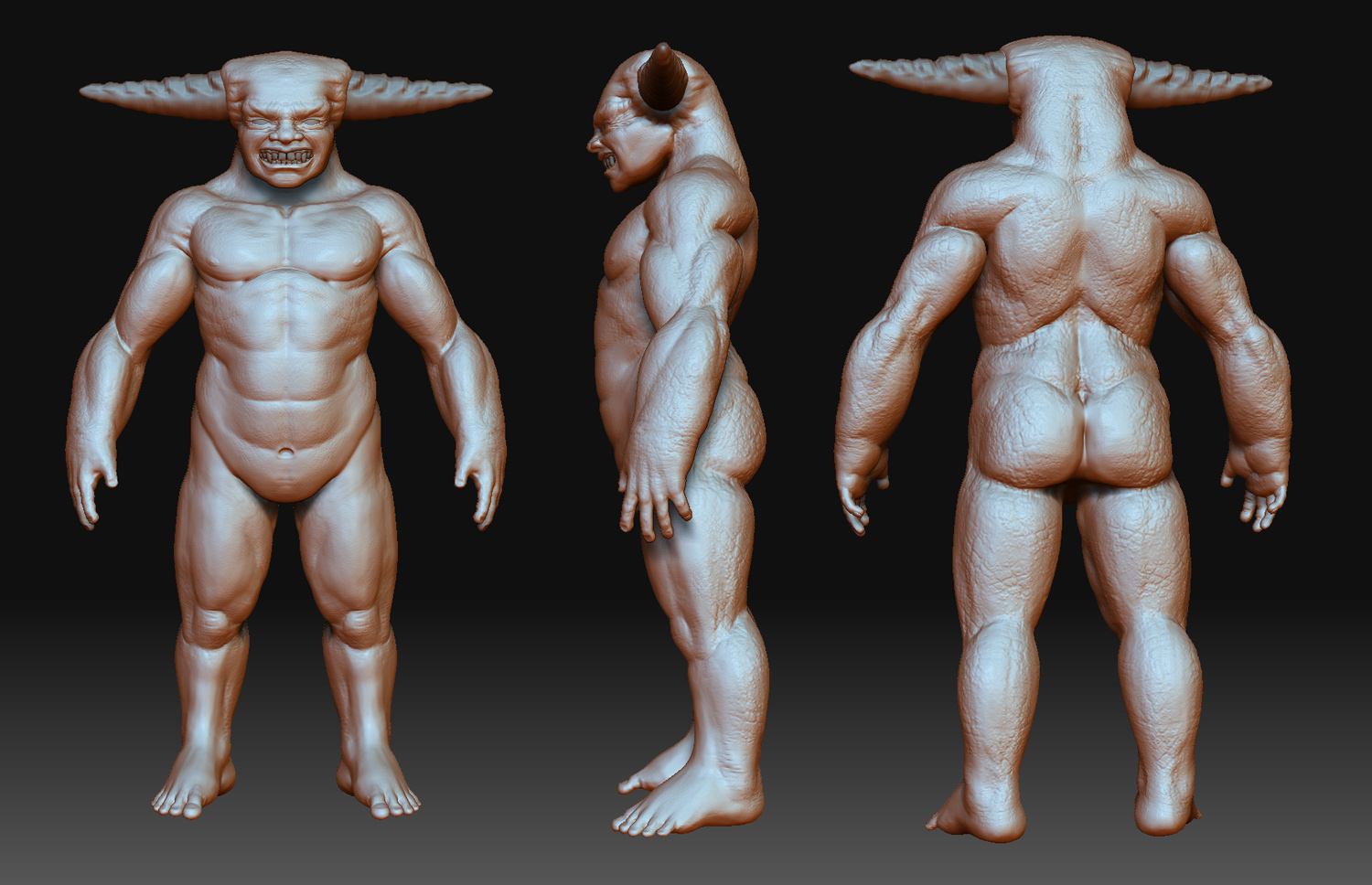
hey there
started to work on something new yesterday.
some hours sculpting so far… just wanted to start zbrush again…
the first months i had my tablet i only worked in photoshop. here is a concept-sketch i made during this time. it is one year old and i wanted to make it 3d with a new interpretation of the character.
here you get the progress for now:
[ ](javascript:zb_insimg(‘143776’,‘1_closeup.jpg’,1,0))
Attachments
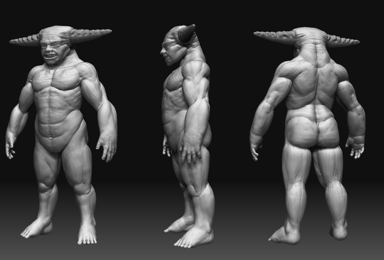
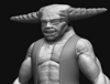
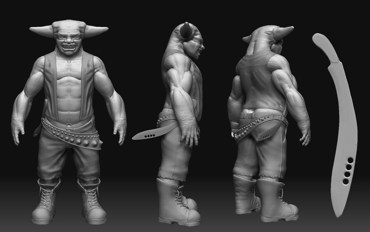
hey there.
here we go with his first update. i tried to correct his feet and gave him some clothing.
i think the vest is better than the shirt in the concept.
i think it is time to detail him.
[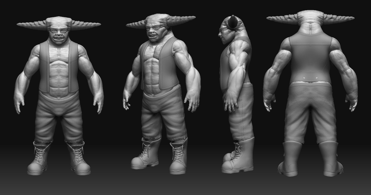 ](javascript:zb_insimg(‘144144’,‘2_comp.jpg’,1,0))
Attachments
Hey wethand, man you work quickly 
Love the new concept. Maybe if the pants where a bit above the boots it would help the silhouette even more.
Great concept art though and the devil in the armchair always reminded me of an evil John Goodman. Love the desaturation I think that really helped the final image alot
Nice job sticking to your concept. Reminds me of “Little Monsters” with the kid from the wonder years and the blue monster with the leather jacket and horns. If you haven’t seen it I highly recommend it. Good work
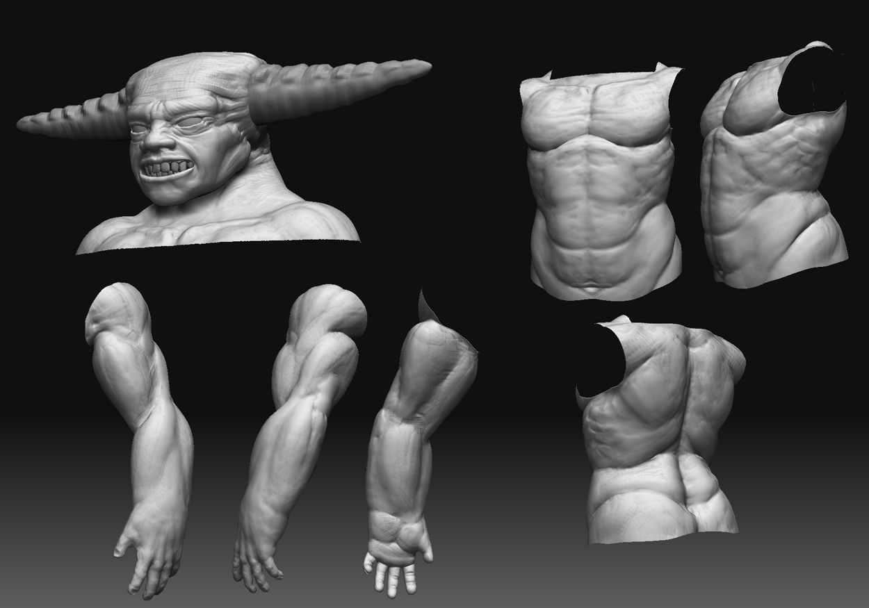
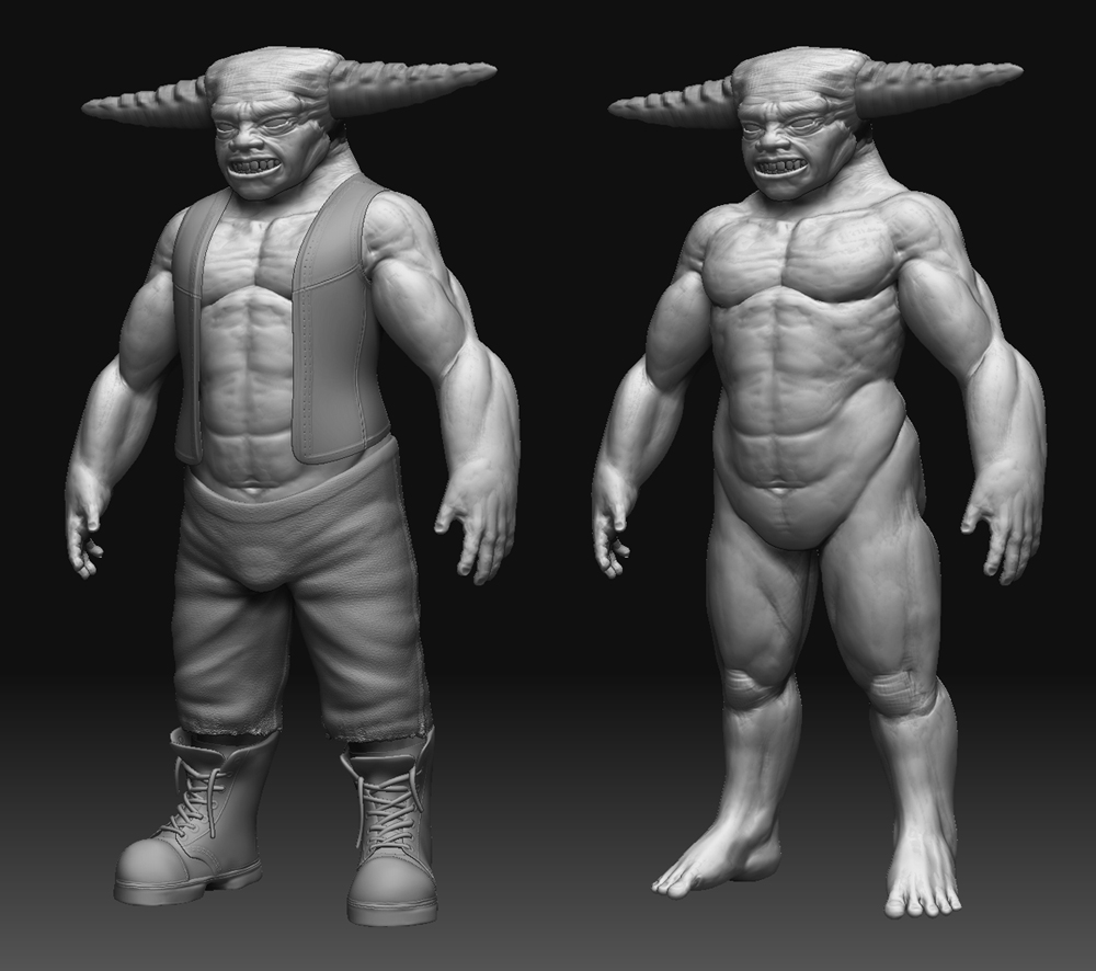
hey there,
many thanks for the kind comments.
i began detailing the guy. next step is further detailing and texture.
hope you like it so far. here it goes:
[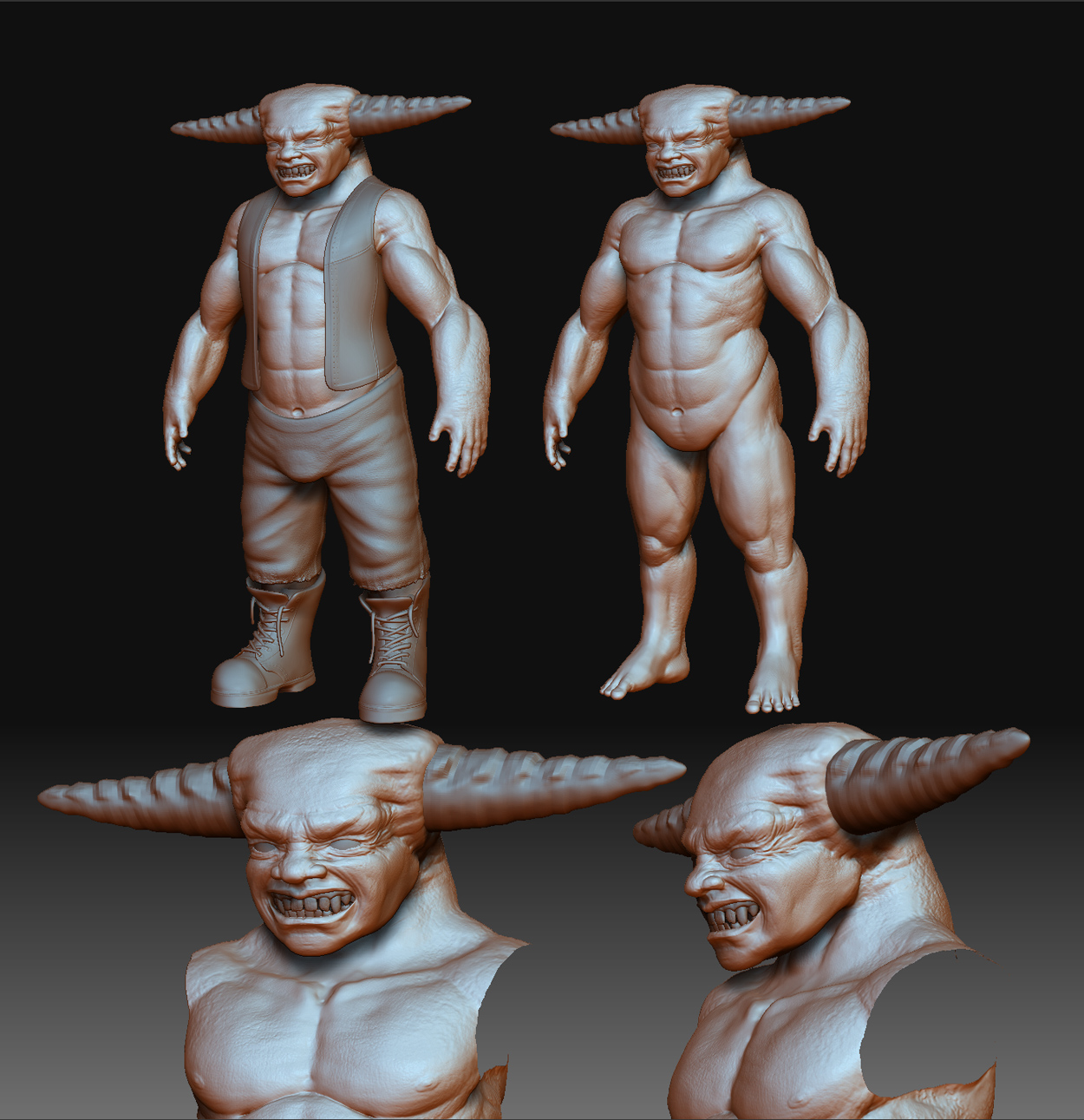 ](javascript:zb_insimg(‘144338’,‘3_zusammen.jpg’,1,0))
Attachments
hey there.
first quick polypaint to get an impression of the color sheme. i think this could work as it is.
i wanted to give him some war-paint or something like that. this is just a quick sketch, but i think the colors work. in the end i’ll paint the tattoos with zapplink.
if you have any suggestions feel free to comment 
anyway, the model itself still needs some work.
[
](javascript:zb_insimg(‘144602’,‘4.jpg’,1,0))
hey there.
just updating the guy. feel free to comment… if you want to
[
](javascript:zb_insimg(‘144759’,‘5.jpg’,1,0))
man i love the proprtions and facail expression.only think is the detials such as on ur clothes and especailly your back seem way too noisey, mite need toning down a tad nice work
http://www.zbrushcentral.com/zbc/showthread.php?p=577002#post577002
uu this matcap doesn´t help at all ;x
the modelling looks good, but still have a lot to do…
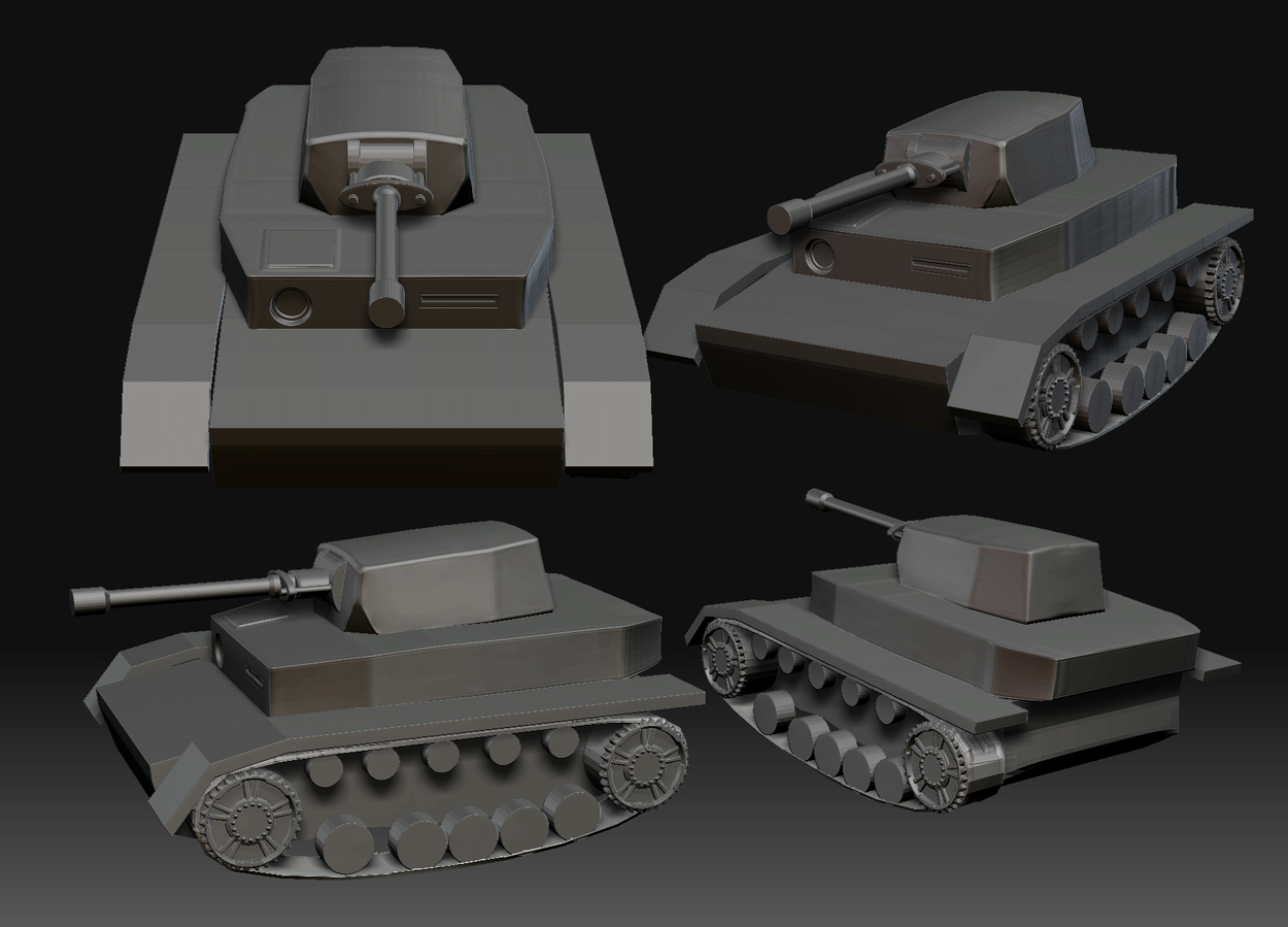
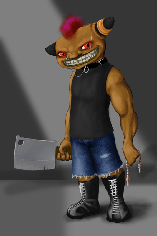
hey there
i smoothed the skin down a little bit. it was right that the skin looked to bumpy. but the pants. i like them how they are.
i gave him a knife and thought about a scene for him.
so i started building a tank inside zbrush. phew, hard surface is hard… ^^
further work on it is comming. but for now its enough. i am playing with the primitves and the flatten-brush. i think with enough detail it could look nice. i know the tank looks a little bit “damaged”… but i think i could make it cool… i will see.
[ ]
]
Attachments