Great new model, Marsyas!
Very clean and beautiful work. Of course, that´s normal for you. 
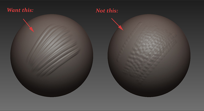
Thanks, guys!  Here’s a little tutorial I put together on how to make fast, fine-lined brush strokes (a problem I’ve had for a long time):
How to Make a Fast, Fine-Lined Brush:
[ ]
]
-
Set ‘Brush>AlignToPath’ to ‘1’ so the alpha follows your stroke direction more closely.
-
Depending on the type of brush, lowering ‘Brush>Samples’ may help. (The alpha takes up less of the brush size so a high sample rate will take into account areas outside of your actual mark).
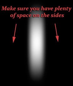
And that’s pretty much it. The only thing you have to get used to is the fact that your brush size indicator will be larger than your actual brush size (because the alpha is narrower)–much like the default ‘Slash’ brush. I find that it’s easy to predict the size after a few strokes though. I also use regular-sized brush alphas for most work, only turning to a fine-lined brush alpha when I need it.
I’ve attached the alpha which I used to demonstrate above in case you want to try it. Just don’t forget to change the ‘AlignToPath’ settings to help with curves.
Thanks for looking!
adio38: Thanks! The tail might have made more sense in her original thread, where I planned it from the beginning: http://www.pixolator.com/zbc/showthread.php?t=66752&page=1&pp=15
Etcher: Thanks, Etcher! I think I’m attracted to the challenge of female faces. I should really try more men and monsters though.  And thanks for the extra plug!
j.fernwright: Thanks! I’m glad she’s recognizeable.
Lucky_1: Thank you! She looks pretty different now that she’s shed all the heavy makeup she had been using for a while.
Captain Sensible: Thank you!
Moni-Poroni: Thanks, Moni-Poroni! Only the work I actually show though. I produce plenty of poop too.
[attach=135034]blocky_fine.jpg[/attach]
Attachments

Thanks for this stroke-tutorial, Marsyas. 
I´ll definitely try that. 
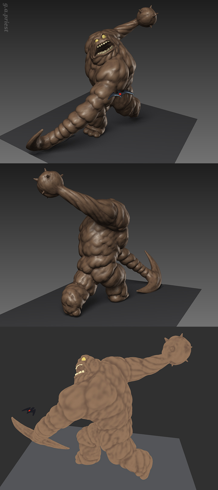
Hi! I haven’t been sculpting lately but here’s a new Clayface.
[]
It's a special boomerang meant to blow his head up or something. ;)
Thanks for looking! :)
Attachments

OoooOOOOooOoo… The bloooob 
Amazing job you did capturing the morphing blob feel. Reminds me of Twelve from Street Fighter Third Strike. He would make a great 3D print. No crits here.
I love Clayface!!!
Awesome, I’m a huge fan of the old Batman Animated series, nice!!!
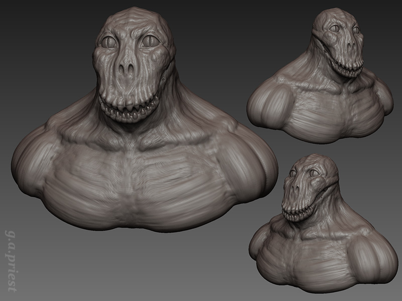
Just a few more renders of Clayface…
[ ]
]
I used simple cavity coloring which I talked about here: http://209.132.96.165/zbc/showthread.php?t=51773&page=11&pp=15
Aberrant: Thanks! It’s tough making him blobby–I find I have to add some sort of definition or he feels sloppy.
jakerton: Thank you! I’m a big fan too, of Bruce Timm’s stuff in general.
Yeah! I like it a lot, great thrust in the pose and the character has got a lot of style, very original. And as always great thanks for the useful tips.
I really like your Clayface, and I have to say I would love to see how you do Batman. Your Clayface has that Batman Animated series feel to it.
http://upload.wikimedia.org/wikipedia/en/e/e2/Clayface-Batman.jpg
excelent stuff. I would love to see a few splashes of clay used like speedlines to denote the movenent, does that make sense?
Hi Marsyas!
Quote:“I think I’m attracted to the challenge of female faces. I should really try more men and monsters though.”
Ow kay… .  .
.
Clayface is great, thank you for taking the time to post the WIP/workflow shots! !
Didn´t “see” you for a long time.
GREAT work! And the WIP presentation is fantastic, Marsyas.
Thanks for sharing!
I have experienced this patchy effect all too often. Thank you so much for the tip. I forced myself to sketch slowly or use the lazy mouse to compensate but ill try this out. Great work around.
Thanks, guys! Here’s a freaky Croc I sketched tonight:
[ ]
]
Somewhat inspired by his first animated incarnation. I didn’t use refs though so he probably looks wonky.
maxinkuk: Thanks! I really owe it to the brilliant design in the animated series though:
//youtu.be/<object width=“425” height=“344”><param name=“movie” value=“http://www.youtube.com/v/YEgTcullKJI&hl=en&fs=1”></param><param name=“allowFullScreen” value=“true”></param><param name=“allowscriptaccess” value=“always”></param><embed src=“http://www.youtube.com/v/YEgTcullKJI&hl=en&fs=1” type=“application/x-shockwave-flash” allowscriptaccess=“always” allowfullscreen=“true” width=“425” height=“344”></embed></object>
Cheshire_Monkey: Thanks! I actually referenced that pic a lot when I was working. I’d like to do a version that’s even closer to it some day.
seth.: Thank you! I see what you mean; maybe some gobs of goo flying off would be interesting too.
Etcher: Thanks, Etcher! I forgot how much fun it is to make monsters.
Moni-Poroni: Thank you, Moni-Poroni!
Aberrant: Thanks! I actually force myself to slow down a lot too–but sometimes it’s a virtue, I think. I find myself spending more time slowing my strokes down these days than using a fine brush. Nice to have them though.
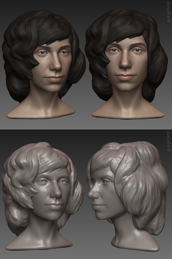
Just some color on PJ… Looks a little odd with the fake eyeshines and stiff hair though…
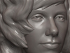
[attach=139768]pj_harvey4_gap.jpg[/attach]
Thanks for looking!
Attachments
Very cool.
The sharp, triangular bangs are bothering me, giving them some more curvature would really help I think. Otherwise it looks great.
Some nice work here. Also, your information on making fine lines is very useful. Thanks!
yeah, you have some really cool stuff in here!
like the last bust very much! is looks clean and has much character!
Wha, no monsters ?