Same here sasquatchpoacher! 
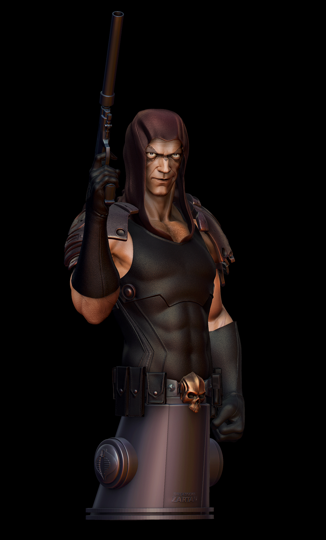
Was playing around with passes and mixing things up…
[ ](javascript:zb_insimg(‘155173’,‘diffuse.jpg’,1,0))
Attachments
Same here sasquatchpoacher! 
Was playing around with passes and mixing things up…
[ ](javascript:zb_insimg(‘155173’,‘diffuse.jpg’,1,0))

Very cool khalavi! I like the expression, and the anatomy is very good.
Thanks ixeon :D.
I just found out my entry won 1st place in the challenge!!!
YAY!!! :D:D:D
Ha, ha, ha, congratulations!
So proud of you, way to go man!
Cheers
Cesar Dacol Jr.
Aka, The Voodoo Monkey
<input id=“gwProxy” type=“hidden”><!–Session data–><input onclick=“jsCall();” id=“jsProxy” type=“hidden”>
Thanks Cesar! XD
well you deserved it
Congrats on the win ,thats a cool model:)
Although he looks different than I think he actually looks—or the was I remember him anyway—he came out really awesome. 
@danko75: Thank you :).
@calum5ZB: Thanks! Put alot of energy into this one :D.
@Vancross: Thank you! Well I had intended to keep the old costume elements with him but yes I did improvise and modernize the design a bit. Glad you like it :D.
Congrats, your effort paid off, well done.
B187 & Tez, thank you for the kind words! 
Trying to make a composition without the base.
[]
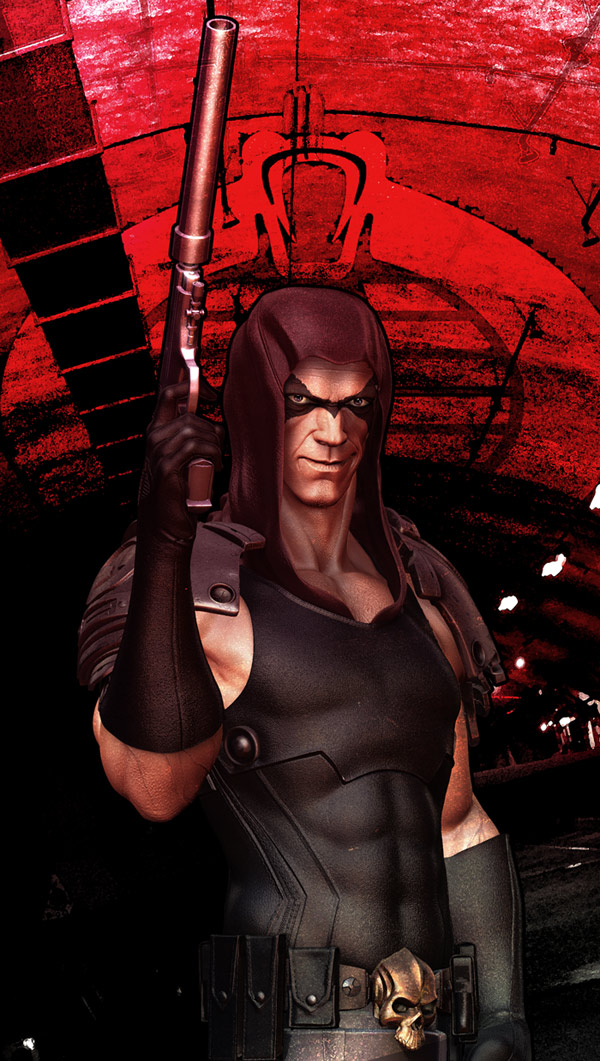
Another one :D. I think its near resolved now.
[[attach=158719]ZBC-3.jpg[/attach]]
[[attach=158720]COMP_03.jpg[/attach]]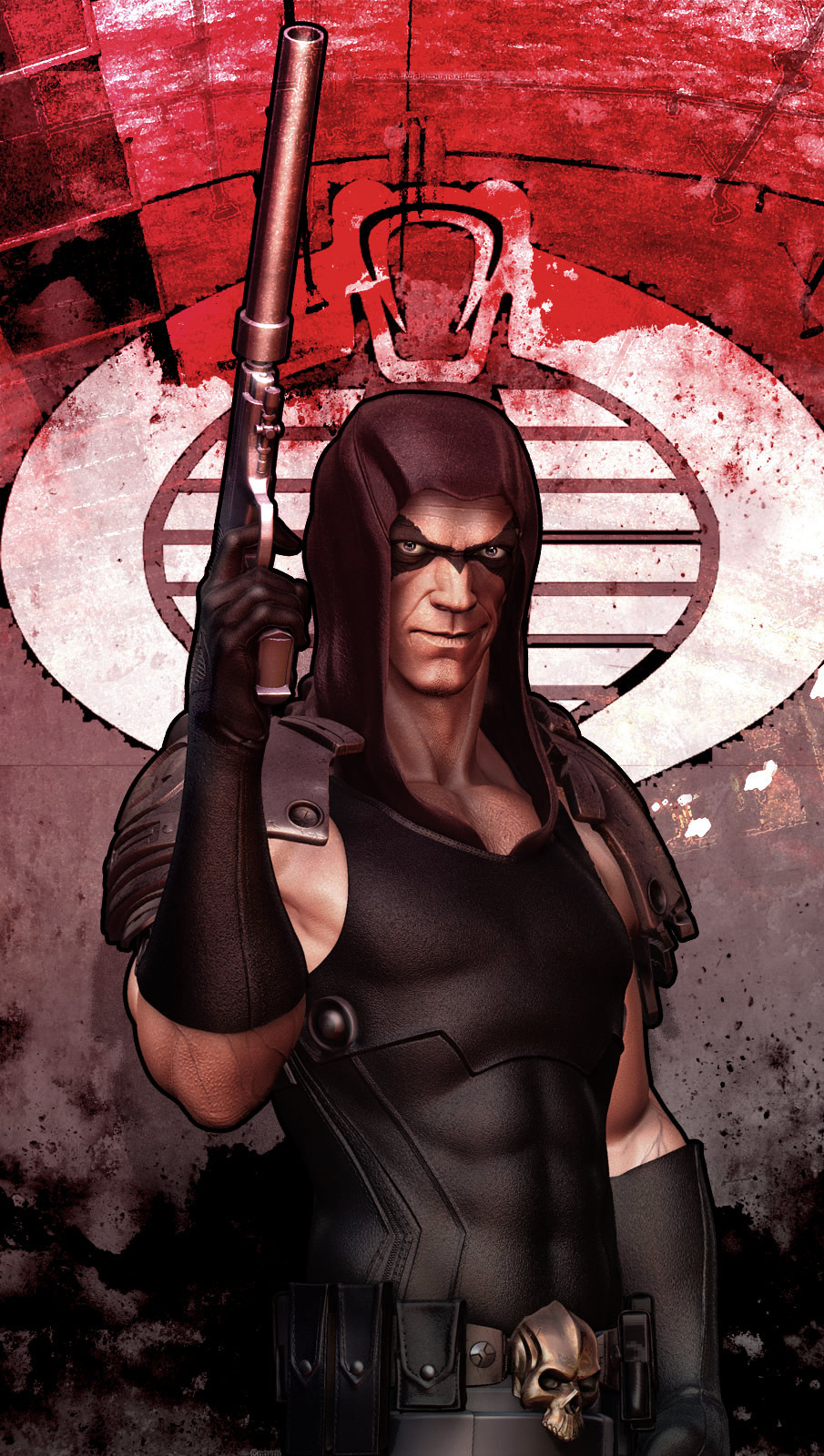
I like it! The only thing that is bothering me is the bold outline that it has. First off it surounds the form and never varies or cuts into it and then there is a problem were it touches at the hand and the hood that really flattens out the piece I think. 
Beautiful !
Very nice!!!
max-tx, Kwamey: Thank you 
Vancross: You’re right it does cut him out a bit from the background. I was trying to go for the comic book cover kind of approach with a textural cut feel to it. Here’s one without the outline! Now I can’t decide which one to choose :D.
[ ](javascript:zb_insimg(‘158737’,‘COMP_02_MED.jpg’,1,0))
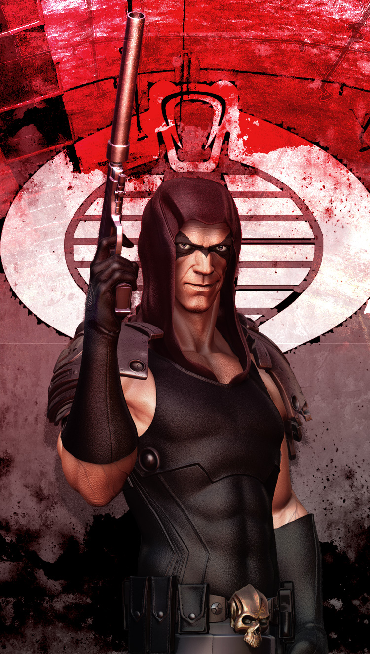
Really nice work. One of my favorites growing up. I remember sitting my action figure out in the sun to make the face turn blue. Just my opinion, but I think you should keep the bold outline. You have such a strong graphic element as the background, I think the outline really lends itself well.