@danko75: Thank you :).
@calum5ZB: Thanks! Put alot of energy into this one :D.
@Vancross: Thank you! Well I had intended to keep the old costume elements with him but yes I did improvise and modernize the design a bit. Glad you like it :D.
Congrats, your effort paid off, well done.
B187 & Tez, thank you for the kind words! 
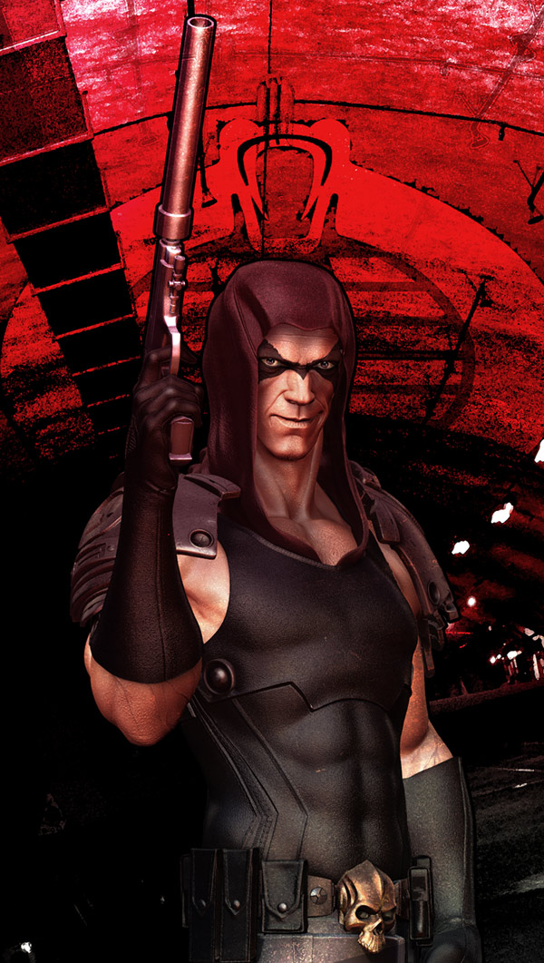
Trying to make a composition without the base.
[]
Attachments
Another one :D. I think its near resolved now.
[[attach=158719]ZBC-3.jpg[/attach]]
[[attach=158720]COMP_03.jpg[/attach]]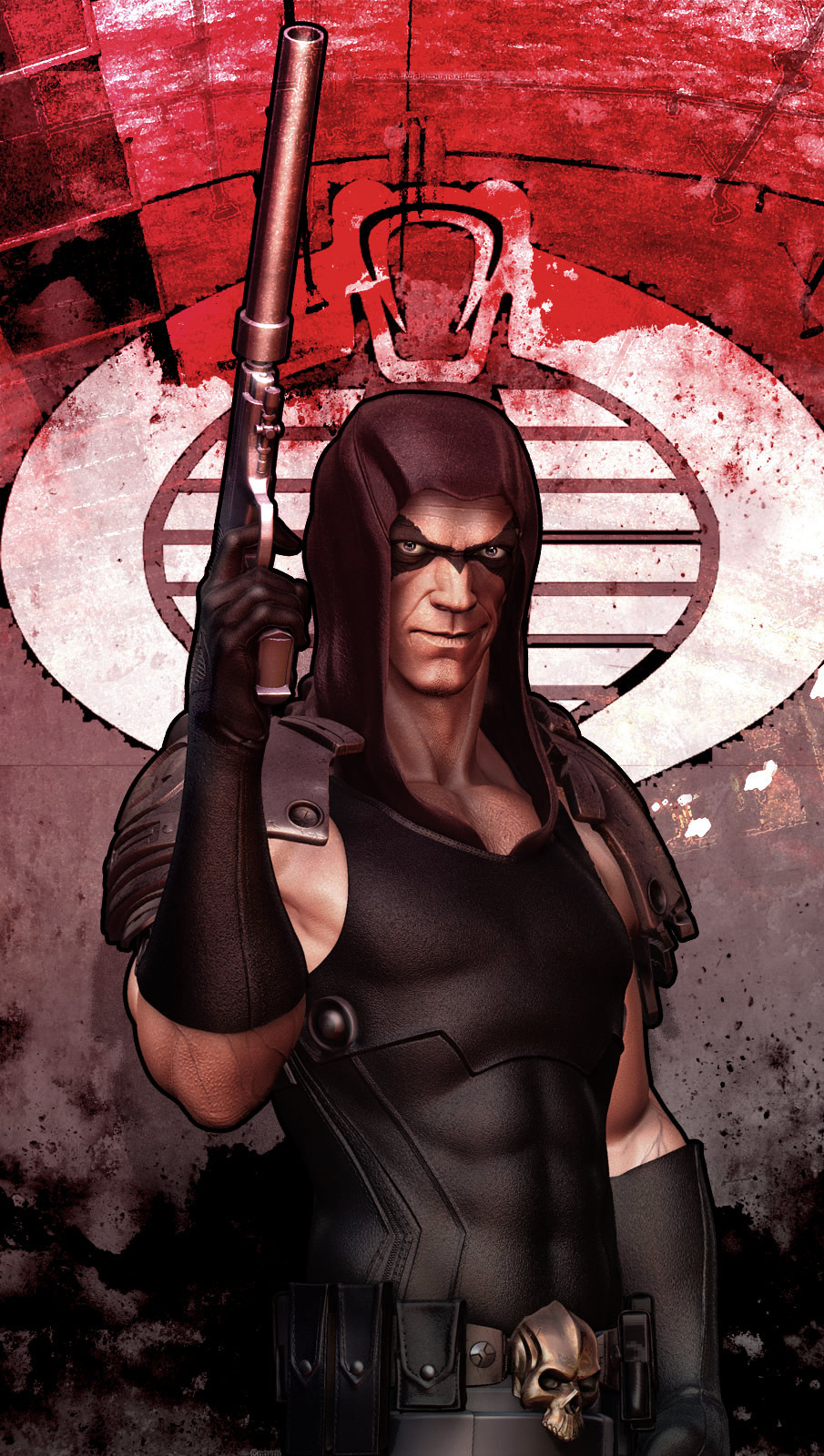
I like it! The only thing that is bothering me is the bold outline that it has. First off it surounds the form and never varies or cuts into it and then there is a problem were it touches at the hand and the hood that really flattens out the piece I think. 
Beautiful !
Very nice!!!
max-tx, Kwamey: Thank you 
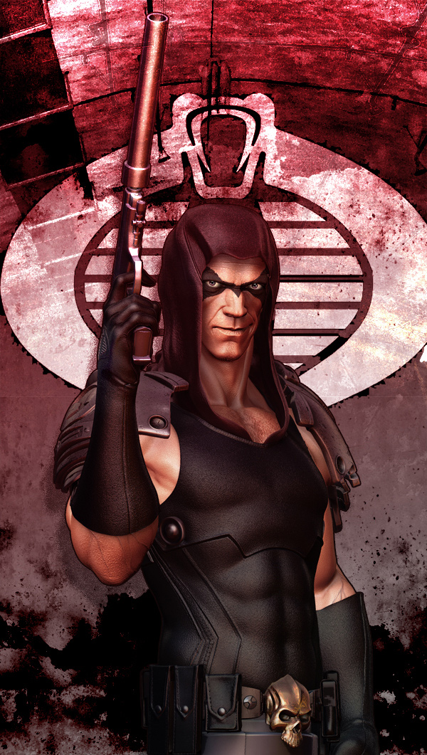
Vancross: You’re right it does cut him out a bit from the background. I was trying to go for the comic book cover kind of approach with a textural cut feel to it. Here’s one without the outline! Now I can’t decide which one to choose :D.
[](javascript:zb_insimg(‘158737’,‘COMP_02_MED.jpg’,1,0))
Attachments
Really nice work. One of my favorites growing up. I remember sitting my action figure out in the sun to make the face turn blue. Just my opinion, but I think you should keep the bold outline. You have such a strong graphic element as the background, I think the outline really lends itself well.
I love the black line. I love the work.
Very cool!
This one really stands out to me, great job!! I throw my vote FOR the black outline. To me the black line gives it a gritty comic book cover feel, but still looks like he could reach out and pistol whip you!!
Very admirable work and congrats on the winning.
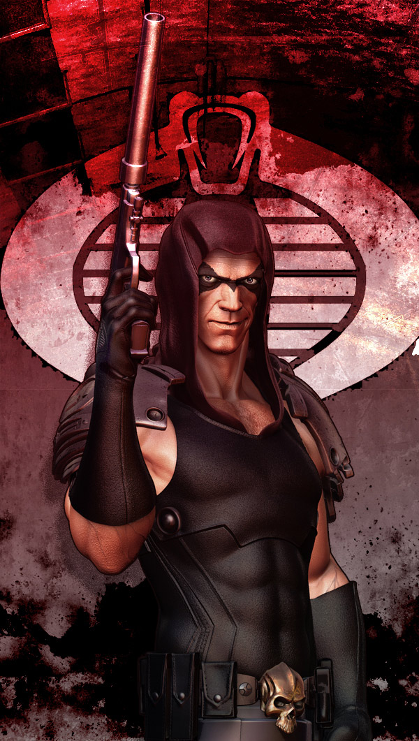
Nice work. I recommend darkening the background to make the character pop a bit more. If you squint down he just kind of gets lost in a blurry sea of red.
industripop: Thank you! Those JOE figures bback in the day were a treat to have with all the poseability and accessories! Zartan always stood out in Cobra. I hope I can do a fuill body of him someday.
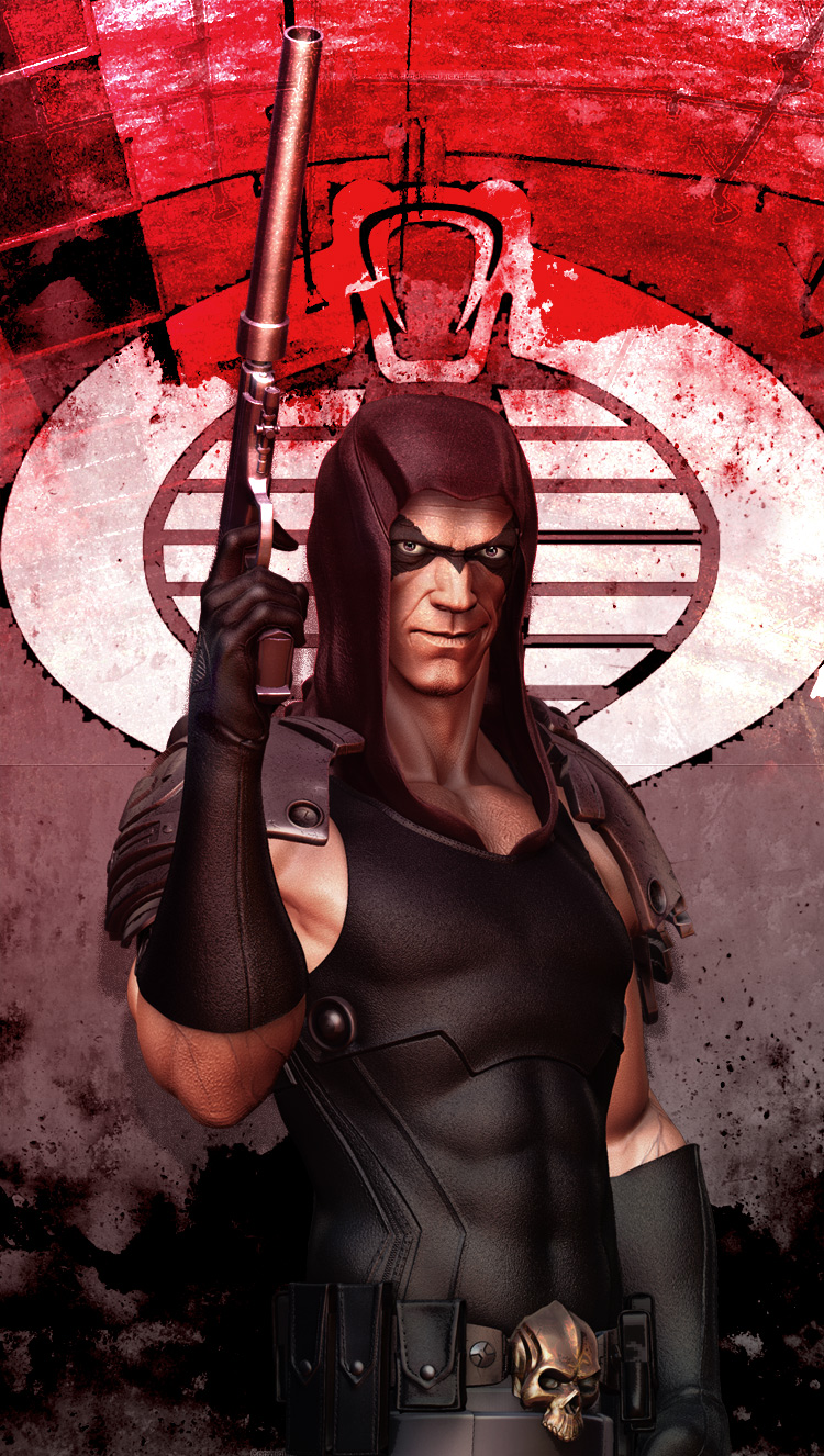
nimblepix: Thanks! I’m wavering towards the outline myself a bit now after these comments :D.
pwr2cr8: Lol… Thank you!
dustinbrown: Thanks for the suggestion Dustin! I tried out these two options;
Attachments
Yeah I like the outline also but the way it is done doesn’t work in some areas. I think maybe if you could do it by hand so it has a more comic book feel to it?
I think it looked better with the darker background as it helped to break up the line some and it really help to hide where the line meets at the hand and the hood which totally flattens out the entire focus of the piece.
You can also try making the line thinner; that may help.
1st - Great work, really grabbed my eye
2nd - Congrats on your win
3rd - Forgive the my noobness, are you using a stencil for the details such a the logo on the glove and base? Thanks
Vancross: Thanks Van! I thinned out the outline and it does look better in the above images. Thats what so great about ZBC you keep getting such constructive suggestions :D.
d100763: Thanks! Well you’re right I’ve used an alpha on a medium intensity level with the standard brush. I’ve even used alphas to carve out the shoulder plates in major areas as well. The great thing about this process is that if you have good alphas it greatly redues the time you put in to actually sculpt such hard cut details. Zbrush rules :D.
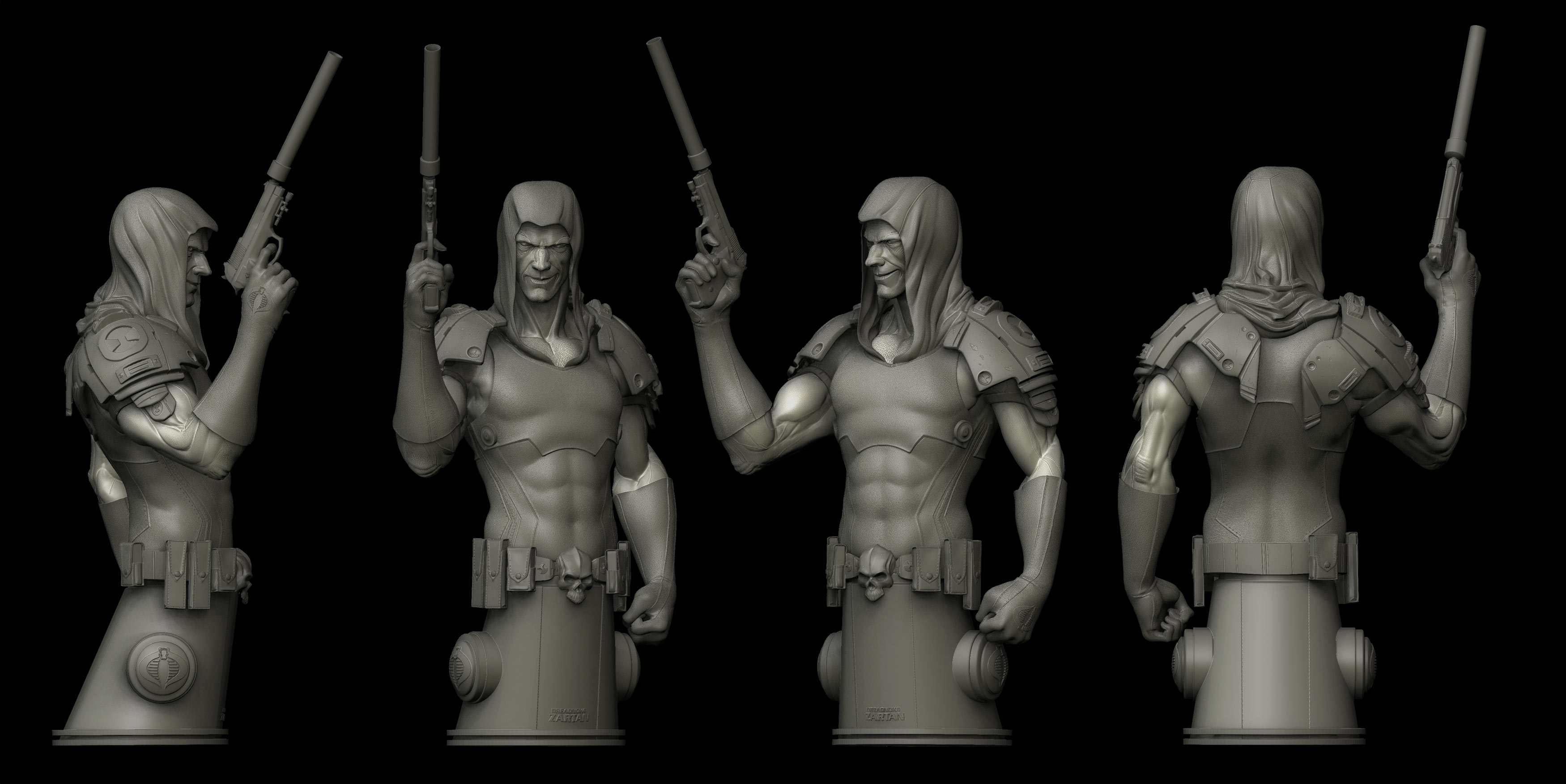
An updated turntable of Zartan.
Improved on the hood, the face and the arms.
[ ](javascript:zb_insimg(‘159637’,‘turntable_new.jpg’,1,0))
Attachments
Have you noticed his face looks like Hugh Lorie / House Md. ? 