thank you for your comments guys, i really appreciate it 
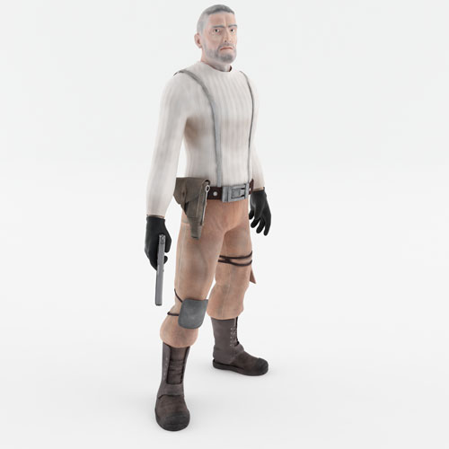
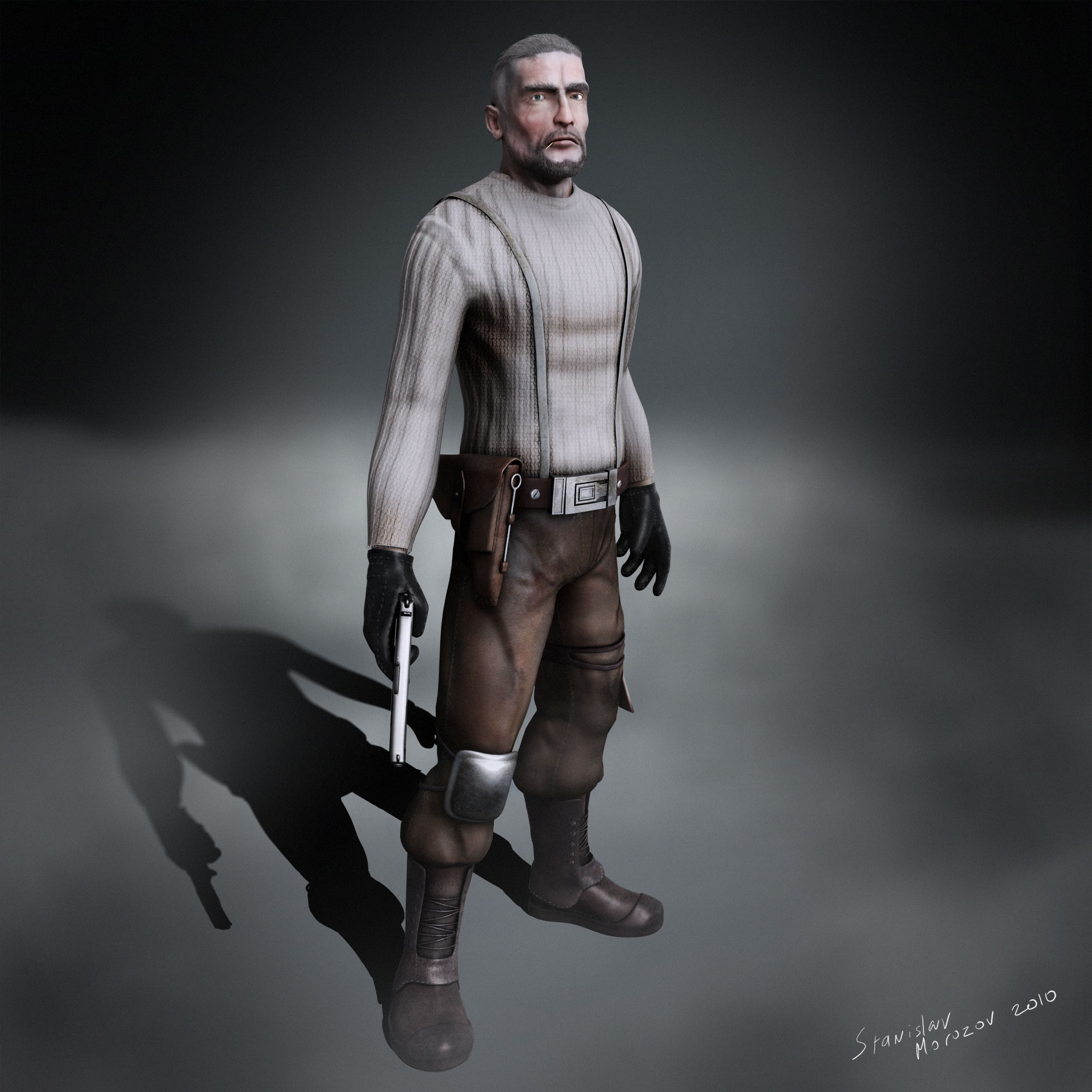
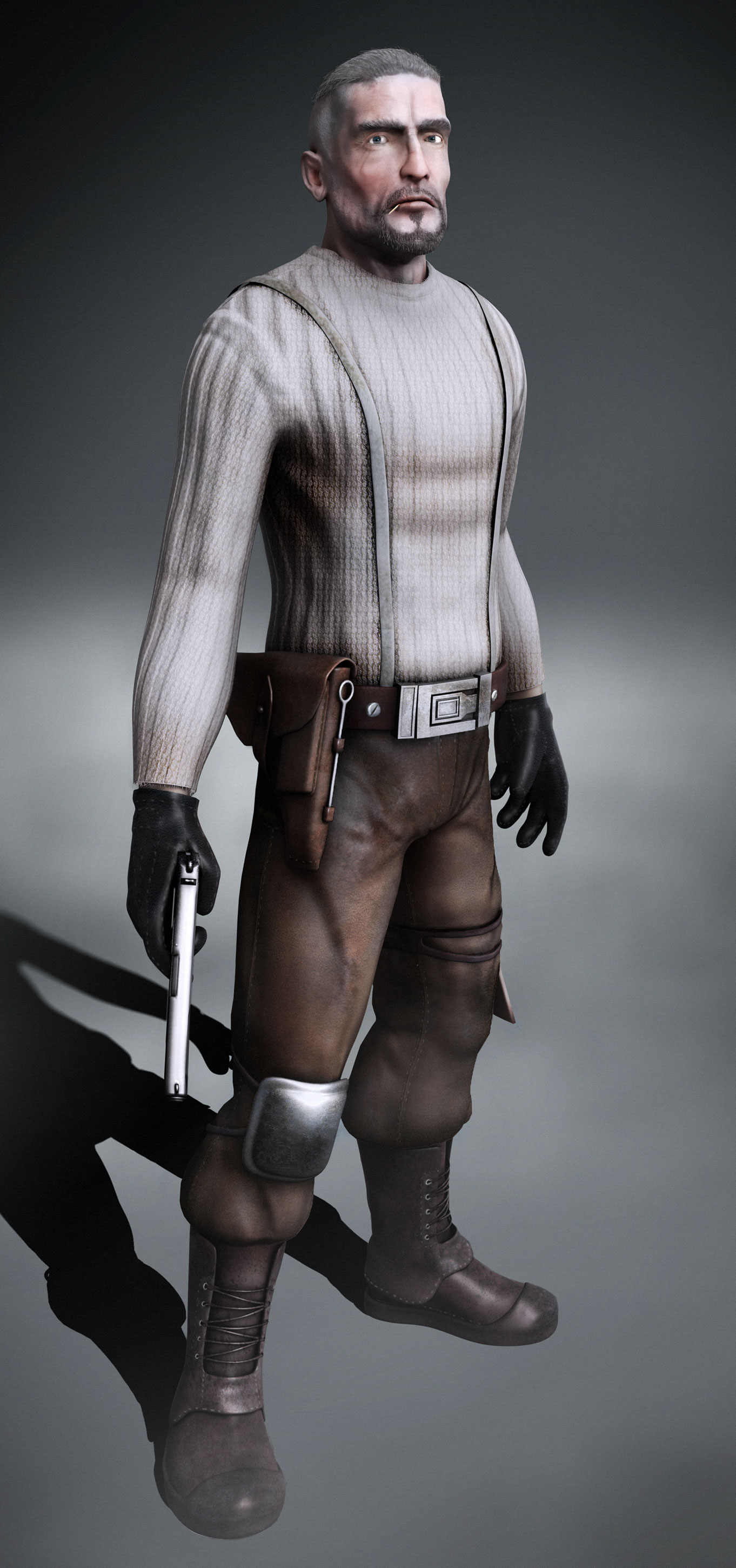
by the way, pants, gloves and boots are specular and not glossy to simulate the look of an aged leather, because with age leather loses it’s glossines because of all of the micro scratches and dust in it’s structure and becomes specular
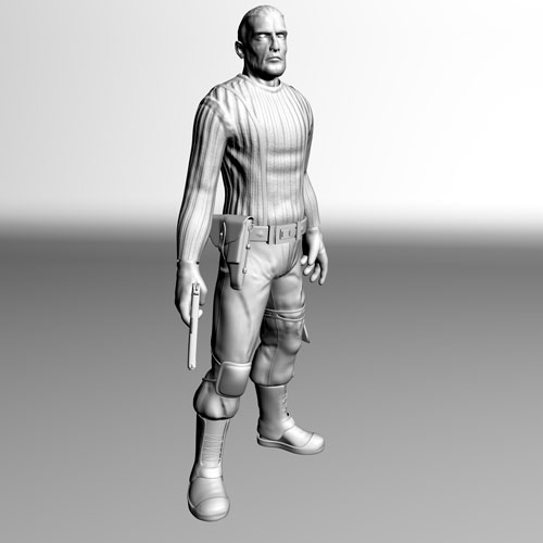
Just wanted to show you guys some passes that i’ve used to combine the final image in photoshop, the original image is 4000x4000 but i reckon 500x500 ones would do for the presentation purpose, so here it goes
[[attach=176050]global_illumination.jpg[/attach]](javascript:zb_insimg(‘176050’,‘global_illumination.jpg’,1,0))
this is the first one - global illumination, that i’ve rendered out with vray with a studio light setup, just to have almost flat colors, but with a hint of a global illumination in it
[[attach=176051]shadows_contrast.jpg[/attach]](javascript:zb_insimg(‘176051’,‘shadows_contrast.jpg’,1,0))
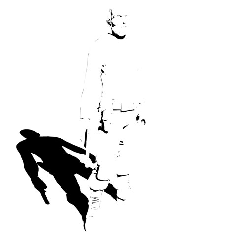
this one was also rendered out in vray with default material applied and set up with a single vray light, this is a first dirt pass - a soft one
[attach=176052]dirt.jpg[/attach]
here’s a dirt pass, that was rendered out with default scanline and skylight applied, took me about 30 seconds to render out 4000x4000 which is why for this pass i’ve used scanline renderer
[attach=176053]light.jpg[/attach]
here’s a light pass that i’ve rendered out with default scanline and normal maps applied, i always use it to pump out normal maps, that get flattened and almost invisible with vray global illumination and it takes only 20 seconds to render
[[attach=176055]specular.jpg[/attach]](javascript:zb_insimg(‘176055’,‘specular.jpg’,1,0))
here’s a specular pass, that i’ve also rendered out with default scanline, which combined with other passes in photoshop simulates falloff vray reflections very well and instead of spending 20 mins in vray to render those reflections out, it took me only around 40 seconds
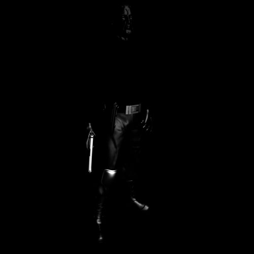
[[attach=176056]shadow.jpg[/attach]](javascript:zb_insimg(‘176056’,‘shadow.jpg’,1,0))
and here’s a basic shadow pass with alpha, just to make sure that i don’t waste my time in photoshop, trying to draw those shadows by hand ))
hope it was helpfull, there a many ways and techniquest for pass merging in photoshop and this is the one that i’ve discovered for myself through some experimenting, it might work for you and might not
Attachments
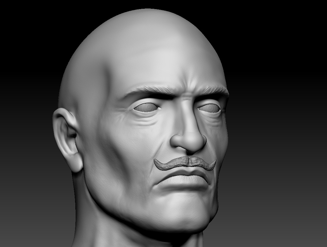
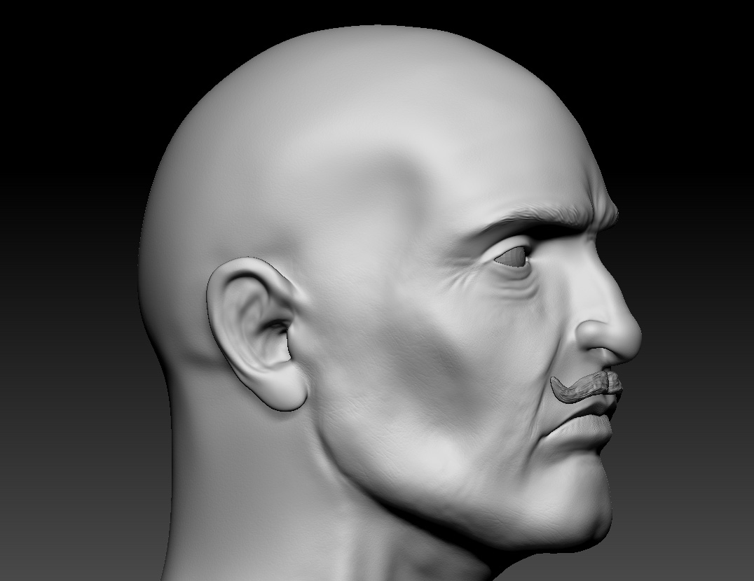
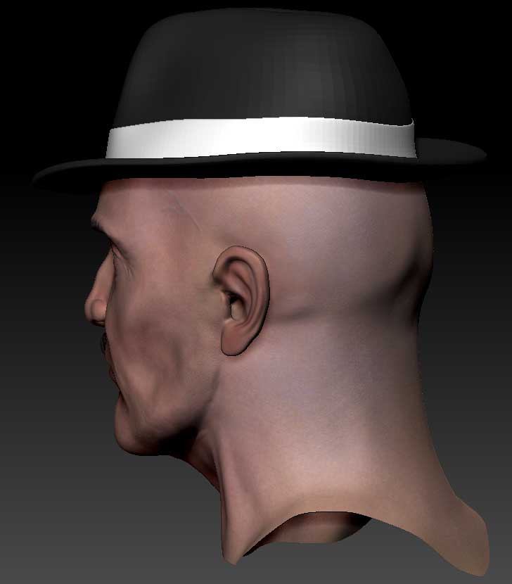
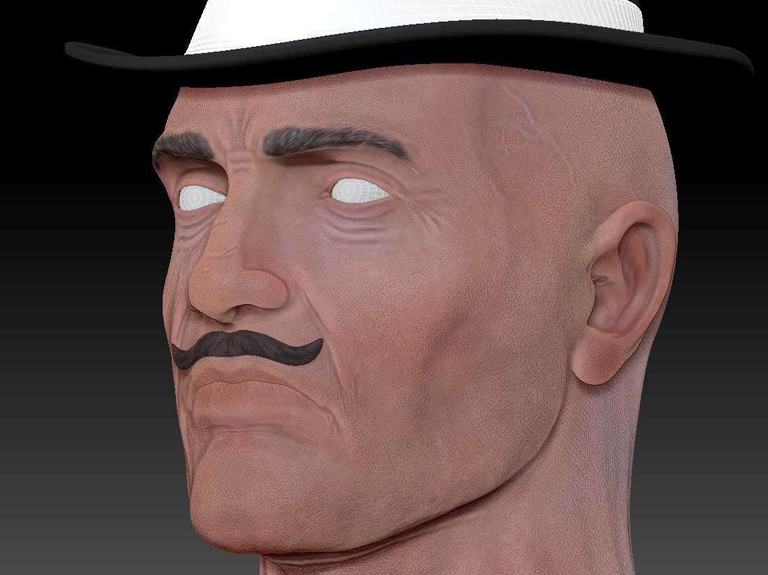
 ) and gave him some eyelashes, even though i had a lot of problem with it because he looked to feminent with a dark eyelashes and fixed up his pale face.
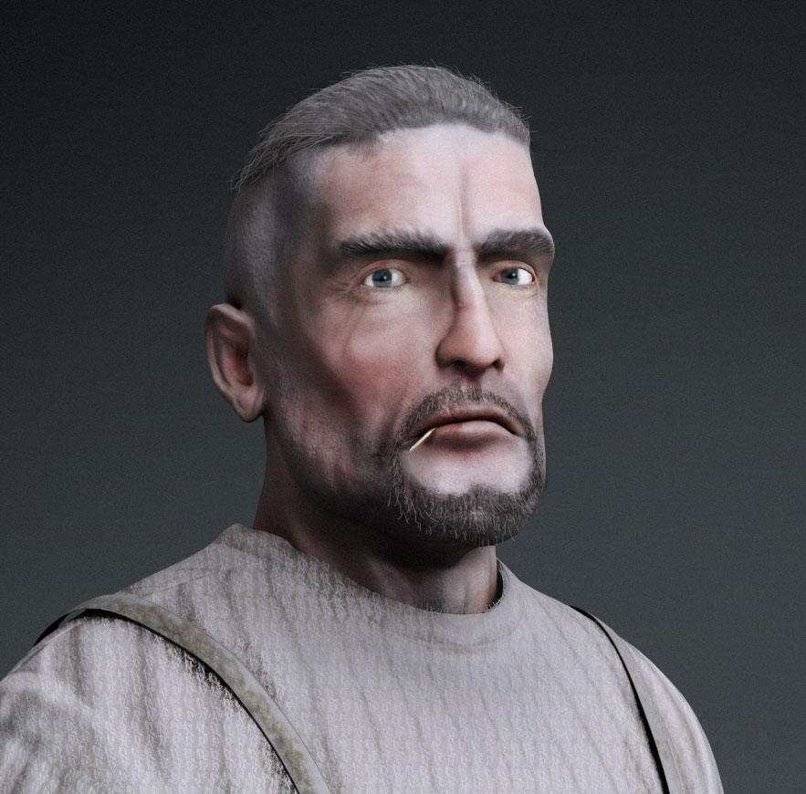
 ]
] ](javascript:zb_insimg(‘176049’,‘350full-dennis-hopper.jpg’,1,0))
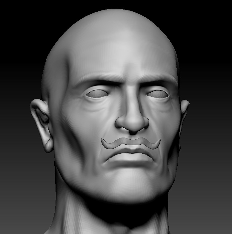 ](javascript:zb_insimg(‘177006’,‘2.jpg’,1,0))


 )))))))))))))
