WOW! It’s a wonderful work.
love the creature. My only crit would be the rather great difference between the creature and Thor’s style. I mean Thor looks somewhat comic as oppose to the hyper-realistic creature. It’s like a clash of style and here it doesn’t works here.
Having say that, this serpent is superb.
Does anyone else see the Xenomorph head on Jormungandr?
Hello
Thanks for the comments!
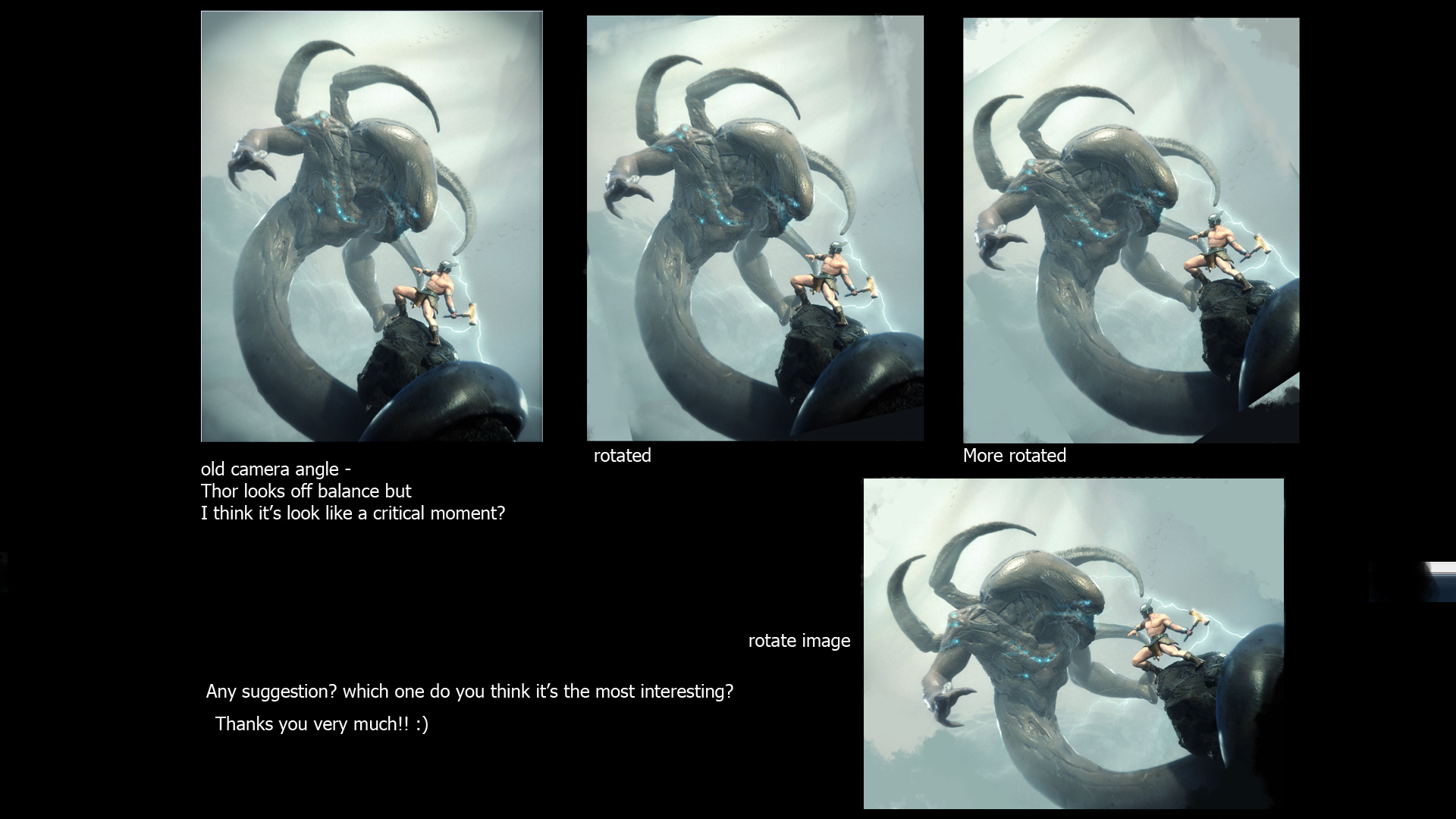
I have try to balancing Thor pose by editing the camera angle a bit and this is what i got. still have no idea what’s the besst angle. pls help me !
I redo his wing on the helmet and add some fishy stuff to Jormungandr.
Still working on final image.
Thanks you 
Awesome image.
I like the original positions best but i did notice Thor looked a bit unbalanced. perhaps a better way of dealing with that is give his left leg a stronger foothold. if he is swinging his hammer he needs to have have leverage which he kinda misses. Rotating the image helps but then you lose the looming presence of the monster which is one of the strong points of the original composition.
My suggestion would be to give him something to wedge his leftfoot against, a more pronounced ledge or a rock sticking out, as right now he’d likely slip and fall if he swung the hammer.
Other than that it’s an awe-inspiring image.
Hey, really nice image you got going on there.
The third on the top looks the best, but if you were to change it to that, i would change the main characters stance so it seems more natural. 
very nice work I think that you should stick with the original pose. he looks off balace but it works and adds to the intensity
I like picture 1 bro.Great work I like it.small_orange_diamondsmall_orange_diamondsmall_orange_diamondsmall_orange_diamond
definitely version 1(old) or 2(rotated) where 2 is probably the most balanced one. thor looks still a little off balance, but just enough so it underlines the situation. after all it’s very likely he is almost falling over backwards, trying to avoid being attacked.
either way - those where the whole flow points up towards the left upper corner make it simply more dynamic and convey a higher tension of danger and action.
Great work and I really like the style of your last character!
I dunno what crit do you require? Only on the rendering and comp or on the models as well?
Here’s both
I think you’ve done a great job, the only thing I’d change would be the size of the serpent’s hands (please don’t confuse them with arms :)) so just the hands/fists about double the size.
As far as rendering, it’s all great as well except the skin shader of Thor. The serpent and the rest of the scene look somewhere between realistic and plastic which I like very much, so Thor could use some of that as well.
I’d leave the comp vertical but just repose the Thore a bit so he looks more powerful and less like he’s gonna fall down. I don’t find it quite attractive being horizontal, not with the same lighting anyways.
Just have in mind as much as you rotate the picture to the left less and less threatning the serpent becomes.
Any help?
Keep up the outstanding work small_orange_diamondsmall_orange_diamondsmall_orange_diamondsmall_orange_diamond
The original composition is the strongest. I would drop Thor’s left shoulder down a bit and raise his right. This would enhance the off-balanced stance, which is perfect. He looks relaxed in the way he’s holding the hammer and this would add to the tension.
Fantastic design work on the snake creature, I agree with cherub that the hands should be a bit more menacing and not so small in proportion with the arms.
#2 Is the best comp IMO. Nice Image!
I agree with sgrell 2nd one looks more like theres a fight on POWER STANCE
I like More Rotated the best! looks good man.
#2 rotated
I’ve gotta go with ur original piece to be honest. #2 is the most balanced but I kinda liked the unbalanced Thor in the first one…sort of gave it this feeling of uneasiness. Just my 2 cents! Great work!
for all it’s worth I think you are trying something that isn’t broken. I like that the worm is on top of Thor looking down on him. This makes the worm look dangerous. You see what is happening the more you rotate the image; Thor is getting more and more on top of things, because he is allowed to get on a more even level with the worm.
The actual composition on the image works as it is now, but Thor’s stance could be improved. Right now Thor is tilted backwards which reads as he is in defensive stance. Tilt him forward to make his stance much more aggressive and strong. Or at least make us believe his on the verve of hitting the worm with his hammer.
Now you have me going, I would also consider the outfit of Thor. You have done a great job make the design of the Worm look interesting unique, but somehow Thor doesn’t fit in this new art direction. I would love to see you go totally Alien-Giger-New-Age with Thor as well and get rid of the loincloth stereotyping.
Hope you can use at least some of this.
cheers,
boom
#3, the final rotated image, is the best as it conveys the precariousness of the figure’s stance, that “cliff-hanger” feel, and the monster appears to be sneaking up on him. The other angles are too staged, and lack that “Burne Hogarth” sense.
Also, your depth of field needs to be changed as right now you’re Smallitizing your models. Get the focus identical image-wide, as currently it looks like we’re looking at miniatures with a macro lens.
Beautiful work!