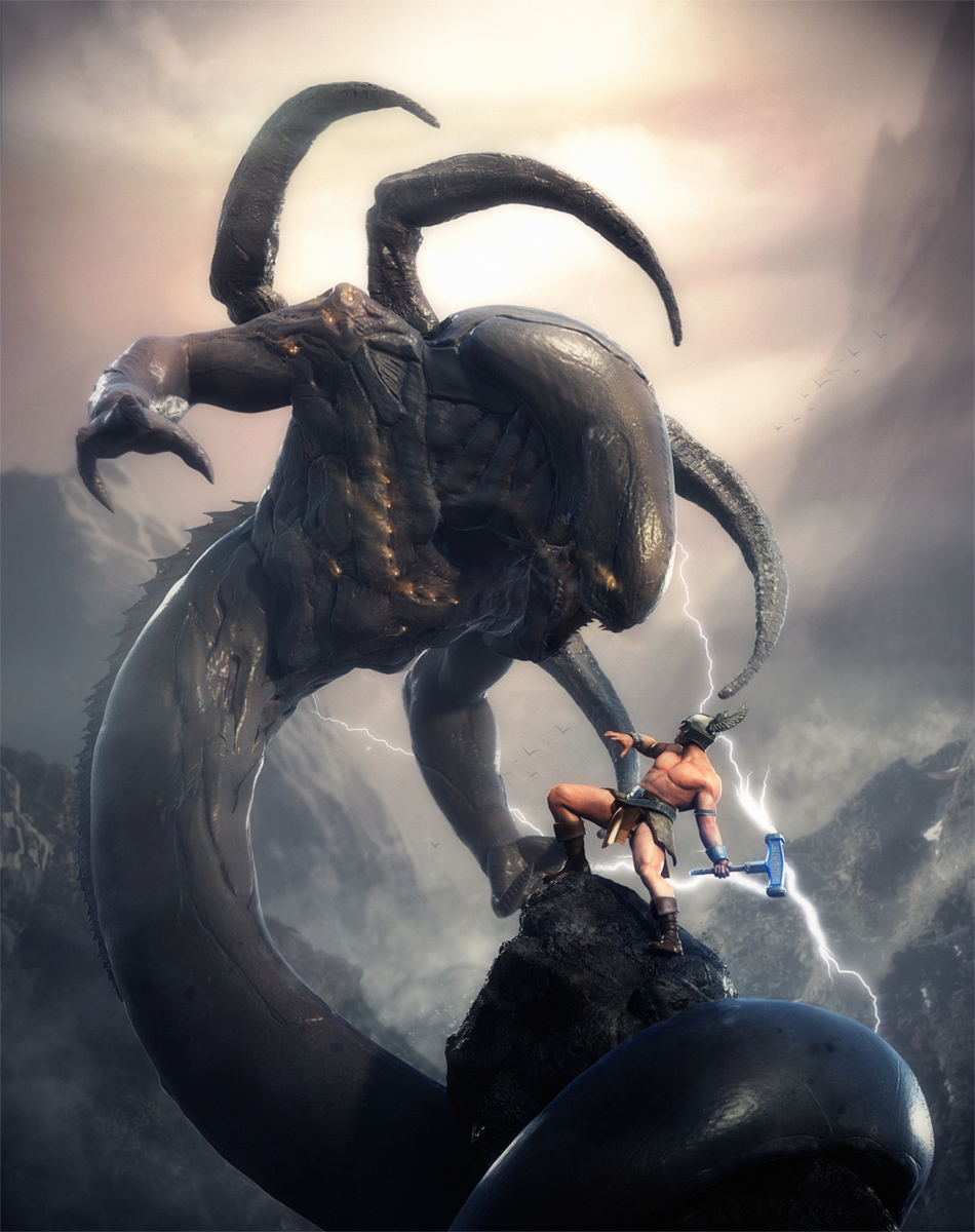
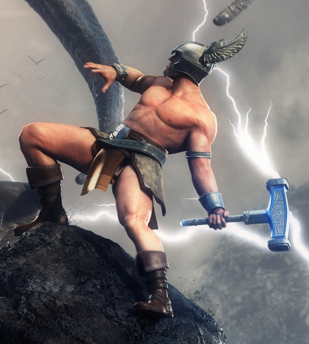
very nice work I think that you should stick with the original pose. he looks off balace but it works and adds to the intensity
I like picture 1 bro.Great work I like it.small_orange_diamondsmall_orange_diamondsmall_orange_diamondsmall_orange_diamond
definitely version 1(old) or 2(rotated) where 2 is probably the most balanced one. thor looks still a little off balance, but just enough so it underlines the situation. after all it’s very likely he is almost falling over backwards, trying to avoid being attacked.
either way - those where the whole flow points up towards the left upper corner make it simply more dynamic and convey a higher tension of danger and action.
Great work and I really like the style of your last character!
I dunno what crit do you require? Only on the rendering and comp or on the models as well?
Here’s both 
I think you’ve done a great job, the only thing I’d change would be the size of the serpent’s hands (please don’t confuse them with arms :)) so just the hands/fists about double the size.
As far as rendering, it’s all great as well except the skin shader of Thor. The serpent and the rest of the scene look somewhere between realistic and plastic which I like very much, so Thor could use some of that as well.
I’d leave the comp vertical but just repose the Thore a bit so he looks more powerful and less like he’s gonna fall down. I don’t find it quite attractive being horizontal, not with the same lighting anyways.
Just have in mind as much as you rotate the picture to the left less and less threatning the serpent becomes.
Any help?
Keep up the outstanding work small_orange_diamondsmall_orange_diamondsmall_orange_diamondsmall_orange_diamond
The original composition is the strongest. I would drop Thor’s left shoulder down a bit and raise his right. This would enhance the off-balanced stance, which is perfect. He looks relaxed in the way he’s holding the hammer and this would add to the tension.
Fantastic design work on the snake creature, I agree with cherub that the hands should be a bit more menacing and not so small in proportion with the arms.
#2 Is the best comp IMO. Nice Image!
I agree with sgrell 2nd one looks more like theres a fight on POWER STANCE
I like More Rotated the best! looks good man.
#2 rotated
I’ve gotta go with ur original piece to be honest. #2 is the most balanced but I kinda liked the unbalanced Thor in the first one…sort of gave it this feeling of uneasiness. Just my 2 cents! Great work!
for all it’s worth I think you are trying something that isn’t broken. I like that the worm is on top of Thor looking down on him. This makes the worm look dangerous. You see what is happening the more you rotate the image; Thor is getting more and more on top of things, because he is allowed to get on a more even level with the worm.
The actual composition on the image works as it is now, but Thor’s stance could be improved. Right now Thor is tilted backwards which reads as he is in defensive stance. Tilt him forward to make his stance much more aggressive and strong. Or at least make us believe his on the verve of hitting the worm with his hammer.
Now you have me going, I would also consider the outfit of Thor. You have done a great job make the design of the Worm look interesting unique, but somehow Thor doesn’t fit in this new art direction. I would love to see you go totally Alien-Giger-New-Age with Thor as well and get rid of the loincloth stereotyping.
Hope you can use at least some of this.
cheers,
boom
#3, the final rotated image, is the best as it conveys the precariousness of the figure’s stance, that “cliff-hanger” feel, and the monster appears to be sneaking up on him. The other angles are too staged, and lack that “Burne Hogarth” sense.
Also, your depth of field needs to be changed as right now you’re Smallitizing your models. Get the focus identical image-wide, as currently it looks like we’re looking at miniatures with a macro lens.
Beautiful work!
composition of 1 is the best… but 3 looks most balanced… but even in the 3, he looks off balance… : P
i think the crux of it is his left foot… it looks like it’s sliding… the flat of his foot doesn’t have a good purchase on ANY surface - just the edges of the side of his boot… and so it looks like he’s in the midst of slipping off the mountain.
good point about “critical moment” but even during a “wind up” to attack, he’d be in balance.
ideal would be to repose thor… especially since his gaze could use re-targeting as well.
if that’s not possible 2 is an acceptable compromise and just put a rock under his foot.
luck
jin
yup! first thought that came to mind. It’s cool though, it only made this serpent monster more badass
Hello guys!!
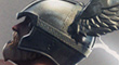
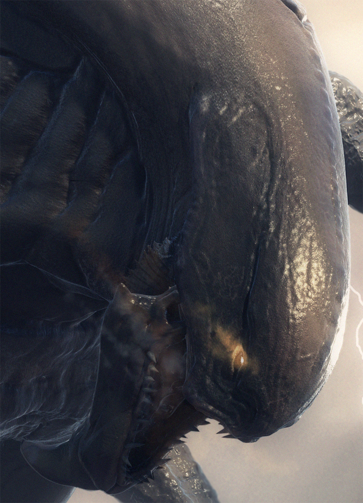
Thanks everyone for a really useful comments and critics. Thank you very much guys!. due to the deadline is next week. I decide to go on with original pose to finish the bg and all the details. I fixed Thor’s helmet wing and add fishy stuff to Jormungandr.
The big probrem I just slove is I got bunch of 8k textures and I want to render high-res image (6k x 4x pixel) . Maya can’t render it lol. my pc is quadcore 8gb of rams and 8800gt . I try command line render or batch but it’s not work. I have to render seperate characters :(. I dunno why tiff format have so much warning in Maya(2011) and It’s slow down the render. it has been a hard time :\
anyway I get to this point . The final one!. sorry for I can’t fix all u guys suggestion but I will keep this for my next work ! only one week remain and I have to finish all character sheets,RVJ,turntable and presentation 0
“The Last Battle of Thor”
Hope you like it ! 
Attachments

fantastic work! very spectacular!
Everything looks good but I think the guy is leaning a bit too far back. Awesome scene.
damn good work!