ZBrushCentral

Thor vs Jormungandr

Hello !

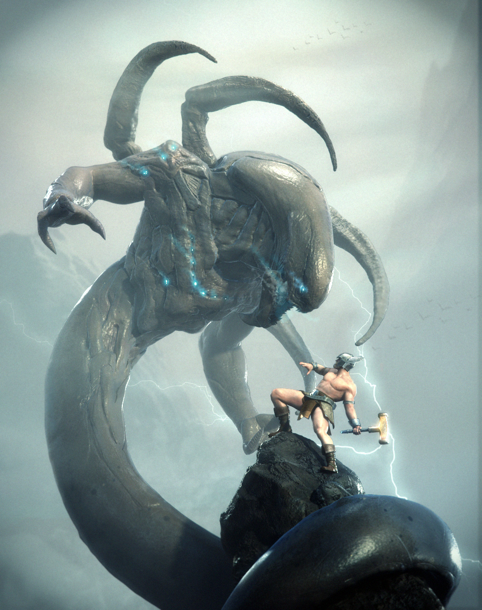
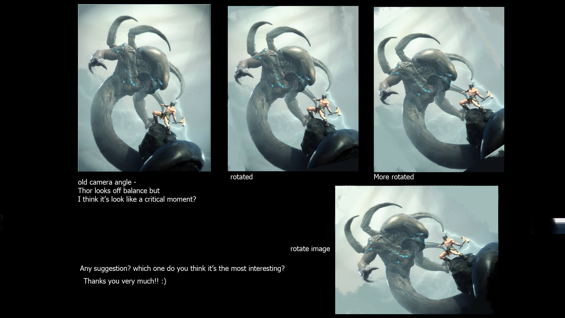
This is my pre-thesis project I’m doing 3D illustration base on story of Thor and The serpent midguard,Jormungandr. Thor and Jormungand meet at Ragnarok, Thor will kills the serpent, but then succumbs to the venom, which it has spat at him. Sculpt and polypaint in Zbrush .

It’s the final draft before I make a big resolution of the image. So Critics are very welcome before I’ll hand to the teacher :slight_smile:
Thanks you very much
tumb.jpg

Attachments

final_comp_small_crit.jpg

awesome!!! love the serpent!! great work man!! :+1:

Very cool. :smiley:

very nice, what did you use for the render?

3dkid- Thanks you !
MINTY- Thanks!
Supervlieg - I use mentalray :slight_smile:

awesome work :+1: i love 3d illustrations. i would be interested in seeing your wip/comping work. the only crit i have is thor looks a bit off balance on the rock, like he might slip off, might just be the camera angle.

For me is TOP ROW !!! Fantastic Image !:+1:

Cool! Can you explain the process a bit? Thanks!

The teacher is gonna be very PROUD!, totally awesome!!! An epic battle will be! damn cool!

wow! very epic man…great work!

It’s wonderfull! :+1:small_orange_diamond:+1:small_orange_diamond:+1:small_orange_diamond:+1:small_orange_diamond:+1:

I really like the composition and I really like the design of the Serpent. I think you could perhaps add a bit more detail to Thor and perhaps make his hammer a bit more apparent in the image since it’s his icon. I would draw a little bit more attention to it by composing the lightning differently so it’s focused on the hammer and play a bit with the light/dark in that area.

Having said that, you could hand this in and it’d be an A, it’s a great piece of work. You are going to be a force in the industry!

i agree that he looks a bit off balance. his left leg could be moved under him more to give him better leverage. and perhaps straighten his torso a bit for the same reason. good work.

yah,

very nice but thor looks like this is the moment before he falls ass backward off the mountain.

also, his gaze seems off to me. it looks like it should be looking up more at the head of the monster.

i don’t love the design of mjolnir but that’s a matter of taste.

good stuff and rock on.

jin

WOW! It’s a wonderful work.:+1: :+1: :+1:

love the creature. My only crit would be the rather great difference between the creature and Thor’s style. I mean Thor looks somewhat comic as oppose to the hyper-realistic creature. It’s like a clash of style and here it doesn’t works here.

Having say that, this serpent is superb.

Does anyone else see the Xenomorph head on Jormungandr?

Hello

Thanks for the comments!

I have try to balancing Thor pose by editing the camera angle a bit and this is what i got. still have no idea what’s the besst angle. pls help me !

I redo his wing on the helmet and add some fishy stuff to Jormungandr.
Still working on final image.
Thanks you :slight_smile:

Awesome image.
I like the original positions best but i did notice Thor looked a bit unbalanced. perhaps a better way of dealing with that is give his left leg a stronger foothold. if he is swinging his hammer he needs to have have leverage which he kinda misses. Rotating the image helps but then you lose the looming presence of the monster which is one of the strong points of the original composition.
My suggestion would be to give him something to wedge his leftfoot against, a more pronounced ledge or a rock sticking out, as right now he’d likely slip and fall if he swung the hammer.

Other than that it’s an awe-inspiring image.

Hey, really nice image you got going on there.

The third on the top looks the best, but if you were to change it to that, i would change the main characters stance so it seems more natural. :slight_smile: