ZBrushCentral

The Sin Eater (WIP)

Wow, the model is a really very good ZBrush monster and not to down play your achievement there but, the background texturing is really something too.

There are a lot of half plaster covered brick walls in CG but the depth and deail mostly just aren’t there. It takes the image to a higher level.

Hi. Good to see that you’re posting again. If you don’t mind, I would like to suggest a bit more sag, volume and splay in the chest region.

I hope you don’t mind ham handed liquefy in my attempt to explain what I mean.

(before & after)

before.jpg

Attachments

after.jpg

Very disturbing!!! I would like to know, if you dont mind , how you do your skin?what is your shader? do you use bump map? and what is about the color and diffuse?? keep the good work

…if you know these series of textures by Lemog? :wink:

Hi Thanks for the comments and welcome to all you new posters to the thread.

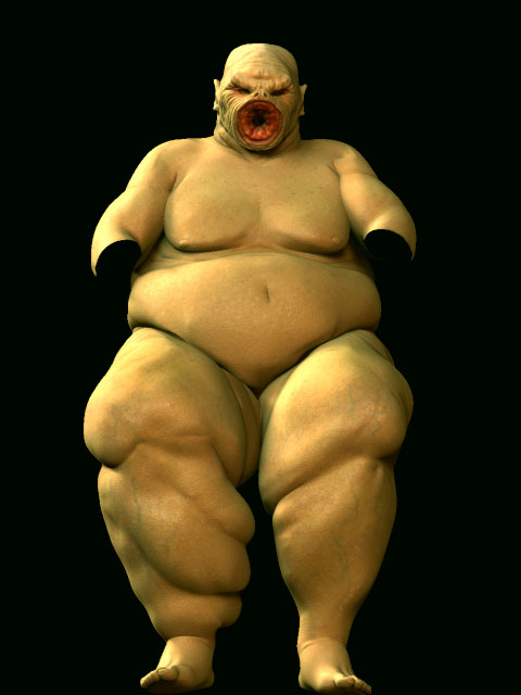
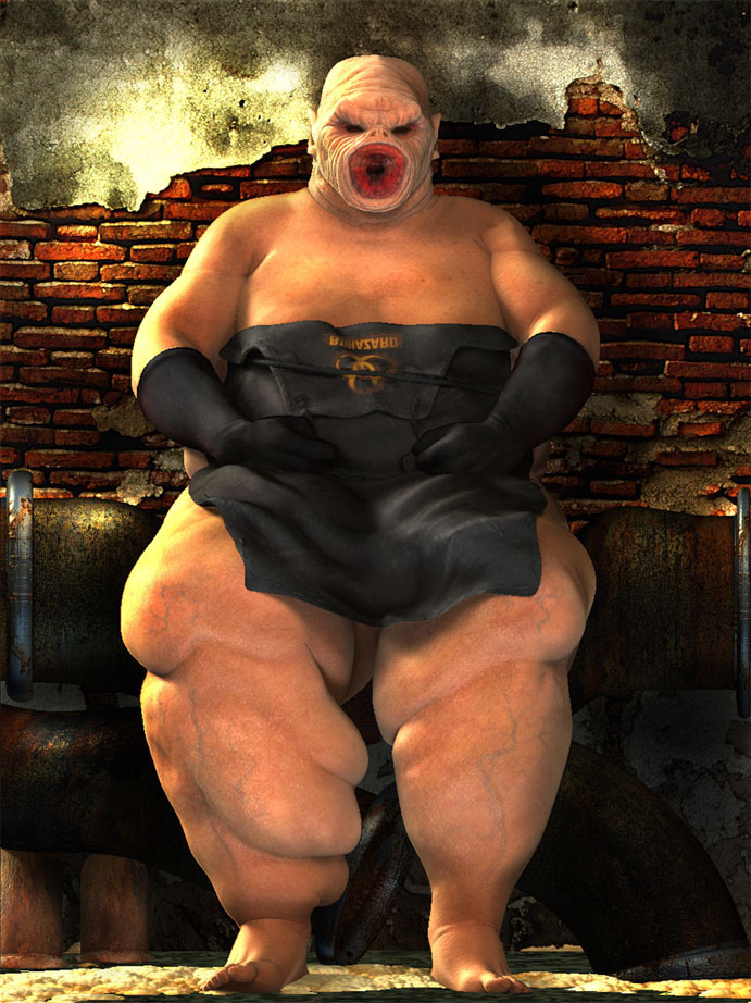
Wildsketch: thanks and I’m very pleased with the way the wall came out, I didn’t want to just stick a 2d image in the background that would look flat, i’ll be doing the same with the floor, so when on perpective i hope will add some geeater depth.

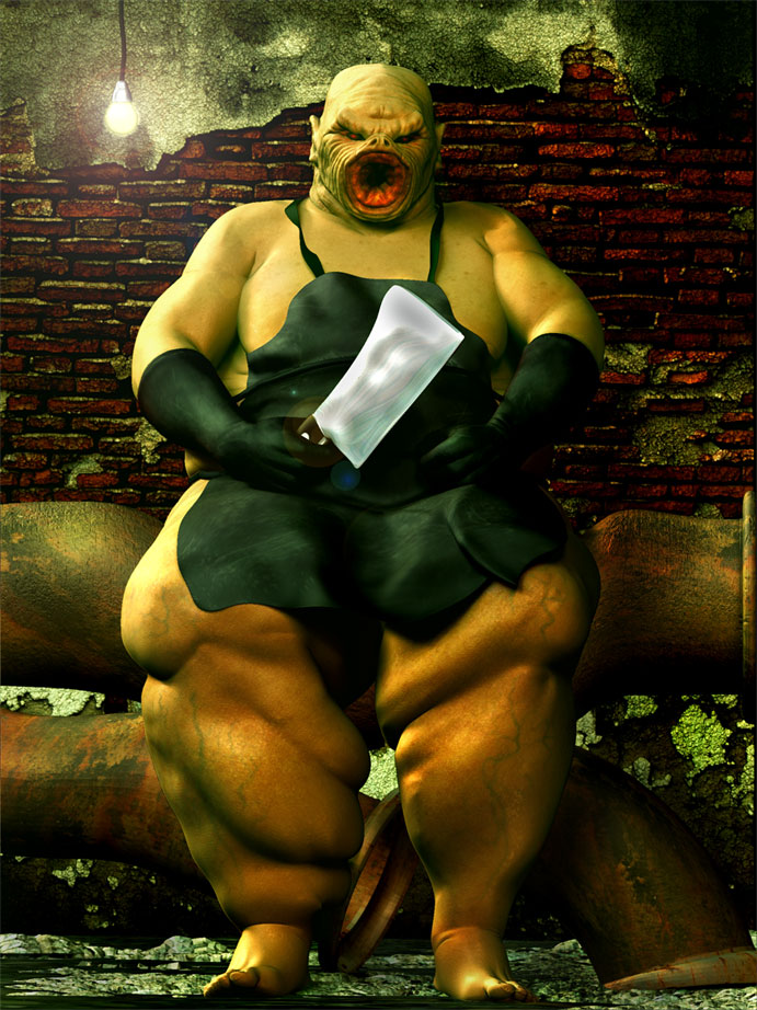
billrobertson42: Thats a great pointer, mate thanks I did wonder if they needed more sag and with your samples i can see chest does. Though I will be putting a rubber appron on him so a lot of the chest area wont be visible. But it’s best to get the form right, so that that flow of the apron will look right.

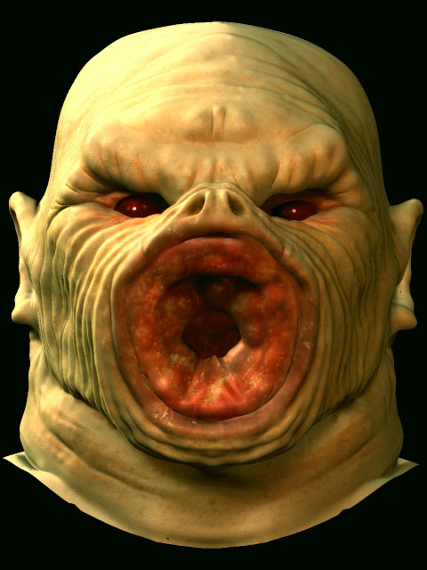
YsenGrin: H iI don’t mind you asking, allways pleased to pass on tips. The skin texture is all hand painted using the spray brush or paintbrush, Antropus, gives a really good tutorial,at this link

The shaders are set up using his method as well, using 5 replicat skinshaders set with different specular setting to break up the plastic look. I’m still working to perfect the technique myself. I have also started experimenting with different shaders renders to composite in photoshop in order to creat a more realist feel, which I posted a brief example of in my last thread “Anciant tribe of Manu”

As for bump maps, I havn’t delved into that arena yet no displacment maps.

Frenchy Pilou: Hi and thanks for that link mate, thats brilliant some how with all my searching for textures and ref images, this one seemed to escaped me.:+1:small_orange_diamond:+1:small_orange_diamond:+1:

Ok well I will post more a bit later on, so keep tuned.

As i trying to becomes better at texture this two links will help me a lot!!
thanks both of you!!

Ok gone back to the body texture, as details where washing out as I played with the lights. And may have to go over all the textures to enhance details.

I need to work on the Rubber gloves, bring in some folds on them, just enought to eccentuate the rubber.

Also I’m going to re do the pipes, as want them to be more visably backled and bent through his weight. So I’ve left them out on this render.

C&C’s on the skin texture
[[attach=52075]thumb3.jpg[/attach]]thumb3.jpg
[[attach=52076]basetest12sml.jpg[/attach]]basetest12sml.jpg

looking pretty good.
looks liek the creature from the x fiels episode “the host” in season 2 that lives in the sewers

For some reason I can imagine this guy sitting on a tube train - you know the type, takes up two spaces.

The rubber gloves add a peculiar malevolance.

Well here#s where, I’m at gone back and retuoched the texture’s, the pipes I feel need more texture work on. I’m not overly happy with the way the rubber appron lays over the legs, and will work more there.

I may even push him back a bit to open up the image and give a bit more floor space for perpective.

Mark: Good to here from you, yes I have have had my share of encounters on tubes but not so often now that i no longer live in London. could be worse you could be on budget airline siiting next to him, just to mak you feel that little more crammed. Well it would be for me I’m 6’5".

wet_chicken_lip: Welcome to the thread and thanks for the comments. So its season 2 of the X-Files. When I done the mouth, I instantly remembered a character from the series but thought it was in season 1, done a look for some reference after that as I thought I could see how they done the wrinkle lines around the mouth. But couldn’y find anything. Are you sure its “the Host” as I’m sure I found pages on that episode but no images of the character I was think off.

The head idea came to me, as I thought well if he’s going to be eating a lot of crap he may aswell have a mouth for it:D

Ok here is the update C&C’s as usuale thanks
[attach=52233]setbuild1.jpg[/attach]
mastersm2.jpg
[
]

Attachments

setbuild1.jpg

yeah its the host
i found an image of it and its called the flukeman and is a sort of tape worm.

you might be able to find more pics of it if you just google it!

aha! yes I can see what you mean now, I have got it close. Closer than I expected to be honest seeing as he’s not quite as I remember him after all.

Can you recall what his body was like, My recollection him was being quite slim as he had his lair under some escerlators, if i recall or have i got the wrong character. It’s been so long since I saw it. I’ll do a google and see what I can find. Thanks

S’lookin good.

From a quick perusal a suggestion would be that you have a strong directional light punching highlights onto your figure yet the front lighting is to full on to give the figure the form it deserves as well as make it sit back into the space.

Dropping some of the magenta out of the flesh, adding a little cyan into the shadows, painting in some of that olive green cast from the top part of the wall into the shadows on the flesh, as well as re-adjusting the lighting a touch I feel would help. You’ll notice that I’ve also dropped the lighting on the legs so your eye traverses up to the face easier.

This is meant as a help and by no means a criticism of your piece.

The Flooze

panstar.jpg

Thanks for that Mark, Yes I can see the improvement. I havn’t finished playing with the light set up yet, so I will take your points on board. Light set up can be a bit of a binde for me. Can never quite get the atmosphere I actually desire without loosing detail.

Initially I was trying for some stark shadows streching across the wall, but doing so took so much out of the skin tones, or made other ellements of the image look wrong. Im hoping ZB3 has better lighting control.

My point of view is your close enough already - it’s now post production that will bring the piece together as you would hope. This could be either the lighting and colour brushes in ZB or another image editor.

If you were lighting in another package you would have the facility to use negative lights or add certain lights that shine on certain objects but not others etc etc.

ZBrush is very good at giving you a painterly light rather than detailed lighting tricks and in many ways that is one of it’s pleasures.

Remember too that you can modify a materials reflective qualities to create a faux lighting effects- this is a great way to cheat in ZB. Painting over with a brush set to material only with a modified diffuse, ambient and diffuse curve factors can be used to very powerful or subtle effect.

… mmm nice girl ! … your girlfriend ? :lol:

Looks really gothic. And a bit disgusting.
But nice techniques and repulsive rendering. :+1:

Oh man, I knew that kinda looked similar to something, but I couldnt put my finger on it! I remember that episode of the X-Files with Flukeman. That episode creeped me out when I was a little kid. Cant wait to see how the rest of the mouth turns out. Love the veins & the leg fat.

I just ate dinner, so I think I will wait awhile to view the other pages of the thread. That said, I like what I see so far. Gory?! Yep. But that’s a good thing.

ok been working more on the lighting taking in Marks comments, only i feel I’ve made it too dark so I’m still tweaking them. Also worked more on the skin texture enhancing the freckles and blemishes.

Still working on the Apron, though I feel each time I’m getting there.

The cleaver needs to be sized, and I’m having a pig, trying to get the steel to look like convincing steel. If anyone has any good tips for me to acheive Steel.

not happy with the pipes yet so I’ll be going back to them as well

I had lay it all out from scratch as I sized the canvas resolution up all the markers went a bit screwy.

All comments as usaual thanks
[thumb.jpg]skin2txtren.jpg

Attachments

skintxtren.jpg

head.jpg

set2lrg.jpg