this post is getting scarier and scarier each day…very nice though 
Sorry I forgot to add a thanks to you all for your recent comments,
Mark, I will be taking it into photshop for final post product just need to get the set right befor i do a final render, I know what you mean about the painted effect ZB causes with lighting, I do Like it but wish I could get it to that realistic look, even with useing ANtropus technique of using several shaders at different specularities.
I’ll try that playing with the reflective qualities, and see if it helps.
Jais/XxDarkMessiahxX/Slosh/Solidsnake Thanks for your comments glad to hear you like the darkside of my mind:D
Looking good. I would go with teeth though. You’ve got a mouth thats begging for rows and rows of them.
I always like to see darker kinds of art work. And you’ve definately got a creepy thread going here to say the least 
Indeed it does get scarier and better.
Well done amigo, I really like the way your pushing the saturation up on this fellow and going for a painterly pallette.
And just to think your debute piece was a sweet explorer a balloon and a butterfly (if I remember correctly). How gothic you’ve become:)
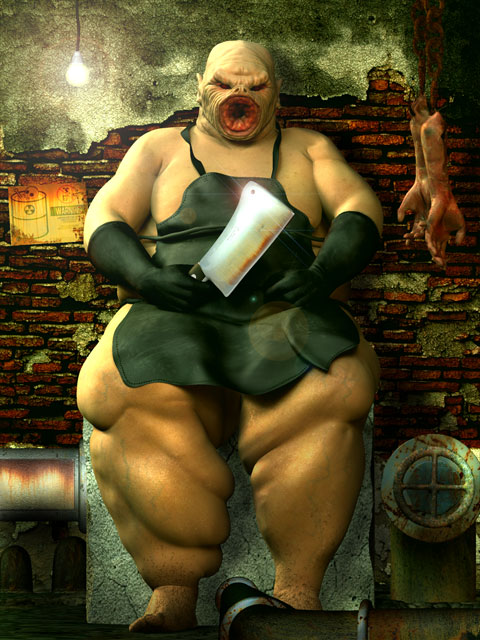
Well I’ve been busy here working away, finaly get to near completion. The pipes need a little tweaking still and the bottom left corner of the image needs work. I’m also considering bringing the hanging limbs more into the forground of the image, sizing them up and bluring them to give some depth to the image. At the momment I feel its to orderly and your eyes dart from corner to corner roughther than leading you into the image.
But as I havn’t posted for a couple of days I’d though I’d put it up.
Mark: Pushing the saturation up does help pull the image out. Yes that Goth inside of me keeps rearing itself, with Alien Sex Fiend, playing happily in my head radio:D
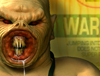
xDarkMessiahxX : I’m still deciding on what type off teeth, I now have some inventive( Ihope) ideas fiting to the mouth, I’ll post the results next.
[ ]
]
That’s offal.
Sorry couldn’t resist the pun.
The work grows with some fine new textures and touches.
Well heres another update, with the severed limbs in the forground, I’ve also elarged the warning sign, Now I ca nfeel it balancing out. Still that bottom left corner to deal with, and Mark Offal!! you just might have given me the idea, a line of intestine snaking over the pipe to the floor!
Ok before I post it, off subject question. Is anyone experiencing problems posting in the forums, using firefox browser? I’ve had to boot up Explorer to post this as in firefox, this page won’t show any images just tags and if i try to post the txt box is static so I can’t write or do anything. This is the same for all thread i open can’t post via Firefox.
ok heres the image
Attachments
thats looking great, its come along nicely.
i like the severed limbs, a nice touch
Ok solved the problem with firefox seems, cleared the cach and now is all back to normal. Phew, i was dreading having to use explorer.
wet_chicken_lip:Thanks for the comments, yes’ I quite pleased with the way the severed limbs add that little touch. Now I must tackle the teeth.
Wait… jumping onto toxic waste doesn’t give you super powers… uh-oh…
The dangling arms are a nice touch with the depth of field. I dont know, but for some reason the skin feels too flat to me. You textured in the veins in the legs, but they dont seem to “pop.” You should bring them out a little more & add some sculpted texture to the body to make it less smooth.
my opinion of it is i think its to light, i know you got some more to do, but some dramtic light would finish it up great set the atmosphere to match the sewer look, abit more dark and dank, im sure your more than capable of finishing it up great as seen from your previous work, so i look forward to the end result.
and thanks for the bone material your posted also, i have founds it usefull for a few of my own models
DarkMessiah: yeah I know what you mean about the skin texture looking flat, not sure why its gon flat, there is sculpted texture there, expecially on the viens, which until you pointed that out i hadn’t realised it doesn’t show.
hmm ?? Thats since i relayed the image out on a larger canvas, Damn gonna have to find out what went wrong, thanks for pointing that out, it explains why i’m looking at the chest area and wondering why I havn’t gotr the detail in there.
Wet chicken lip: I will be darkening the image a bit in Postwork in photoshop. I have tried to get a dark gloomy efect in ZB but I just can’t seem to get it to happen with the lights .I’m glad your making use of the bone material, I’m still a novice in that department of ZB.
Well Iwas going to hold off posting this as I’m in the middle of working the left side of the image which will balance it out.
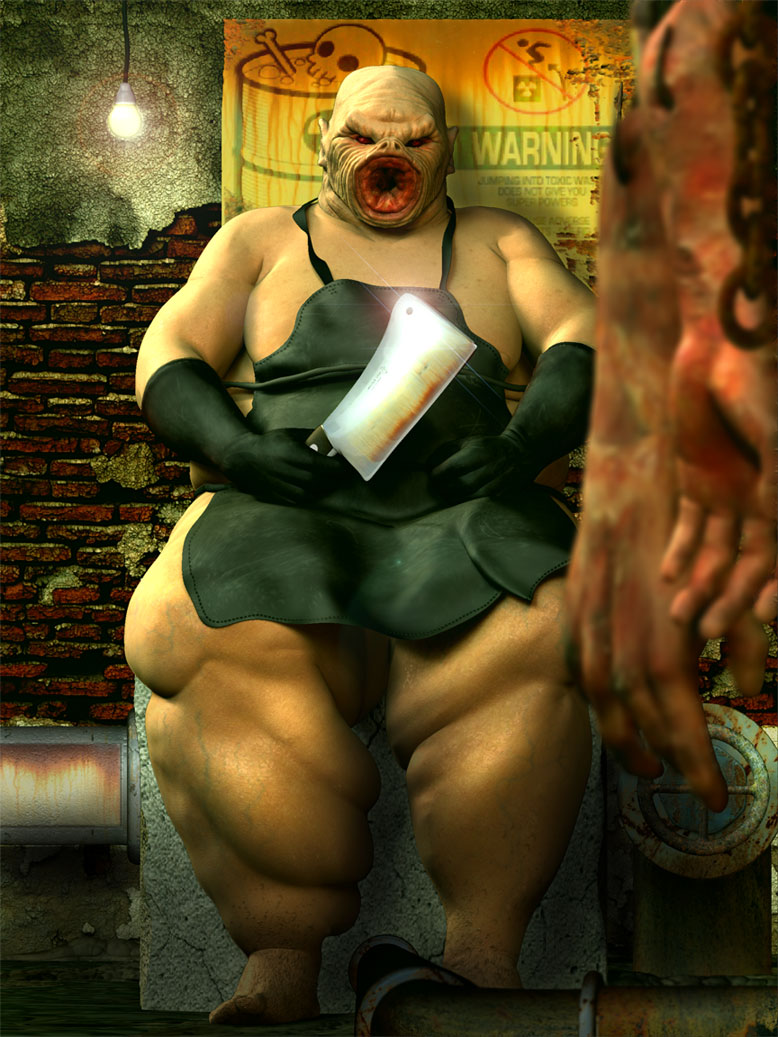
But here is where i’m at, with work done to the mouth area
[ ]
]
wow, Panstar!!! Very kewl. I go away for a bit and you got busy. Love that sign on the wall…I have looked this over and over and dont have any crits. He is obviously waiting for a fresh victim. I say this because he is in a clean state…no blood on the cleaver, aprin (sp?) and his own plump skin…maybe some droolies leaking out of his mouth parts. I love you vein work on those legs. The blurred arms in the foreground look great to me also. Adds alot to the piece.
lol guess I did have a couple of c and c’s …love this though. Sorry it took me so long to get over to look at him…my apologies.
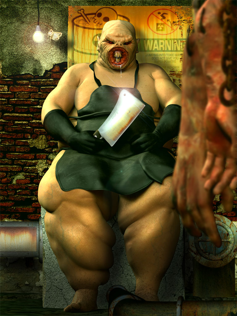
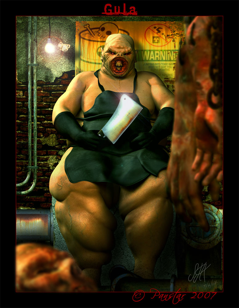
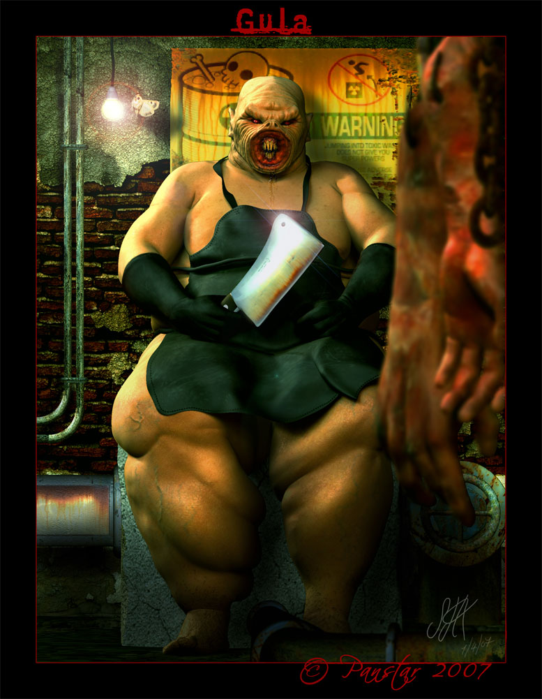
Ok Everyone, I feel I’m finaly near the end for Gula, Just that bottom Left corner I’m fumbling over, so I’m posting 3 versions here, 1 with the corner left empty( which I’m not happy with) 2 with some bricks laying around and 3 with part of a rotting severed head. I was going to go with a pile of offal, but couldn’t seem to get ti to look right. So all opinions would be helpfull here.
Ron: Good to here from you my friend, I assume your abbsence has been down to playing with your new system, how it going and how is Vista working out? A friend went a brought vista, for his new system only hes only got 500 ram and it took 1/2 an hour to boot, needles to say he wasn’t happy.
Glad you like Gula, I feel a lot happier with him than I do with Avarice. your point on him being very clean is a good point, and I have toyed with the idea of having covered in gore, but worried it may be to much for the image. But for you my friend I will see, what the magicians box can cunjure up.
I have given him some drool around the mouth, and reworked it for these images though it doesn’t show as well in the scaled down images.
ok here they are
[ ]
]
Attachments
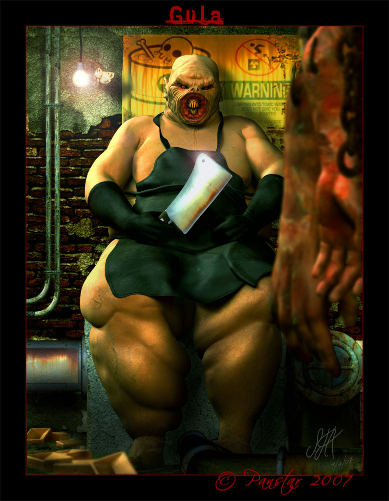
The one with the severed head looks best, in my opinion. It works better with the arms hanging on the other side & the DOF. The legs look better now too. Any chance you could post a close up of that mean looking mouth with the newly added drool?
ok i think i’ve nearly finished here, I may rework the blood and deciding if i like the way the drool sits.
Fantastic work,just the lense flair being slightly offset is bugging me!
cal
Panstar,
Overall, I like how you proceeded and made your adjustments to this piece. You put a lot of attention and effort and it shows. I think you thread deserves higher than 3 stars. You asked what folks thought of the lower left corner. My take on it is it needed something like the head… possible entrails might be another or few small rats even! However the head you put in… though it plays the diagonal cross angle shape well for the composition adjacent to the hands I feel that its too large and thus with the hands and head both being as large as they are it crowds the image a bit. Meaning you could put the head or any other object in that corner but pushed further back closer to gula and potentially get a better effect with it while maintaining the compositional aspects in regards to the diagonal shape. Calum5ZB made a point about the lense flair and for myself I think its the light in general draws my eyes to it bit to much for my liking also. Perhaps softening the light would help and also create a potentially better atmosphere for Gula. Be a more menacing look of the butchers environment rather than one of him modeling for a photo shoot. At any rate keep up the great work, I’m going to rate this 4 stars myself.
Will be looking for more of your works.
P.S. Also something with the top gumline and teeth. Appear a bit to narrow/rounded for the head/face structure. Maybe teeth in a circular shape would go well with that circular type of maw Gula has at the moment. At any rate this last bit is just a mild thing I noticed take it with a grain of salt.
Thanks Calum5zb/ AngelJ For your kind words and crits, That lens flare Im gonna fix. I looked over the image and that by passed me. Thats what i like about C&C’s they point out the bits you miss.
AngelJ, thanks for all your points, I’m with you on what you say about the head, I did try it further in the background but it didn’t work for me and this way worked best. I think maybe if it wasn’t blured as much it will pull the DOF mor in line with the hands. as the hands are the nearest objects with the head laying between them and gula. Like with the lens flare I looked at this and at the time it looked 90% right. Now it screams out its not right but almost!! I shall play,and see what I can do. I always have this problem with the bottom left corner of my images, it’s like my brain gets stuck:D Just had a thought:idea: gonna flip the image in PS so that it will be the right corner and see if it breaks the block. I know it’s an old trick and Why I hadn’t thought of doing that before now, I dont know.
With the teeth I decided to stay away from the idea of a circular set once i saw how close the similarities with the flukeman in X-Files, where.
Incidently could i have some feedback on the drool, as I can’t decide if it’s a bit over done
Ok thanks again
Panstar,
About the drool, looks good inside the mouth. The spittle on the chest area… appears to have the same viscosity and shouldn’t. That large of saliva moving down should have some inconsistences as it runs down. Perhaps add some white frothy bubbles to certain areas of that spittle and play with moving its flow. As it hits the clavicle area try moving it toward the right arm a tad then streaking down the flabby chest area, which might help to lay it down on the body more. Don’t ask how I came to my ideas on this… just don’t ask :o . Again take this with a grain of salt, you asked so I just looked at it closer but you do a great job I’m sure it’ll be fine whatever you decide on.