very interesting material yo use in the competition i find it unique very nice models 
Thank you UncleZ!
I have finished with the man’s fingers and sized down the hands a trifle. I’d wanted them big and expressive, but that was too much.
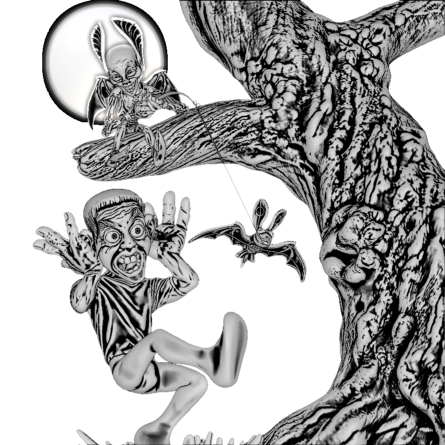
I also have increased the size of the rubber bat and rotate-shifted the man further to the left to make way for it; I wanted for viewers to be in no doubt that this was a toy bat. These changes are not reflected in this picture.
R
I really do like this work Rory_L. Looking forward to the final piece.
Really interesting look
very nice Rory_L
best luck
Thank you guys!
The timing is looking safer to me now and I can consequently start to enjoy myself a bit more. Deadline anxiety was gripping me till I got the hands and shirt done yesterday. I’ve set my computer clock to U.S. Pacific Time so that I don’t over run.
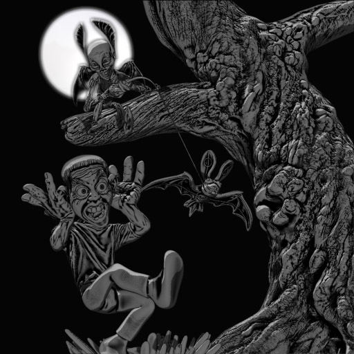
Here’s the image with the enlarged bat.
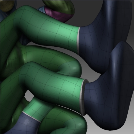
I made the trouser cuffs by adding edge loops to the ankles, masking and inflating. Pics to follow.
Good luck all!
R
“Deadline anxiety was gripping me till I got the hands and shirt done yesterday”
I so know where you’re coming from, I’ve had nights where I can’t sleep…well when I eventually do actually go to bed that is. But I then lay there thinking “oh no I’ve still got to do that and this and…ahhhhh”
I really like your style by the way. Reminds me very much of an etching.
Pete B
Really fresh style, bravo! 
Very nice.
A very clever perspective view, nice and clean modeling in an uncommon linoleum-cut-like finish.
Very beautiful. I think this will be ranked high at the end.
Maybe try a very subtile and slight coloration with ZBrush’s 2D-Painting-options on the final picture to enhance some aspects that will be lost in a grayscale-technique.
Like the after-colorated black&white-movies from the 20’ths.
Thank you everyone for the kind words!
Rastaman, that’s a great idea. Indeed, I had been thinking that if I had the time I’d like to experiment with some subtle and rather sloshy watercoloury tinting. The linework would hold the image together and the bleeding colouring would add a dreamy quality, perhaps. I’d have to try it to know for sure.
Cheers,
R
You maintained the feel of the sketch very well! Looking forward to the color.
Arrgh! I missed the last few posts you made! Been so busy I missed the email notification!
THIS LOOKS GREAT! I love the style of this. it’s comming together nicely. well done!
Again, thank you guys! Feels wonderful to be so supported.
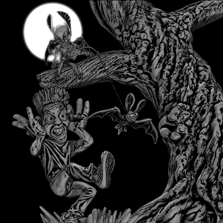
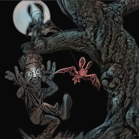
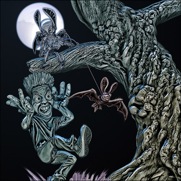
Here’s the finished modelling, one in the B&W style and one a very quick, er, hasty coloured version. Subtler might be better…I miss the uncompromising quality of the monochrome one.
Here also is the screen grab showing what I did to get the jeans cuffs.
Cheers,
R
Attachments
A very original working method - very nice indeed.
good work! I kinda like the color one.
Saquatch, so do I on reflection, but I’m still torn. Shader enhancing the coloured one to highlight important areas like the fella’s eyes was good and I’ll keep that, should I go for colour or not.
Mark, cheers! I’m just sorry there isn’t a Boozy entry in this shindig; something like your zombie elephant would have enriched the competition.
The man’s pate was not sufficiently full of polys for hair making, so I isolated those polys, (easy, as I’d retained the edge loop polygroups) and extracted them with no edge thickness to a new subtool, which could then be more highly subdivided.
The entire scalp object was masked and then I unmasked dots all across it, using Alpha 23, the crisp random dots alpha.
After that it was a simple matter of applying judicious amounts of the deformers Inflate, Smooth and Gravity to pull the hair out from the head, smooth it off a bit and make it reach for the sky.
Since the scalp tool had been extracted from te rest of the head at te head’s highest subdivision, there was a very good match at the join line, requiring barely any manual blending.
R
This looks awsome, an truely original design and funny concept.
If you did go with a bit of colour then I think all you’d need to do is tone the bat back a bit more. the rest looked good. Maybe blue for the bat instead?
anyhow, it’s not really needed as this is great as it is. Well done!!!
Wow!!! Really nice work, luv the tree sculpting and the BW render…looks very original.
Ugg! It is 12.45am Saturday morning and I’ve just finished the picture and submitted it. I am shattered and have been fighting a killer headache since 6pm last night, but I am well satisfied with the image and with having completed in time!
Thank you Mark and Soulreaver. Thanks to everyone who’s posted and viewed my progress. As I suspected at the start this has been a challenge not just technically, but also with regard to available time. I have had to take time from things I should have done at home, so thank you also to my wife, Yumiko for having put up with all this!
Good luck everyone!
R
It looks excellent - the final render you chose really does the piece justice.
Good luck,
Jason