Really fresh style, bravo! 
Very nice.
A very clever perspective view, nice and clean modeling in an uncommon linoleum-cut-like finish.
Very beautiful. I think this will be ranked high at the end.
Maybe try a very subtile and slight coloration with ZBrush’s 2D-Painting-options on the final picture to enhance some aspects that will be lost in a grayscale-technique.
Like the after-colorated black&white-movies from the 20’ths.
Thank you everyone for the kind words!
Rastaman, that’s a great idea. Indeed, I had been thinking that if I had the time I’d like to experiment with some subtle and rather sloshy watercoloury tinting. The linework would hold the image together and the bleeding colouring would add a dreamy quality, perhaps. I’d have to try it to know for sure.
Cheers,
R
You maintained the feel of the sketch very well! Looking forward to the color.
Arrgh! I missed the last few posts you made! Been so busy I missed the email notification!
THIS LOOKS GREAT! I love the style of this. it’s comming together nicely. well done!
Again, thank you guys! Feels wonderful to be so supported.
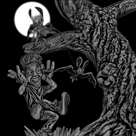
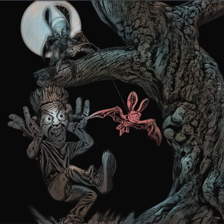
Here’s the finished modelling, one in the B&W style and one a very quick, er, hasty coloured version. Subtler might be better…I miss the uncompromising quality of the monochrome one.
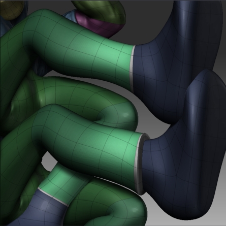
Here also is the screen grab showing what I did to get the jeans cuffs.
Cheers,
R
Attachments
A very original working method - very nice indeed.
good work! I kinda like the color one.
Saquatch, so do I on reflection, but I’m still torn. Shader enhancing the coloured one to highlight important areas like the fella’s eyes was good and I’ll keep that, should I go for colour or not.
Mark, cheers! I’m just sorry there isn’t a Boozy entry in this shindig; something like your zombie elephant would have enriched the competition.
The man’s pate was not sufficiently full of polys for hair making, so I isolated those polys, (easy, as I’d retained the edge loop polygroups) and extracted them with no edge thickness to a new subtool, which could then be more highly subdivided.
The entire scalp object was masked and then I unmasked dots all across it, using Alpha 23, the crisp random dots alpha.
After that it was a simple matter of applying judicious amounts of the deformers Inflate, Smooth and Gravity to pull the hair out from the head, smooth it off a bit and make it reach for the sky.
Since the scalp tool had been extracted from te rest of the head at te head’s highest subdivision, there was a very good match at the join line, requiring barely any manual blending.
R
This looks awsome, an truely original design and funny concept.
If you did go with a bit of colour then I think all you’d need to do is tone the bat back a bit more. the rest looked good. Maybe blue for the bat instead?
anyhow, it’s not really needed as this is great as it is. Well done!!!
Wow!!! Really nice work, luv the tree sculpting and the BW render…looks very original.
Ugg! It is 12.45am Saturday morning and I’ve just finished the picture and submitted it. I am shattered and have been fighting a killer headache since 6pm last night, but I am well satisfied with the image and with having completed in time!
Thank you Mark and Soulreaver. Thanks to everyone who’s posted and viewed my progress. As I suspected at the start this has been a challenge not just technically, but also with regard to available time. I have had to take time from things I should have done at home, so thank you also to my wife, Yumiko for having put up with all this!
Good luck everyone!
R
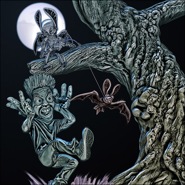
It looks excellent - the final render you chose really does the piece justice.
Good luck,
Jason
A really terrific image Rory_L
Love the originality of style you’ve put into this one -
Your sense of composition is spot-on too…Great stuff !!
Chris
Very cool! I like the metallic look. The subtle coloring and highlights add a lot.
Congratulations on completion.
I like your work.
The sense of making the color a minimum is effective.
And, it is cool !! 
Is your wife Japanese? 
I was able to solve the mystery by this. it you use Fluent Japanese. 
Please give my best regards to the Mrs Yumiko.

From Shikuri, Wife of pigma.
Very Nice! It looks much more dynamic and easier to read now. Great work And good luck! 
Thank you Jason, Atwooki, Geoff, Uraji san and Jesse!
Yes my wife is Japanese and she says hello to you too, Uraji san. She thought your picture was beautiful! そうですよ。妻が日本人です。うらじさんに宜しく言っています。うらじさんの絵がきれいと言いました。
At the time of submission I was too drained to complete my notes on how I made the image, but now I have the opportunity to share my rendering process with you. Here you go!
Rory
The trainers were entirely masked, save for their soles which were bulked up with the Inflate deformer, then smoothed a little to remove any rawness at the mask edge.
The soles’ tread pattern was created in a similar fashion, masking all but the area to be worked on; but this time I drew a Standard brush DragRect stroke across, with a fractal crumple alpha in the active alpha slot.
Rendering.
My composition required a square format, so I created a 1024*1024px document, a good size for moving elements around the screen easily.
The scene tool was drawn to the canvas on layer 2 and a marker was attached to that position.
Clearing the scene, I double-sized the canvas and re-drew my tool onto the page, by clicking once on the marker, which had been retained even after re-sizing the document, since it had been on layer 2.
The key elements of the picture, the man, imp, bat and tree needed to be comprised of super-highly dense meshes to eradicate poly edges being picked up by the cavity shading, so I activated HDGeometry for these models, creating two or three HD layers per mesh.
Placing the cursor over blank canvas space, I tapped the A button once, activating the HD geometry render preview. With the HD polys fully rendered I could then make a Best Render for the currently selected sub-tool.
Using Z-Applink I took these data to Photoshop and copied the top shading layer to a new PS document. I repeated this process for each sub-tool.
With all the elements nicely rendered I just needed a way to isolate each element from each other in Photoshop, to discard the non-HD Geometry rendered elements from each PS layer. To do this I selected each sub-tool in turn, chose violently strong colours and filled each model with a different colour.
Returning to Photoshop, the Z-Applink temp file colour info layer was now a perfect mask for each of the pieces.
I wanted a warming of colour through from the far background to the front of the scene, so I grabbed the z-depth information from the Z-Brush document and exported it to Photoshop. The Z-Applink file does have a z-depth channel, but it’s only 8 bit quality and I wanted to boost its contrast considerably, so used the alpha version.
At the top of the Photoshop layers stack I added a new overlay blending mode layer, filling it with blue. Selecting the z-depth alpha as a selection mask, I deleted the unmasked parts, leaving the picture bluer to the back of the scene.
Making the background radial gradient was started in Z-Brush. On layer one I drew a polymesh cone onto the canvas, removed the cone base polys and reversed the normals. Positioning it with point away from us and the now-absent base facing us, using transpose tools I positioned it in the centre of the moon tool and scaled it up to fill the canvas. Hiding layer 2, I grabbed the z-depth scene alpha and exported it to PS, where it was used to softed the pure black of my base layer background.
Saving out the image as an 8 bit, flattened .PSD file, I imported it to Z-Brush and Crop-Filled it to the canvas.In Flat Render mode I applied the whizz line motion blur to the bat wings, shoe and grass, using the Smudge tool with a spotty alpha.
With Render Adjustments the contrast of the picture was boosted to my satisfaction and the final image was returned to Photoshop via Z-Applink and saved.
Thanks Rory_L for an excellent rendering tutorial. There are some very useful tips in there.
Jason
I know what you mean about being too drained at the end to post the WIP’s LOL. Thanks for showing us how this was done. As this was a WIP competition this one should have won not just on the creation of a great image, but also the unique method you used to make this image, and the sharing of the porcess of said image.Well done Rory this is something I am gonna try out someday soon I hope.