Thanks for the comments!
fizzy, yes I am rendering in Zbrush, my final will be Zbrush + Photoshop.
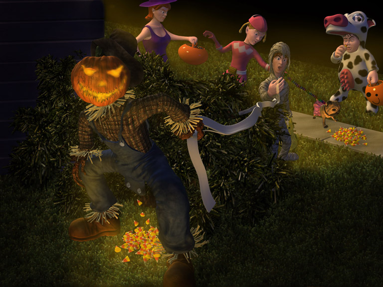
Putting this all together has been quite the challenge, I spent many hours pacing everything in layer in zbrush in all large document, but I couldn’t get them to merge without loosing information. :mad: So getting my render passes has been quite difficult. I have also been spending allot of time on details, refining characters, making candy for the bowl, making eyebrows, buttons and hair Tweaking textures. :rolleyes:
Anyhow next wip. Still needs work but I wanted to get it up in hopes of getting last minut crtis before sending in my final. So if you have any comments or critiques please let me have em! :ex:


 .
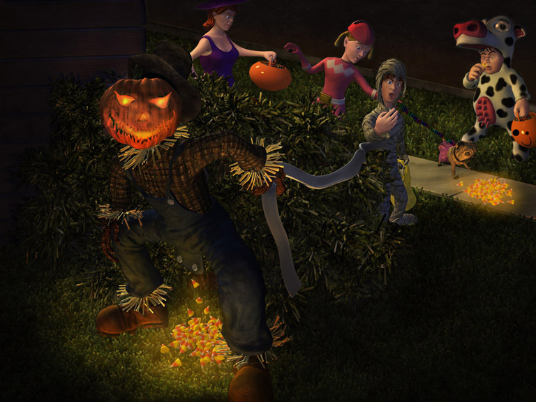
.  I’m amazed at how far you took it. You really nailed it. Love what you did with the sidewalk. Great improvement in the lighting and the scarecrow’s face/light. I must admit, I’m kind of itching for a title in the lower right. Hope you take a prize… I’m sure you’re glad to let it be done by now. I’ll be interested to see what your next project is…