you need to work on your proportions and anatomy
For me the anotomy thing is not imposible i have observed,when i look at it maybe slights are off but il get their,Its not imposible.
A set of head images im starting on the head and ill start focusing on the parts
and praportions. [ ](javascript:zb_insimg(‘205137’,‘Sets-of_Faces-subs-display.jpg’,1,0))
Shockblade man, that head is nowhere near correctly proportioned, i’m sure you have looked in the mirror once or twice in your life and can at least see you have a fairly round shaped head, not this odd oval, don’t work so far into the details before you get the proportions down, the bike was going well earlier but once you added the detail it got a little wonky, there is radial symmetry under the transform menu that you can turn on to help you draw uniformly sized tread on the wheels. Make sure you save multiple files or store morph targets so that you can go back on mistakes that happen while you sculpt. Hope this helps and isn’t too harsh
Just don’t get the urge to subdivide so quick. I can see theres a couple of
triangles in that head. That doesn’t matter, just get that shape down.
and retopologise it later.
Every thing to the q,ill fix up the head for another display.On the funny side a freand said it looked like tilk from stargate.
hey! I live in brooklyn too! I am not very good at anatomy in zbrush either, but i would study the human models that are free at the pixologic website. Or try to model some environments
If you want a good example of proper proportion, check out this thread:
http://www.zbrushcentral.com/showthread.php?t=65108
As you can see, it shouldn’t appear as if the face is being pulled forward off the head.
Or check out this thread.
It has a very good female .ztl available to the community.
Other then your proportions being way of your topology could use some extra love.
I would load up the female .ztl from that link and take a good look at where the differences are. Though I would restart the sculpt myself.
I’ll get it going right ive bin looking at some pics to better understand and mesure it.When standing your hands are positiond in a specific lenth.
[ ](javascript:zb_insimg(‘205386’,‘U_How-about-ths-apples.jpg’,1,0))
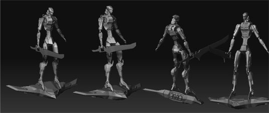
I also like doing artwork of teck be it bikes cars or mecha this next pick displays that facter.Even though this site is caterd towards more perfection in the hopes that ill get their.[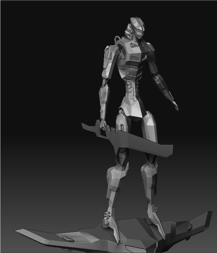 ](javascript:zb_insimg(‘205389’,‘vstrip_ST-N-MECH-set.jpg’,1,0))
Attachments
Thats a really cool looking robot. Kinda wish you would upload larger screen
grabs though, I can hardly see whats going on there.
dude seriously take the time to look at all the artists of this forum and gauge just where you are
you dont seem to get basic proportions, it usually helps to look at other peoples work
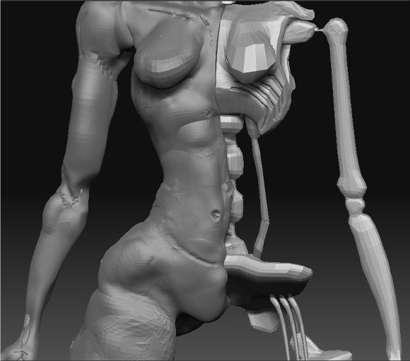
I have a character here that in a way kind of has to do with the rock 1 character in the animation their was a scene when they turnd into stronger
alter egos.During the transformation’s a robotic skelotin in each character would be shown.Though the skelotins were much more solid then my display.When doing this i also paid close attention to the arm lenth at the side of the body and the hand in compaison to the pelvis area.If something is still rong with it
it may take me some time.I get beaten by this but i also know perfection doesnt happen over night,at least not in every persons case it takes time.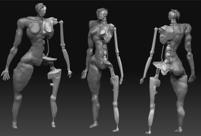
Attachments
Shockblade if I may ask, how old are you? I think you should take a while to stop posting on this forum until you get a little further. I believe you need to stop working in zbrush and come back later when you have better fundamentals. Use a traditional modeling program such as Maya or 3ds Max, once you understand basic polyflow, perhaps try working on some animals, or at least off of a real human with references and a cartoon. Learn how to setup images in the background to model from, that way your proportions are correct, these proportions in all of your models are 100% incorrect, the hands are always far too small, the head is far too small, the joints in your latest post wouldn’t even be able to hold themselves together. You need to listen to what people here are saying instead of ignoring everything and acting like you are the greatest modeler ever. People here are nice, honest people, the fact that you continually ignore them and post whatever you like is what is causing them to get upset with you. As a last note be sure you use a spellchecker so that you can sound like you really do know what you are talking about. “Skelotins” and “turnd” are not the correct spellings. Please just take some time to learn and look at yourself as a student of 3d, not a master.
Agreed. Though, I will critique your last image using what I’m assuming is a proper proportional layout for the type of character you’re making.
First, for a female, the shoulder width should be one and one half (1 1/2) head width. That means whatever width the head has from a front view. This won’t be helpful to know at all unless you have a somewhat decently proportioned head, though.
Hips should be two head widths. Height of the body from top of the head to the bottom of the feet should be seven and one half times the head height - how tall the head is from top to bottom. From the bottom of the chin to the bottom of the breasts is one head height. From the bottom of the breasts to just above the pubic area is one head height. From there to midway down the thigh is one head height. From there to the knee is one head height. From there to just below the midway point of the shin is one head height. You break down the character’s major landmarks based on the height of the head and width of the head to keep things in proportion - without proportion, your character will not look correct. That is why your characters do not look correct - because you are not proportioning them.
For example, the last image you posted - the character is at least 9 1/2 heads high. She looks, assuming the head’s proportions were correct, as if she’s 15 ft. tall. Her hands in relation to her head are massive, while in relation to her thigh are miniature. Her hips are four head widths wide, as are her shoulders - this is a good standard for making the Incredible Hulk, but not a female. The breasts are enormous compared to the head, but insignificant blips in relation to the width of the chest.
The elbow should be in line with the belly button, and the tips of the fingers with the arm resting at the side should, if fully extended, just barely reach the midway point of the thigh, if that far. The musculature of this character is completely unrealistic and doesn’t appear to be functional in any proper sense - the thighs are enormous, and look as if they might crush the knees at any point.

Just to show that I’m not pulling these numbers out of a magical hat, I overlaid the head of the character to show how bad the proportions are right now. The character is at a slight viewing angle, meaning that it’s likely more than 9 1/2 heads high. It’s completely off. There is very little that could be done to fix it at this point - going back to the base geometry and shifting around your forms with this is equivalent to learning particle physics to do basic math; it’s more work than it’s worth. You’d be better of starting over new with a basic form that is in proportion and NOT adding detail at all until the proportions are correct. No facial features, no hair, no fingernails, no clothes, no skin pores, no polypainting, no skin folds, no nipples, no ripples of muscle, nothing except the basic forms. You should be able to silhouette the character and it be recognizable without any interior detailing.
This means avoid doing characters like the one you have where you can’t use symmetry - you, personally, NEED symmetry in your model to make things easier. Focus on getting one side completely right and having the other side be a mirror image of what you’ve gotten right instead of being another chance at getting it horribly, horribly wrong. Once you get that down, you’ll be able to add asymmetrical aspects to your model using the transpose tools. You need to find some references, and use them heavily. I suggest you stop posting work here until you prove that you have the ability to take advantage of the advice and critiques given to you by the other users here - otherwise, why bother? I haven’t seen anything on your models improve as this thread continues despite the advice and techniques that have been given to you - instead, you continue posting work that is obviously not in proportion and badly arranged and laid out. Buy a book on using Zbrush, watch the Youtube video tutorials, download free .ztl files with the proper proportions and work with them, work with the Super Average Man and Demo Soldier that come with the program, improve and innovate - stop doing the same thing over and over and saying that it’s an improvement when the thing you keep doing is wrong.
any plans on polypainting your model?
that is the LAST thing he should be thinking about doing now…
i too would like to know how old shockblade is…so we can tell if he’s just a young naive guy with a lot to learn or an older guy that should know how to take criticism and learn from it…
we’re all here to help but you have to show us you’re willing to be helped, or people just won’t bother…
I think Shockblade is seriously punking all of you guys :lol: . It’s no secret that zcentral has a very strange vibe to it.