I have some comments late as it may be, and if of any use great. If they are too late or of no use just disregard them.
Please allow me to say thanks for sharing this awesome work you and the artist have put together, I can’t wait to get my hands on a copy.
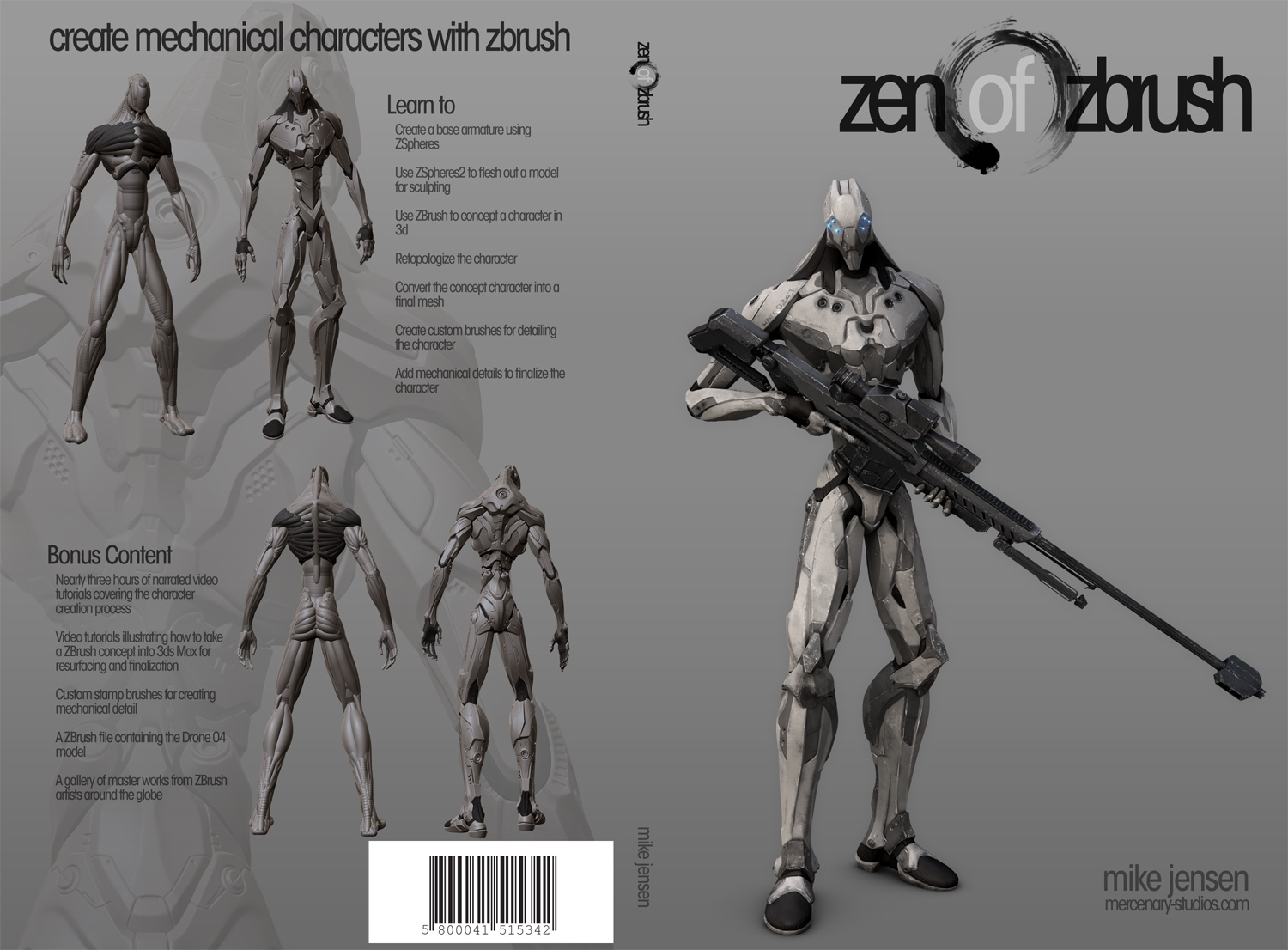
Notes pertaining to the art of the book cover.
The title is too squished together, it’s hard to see the ending of the word Zen and beginning of the word Zbrush within the brush stroke. Too close or too similar in color.
Expanding the word Zen and Zbrush would alleviate some of this.
And or a gradient from the start of the brush stroke to the finish from grayscale to a deep red would really make the Text pop.
The text layout of the Learn to & Bonus Content headings on the back should space out a bit more to the left of the smaller text below. An alternative is to give them some form of pop lighting effect (side lighting, gradient or bold ) giving them weight. The text sitting in a medium gray background should stand out and be legible.
The Cover gradient doesn’t have enough range to display the text and high light the high rez models enough.
Start with a lighter tone of gray.
Maybe even have the diagonal gradient start a little more from the top.
This will effectively give the text on the back more pop to stand out and make it easy to read.
It will also high light the high rez models as they would be closer to the light source making them pop just a bit more.
3 hrs past my sleep time and what seems to be 2 weeks late, my apologies if this is of no use.
-zkretic
 thx - Cover is looking very cool man … yeah this new one has a nice balance


