ZBrushCentral

Mech Drone 04

Please use the ATN code on all images for this thread if the image is substantially the same one. We all thank you.

Also, how come the book cover is limited to that color palette, is the publisher not supporting a 4 color cover design? Just wondering.

And I LOVE the sculpture, super talented!

:+1:

WTF, again that image in the sub-row :angry:
As Lemo said: I think we got it… so… please do not clutter the bottom row with multiple posts.
IF (!) you knew anything about zen… you should make all of us happy :lol:

Apologies gentlemen, seems I’ve offended lots of people.
To my knowledge I only posted 3 times yesterday, and only ever one image in the thumbs row at a time; they were, I believe, substantiative changes, though you’ve certainly made me question where the definition of that lies now, thanks Eric.

Mike, Mestophales, given I seem to have unintentionally brought down a bit of a $#!t storm in your thread, my sincere apologies to you.
As I was only trying to help, but now appear to be doing the exact opposiite, I’m going try to discreetly bow out :slight_smile: and wish you luck with the book
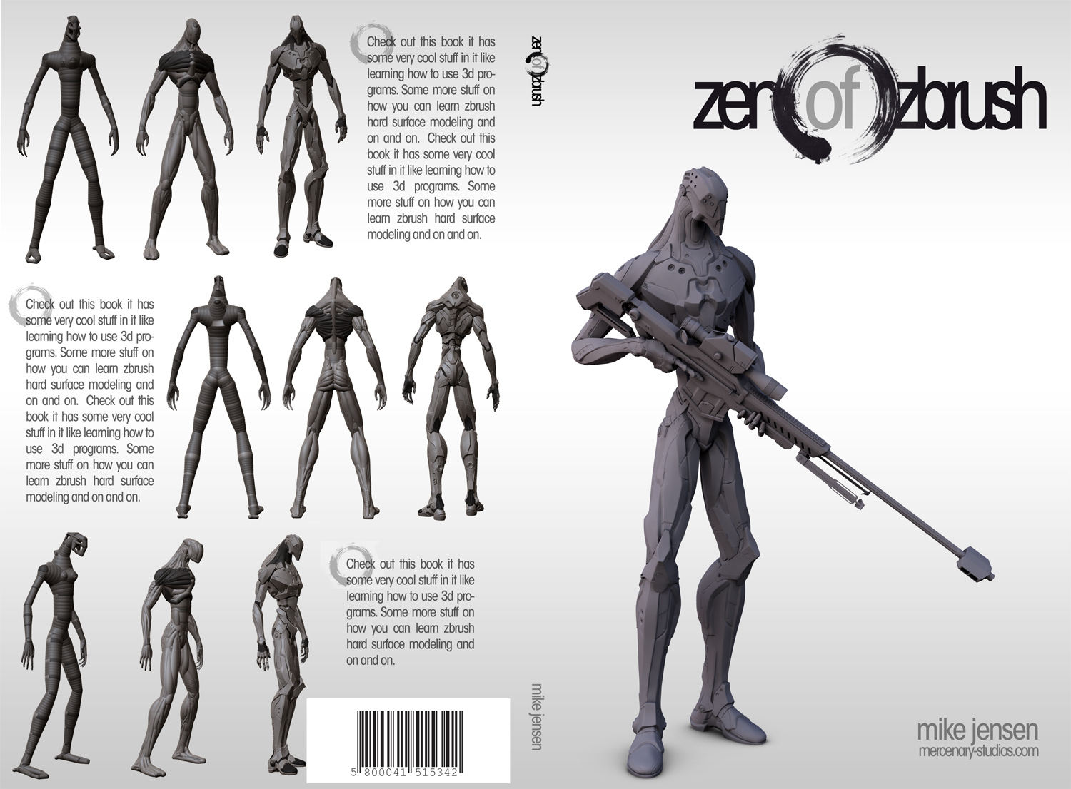
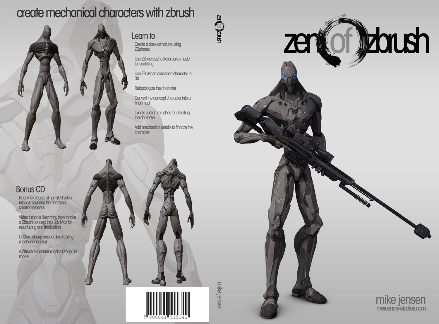
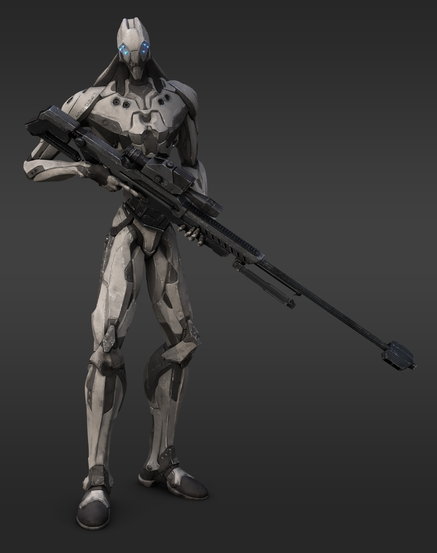
I have no doubt it will do very well; Mike’s drone is exquisite and the list of other artists suggests the rest of the book will be the same.

One last thing: I received this very kind message from Thomas at Pixologic, I hope it’s of help to you.

Hi,

I'm Thomas from Pixologic. I'm contacting you about the cover that you are creating for the Zen of ZBrush book. I saw a question about the brushes in the last posts, I added in attachement the icons if you need them for the book content or the cover, if it can help a little bit. It comes from the documentation sources (as I'm writting it :))

As I'm in france, I don't know with who in the US team you are working with about this book, can you let me know (well, I can ask my co workers :)?

BTW, let me know about the release and if you can provide us in france some samples of the book as I'm in contact with several editors/book stores.

Thanks,

Thomas
 <b>Product Manager & 3D Artist
Pixologic, makers of ZBrush</b>
+33 (0) 9 51 41 14 41 - Tel
+33 (0) 5 56 37 13 44 - Fax
[http://www.pixologic.fr](http://www.pixologic.fr) - French website
[http://www.pixologic.com](http://www.pixologic.com) - English website
[http://www.zbrushcentral.com](http://www.zbrushcentral.com) - Community
[http://www.pixologic.fr/blog](http://www.pixologic.fr/blog) - Le ZBlog !
[http://twitter.com/pixologic](http://twitter.com/pixologic) - Twitter Pixologic

Good luck, I’ll be looking out for the book :+1:small_orange_diamond:+1:small_orange_diamond:+1:small_orange_diamond:+1:

Hey guys,

Not really an update. I’ve seen the discussion of the book cover. I go to school for design similar to this so I thought I’d make a minimalistic design incorporating the enso circle from the zen tradition. I’m not sold on the back as I feel right now it’s too cluttered. Anyways, I just figured I’d share.

I’ll answer all of the rest of your questions later right now it’s 5:25 am time to get some sleep. =)cover-test-007.JPGcover-test-008.JPG

Attachments

cover-test-007.JPG

Hey Mike,

Wow, that IS nice and clean… glad to step aside for that cover :slight_smile:
Would agree about the back, but you already know…

Only thing I might do is turn the opacity down on the enso symbol so that the title reads a little more clearly.

Mike, YES! I definitely think this is more of the direction that it should go. It’s not selling “Zen”, though it uses the philosophy of Zen in the cover design. That is what I was talking about before.

My personal feeling is that it still needs a strong splash of color somewhere. Maybe on part of the model. Something bold to grab attention. When you have such a simple design, the fewer the elements, a strong focal point is even more needed. So a splash of color and perhaps increased contrast in the model. And maybe something is needed to give the overall cover a little more depth. Faded water ripples in the background, But overall much better and heading in the right direction.

The back cover is where you could start adding a little more info with blurbs and small previews of what’s inside the book. Maybe bringing in a few more detail shots and less of the full model would help make it look less repetitive.

Forgive me, but below I took the liberty to take a few minutes and add a bit of color to demonstrate (I hope I got the orange areas somewhat accurate to your character). I threw in a transition between color and grayscale render, but you could even do a transition to wireframe, or even better, maybe a transition to a ZSpheres 2 render to drive it home that it’s all ZBrush.

Just some friendly suggestions I thought I’d throw out there. And BTW, I’ve forgotten to mention in my last post how killer your model is! :+1: :+1:

![Cover.jpg|534x811](upload://jxaMFTjItFBSoRSDzqLTbVWS8DC.jpeg)

nice mike…thats much better … :slight_smile:

kraken your looks good too…but i would vote for mikes version…

? …because mike’s is so beautiful :slight_smile:

![MIKE'S cover-test-010.jpg|1100x811](upload://8GlY2Q6ZmIre08EB16bwAOu1wl5.jpeg)

The new cover looks great.

How long until it’s available?

Truly excellent outstanding work! I am also interested in seeing the low poly version. And how many polys the low version got down to. :smiley:

Hey guys, thanks for all the comments! Specially thanks to you RawSunlight and KrakenCMT for posting variations of the cover. I’ve taken cues from both of you to come up with a final version of the cover. There are two variations. One is a dark cover and one is a light cover. I think I prefer the dark color more but I figured I’d post both just to see what others think =).

But first off here’s the composite I ended up putting on the cover in a larger size:

And here are the covers:

Thanks to all for the support and I hope you enjoy =D

Hope I posted this message correctly XD

book-cover-light-001.JPGbook-cover-dark-001.JPGcomp-003.JPGthumb-001.jpg

Attachments

book-cover-light-001.JPG

book-cover-dark-001.JPG

comp-003.JPG

I love it!!!

The weathered mettalic render rocks!

great stuff man. I prefer the lighter cover. I want to get a copy of this. when is it avalable and where can I get a copy?

MikeJensen,

Congratulations for the book. Really nice model you have there and I am very much looking forward to get my hands on this book.
One thing, CHOOSE THE WHITE COVER. The reason is, the image is already quite grayish and if you choose the dark background, the image stands out less if compared with the white background. The white cover makes the image and the words stands out wayyyyy much more also the title is more readable. Everything stands out with the white background. Please do not choose the one with the dark cover, it might look cool, but not as nice as the white cover. Trust me on this please.
Statistic also shows that white cover books last more than the dark / black ones and people have the tendency to pick up the book more than dark cover books.

Besides, when will the book be out? Can we start ordering it? Thank you.

WHITE COVER!

Hey Mike - looking wicked dude …like the white agree with guys
and leave space for the featured artists dude :laughing:

really nice job :wink: :+1:

White cover please:lol:! love it!!! looks awesome!, definitely this is going to be a must have book!

WHITE cover…Maybe make parts of the circular stroke slightly lighter as portions of the ‘n’ and ‘z’ are obscured.

One copy sold, when it comes out. :wink:

The gray cover shows off the drone better. The white has a bit too much contrast and causes the eye to bleach out some of the detail of the art. Great work all around though and awesome detail on the robotic drone.

yeah gray works much better