ZBrushCentral

Lad's sketchbook

Fran is looking good. The designed elements like her armor and helmet details are so intricate. Did you use panel loops and hard surface techniques for the helmet design? My only constructive criticism is her mid section only has one vertical indentation. It’s looking a touch flat. I think you add a subtle indication of her abdominal muscles to sauce up the sexiness. I love it so far. Just sculpt it!

Blog- http://micahmyerov.com/blog/
Portfolio- http://micahmyerov.com/portfolio/
https://vimeo.com/103362994 - Demo Reel 2014

Hey ! I get what you mean about her belly and i think you’re right, maybe i’ll try to add something ! But the thing is, her armor hides everything on this part, if you take it off there are some muscles in this area ! I’ll see what I can do to improve this, thanks :slight_smile:

No I didn’t use panel loops, nor hard surface techniques for her helmet. I modeled a pretty simple helmet to get the shape, added a lot of subdivisions on it and then I’ve polypainted with different colors the details of the helmet. Then I exported my mesh with the colorss in TopoGun, and did a retopology of every color individually. Exported each one in Maya, added some thickness to it, and used Slide Edge + Bevels/Edge Loops to sharpen it and make it look like Hard Surface :slight_smile: Hope I’m clear ^^

You did a great job. I have wanted to create artwork like yours.
Excellent Job. Keep up the great work.

Character_Kreation_Studios thanks a lot man :slight_smile:

Here is a WIP on the next one I’m working on since a few days

Character is pretty much done, i’ll do some tweakings on the hoodie and it’s folds which are not pleasing me for now, and I’ll add some seams where i’ll want some different colors on it, so i’ll do this later !

Gonna add a LOT of graphic stuff around the spheres in the background, looks weird at the moment of course ! ^^

(MatCap by Jon Troy Nickel “HazardousArts”)

Feedback will be much appreciated !

Capture3.JPGCapture.JPGCapture2.JPG

Cheers !

Lad

Attachments

Capture.JPG

really fan. not sure about gravity and the way she stands on the ball. but very clean!

How did you do the Fran helmet? could you make like a mini tutorial? ^^

I like how you approach the illustrative younger female face. You achieve great results.
The girl on the ball is very pretty.

Hey guys ! Thanks a lot for your kind words !

Zeriel00 sure man, here is a mini tutorial of my process for creating the helmet. Hope I didn’t forget anything, and hope it’s clear ! If it’s not don’t hesitate to tell me and I’ll try to do something better !

TutorialHelmet.jpg

And to accompany this, here is a new WIP of my new model !

I did some minor changes in the proportions, scaled the head a little bit up, scaled the legs a little bit down, made the knees and ankles thinner, and changed some folds on the back of the hoodie. The colors are, of course, not at all definitive. I’m still adding a few things in the background, and I’m thinking about the colors, doing some test to get something pretty nice visually. I think I’m going for a monochrome gradient of reds and oranges… ! Maybe she’ll turn into a redhead eventually :slight_smile:

Made her hover over the ball instead of being directly ON it !

Still thinking about my camera angle too ^^

Again, any critics and feedbacks are welcome !

(MatCap by Jon Troy Nickel “HazardousArts”)

Capture.JPGCapture2.JPG

Cheers !

Lad

Attachments

Capture.JPG

Capture2.JPG

Wow your the best! Thanks so much ^^

Unfortunately I’m a complete newbie to 3D
and just barely learning Zbrush so I got no
Idea of Topogun and Maya but I’ll keep trying ^^

Hey there !

After some time I’m finally done with this model !

Modeling in Maya&Zbrush, Rendering in Zbrush, Compositing in Photoshop !

Feedback always welcome !

Hope you like it tho !

Render.jpgStills.jpgCloseUp.jpg

And you can watch a Turn here : https://vimeo.com/118916735

Cheers !
Lad

Attachments

Render.jpg

Stills.jpg

CloseUp.jpg

Hey guys !

Sorry if I spam this thread a little bit, hope that’s alright.

I came to really hate what I’ve just done with my last model. I felt with my previous render that I lost sight of the style I liked, and of what I was aiming for.
Went back to ZBrush to improve my textures, and do a new render. Sticking to the flat and illustrative look I liked and I originally found interesting ! I get the feeling that it’s better. I think that I unconsciously tried to mimic the style of artists I admire, while I could try to find and push a style that suited me more…

Anyway, here’s the image, hope you like it !

C&C are welcome of course ! :slight_smile:

Girl&Spheres

GirlSpheresRenderReisze.jpg

Modeling in Maya&ZBrush
Rendering in ZBrush

Cheers !
Lad

Attachments

GirlSpheresRenderReisze.jpg

I agree with you, this image is definitively more interesting … I really like the look you’re achieving, i watched Milas tutorial, but can’t reach this illustrative quality that you’re reaching!

Thanks a lot man !

Hmmm I think a good way to have a pretty look is to pick your colors right ! I always ask some friends who have a really good eye about this (way better than mine) to check my colors, and they always have some ideas to improve it !
I believe getting the right colors really gives a boost to your image !

Also try to tweak the BPR Filters a lot, as they can really improve your render, and you see the changes in the viewport instantly, you don’t even have to do a BPR !

Finally I think getting right Shadows really adds a lot. I usually turn the strength down a little bit so they aren’t black, smooth them just a little, and add wax in my material to give a reddish look on them ^^

Also, I usually get an ID pass, so I can have instant and easy control to tweak my colors on Photoshop, give some brightness to some, change others […].

Anyway I still have a lot to learn to do better images, so don’t really take my word for it , but here’s my two cents on some of my settings if you are interested ^^

Cheers,

Lad

thanks for the insight …I try to follow the advices!

The illustrative look I feel suits your style pattern you posted here before. On the other hand, stepping outside of perceived boundaries can help artist grow, so I commend you giving it a whirl. Both renders look good to me, but the illustrative one does fit the style of character a bit better.

quick questions:

If you rendered inside of Zbrush, what illustrative / toon materials are you using? Which ones do you like to use the most?

If in another renderer (like Keyshot) what illustrative materials do you like to use? Do you like to mix and match toon and realism materials?

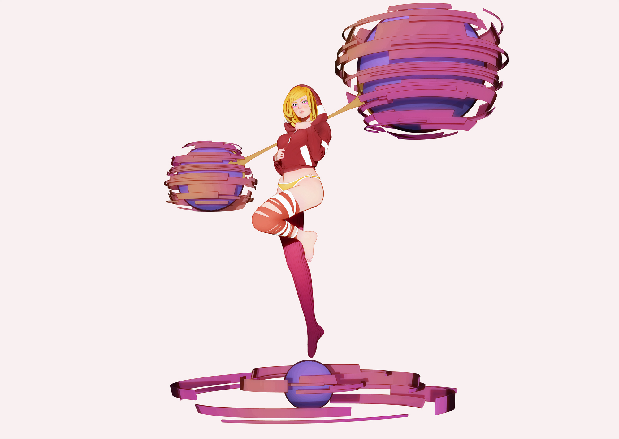
I get what you mean, and I gotta agree on this. I don’t plan to stick to this kind of illustration on all my models of course ! I’ve done something a bit different with Fran, and I plan to model characters from different styles (from cartoon to realism). And of course, I’ll have to adapt my renders according to the style of my models. I’m not sure this kind of render would suit a photo realist model for example. I really agree with you on that (if I understood you correctly). On the other hand, I’m liking this look at the moment, and I feel I can do better than I have done previously, so I plan to keep pushing this a bit further sometime in the future. I like having some kind of coherence and unity in my portfolio, and at the moment I really enjoy doing this. Probably in a few weeks/month I’ll hate this and I’ll move on to try and experiment something different. I’m still trying and struggling to find some kind of signature in my work. When I’m working on personal projects, I want to learn and get better with the pure technical part of the modeling, but I still wanna get a pretty and unusual image !

Hope you get what I mean ^^

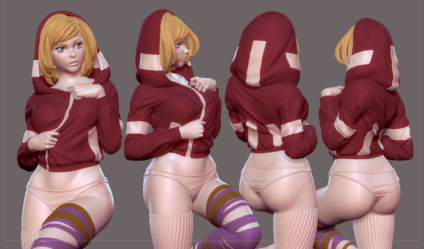
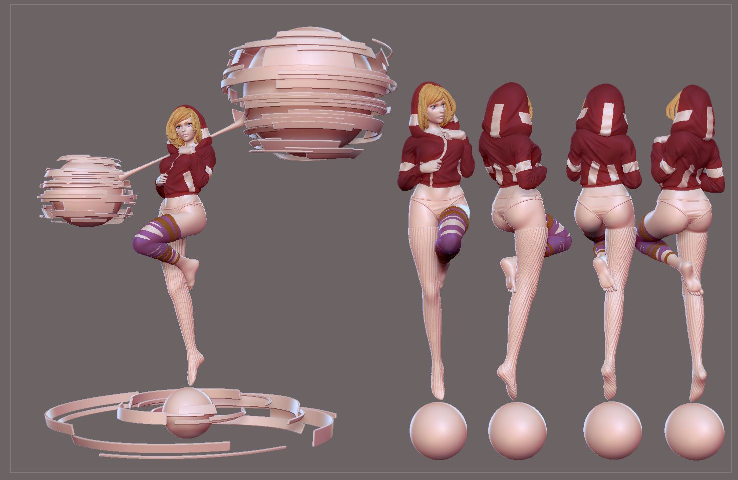
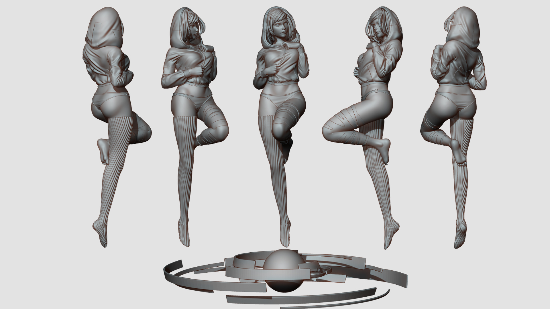
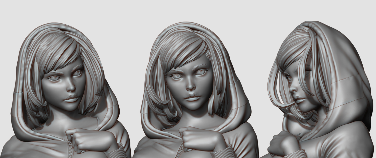
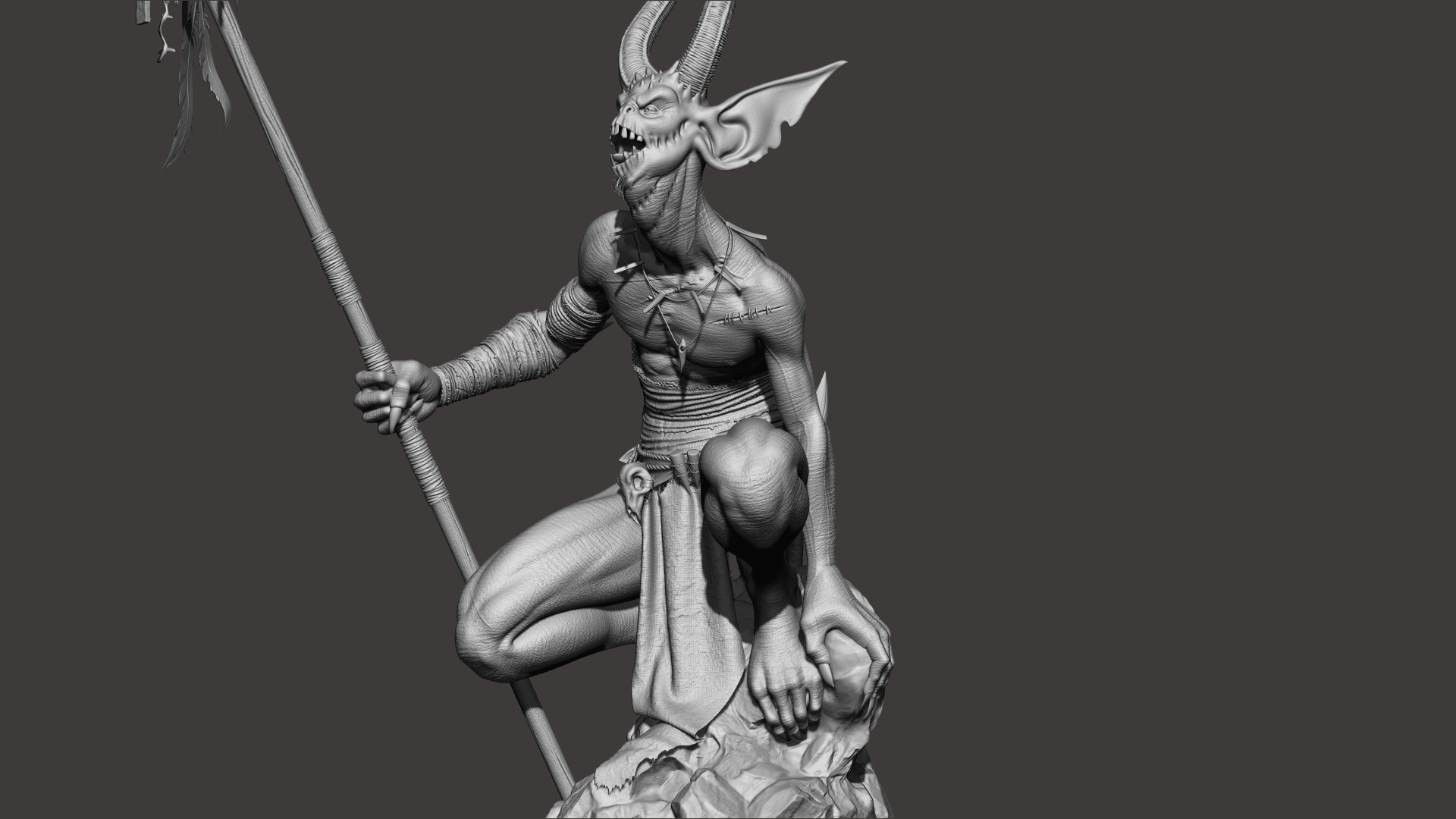
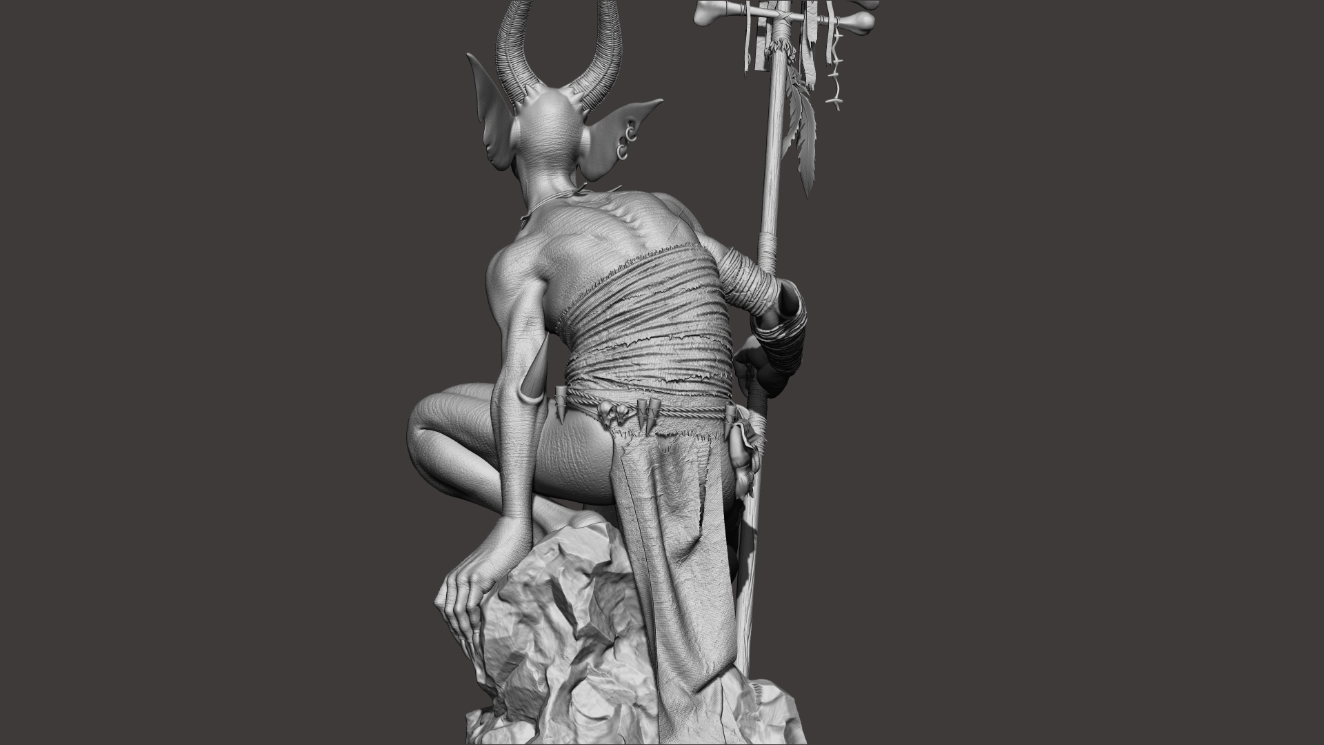
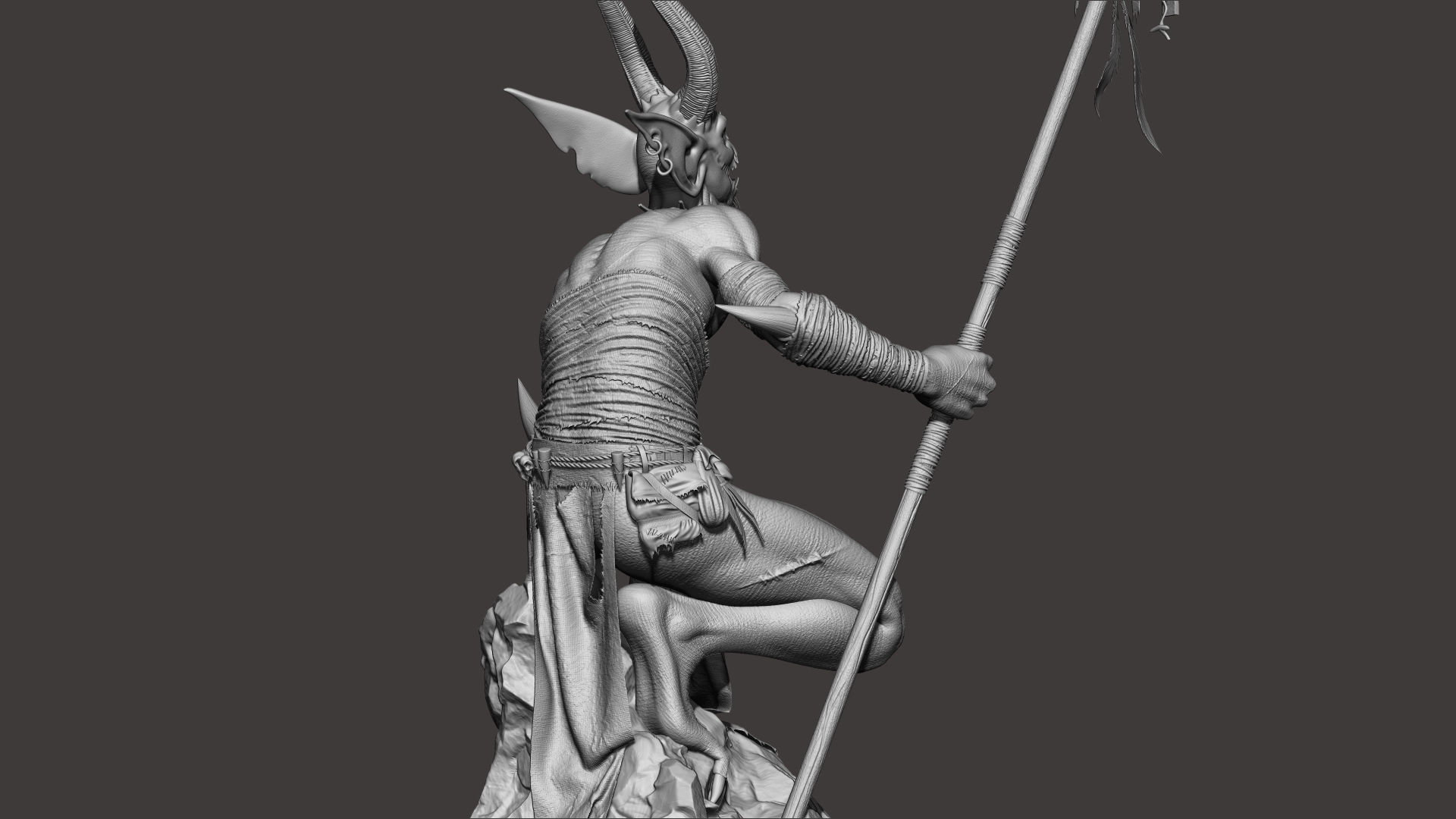
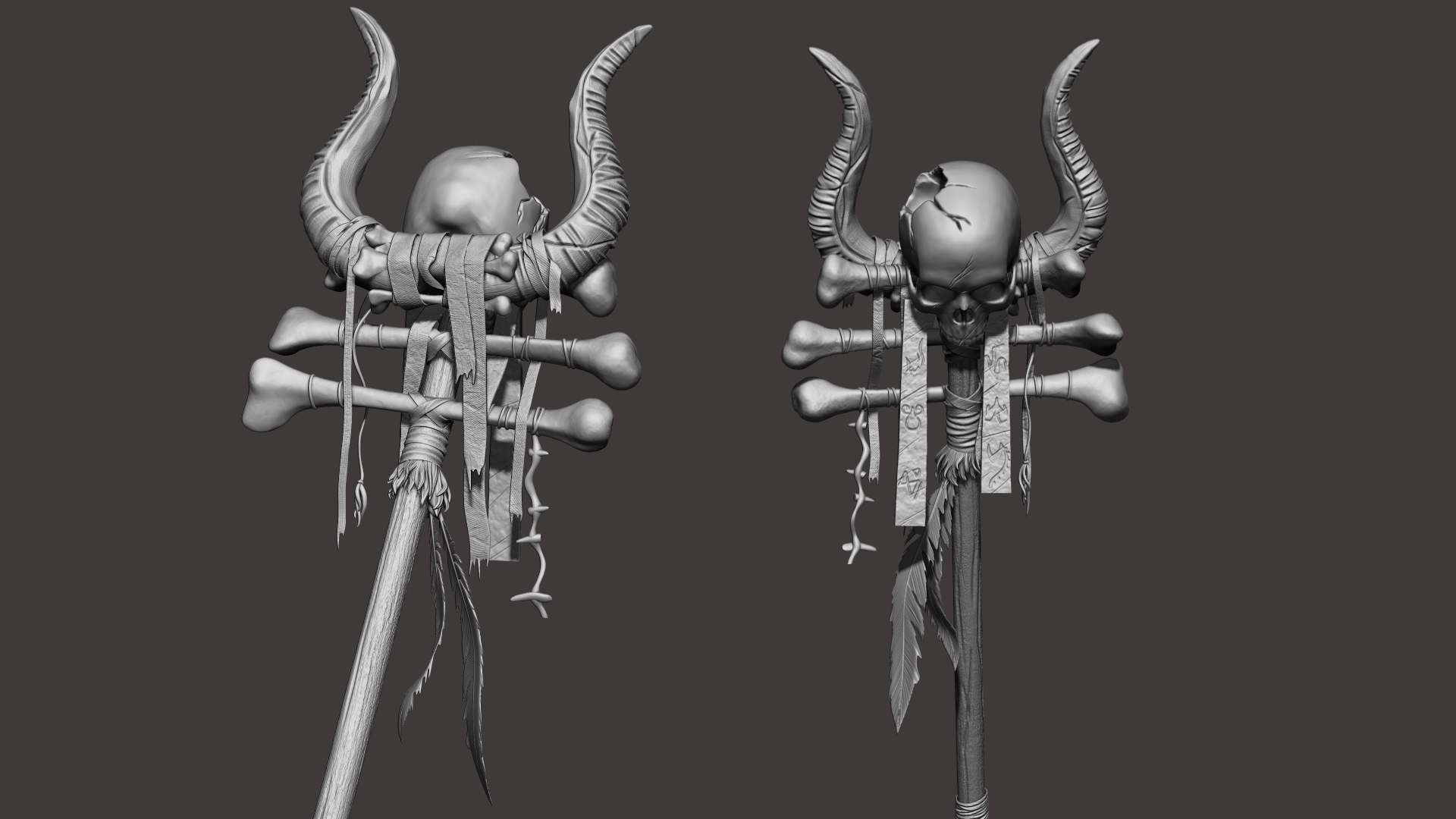
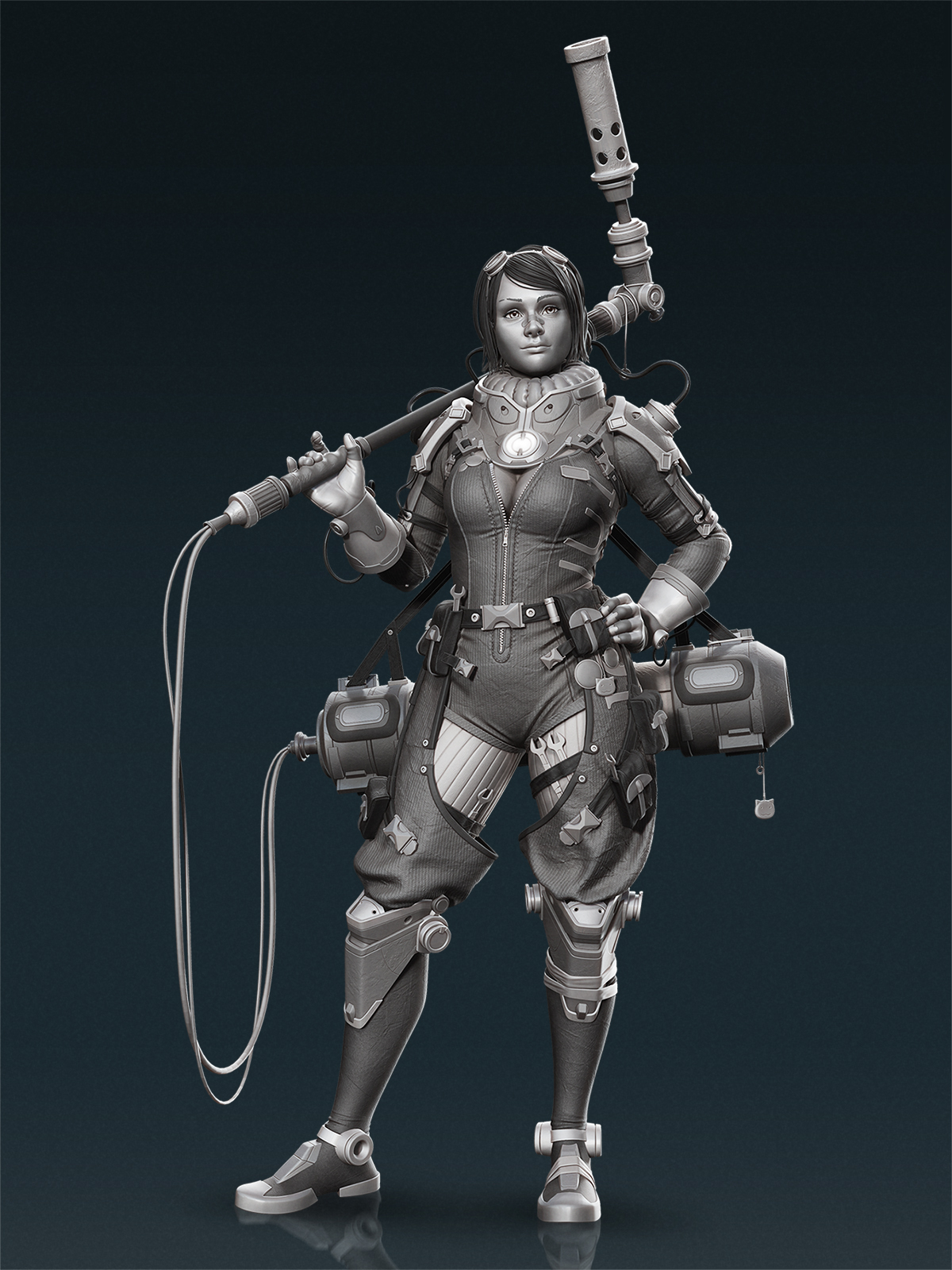
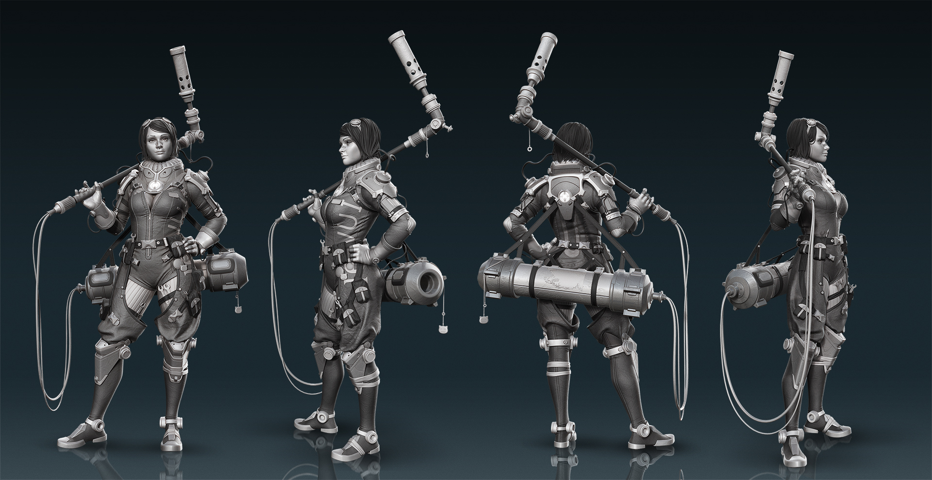
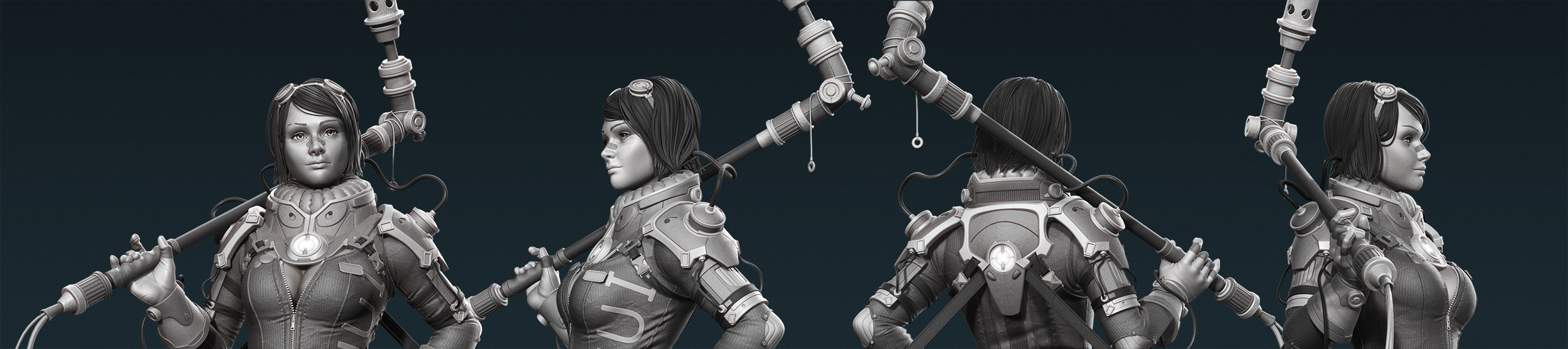
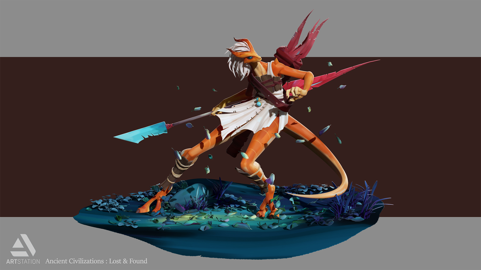
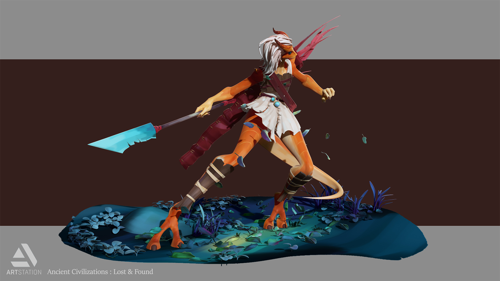
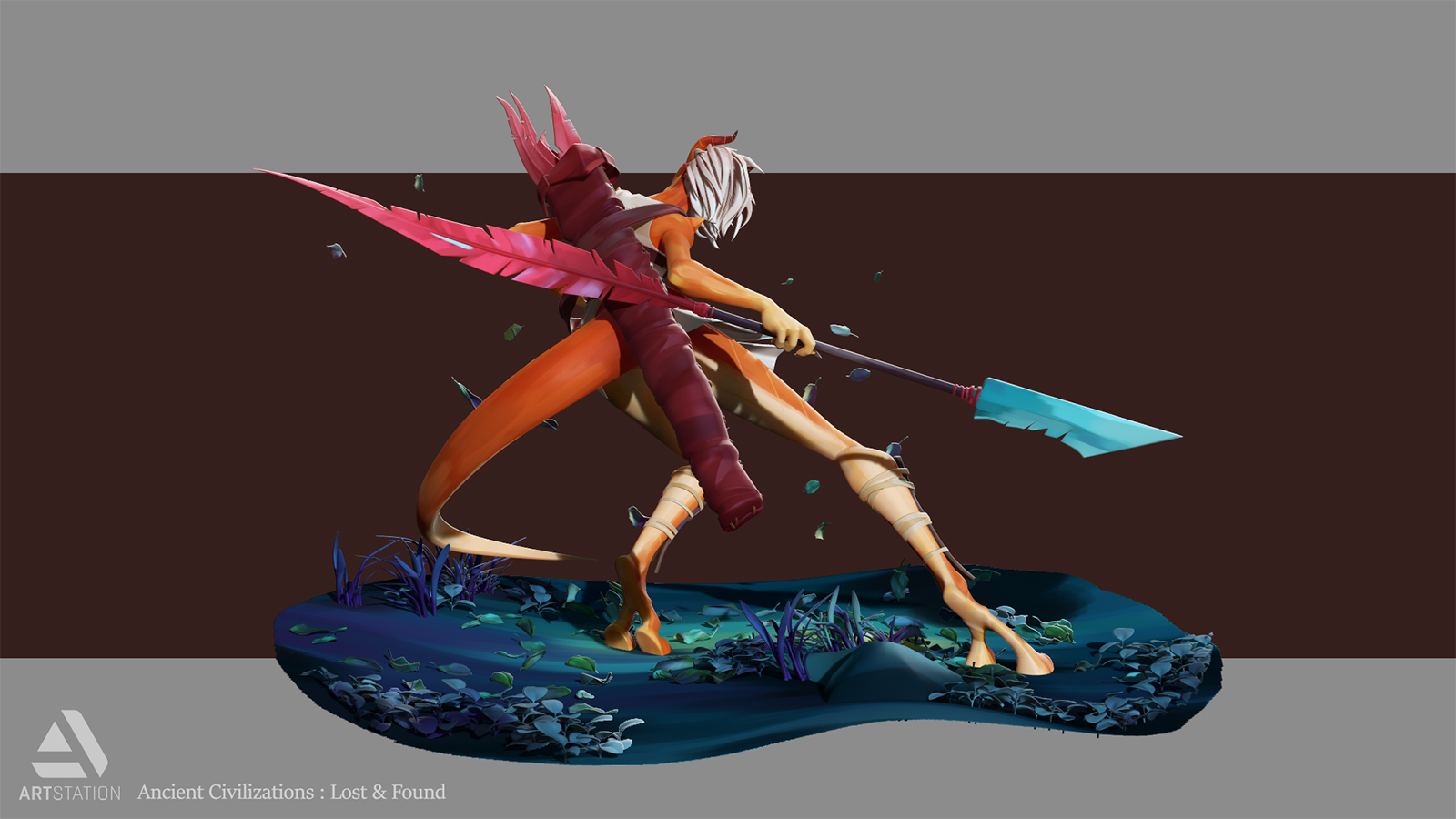
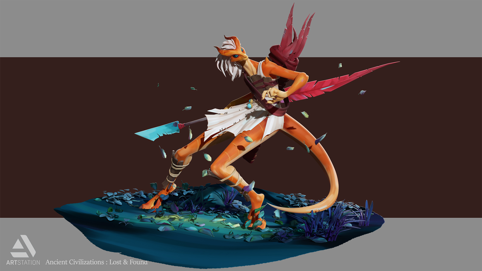
About the way I’m doing my renders, I do it in ZBrush only. Both of the renders on my last piece were done in ZBrush, and the base image is roughly looking the same on both. On the first one, I’ve just done a lot more post work in Photoshop, by rendering a lot of Passes inside ZBrush.

So for the first render, I used SkinShade4 with Posterize Effect turned on in the material and in the Render Properties. Then I used various materials (Basic Material, Toy Plastic, ReflectedMap, FlatColor) combined with tweakings in my render setup and lighting to get my passes to work in Photoshop.

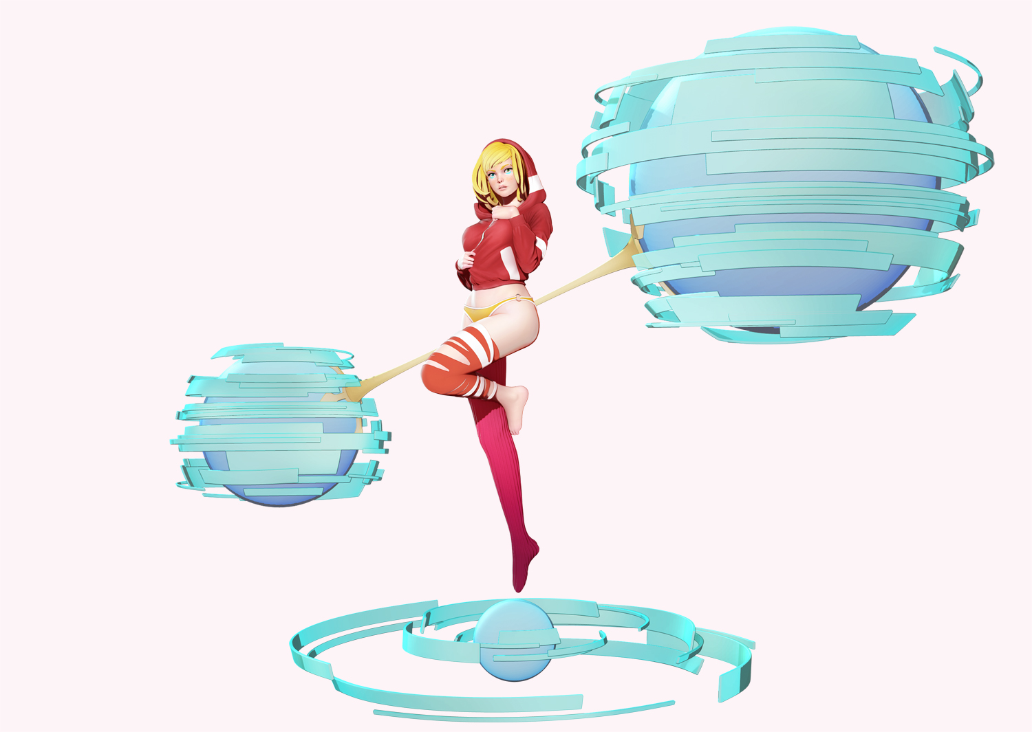
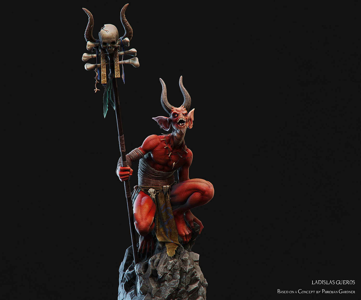
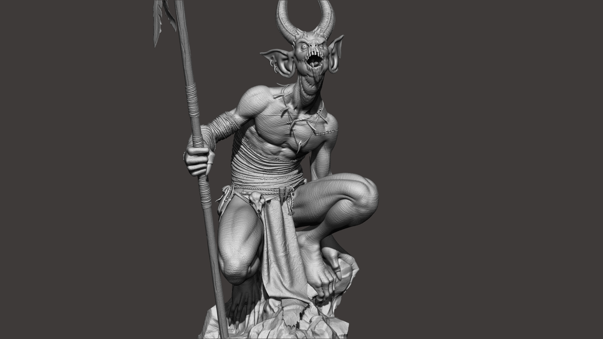
For the second render, I just used the same setup I explained for the Butterfly Girl : only the SkinShade 4 ! =)

Cheers !

lad

Hello guys !

I want to share with you the last model I created ! I’m a huge Blizzard fan, and I recently stumbled upon Phroilan Gardner’s awesome Fallen Shaman concept ( http://www.videogamesartwork.com/sites/default/files/styles/image_node/public/images/image/1377179012/diablo3-monster-fallen-shaman-by-phroilan-gardner.jpg?itok=do0eVD9X ) and I really wanted to try to model this.

I’m still learning how to render in Zbrush, and I have a lot of work to do about that… !

Modeling in Maya / Zbrush / Marvelous Designer
Texturing in Zbrush / Photoshop
Rendering in Zbrush
Comp in Photoshop

As always, comments&crits are very welcome !

Hope you guys like it !

Fallen Shaman

Shaman_Def_NewRESIZE.jpg CloseUp04_Chara_Grey.jpg CloseUp02_Chara_Grey.jpg CloseUp03_Chara_Grey.jpg CloseUp01_Chara_Grey.jpg CloseUp_Staff_Grey.jpg

I’m working on a turntable video with some Wireframe renders…
I’m limited to 6 images here on ZBC, but you can check out my artstation portfolio for more views and images… !

Cheers !

Lad_

Attachments

Shaman_Def_NewRESIZE.jpg

CloseUp04_Chara_Grey.jpg

CloseUp02_Chara_Grey.jpg

CloseUp03_Chara_Grey.jpg

CloseUp01_Chara_Grey.jpg

CloseUp_Staff_Grey.jpg

Excellent work!

Hello,

Long time since my last post here.
I’ve been really busy recently !

Anyway, here is my latest model !

IV

Front.jpgLineUp.jpgLineUp_CloseUP.jpg

Huntress - Artstation Challenge Ancient Civilizations: Lost & Found

Hello guys !

I want to share with you my latest work, done for the Artstation Challenge Ancient Civilizations: Lost & Found.

I’ve chosen Nadezhda Tikhomirova’s Huntress design for this challenge.
You can see her entry here : https://www.artstation.com/contests/ancient-civilizations/challenges/14/submissions/13070?sorting=popular

I had a lot of fun doing this ! I learned a lot and some of the entries were amazing. That pushed me to do my best !
I wanted to create an image that looks like the short film Meet Buck (https://vimeo.com/17535548) with a 2D look and heavy brush strokes in the textures. I thought that it matched pretty well with my artstyle and Nadezhda’s design.

Modeling in Maya
Posing, Base Body, Texturing, Rendering in Zbrush
Compositing in Photoshop

No Zbrush sculpt and no Paintover.
Basically I rendered in Zbrush using the Flat Color Shader, then using the Basic Material shader without any textures I rendered different light and shadow passes that I added on top of it using different Mask IDs to get what I wanted.

Final Image :

00_Final_Image.jpg

Turn Views - Shaded

01_Front_Shaded.jpg
02_Left_Shaded.jpg
03_Back_Shaded.jpg
04_Right_Shaded.jpg

Attachments

00_Final_Image.jpg

01_Front_Shaded.jpg

02_Left_Shaded.jpg

03_Back_Shaded.jpg

04_Right_Shaded.jpg