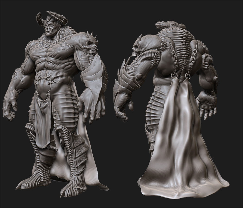
I like your added folds and line-work, I think it adds aggression to him and the repetition is nice. Keep it up! 
Some fine modelling you have done there sir.
Look forward to seeing this guy painted up and ready for action
Here is a little more detail and I’m just working my way head to toe. The bottom half has no work at all really. Wondering if I should give him some Nike’s b/c I think that would just make him pop.
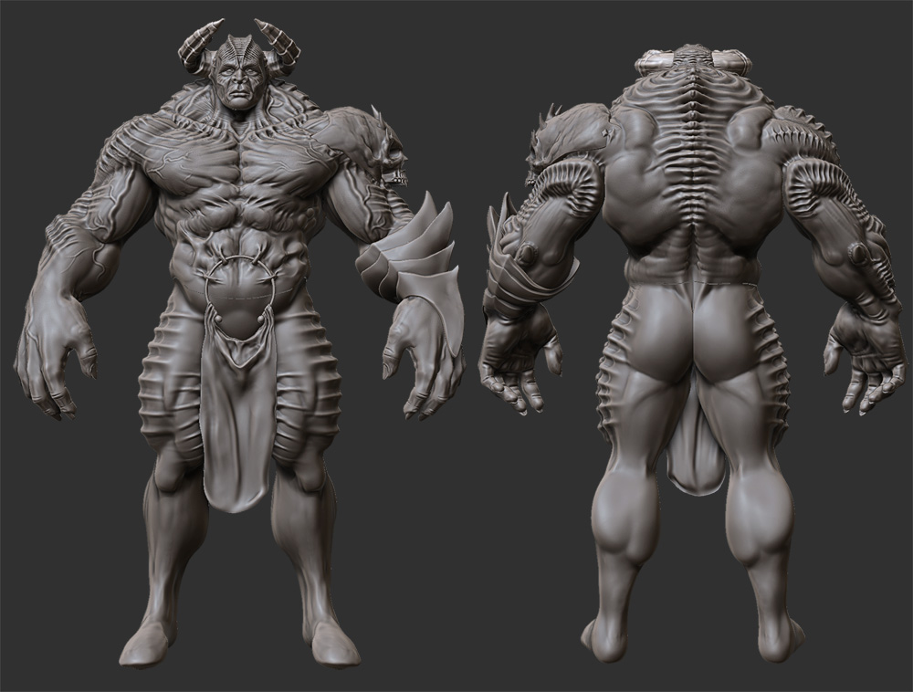
Attachments
Amazing Detail! No crits once again, just getting better and better
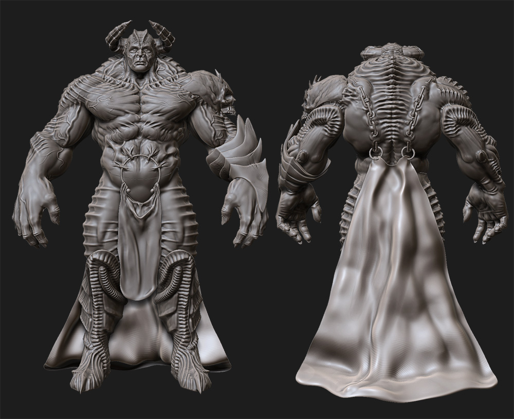
Ribbed. For your displeasure.
Displeasure. Hmmmm I like that. Kick ass.
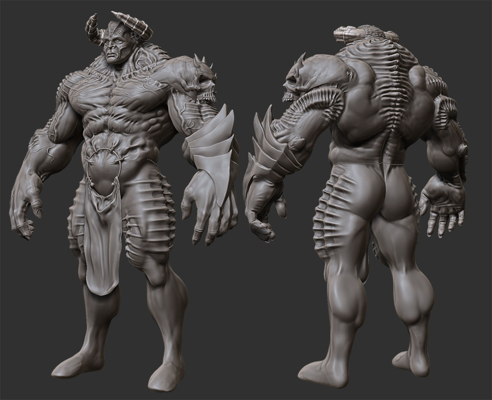
Here are some updates. Let me know of any crits.
Attachments
Ok. Here is the Low poly with wire-frame. Comments or Crits?

thats a cool demon u have got ther man…
love it…
I love it, awesome piece. You pushed repetition to the max on this one. Any more and it would be overboard. Overall its a great piece.
If you texture it with a lot of variance it would be a great compliment to the hard lines of repetition. I think earthy natural colors when I see this guy, maybe even keep some gray. Add in some color that pops on your skull on the shoulder armor or things you want people to look at. I am not the best when it comes to color but this is my opinion.
One quick question for you too, I would like to know how you approached the cape. Were the hoops pop out and clasp onto the cape in the back… When you re-topologized it did you actually go around the rings and add loops where they intersect? It looks really nice thats why I am asking. What was your method when you approached these areas of connecting geometry?
P.S. Can you please load up a side view?
Here’s a progress report. I still have quite a bit of work ahead of me. I need to make his hand clutch the weapon and fix some seams. Not sure if I should go with the blood on his body or not. Also, his specular and lighting still need work.

this looks awesome!!! really like it!
nice textures and shading!
and i like the blood! but i think its the color i like, not the fact it is blood. maybe you can give him some signs or something else. some tatoos with this color.
I would say without blood 
This is looking great!
super friggin awesome! haha.
I would go with tiny splats of blood, but not overdone. Or just crusty old blood on his weapon. Great work!
Great! Love that last render
Possible beauty shot for Dominance War IV

It keeps getting better! Great job!
I really like the contrast of colors you used, and how you added the nice glow to areas with intense heat.
My critique would be to lessen the areas of white on parts that glow, I think it would help the piece flow better, instead of locking my eyes to the bright spots.
The blood on the rock seems a little too straight and clean, try a little more splatter and randomness.
Aside from those two things, I cannot see anything else to improve (In my opinion)
Once again great work, beautiful as it is, I just get stuck on the highlights a little too much.
the clouds seem a bit too bright for a demon prince. I would muck them up and darken them a whole lot.
Here is the start of a redo of my Green Lantern character that I did a while back. I know it doesn’t look like much yet, but I’ve learned so much about form and the zbrush tools that I just had to go back and correct some earlier work. To all noobie zbrushers out there I can’t stress this enough. CLAY BRUSH, CLAY BRUSH, CLAY BRUSH! My “before” picture on the right was made just using the standard brush, back when I was ignorant. If you don’t believe me about the clay brush just watch this
http://www.3dtotal.com/3dsculpting/
Rafael Grassetti is simply amazing to me
