ZBrushCentral

Hate on the Brain WIP

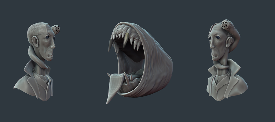
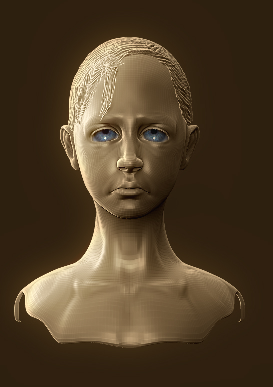
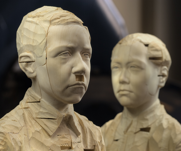
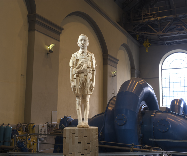
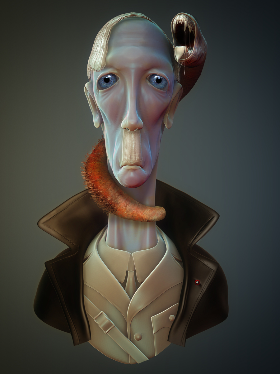
Relatively new to Zbrush, I never felt worthy to post anything on this forum full of extremely talented artists. Not that I am now worthy, but I have been working on this sculpt this week-end and liked the concept. Thinking of maybe doing a series of all famous misanthrops accompanied by the creatures that represent their hate. However, as I was texturing the infamous equilateral cross on his button and before going too far in the sculpt, I thought I would ask the community what the thoughts are on portraying such vivid emblems. Did change my mind as you can see on the look of the creature. Also did some test shading in photoshop. Thank you all for your invaluable contributions.
concept5.jpg

Attachments

sheet02.jpg

Is very beautiful! I like the rendering. good job !

thanks. Just noticed that Hitler’s hair are parted on the other side. Oh well, that’s what mirroring is for…

I would simply say that the usage of such iconic( in this case horrifying) emblems depends on the context and your context certainly justify using it.
besides, there are countries which have a totally different perception of the swastika. india for example. I have been there last year and believe me I had a hard time getting adjusted to seeing swastikas all over the place, even on chocolate :wink:

one point of criticism though. I do like the whole concept and your rendering, colors etc… very unique. the one thing I don’t like is that the form of your hitler is quite exactly the opposite of the real(and thankfully dead) one. he was no long tall haggard type of guy at all.

thank you Julian for your comments. I must say that the look evolved organically without true initial direction. when fashioning the uniform, I finally did a search for references and noticed the “erreurs”. However, by then It was too late, I liked him too much (in the form sense of course).

In the words of Wayne and Garth:

WE’RE NOT WORTHY

WE’RE NOT WORTHY
WE’RE NOT WORTHY

p.s. excellent work!!!

Hoping to be worthy someday…thanks.
New character for the hate series. Took me forever to find the form to accommodate the big eyes. I am no loretta lux…but hey she uses a camera.

[attach=211749]ZBrush-Document2.jpg[/attach]

Attachments

ZBrush-Document2.jpg

ZBrush-Document2.jpg

HAving difficulties finding references for 10-13 yo child. any suggestions on the proposed proportions. thanks. ZBrush-Document5.jpg

Suitable Putters for Golfers

If you a golfer, I would like to read much more your articles. This putter also arrives with golf equipment two stock 12 gram stainless steel single weights. The top fat is 370g as well as can also be encounter balanced. ishiner

Hitler? That’s obviously David Hyde Pierce. . .

wow very nice. What did you use for the eyes? Are they done in zbrush or another program?

Are you familiar with the work of Gerhard Demetz?

Attachments

03.jpg

09.jpg

HAving difficulties finding references for 10-13 yo child. any suggestions on the proposed proportions. thanks.

Try out MakeHuman. Free program.

Joshua, David hyde pierce, never thought of that one.

Adio, a simple sphere with a texture applied.

Zseth, absolutely, found a few images of his sculpts but no front or profile images. Should have gone on his website, how stupid of me. Thanks.

Pro, will do thanks.

cool:cool:

Keeps on going through many iterations… posting the final image, I think. Final03.jpg

Those amazing eyes! Yeah, I’d use them again and again as well.

5 stars.

:+1: :+1: :+1: :+1: :+1:

I like it. Which one is the parasite, though? Is it the one with the teeth, or the one with the mustache? :wink:

I much preferred your ‘Aryan’ rendering of Hitler. Irrespective of the irony (not sure if that was your intention), I just think it looks a lot better - it’s got an eerie, cold pallor. I find your second rendering too warm.

Interesting artistry - looking forward to seeing more.

Just kidding, of course, this is great. I love the look of the skin.