very very nice man
and congrats for the new lcd monitors at the ant lab hahahha
thanks mohamedaly! Yeah we were lucky. We got em just when we moved into the antfarm hehe!
cool man
Gordon…love your clay…but dig deeper and go opaque…switch to chavant…its less forgiving but so rewarding.
Peter
wow thank you man!! im very flattered you used my sculpt as refrence!!!
Thanks for the comments guys!
hey ministerart, thanks for the advice! i just bought chavant clay. gonna try it out over xmas!
your welcome nervink, I digg your art a lot!
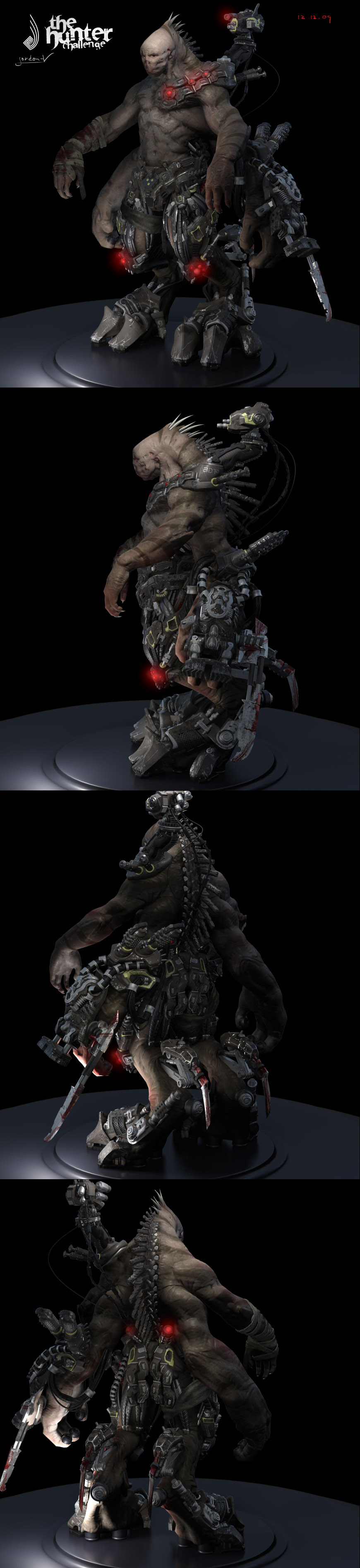
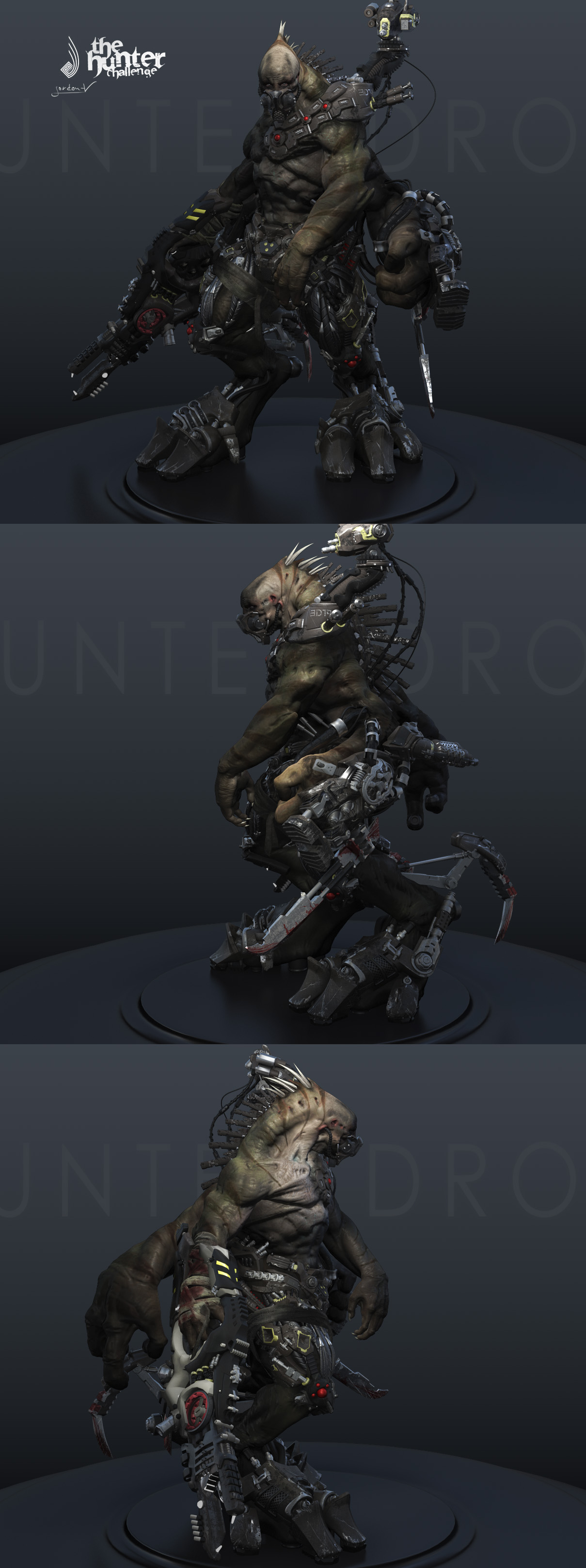
I wanted to share my current progress on my hunter. Thanks for the advice for setting up the skinshader Chris. I slowly get the hang of it. still need to paint all the maps for subsurface etc. And of course i need to sculpt more skin details and pose him.
Attachments
this is cool man… the only thing that stands out to me is the actual face… what I would suggest is making the stripes that are going up his back and neck continue further down his forehead. As, as it is the one on his head looks like it could almost be a shadow at first glance which then throws the off.
From a design point of view i’d also consider dehumanizing the face a bit…push the forehead down maybe just something to keep it from looking like a human head was just tacked on there. Thats my 2 cents…
Very cool tho… reminds me of a Strogg or something from Quake!
Wow man! It keeps looking better and better! Keep up the good work!
Hey Max, nice work man.
I really think you need to inject stronger color into your model. You have a very busy looking character, many parts and stuff and I think you have to break it up with color. Maybe your still in the process of that in your texturing but if not you should choose either to make your armour colorful and keep your skin muted tones or vice vera. It will really help to make define your model.
cheers
Chris
<input id=“gwProxy” type=“hidden”><!–Session data–><input onclick=“jsCall();” id=“jsProxy” type=“hidden”>
That creature is insane! Did you start from a sketch or concept? He looks like he would be a better enemy in gears of war than the Locus. Cyborgs are always awesome!
Hab die letzten Updates total übersehen, oops. 
Youre also modeling with real clay? Thats cool. Ive done that as a kid in school but never again. You know I love your cyborg beast (does he have a name, btw?)... but I agree with Porkpie Samurai. I know it was just a base paint but I liked the skin color he had in the update youve posted before this one better. Hes a little to brownish/grayish and too dark now. For my taste.:) Without his armour that would be no problem for sure but.. sorry, dont know how to say that in english (aber der übergang von Rüstung und Haut geht ein bisschen unter, weil die Farben alle sehr ähnlich sind. Man weiss nicht so recht wo man hingucken soll. Hoffe Du weisst was ich meine).
A brighter cream-beige skin color and for the stripes an olive-gray-brown coloring (like the color of the strap around his leg)would be great IMO. Hope you don`t mind my little critique.
You know what? I visited your blog and saw the concept sketch…and the colors youve used for it are exacly what Ive had in mind. Funny!
Gordon-V,
Top notch work so far! Really excellent texture / sculpting work!
I’m going to critique your “Hunter” character because the anatomy bothers me.
Overall I l like his design, but the second set of arms would not work at all. (Unless this is intentional, then just ignore this critique and carry on with your life )
The second set of arms would need a second set of both scapulae and clavicles, for just the bone structure alone to work. They would also need a second set of Deltoid, Trapezius, and Pectoralis muscle groups to be able to move.
Anyway, this is just me and my first post.
Keep up the good work!
Hey guys! Thanks for the very helpfull comments and critic!
//dragoton - thanks man, i will do more work on the face, it bothers me too!
I would like your oppinion on my next update that I will do!
//chris - Thanks bud. yeah as you know colors are hard for me. what do you think about my current colour choice. i will put more red into his armour i guess.
//wombal - hehe thanks you! yeah cyborgs rock!
//moni - jap your right! what is you opinion on my current colour choice?
//mcapplbee - Thanks a lot for the helpfull critique!
Yeah 4 arms is hard to make. well it was my intention that the lower arms would have a shorther rage of motion. both sets of arms are sitting on on scapular with 2 joints. the lower arms have a deltoid, a bicep, a pec and a tricep. maybe you can see those musclegroups better in my next update!
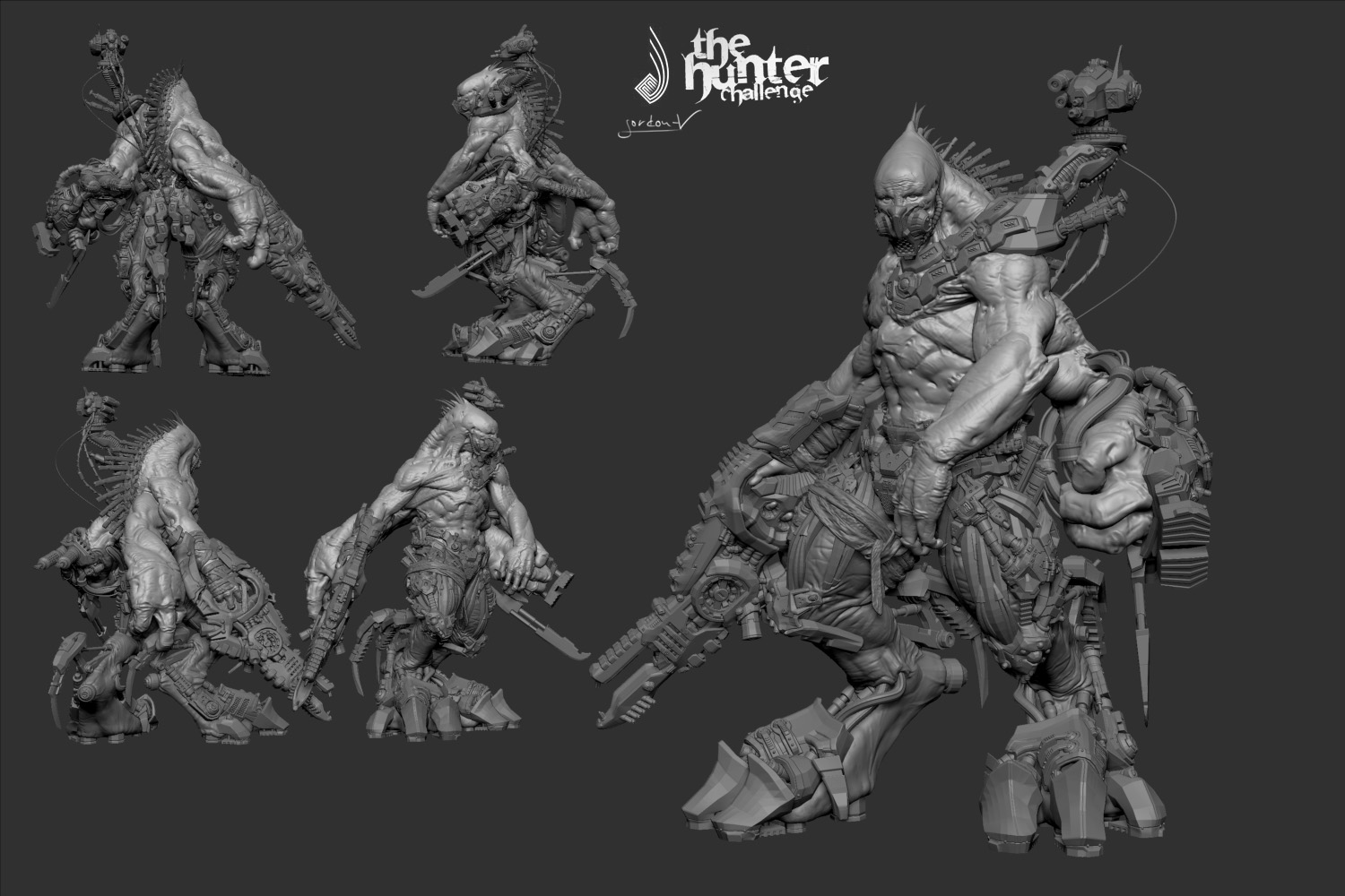
Here is my current wip
Attachments
Wow that is fantastic! I would change his expression a bit though. Keep posting!
This last image is awesome, you have it all. Organic, mech, color, great lights, and bloooooood. Just great.
Just beautiful work - Great Job!!!
really beautifull! good work!
Fricken Sick! I love it! Detailed!