Its a fine looking healthy Dragon, but on my monitor the eye looks gold not green…In Zbr4r3 there is a smart transpose brush…is that what youre Talking about ? Deke 
Hey Deke! Thanks for your comment. And I’m not sure about the smart transpose part. It’s a combination of holding alt and using transpose>rotate. It’s a little hard to describe what it actually does especially since this is the first time I’ve run into it. I put the pivot point on the place where the wing meets the body, hold alt and drag the other end of the line downward. Instead of the usual rotate, where the whole wing would rotate centered on the pivot, it kind of gives a very organic bend between the pivot and the end of the line that you’re moving. Very cool effect in my opinion. I liked the way the wings looked before, but I totally love them now.
Ok I’m certainly going to have to give that a shot on my sureal horse project… Deke
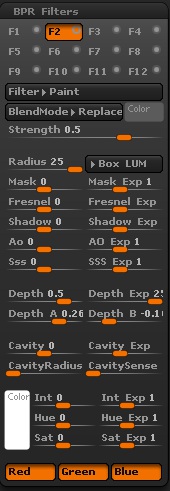
Mealeaying and I were chatting in irc earlier this evening about things we wish we could do within zbrush. Specifically about not being able to use fog and depth cue in bpr renders… We had both read different things about simulating the effects with filters but never had much luck. Well she started testing and I started the loooong render of my river scene and she was able to point me to the correct filters to achieve the effects with a bpr render. Therefore full credit goes to her for the render below. I just tweaked the settings, she’s the one that steered the ship!
Rivendell with fog!

I decided to do a new render on Bag End with a touch of fog, a new background and better lights. Comments please?

Can you share render settings?
Glad to Faircat. This is the one for Bag End. I ended up using just one filter on this one and I think it gives a better effect. I just have ao and shadows on with global shadows set somewhere around 50%. For the filter you just have to play with the settings until you get what you like. The depth settings are the most important here and they’ll be different for every model of course.

Thank you.
Result is awesome!
You’re welcome, and thank you. Yeah that paint filter is close to magic in how it works. Just a couple of minor tweaks and it was just there. Somehow it gives a photorealism that wasn’t there before.
cool voodoodad , I thought the thumbnail was a photograph. I was trying to get the fog function to work on my BPR render of the beast, I emailed Paul Gaboury and he told me to use the paint BPR filter but my results didn’t turn out like yours .I’ll have to try again. Nice job how many layers of fibers in this piece?
RICK BAKER REPLIED TO MY THREAD!!! Whew! Sorry, my heart just skipped several hundred beats there! Honestly I lost count of how many layers there are to the fibermesh. I want to say 15 to 20 at last count but I’ll have to reload it and count them again lol. I found I like to use at least two layers on each mask for flowery type plants, one for leaves and one for the colored parts. Unfortunately with this light setup Most of the colors seem to be a bit washed out, so I may end up doing some more lighting tweaks to try and bring those back. And yes, it sucks that fog and depth cue don’t work with bpr. I really wish they would fix that as the fog function for “best” render mode looks a lot better, but the paint filter isn’t bad.
Now, if you’ll all excuse me, I have to go find my portable defribulator…
Went back and counted. 26 individual fibermesh subtools. I do remember now going back and filling in some areas that look pretty sparse, so that about doubled the number. I’m still playing with the settings to get the fog falloff to be a little softer and trying to get the colors back into the flower type fibers. /sigh. gardening is such hard work!
Okay, after much tweaking and cursing I managed to get the colors back to where I want them. It was a lighting issue totally unrelated to the filters. Magical “use material curves” button, oh how I love thee! And I think I’ve got the falloff to look pretty good for the fog effect (new settings posted). I still need to go and fix the texture on that sign, it looks like its been through a sandstorm. Let me know what you think!

Fixed the issue with the sign. It wasn’t a texture issue as I first thought. I just needed to click “double” in the display properties pallet for the plane3d it was applied to. Also recolored some of the grass toward the bottom of the image to blend it in better. I think maybe I can stop spamming uploads of this model now.

That’s looking really nice, voodoodad! Very inviting and homey, and you’ve got a much nicer sense of depth with the fog now.
If I may humbly offer a couple of suggestions, I would recommend that you make the ivy on the house itself closer in color to the grass around it. The color you have now looks a bit plastic-y and stands out a bit too sharply, I think.
Also, the sign needs a bit more of a hand-painted look to it, I would say (the script itself is quite nice, but it looks like a typed font). At the moment, it looks a bit like something you might see in Second Life or something (just the sign, I mean).
Just a couple of minor suggestions, though–I like this piece very much. I’d love to retire there!
Terry
Thanks for the suggestions, Swampghost! The ivy was something I worked on this afternoon, it had a different mat applied to it and I didn’t realize that until I was looking at it here again. So that’s already fixed but I didn’t want to post another render that soon lol. The sign looks like a typed font because… well, its a typed font lol. I’ll take the texture back to ps and try to put a little wear and tear on it. You’re absolutely right. It really sticks out being right in the middle of the image like that so it needs to look more home made. Thanks again and stay tuned.
One last shot before I move on. Corrected the specular that the ivy was picking up and beat up on the sign a little to make it fit a little bit better with its surroundings. Hope you guys like it!

Fantastic! A real improvement on the sign! I think it just really needed to be dialed down brightness-wise, but adding wear and tear is much more interesting, of course, and disguises the uniformity of the script a bit without you having to go in there and mess around too much with it.
The Ivy is really coming along, and I hope it isn’t presumptuous of me (and that I’m not dragging things out when you just want to move on) to include a quick, sloppy little desaturation job I did, which is meant to illustrate what I was picturing when I made my suggestion. I think sorting out the specularity was a huge step in the right direction, but also still feel that the green may be too punchy.
I literally just desaturated it in PS, of course, and played with a few other settings, but you may also want to play with the color settings a bit more or whatever. Or perhaps you disagree with what I’ve done here, which I can completely respect. It’s fun to play a bit when I see something I might do differently, but–again–I hope you don’t take exception to my humble suggestions and tinkering.
And just to clarify, While I do a lot of 2D artwork, I am–so far–no more than a zbrush novice and most definitely know far less about it than you. I am simply making suggestions that I hope might make a more harmonious image, without necessarily knowing how you would execute that in ZB.
Anyway, thanks for sharing, voodoodad!:)
Terry

Attachments

Hey Terry, thanks so much for your suggestions! Listen, don’t ever think you’re being presumptuous by giving me suggestions, especially when it regards issues of colors. As I’ve said many times in this thread and elsewhere, I have red/green color blindness and that makes it really difficult for me to judge different tones of color in the red/green spectrum. So when someone suggests color changes I take them really seriously. One thing I would love to see in Zbrush is the ability to apply filters per subtool as opposed to applying them to the whole render. I’m making a huge effort to keep this one and the river scene completely in Zbrush, which means I can’t take it to PS no matter how much I want to. Ill fix the ivy color issue by just picking a (hopefully) grayer shade of green and filling the ivy subtools with that. It’s not a completely ideal solution, but it’ll work lol.
Again, never worry about giving me suggestions even though you’re new to Zbrush. I’m coming up on using it for 6 months and I still consider myself a noob lol.
Great job on this scene Voodoo. Convey’s a very peaceful felling, again fantastic job