ZBrushCentral

Fauna

The giraffe pattern is perhaps distracting, because we’ve never seen that applied to a human, nor to anything with long spiral horns.

…but, I’m not convinced that making us stare at this girl is in any way a bad thing.

It’s a strong and evocative decision, for better or for worse. I’d say go with it.

So this will be the end…

Still lot of work to do, fur and the ropes around the waist…I’ll be off for a week, but next sunday I’ll be read your comments! Hair is photoshop painted (needs a lot of lighter strands), grass is XSI hair, sky is vue…

FaunapreFinal.jpg

looks amazing! I’m a little upset there wasn’t hair on her other than the photoshopped hair and I was almost about to be very upset when I saw “so this is the end” at the top. Glad I read further. :wink:

I hope you have fun on your trip! I too am going on a nine day vacation starting tomorrow. Hope you have a great time!

Great work! :+1:

Nagyon szep lett . A a horizont fele elkodosodhetne egy kicsit az eg, az nagyon megdobna a teriseget es jobban fokuszalna az ember szemet a karakterre.

Nicely done!

Beautiful! The lighting is nice too.

It’s coming together. Very sexy!
I’m not totally sure about the hair and her teeth yet… Maybe I liked it better without hare. Maybe some manes?

Good that you persisted with this model.

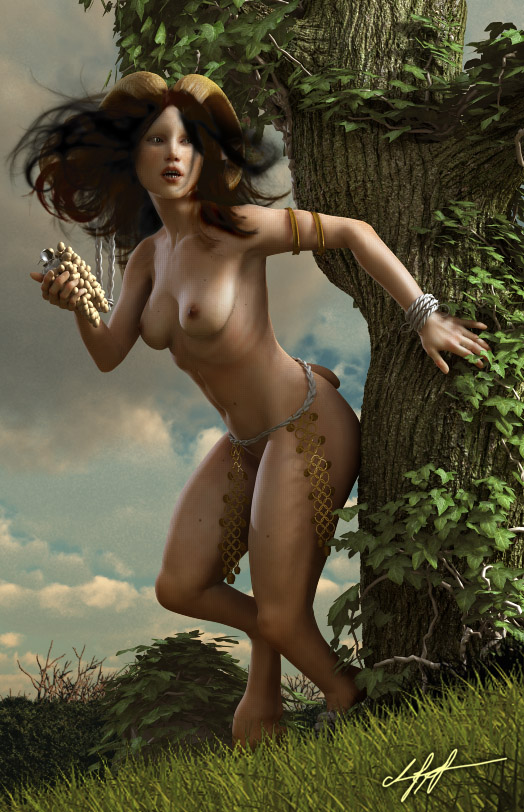
Hi there, long time went without advancement…

Now here’s an update, and a question:

Teszt3.jpg

So the question is here…
I had the base mesh imported to ZB3. I’ve painted the details, etc, sculpted a lot, etc. Then, I’ve created the displacement map, and exported the map, and the base level object back to XSI. Interesting, but the displacement map pushes out the horns, and the lower area of the breast too much. The map is very bright there, although the zbrush model is not as pushed…I haven’t figured it out yet, how it should work, but now they are too displaced…

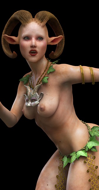
The mask is designed by phee-adornments, at deviantart.

The mouth looks off to me… Not natural. Everything else is spot on. I think it’s the fact that the mouth looks like a basic hexagon shape. Not fluid and curved naturally. Atleast that’s my perception of it.

Still, great, great work! :+1:

Thanks Kyphur! I’ve used photo reference for the lips. To me to color of the lip is not what I want, I’ll desaturate it a bit. But maybe, the displacement issue I’ve descriped is kicking the ass of the lips.

Maybe…

I think the color is alright but desaturating like you mentioned might help a bit. I hope you the best with the displacement issues. :slight_smile:

Great work! Kind of agree about the mouth. It may also involve some width issues of the rear of her jaw (Mandible) – something in my brain isn’t reading that right.

I think I liked her better with hair on her head. :wink:

Also, is that poison-ivy she’s wearing?

Really gorgeous work. Woman after my own heart!!! :smiley:

I do have to comment though. I really reallly liked the furry goat legs a bit more than the smooth ones. Other than that she’s perfect!!

Glad I found this thread!! :slight_smile:

wow, that’s an awesome piece of work.

I think if you “cut” the grapes loose from the silhouette a bit more it will make the image easyer to read and improve the composition.

:+1: :+1: :+1: :+1: :+1: :+1: :+1: :+1: :+1: :+1: :+1: :+1: :+1: :+1: :+1: :+1:

very nice work.

This is a really beautiful piece. Amazing work.

Why this has yet to make Top Row is beyond me. Some things in top row don’t belong there in comparison to the work and progress you have shown here. Keep it up and best wishes!

Thanks guys. I hope, when it is finished, it’ll make to the first row. It’ll be a great honor to me!

Great work!