ZBrushCentral

Energise´s Sketchbook (mini-tut pge 5, 6 & 17)

Etcher: Thanks man :slight_smile: I´ll try and keep that for the final render!

eof3D: Thanks! And the same back to you :wink: Following your renders closely.

highlander_72: The textures are actually kinda desaturated so it must be to much of the orange back light I guess :stuck_out_tongue: I will turn down the lights in post, just struggling with vray renderpasses and max crashing on me with these big renders at the moment (3636x2657) :confused:
Btw, is your screen calibrated to gamma 2.2? (all my renders usually look more saturated and overblown on my non-calibrated screens) Just curious :slight_smile:

Thanks for the great crits!

Santis: Tja! Thanks man! Working on anything new? :slight_smile:

/idkfa: Thanks! Glad you like them! :slight_smile:

Yes, finally I have gotten back to sculpting again, how great it is!
This autumn I will start a new sketchbook, and hopefully have some good work to show by then :slight_smile:

I checked and am pretty certain that my monitor’s gamma is set correctly.

Anyways, I hope I did not step on your toes with my crit, and am not offending you when I say that when placing gels/coloring lights you probably want to be a lot more subtle unless you have a very specific idea of what you want to achieve. Color is an emotional modifier and can radically change the way an image or a sequence is perceived. That orange is definitely is too intense for a simple character presentation, I’d say, as its kinda competing with your key, especially in the lower half of the image. It might work however if he was standing right next to or in front of say, a fuel explosion or burning fire of some destroyed installation, which would add a whole new meaning to the image. Something along the footnote of “Mission achieved. Piece of cake!”

Anyways, great work! Cheers!

Santis: Sounds great man! :slight_smile: Can´t wait to see what you come up with!

highlander_72: Don´t worry about me, I appreciate your crits 110% and concider them very valuable! :slight_smile: I totally agree with you regarding the lights! My first plan was to have a burning background, but in the end I felt that it would compete too much with the character. I was just to lazy to fix it before posting this wip hehe :smiley: It will be much turned down in post, promise!
Thanks again for your input Felix, you have given me new perspective on how to approach this guy :slight_smile:

Here is the raw diffuse-pass directly from vray btw :slight_smile:

![diffuse.jpg|1100x1600](upload://rHTwTezl21eIZvdXydnBB7nnb5V.jpeg)

Attachments

diffuse.jpg

:+1: :+1: :+1: :+1: :+1:

Those textures look great!:+1:
It’s definitely the lights causing the saturated look then.

You might want to “tan” the outside of the forearms a little more though. If this guy is in the habit of running around with the sleeves rolled up, they probably would get a little more pigmenting.

Cheers!

nice and detailed works on cloth and textures,thanks for your breakdown man:)

<!–[if gte mso 9]><xml> <w:WordDocument> <w:View>Normal</w:View> <w:Zoom>0</w:Zoom> <w:HyphenationZone>21</w:HyphenationZone> <w:PunctuationKerning/> <w:ValidateAgainstSchemas/> <w:SaveIfXMLInvalid>false</w:SaveIfXMLInvalid> <w:IgnoreMixedContent>false</w:IgnoreMixedContent> <w:AlwaysShowPlaceholderText>false</w:AlwaysShowPlaceholderText> <w:Compatibility> <w:BreakWrappedTables/> <w:SnapToGridInCell/> <w:WrapTextWithPunct/> <w:UseAsianBreakRules/> <w:DontGrowAutofit/> </w:Compatibility> <w:BrowserLevel>MicrosoftInternetExplorer4</w:BrowserLevel> </w:WordDocument> </xml><![endif]–><!–[if gte mso 9]><xml> <w:LatentStyles DefLockedState=“false” LatentStyleCount=“156”> </w:LatentStyles> </xml><![endif]–><!–[if gte mso 10]> <style> /* Style Definitions */ table.MsoNormalTable {mso-style-name:“Normale Tabelle”; mso-tstyle-rowband-size:0; mso-tstyle-colband-size:0; mso-style-noshow:yes; mso-style-parent:""; mso-padding-alt:0cm 5.4pt 0cm 5.4pt; mso-para-margin:0cm; mso-para-margin-bottom:.0001pt; mso-pagination:widow-orphan; font-size:10.0pt; font-family:“Times New Roman”; mso-ansi-language:#0400; mso-fareast-language:#0400; mso-bidi-language:#0400;} </style> <![endif]–> Hey there Jonas!

Sorry fort he late reply - I was so busy and on top of that I have a problem with a model that should get printed and somethings not right with the texture. :confused: </span> <span class="fontnone">Also no holidays this month, we have to wait until the first week in august because of my husbands job. Ugh… :rage:
Now to your question, well I forgot the most names of all the sight-seeing places in Nice but there are many museums and there are also amazing Cathedrales.
You shouldnt have problems with finding lots of awesome places. [font=Wingdings]:)</span></span> <span class="fontnone">Regarding the macro, thats the lense you need for close-up photography.
I want it to take pictures of small things like insects for example.

Since there are still almost 4weeks left until vacation I`ll enter the contest over at cgcoach.
But I think you can count me in next time, too.
Would be great to see the old team completed then. :slight_smile:

<span class="fontnone">Now let me say something to your latest update finally: </span> <span class="fontnone"><span class="fontnone">Whoa!

Amazing painting job, seriously and I also love the render.
Now I`m curious to see the final render you were talking about since it already looks perfect to me. :slight_smile:

<span class="fontnone"> </span>

Hey guys!

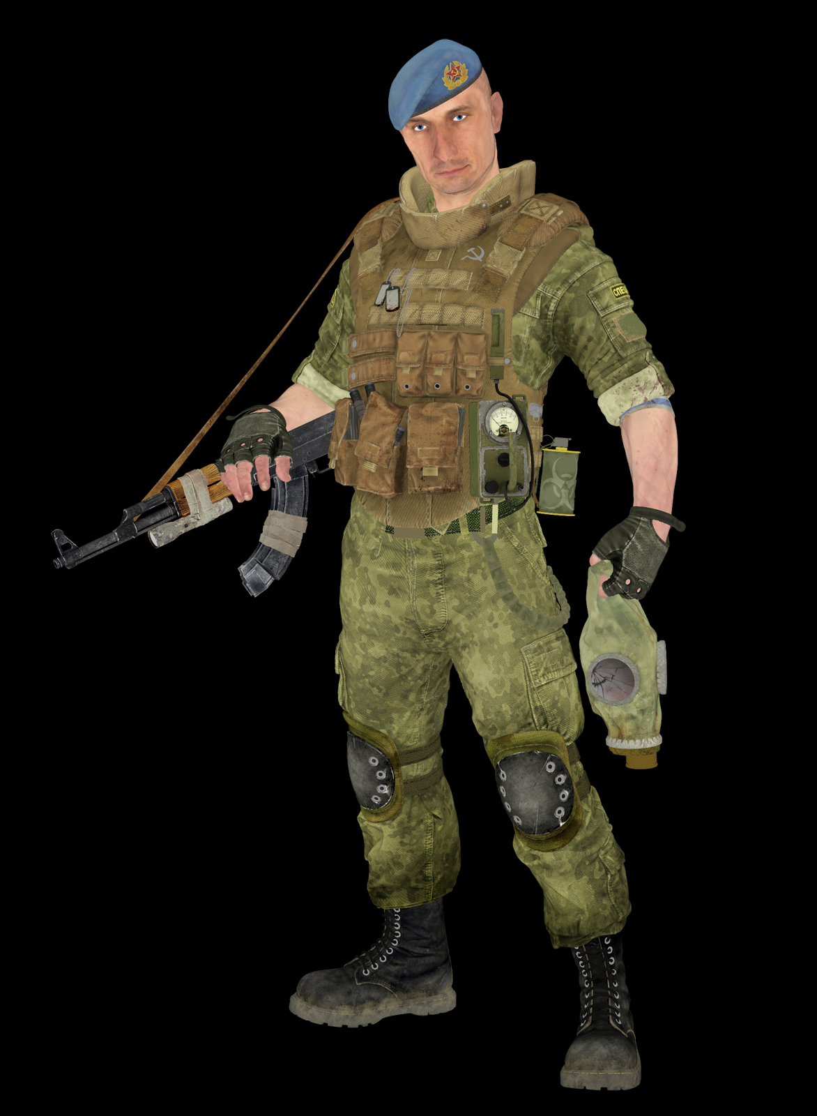
Now I have finally had time to put a big render together :slight_smile:

This one should be more desaturated and crisper since it is originally 2564x1832px.

Hope you like it! :slight_smile:

N0b1: Thanks!

highlander_72: Thanks Felix, I have tanned them a little in this last render.
I also turned down the saturation quite a bit :stuck_out_tongue:

3mm: Thanks for the comment! :slight_smile:

Moni-Poroni: Hey! No worry Moni :slight_smile: Cool, which is it you are having printed? And what is the problem? I am also having a print made of the spetsnaz that will be arriving shortly :slight_smile:

Sorry to hear that, but like you said more time for modeling contests!! :wink:
Can´t wait to see your Llama and monkey.

I had a great time in Nice! Although we did not visit any museums hehe.
Also went to Cannes on a day-trip which was cool.

Ahaaa then I understand what a macro is haha. I was thinking of computer-macros :stuck_out_tongue:

Glad you like my rendering, this last one is twice as large and rendered out in passes ect. Hope you will like it too!spetsnaz_avatar.jpgspetsnaz_1600.jpg

Attachments

spetsnaz_1600.jpg

Top Row, excellent. Superb work.

:+1:

Nice work. All of the normal maps read really well. I really like the cloth and the gloves.

-Briggs

www.3dbriggs.com

awesome!!!:+1:small_orange_diamond:+1:small_orange_diamond:+1:small_orange_diamond:+1:small_orange_diamond:+1:

I am for close-up. looks detailed. superb.

This is gold man. It looks even better in color.

this is some phenomenal work. well done

Beautifull!!! Absolutely love the subtlety and richness of the colors/lighting in this render, great finish -> :+1: :+1: :+1: :+1: :+1: !

An absolute masterpiece. The shadow and lights around the eyes are fantastic.

Great work Jonas !
you give him life from color !

Wow nice work 5 stars

Great presentation!:+1:

Tiny crits: To my eyes the bump on the Geiger-Counter and gas grenade look at tad too strong and the skull surface appears a bit too smooth/plasticy.

Cheers!