Clayton. Yours seems pretty natural to me for a 2D layout. That is pretty much the same way I set up painter with everything across the bottom. It’s a fairly natural painter interface IMO.
Clayton,
Talk about making a product your own. I have to admit your organization was a total (and pleasant) surprise to me, something I’d never even considered.
It’s pretty much a complete customization and just looking at it I have no idea how it would feel to use it. I wonder if you would consider posting the UICustom.cfg file for your layout. I’d like to give it a try  .
.
Thanks, Sven
p.s. Also, when you feel ready, please post some of your 2D work and comments on ZBrush as a painting program.
Hi,
Just to say, it took a couple of days playing around to achieve the interface. I then made subtle modifications when I started painting, but I think I’m pretty much there. I have made one slight re-arrangement to the one above, but essentially it’s the same.
WierdPal: Spot on In fact I actually got the idea from watching Ryan Church’s DVD. I also have a copy of Corel Painter 8, however I found the artifacting annoying when doing a painting, so I decided to switch to ZBrush instead, which I find extremely powerful.
Sven: I have to admit it surprised me as well, which is one of the reasons I like using ZBrush. Feel free to use UICustom.zip to your liking, however I have a 23" monitor (1920x1200) so I’m not too sure how it will look on yours !
I must admit, I’ve hit hurdles along the way as ZBrush painting does work a little differently from other applications, however I have found that the support here is awesome and quick ! As soon as I finish a painting I’ll definitely post it here.
well, here’s mine. bothe the ‘slick’ and the 'cluttered version. had to scale them down a bit, 1600x1200 seemed quite huge for a post.

i guess i’ll never finish tweaking and fumbling with the interface, 'cause each and every new tool or function i discover/understand seems to deserve some changes …
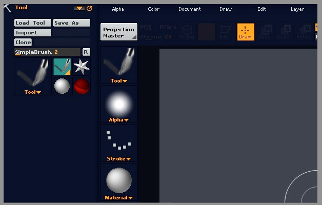
as i find any colorful stuff around my workspace extremely distracting and irritating i tuned everything down to greys and swapped all the essential stuff to the right side, which seems much more natural to me - being right-handed.
the right panel is always kept open and holds the never-ending tool palette, which i need constantly.

whereas the left panel holds task-specific stuff, mostly materials, alphas or textures.
i tweaked and rearranged the top bar a little, added ‘make polymesh’ and axis constraints (wish i could place the symmetry thingies there!).
all essential layer controls plus RGB/grey sliders went to the bottom bar.
as much as i have learned to like Z’s interface and its flexibility, i still don’t really like those auto-flyout-collapse menus, that’s why i prefer surrounding the canvas with buttons and gadgets instead of using the menus - not quite ‘zen’ but comfortable
mahwork that is cool…
do you mind posting it?
here’s another: my ‘work at home’ setup, a tad darker and for a puny 1280x1024.

feel free to DL, if you like it
heres mine. Thought I would post an update
to show new buttons and alpha manager’s new look. 
Has anyone figured out how to load the custom setups people have made and have the colors load too?
I have figured it out, for anyone that wants to know, I had to rename the configuration file to the default name and it worked.
Oh hey dr. jjwow how that new alpha zscrip going? Is it done can we download it?
Whouuuaahhh Dr.JJwow
Marble’s buttons !
It’s very design 
As soon as the Demo release, I want fur’s Buttons  More confortable
Pilou
Hi,
I have been watching a few of Glen Southern’s free videos (I need the DVD) and I really like his layout. Is there a place that I can download the interface settings from?
Howdy all. I have been trying to figure this out for awhile and haven’t seen anyone do it yet. So I was just wondering if anyone knew of a way to hide the top panel
So if anyone knows how to get rid of this top bar please let me know
[attach=29208]fullscreen.jpg[/attach]
Attachments
It can’t be removed, but you CAN change it from icons to text. Just turn off the Preferences>Interface>Iconized switch. The text uses probably 1/3 to 1/2 of the height that the icons take up.
SWEET! thank you aurick. That helps!
Hello,
Where I could find the original&unmodified interface for ZBrush 2.0? Could someone please be so nice and upload the original versio for a while?
There are two ways to get the unmodified interface:
-
In ZBrush 2, click the Standard button in the title bar.
-
In the ZBrush 2 folder, delete (or rename) the UICustom.cfg file.
Either of these methods will restore the interface to its default state.
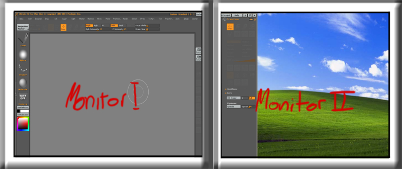
this is what i found out, correct me if im wrong: zbrush doesn´t features a dualmonitor view, right?
This is what u can do, when ur using the right panel: drag the window on ur second screen, till ur right panel fits into the window of the right screen. (first ugot 2 push the button beside the close button (x))
greetingz ever
[attach=26005]bspdualmon.jpg[/attach]
Attachments
good idea Ever.
i usually reserve the second for ps or the other hundred things i have going on at the same time but it is nice once in a while to just have the old z being the only thing visible on both!!
I customized the rest of my interface, but I’d like the document background to fill the screen, as well as be a darker color.
I’d also like to change the light set up to use a warm / cool light color vs. the default white.
How do I make these changes and have them remain as my default startup ?
Thanks for the help !
once you set the document the way you like it, go to documents>save as>
and go to folder Zstartup and name the file StartupDocument.zbr
that should recall the document size that you’re like working at everytime you load Z.
Its on Zbrush documentation btw if you just read the manual and the help topics.
not much of a customization, but I thought I’d share it.
[attach=28924]Untitled-2.jpg[/attach]
Attachments