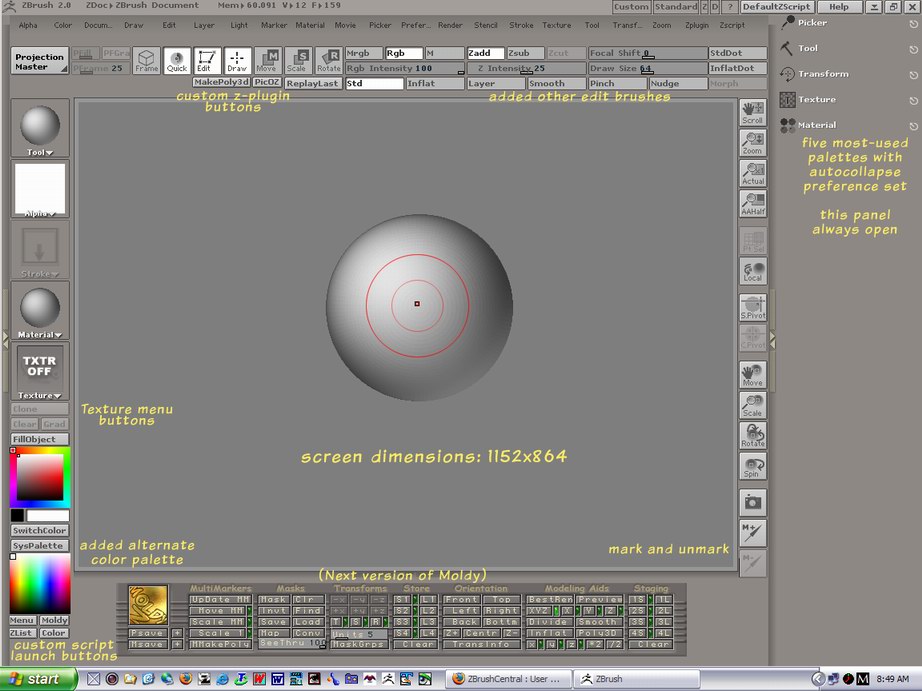
ZB2 gives us a lot of options for modifying the standard interface to better suit how we work. I’ve seen several custom interfaces posted and thought I would start a thread where people could post tips and examples of alternative layouts.
I’ll start with my own by posting the current state. The changes are not radical, just a few added buttons and controls along with several custom buttons loaded as plugins. One thing I spent some time on was modifying the colors for the interface (and the look of Zscript - buttons and skins).
I run the screen at a conservative 1152 x 824, but may move up to 1280 x 1024 for more canvas space. One very useful key is the tab key - toggles the shelf on/off - but leaves visible whatever current ZScript is running.
I’ve preloaded the right panel with five palettes that I use most often. They are there at startup. They are set to autocollapse, to minimize scrolling to find stuff. When I need extended use of another palette from the main menu list, I move it temporarily to the right panel so I can keep it open… then drop it when I no longer need it.
The remaining edit brushes have been added to the top shelf as a third row, below and to the right of the standard draw controls. Handy.
So, that’s it… nothing brilliant but its what suits me at the moment, at least until I see what other ZBrushers have done.
Sven
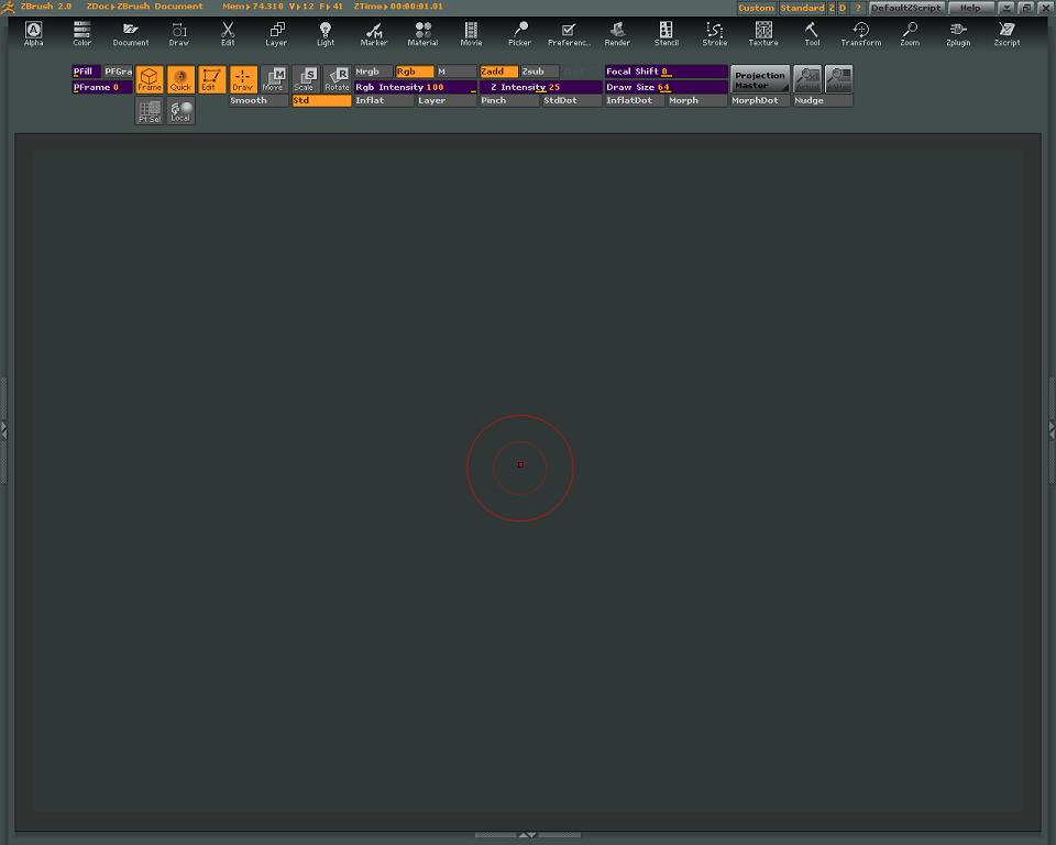
[attach=36804]user_image-1087825470lrq.jpg[/attach]
Attachments