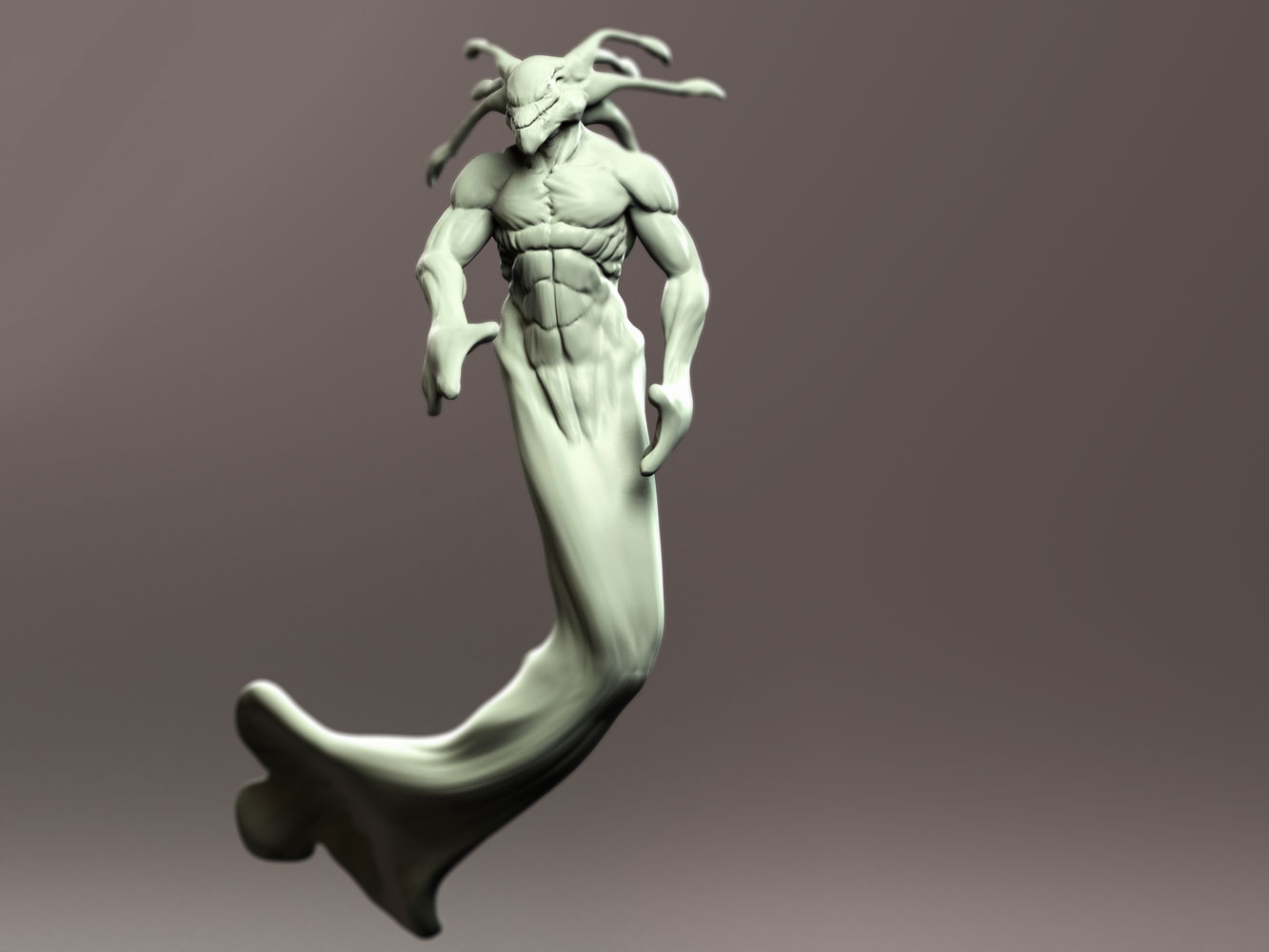
Hey Everyone,
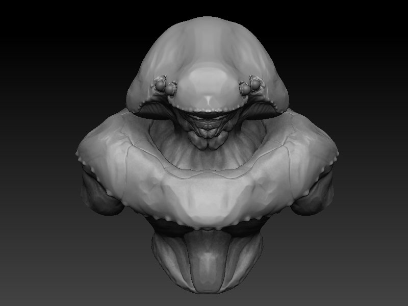
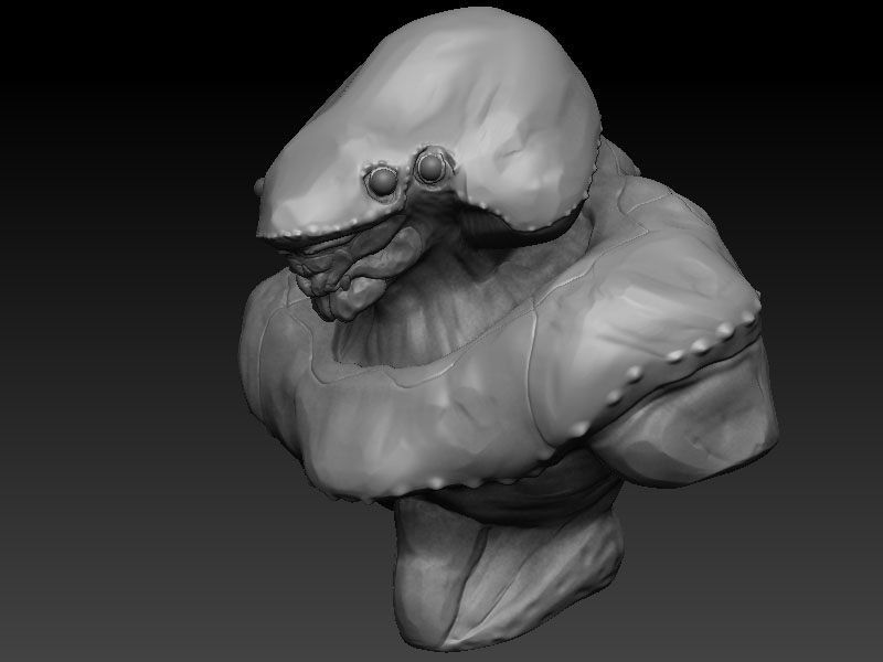
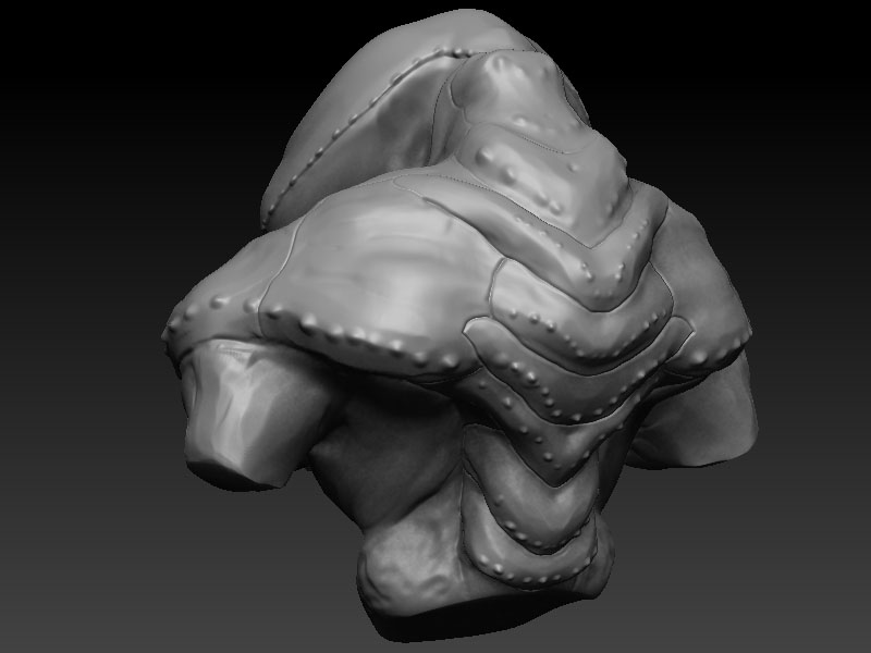
Wanted to post up my recent stuff. These I did for fun, hope you guys like it. I post up often on my blog www.delvolta.com if you want to check it out.
- Danny
Attachments
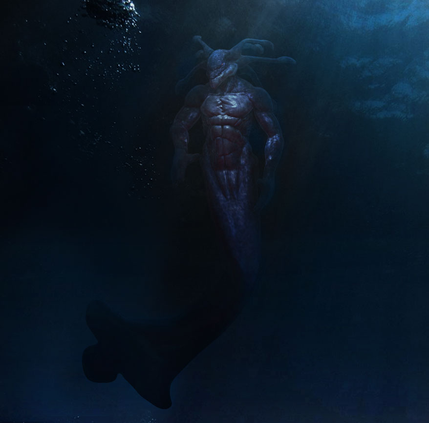
Hey Everyone,
Wanted to post up my recent stuff. These I did for fun, hope you guys like it. I post up often on my blog www.delvolta.com if you want to check it out.
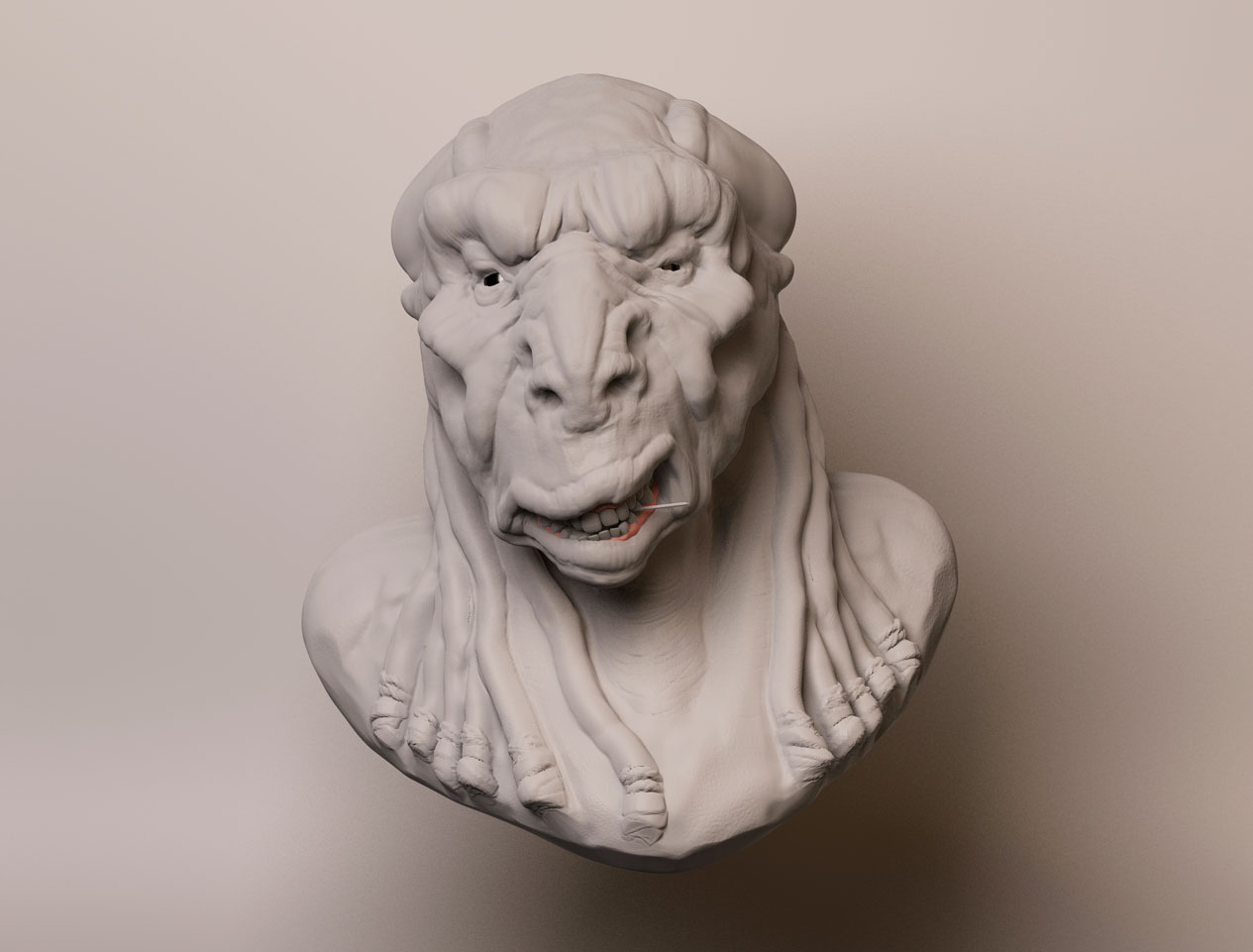
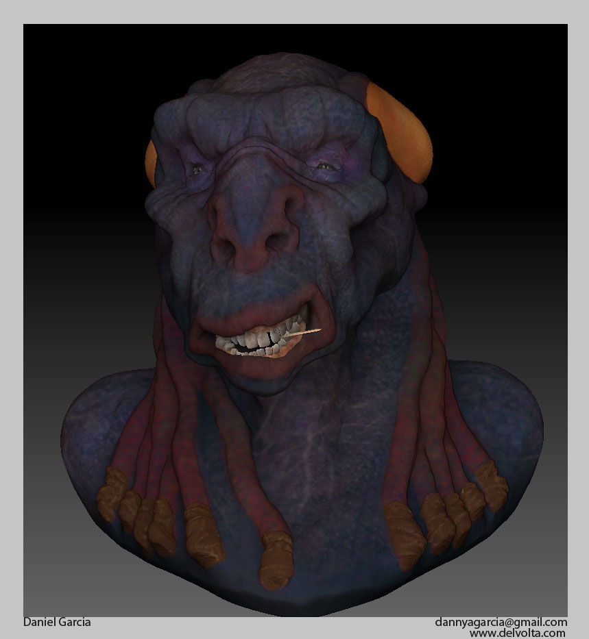
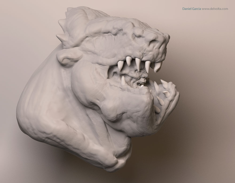
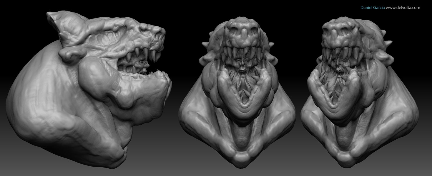
Hey Everyone,
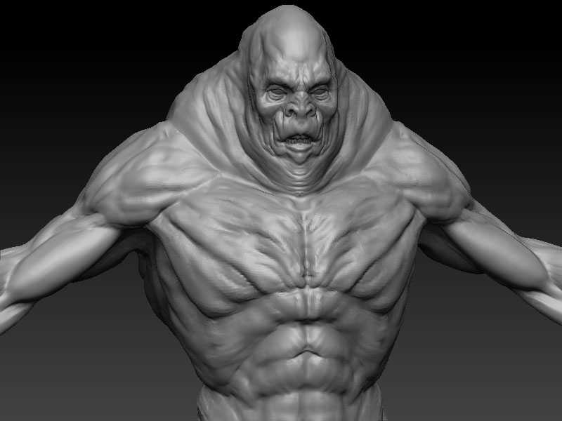
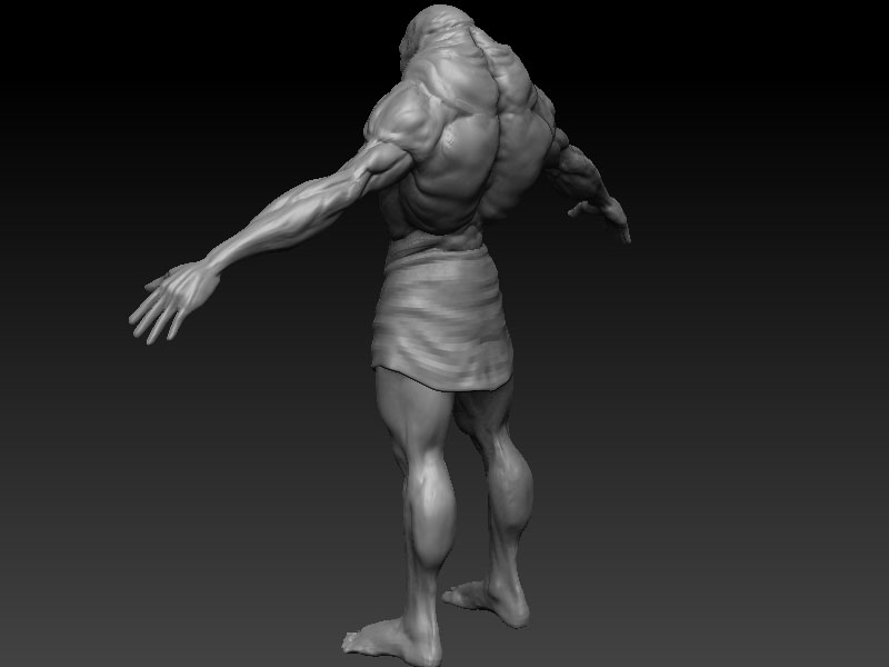
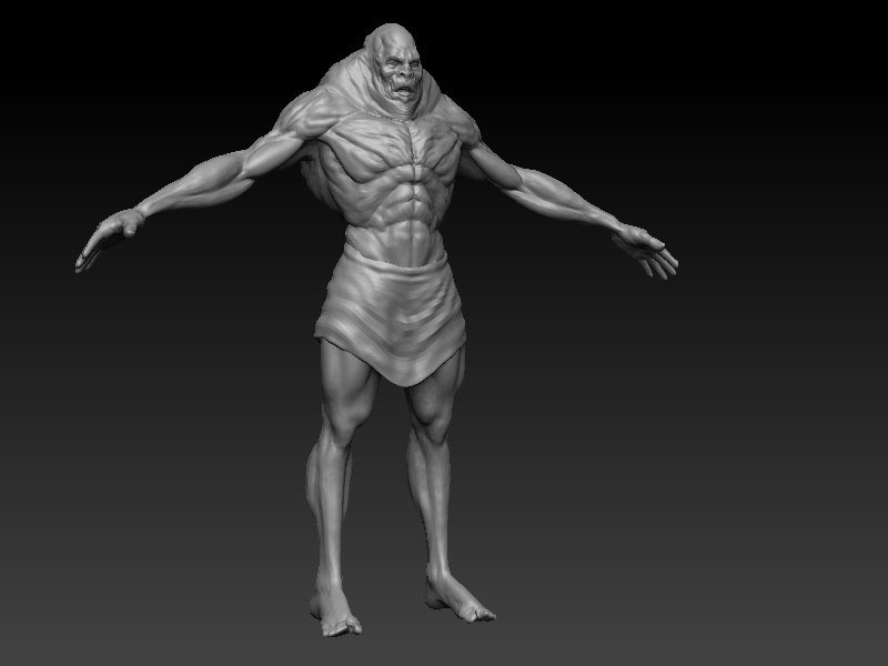
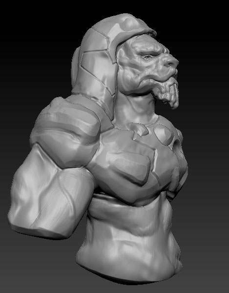
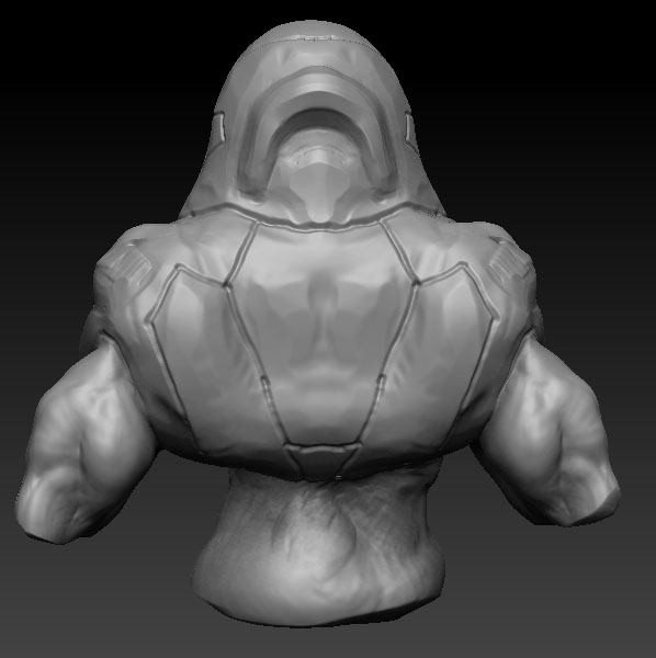
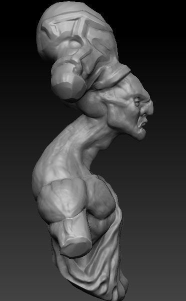
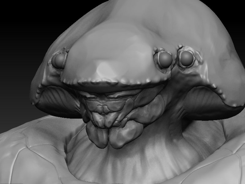
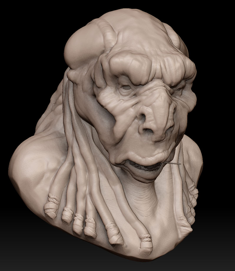
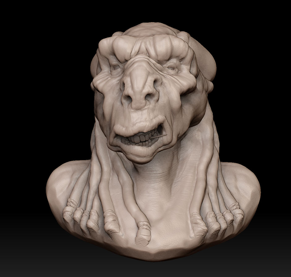
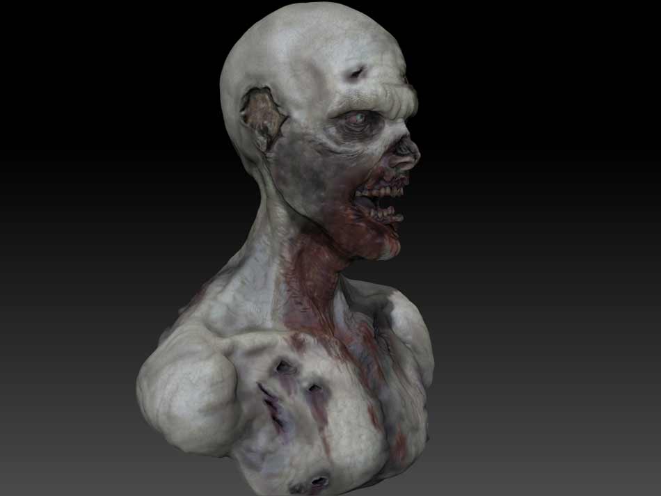
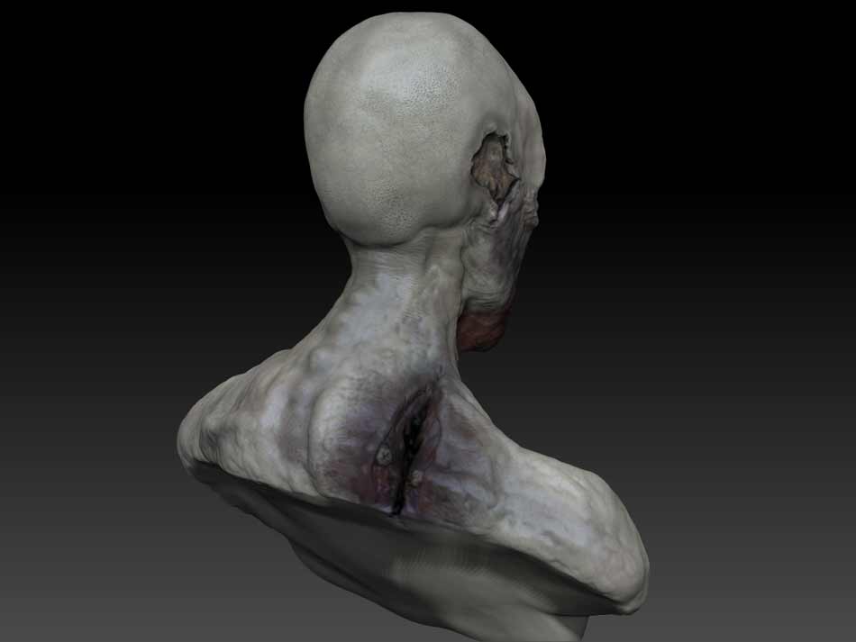
Here is a quick sculpt that I did at a workshop. Started from zspheres and pretty much came up with this guy. Enjoy 
having fun are we?
haha, yea. I’ve been busy with work and its just fun to just let your creativity loose when you can. I’ll be doing more as the days go by.
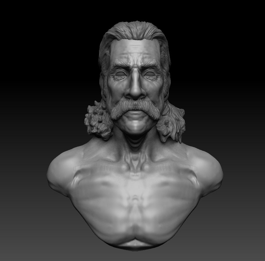
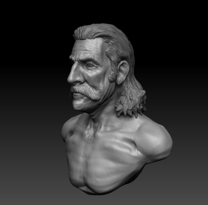
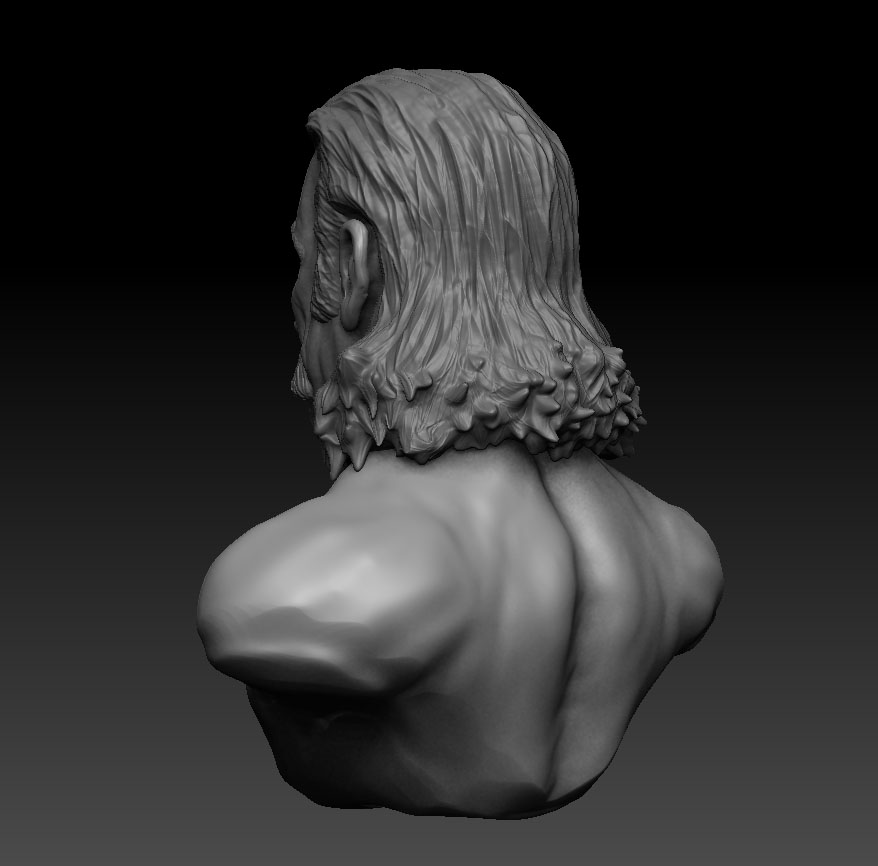
Hey everyone, since livestream has drastically changed my life, I’ve been posting videos of this current project from start to finish.
I usually work on it for a couple hours a night, which would be 8pm madrid time, roughly.
so if you want to drop in around that time i will be sculpting most likely. If you miss it, then you can see the video as much as you want here or on my livestream channel. Critiques welcomed =)
<iframe width=“560” height=“340” src=“http://cdn.livestream.com/embed/delvolta?layout=4&clip=pla_491c851d-a541-4edf-a576-97833ba6e19e&height=340&width=560&autoplay=false” style=“border:0;outline:0” frameborder=“0” scrolling=“no”></iframe>Watch live streaming video from delvolta at livestream.com
<iframe width=“560” height=“340” src=“http://cdn.livestream.com/embed/delvolta?layout=4&clip=pla_59938703-eb76-4d87-95ad-826d42378318&height=340&width=560&autoplay=false” style=“border:0;outline:0” frameborder=“0” scrolling=“no”></iframe>Watch live streaming video from delvolta at livestream.com
<iframe width=“560” height=“340” src=“http://cdn.livestream.com/embed/delvolta?layout=4&clip=pla_0784f710-15ec-4b79-a72c-6c1a2ec78f25&height=340&width=560&autoplay=false” style=“border:0;outline:0” frameborder=“0” scrolling=“no”></iframe>Watch live streaming video from delvolta at livestream.com
<iframe width=“560” height=“340” src=“http://cdn.livestream.com/embed/delvolta?layout=4&clip=pla_b1b3171e-b75f-4b52-a05e-be0897eb6a7e&height=340&width=560&autoplay=false” style=“border:0;outline:0” frameborder=“0” scrolling=“no”></iframe>Watch live streaming video from delvolta at livestream.com
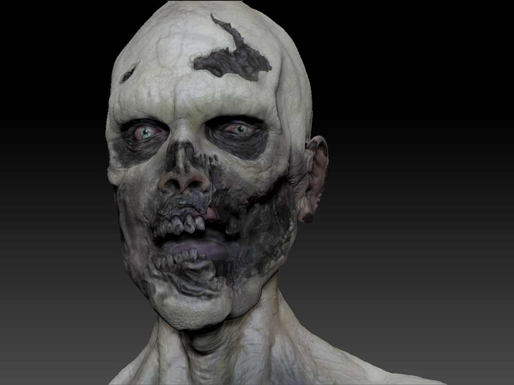
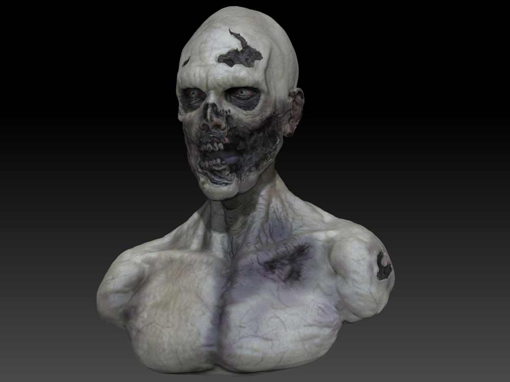
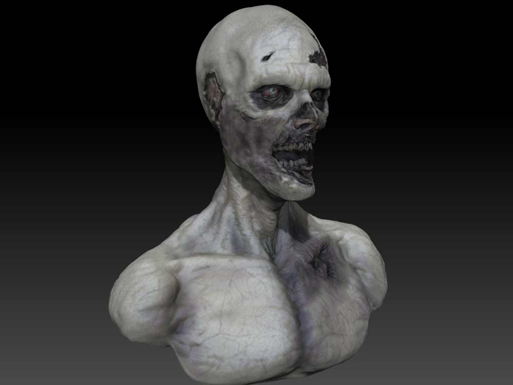
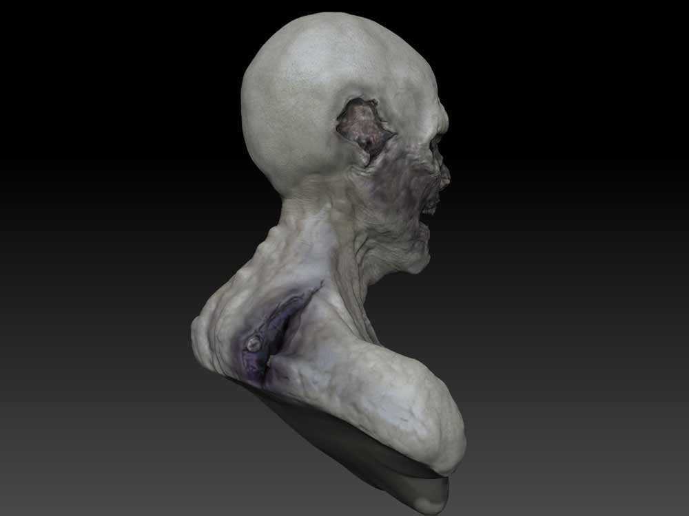
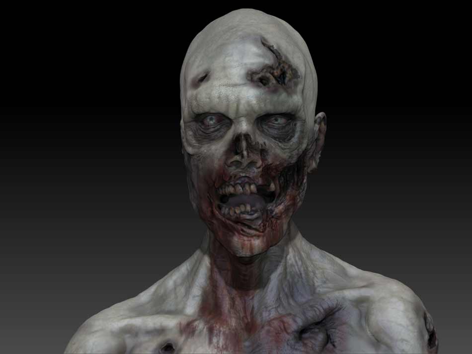
Here is some progress snapshots of the zombie, Happy Halloween =)
Tremendo ese zombie.
Great work.
Looks damn cool…!
I would make the eye more white, it could feel more dead, like how it seems to show on your video thubnail, polypaint 4.
Hey why dont you try my eye shader:
http://www.zbrushcentral.com/showthread.php?46175-Matcap-repository/page13&highlight=matcap
On the eyes/teeth/ blood areas it would give a wet feeling… Just a suggestion…
cool stuff!
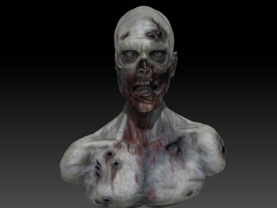
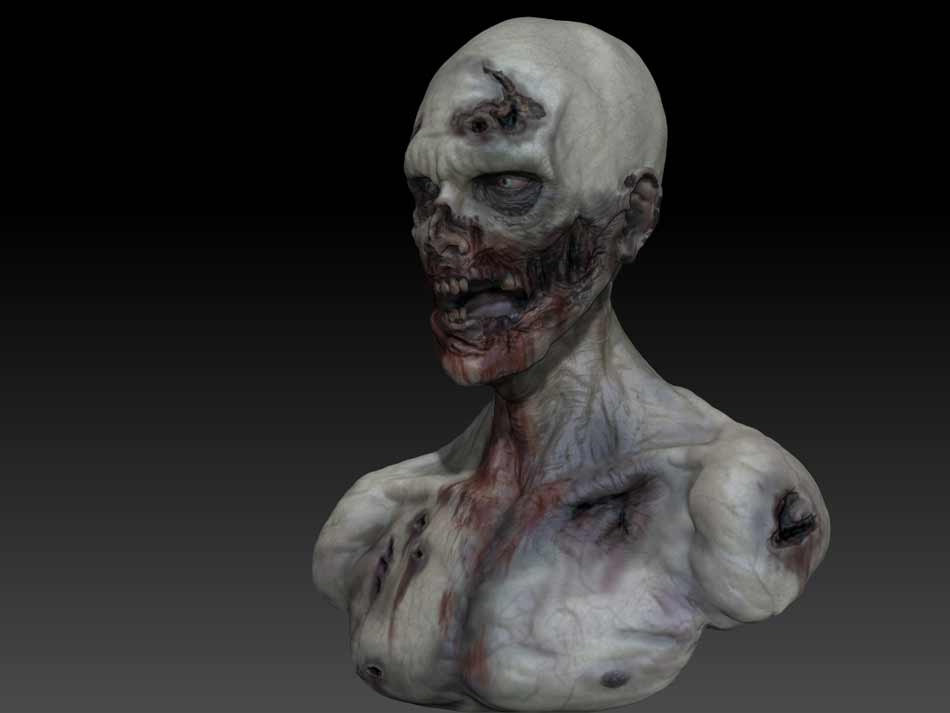
Added the Blood and did a touch up of the details
<iframe width=“560” height=“340” src=“http://cdn.livestream.com/embed/delvolta?layout=4&clip=pla_060f7434-0945-44b9-9db0-1b0f49cd908c&height=340&width=560&autoplay=false” style=“border:0;outline:0” frameborder=“0” scrolling=“no”></iframe>delvolta on livestream.com. Broadcast Live Free
Started the Retopo
<iframe width=“560” height=“340” src=“http://cdn.livestream.com/embed/delvolta?layout=4&clip=pla_bff22b3f-b125-4581-92af-edb3a662b19d&height=340&width=560&autoplay=false” style=“border:0;outline:0” frameborder=“0” scrolling=“no”></iframe>delvolta on livestream.com. Broadcast Live Free
Davitxu - Gracias XD
Sebcesoir Thats a good Idea with the eyes, maybe make them seem as if they have cataracts. I love the shaders man, but I’m planning to take it to mental ray for the final renders.
But i will consider using them on future sculpts. Thanks again =)
Did some test renders with a basic material. Wanted to get the hang of it before i start to get in depth with the subsurface materials. Hope you guys enjoy this =)
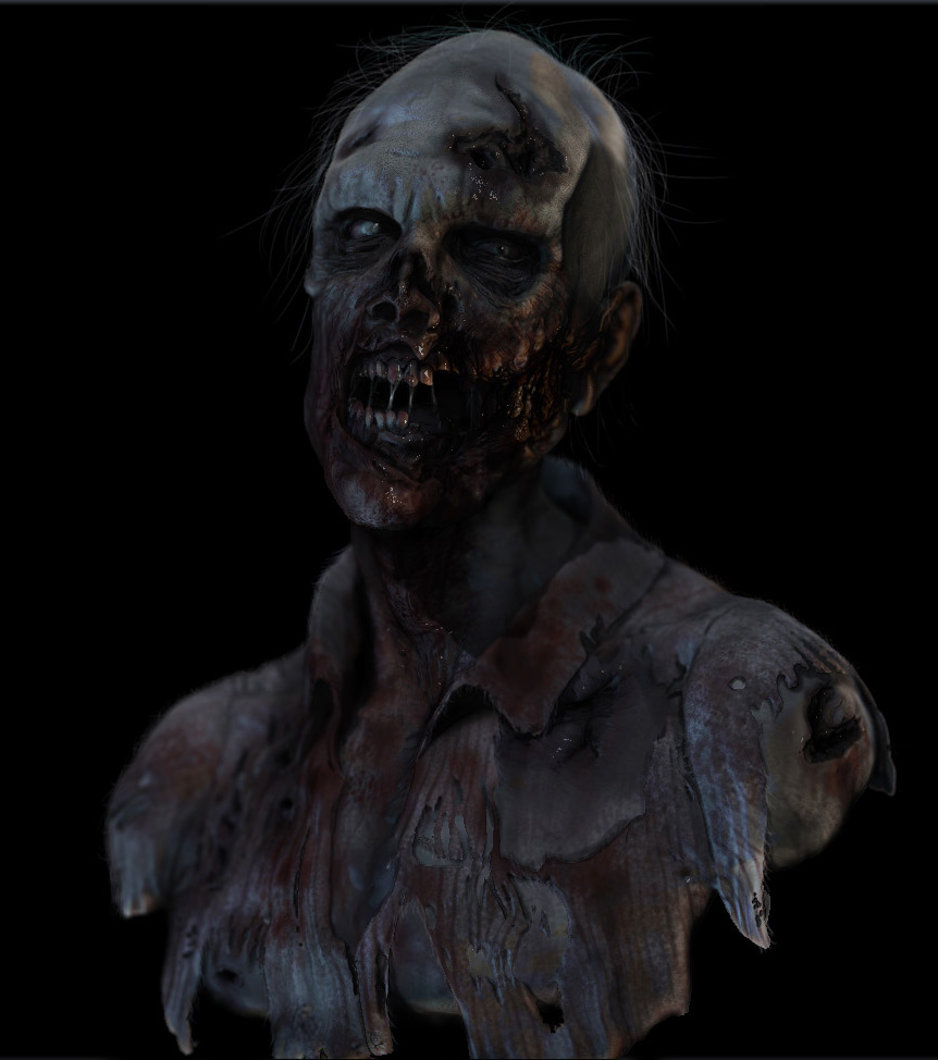
Hey everyone, I did a another render of the Zombie, this time its more of the direction I want to take it. If you guys have any critique or suggestions, they are more than welcome.
Danny =D
This is coming along really nice. Better with every post. Getting some good, dynamic, dramatic lighting will really help sell this guy. I can picture a “slash” of light coming from the upper right corner, down to the lower left corner, along the character’s left side of his face, down the neck area under the jaw, to the exposed skin in his chest. That would be the main, directional key light. With that, the best parts of your model would be lit/showcased, the diagonal angle would add some tension, and it would imply something outside the scene, blocking some light, like a door or a window, which will add to the drama. His left shoulder would be moderately lit, but not as much as the main main face/neck/chest area, and his far right shoulder would be in shadow. That would give it some nice depth and atmosphere. Also, go easy on the depth of field. Subtlety is key. It shouldn’t be as noticeable. Folks often get carried away with it, and it can be distracting, despite the fact that “it’s cool looking”. Like when people get carried away with subsurfcace scattering. If you notice it, it’s probably too much. Subordinate “cool looking elements” to the overall impact of the entire image. Know what I mean? This of course, is just my opinion, and I don’t claim to know what I’m doing 
That being said, this is a cool model, and some good lighting to help push the look/feel/mood/atmosphere of the character will really help seal the deal. I think you just took your game up a notch with this model. Keep it up.
I like the idea fattkid, i will do a lighting paint over him and see where that takes me. I’m also going to go back and fix the shirt, it looks very funky to me looking at it again.
appreciate the critique small_orange_diamond:D
Should I add a background of some sort or keep it black, what do you guys think?
In my opinion - I’d say add a background. Maybe nothing in particular, more so something subtle and atmospheric. Some fog/smoke, with some areas hit by light, other areas not maybe. Maybe Some trees in the distance? Or maybe an old cement wall texture, with the opacity set low, and a gradient from top to bottom, as it fades towards the bottom. Point being, the character is posed and has an expression - there’s a story going on. So some sort of background/atmosphere will place the character in that story situation, and help sell the feel of the design and image, more so than the character sitting in a black void. Know what I mean?
