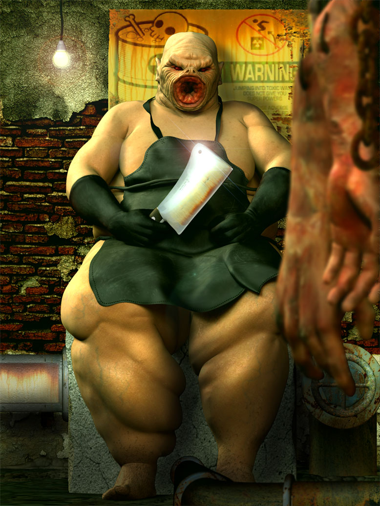
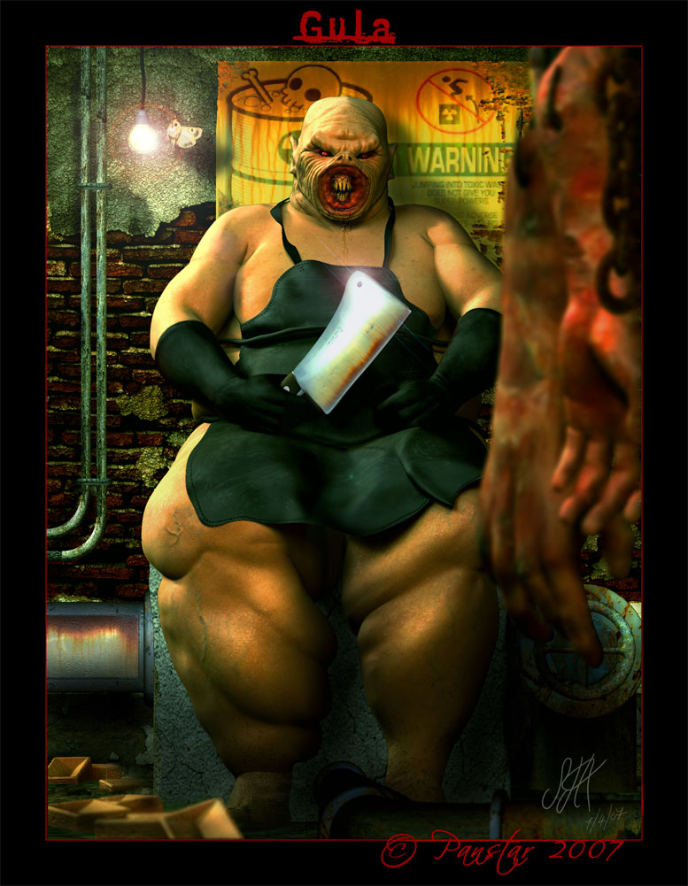
Well heres another update, with the severed limbs in the forground, I’ve also elarged the warning sign, Now I ca nfeel it balancing out. Still that bottom left corner to deal with, and Mark Offal!! you just might have given me the idea, a line of intestine snaking over the pipe to the floor!
Ok before I post it, off subject question. Is anyone experiencing problems posting in the forums, using firefox browser? I’ve had to boot up Explorer to post this as in firefox, this page won’t show any images just tags and if i try to post the txt box is static so I can’t write or do anything. This is the same for all thread i open can’t post via Firefox.
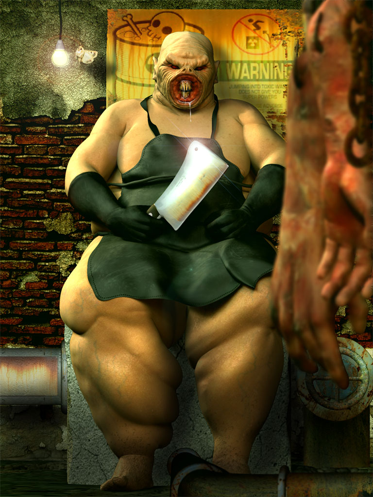
ok heres the image

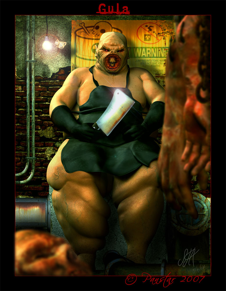
Attachments
 ]
]

 ]
]
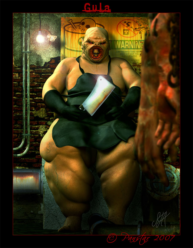


 D
D
 D
D