ZBrushCentral

The Killing Joke (WIP)

Hey guys. I wasn’t going to post a WIP, but I’m not particularly satisfied with the way it’s turning out. I need other artist’s point of views to see what I can touch up on. I don’t like the black shirt (collar) or tie (recommendations?). I still need to finish the hat as well, and do hair. When I do his eye, I’m going to put it in the lens and see how it looks. I wanna know what you guys like and what you don’t like. BTW, this is a draft render with Mental Ray. So please excuse artifacting. I’m hoping to get some good tips between here and CGTalk. Thanks

zbcthumb1.jpg
[attach=151198]JokerWIP3.jpg[/attach]

Attachments

JokerWIP3.jpg

hello sir. I wanted to give you an honest crit. hope im helping !!

from what i see in the render i have to say i dont really see to much wrong with the piece. i think the wrinkles just above his eyes look a little bit wierd. ( like they dont belong). the nose looks good. the ear needs some work. the tie looks like a hard surface object. it has an un natural shape to it. the left part of the piece looks a little bit dark. ( the right side is bright so it kinda throws off the balance… i think the gloves and the mouth look real good. oh and nice work on the jacket.

i wouldnt put his eye thru the lens because in reality you wouldnt see it. inside cameras theres some mirrors and bunch of moving parts. maybe a reflection of what hes taking a picture of would be cool. like batman crying like a baby or somethin…

thats all i can say. the piece as a whole looks prety sweet. just needs some work on the small stuff to give it that little thingy that makes good art.

oh and one more tiny thing.i think you cropped the image too much.

nerveink: I think he cropped the picture too much to match his reference, which is the cover of The Killing Joke graphic novel.

Anyway I can’t see much wrong but I do agree with the tie, and I think the problem is that it looks too much like a hard surface than it does a soft cloth tie.

The wrist in the foreground is the one thing that jumps out at me. I know it isn’t textured yet, but I can look past that. The problem is that it’s too tapered. The wrist area has more of a rectangle shape than a cylinder, and it doesn’t really taper.

I’ve been meaning to read that novel. It’s supposed to be great.

Can’t remember how close this is to the original Bolland cover, but it’s looking great. A few last tweaks and it’d make the perfect alternative cover!

Sweet!

That looks sick dude, I liked it on facebook and i like it now

my only critic about his tie, rest of the scupture is far beyond my artistic judgement :slight_smile: 
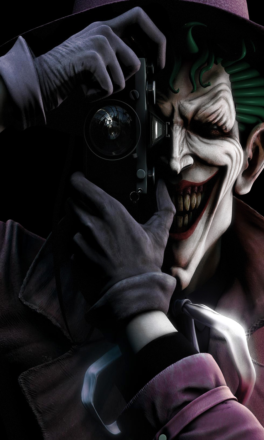
i hope one day i can achieve something like this. Btw dont hesitate to share any high-res version:)
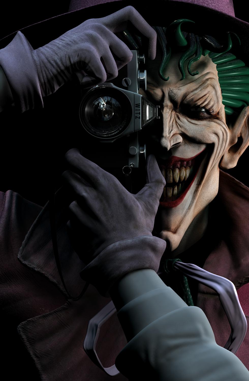
been getting a lot of feedback from other sources. I put temporary geometry as hair until I actually do the hair and eyebrows. Still needs a lot of work, but here it is as of now:

[JokerWIP6.jpg]

I recognize the HDRI you used as the reflection map for the lense :slight_smile: I think that’s one from Paul Debevec’s site.

Looks like this could be a top row when you finish!
Make sure to post lots of ZBrush screen shots when you finish.

Keep up the great work!

cool image - just the hair looks a bit pluged in but cool work man :wink:

Ok, I’m at the point where I really need you guys to tear this apart. Anything that you guys can think of that would make this better, please let me know. If I get no feedback, then all I have left to do is the hair and eyebrows. Hopefully I’ll get some good responses. Thanks

edit: pardon the pixel aspect ratio. when I opened it with PS, it gave me a warning but this isn’t the final piece so I didn’t care to fix it. I just added a diffuse glow over the face and an occlusion pass.

[attach=152414]WIP7.jpg[/attach]

Attachments

WIP7.jpg

This is really quite a remarkable image.

When I looked at the first image my immediate response was that perhaps the teeth are overly rotted:) The colour doesn’t seem quite right to me.

Having said that it is a remarkable image.

Best wishes and keep up the great work.

Paul

You should try putting a reflection in the lens of Barbara Gordon bleeding on the floor :cool:

ok, well I’m putting this aside till finals are over. It’s going on the “end of semester” reel as this, but I am still not done. Anyway, I hope you like it and I still would like C&C. Thanks

[JokerWIP9.jpg](javascript:zb_insimg(‘153382’,‘JokerWIP9.jpg’,1,0))