ZBrushCentral

Squiddy WIP

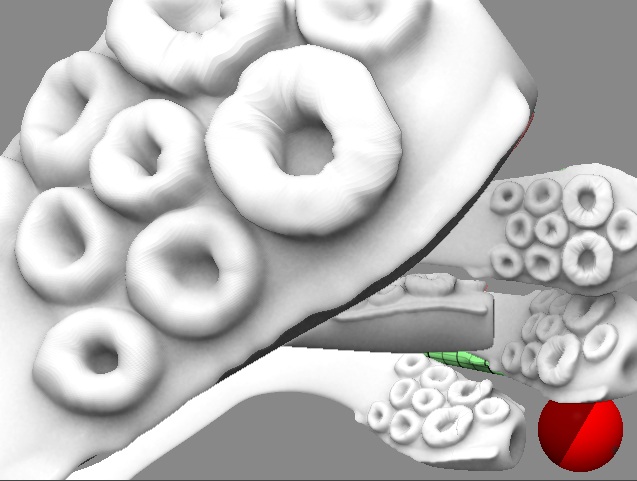
Coming along nicely. I had a few minutes to provide what I promised. You are almost done, but for the future… :wink:

This was done fast, I provided the script as well as image. Some care needs to be taken to do more at a lower level and smooth the outer edges, but I think it explains the idea similar to what you see in the feature POTCDMC that was out this summer.

Note: it’s a very poor zsphere structure - for those thinking I provided a near live tentacle to play with. I ws experimenting along the way. :wink:

Picture 1.jpg

Attachments

Picture 2.jpg

Ron Harris, Thanks for your feedback. As you say, he’s not quite right. I’m not totally happy with him but I’m at the stage where I can’t go back. If I designed him and built him again then I would do a LOT different. I hope to make him more weathered in the final image, that’s when I’m going to hang seaweed from him and add the barnacles and such. And, photoshop talent willing, also have water pouring off him… but that maybe pushing it a bit too far. :slight_smile:

As for mixing crustacean with cephalopod… I wasn’t sure how to give him a realistic bipedal cephalopod body. Something that could withstand the weight of his head. It’s odd that you had a picture of Dr Zoidberg in your mock-up. :) he only came to mind a little time ago. Could be Zoidberg’s long lost uncle. Wooop-wooop-woop! Rory L, Yus, Will had them bits and pieces very soon. Jason Belec, Thanks for that script. That would have been a good way to do it……. but… I was being lazy due to the several hundred (probably thousands) on all the tentacles. Next time though. :) Right, I’m trying to put together the final image. The idea of using a more extreme pose fell through. The detail in the model went the same way at the head model and it would have meant doing a hell of a lot of work to get it back. So here’s an early image with temp rocks and photoshopping for shadows and stuff. He still needs to be filled out with extra tentacles (possibly wings if they don’t silly), barnacles, shells, depth cueing, depth fogging to give him a bit more depth, fake SSS and proper lighting and a shinier material.

final_large_04_test.jpg

C and C is welcome but I don’t know how much more I can shange without going totally bonkers. :| Thanks for your patients. MX

It coming along very nicely! Its a bit too saturated color wise (his colors) and I think more of him could be in darkness. Perhaps a lighting strike could be the source for illumination, and the rest in silhouette. What you can’t see is scarier you know. This scene looks like its a horror scene, yet as it is, isn’t very scary due to lighting.

It’s only temp lighting for now. Trying to get the light to cast long shadows. No such luck so far. :confused:
I hate this brain of mine. I keep getting to a stage where I think he’s looking OK. Then about an hour later I think it sucks

MX

Are you using zbrush or something else? I would probably render in an external program so you can get cool perspective effects.If its a zbrush render I would just ask in the question section. Aurick is pretty quick about answering questions.

hey mxhaunted!

i’ve been checking back now and on this one. great work. i like the design of him.
as for crits (-apart from what you said yourself). if possible, i think you should blur/smear the shadow he’s casting on the water infront of him.

-r

you might be able to use the new ez-extruder plugin to make better suckers heres a linkhttp://www.highend3d.com/f/dl-4253…truder-Ver2.zip
this. There’s a thread about it on this main forum.

ok so that link doesn’t seem to work so heres where it was posted first
create clothes with ez-extruder. this thread is where you’ll find the plugin.
hope it helps you.

Contrasts - lighting is off between your character and the cave. At this point in your work, lighting is more important than almost anything. Then you can focus on areas that are visible/in-focus. As for the suckers, another idea would be to use the scale tool and click and drag on various suckers to create a more natural/soft-flesh look. This will get you away from the computer generated look - the purpose of Zbrush after all. :wink:

I tripped over this while rendering out a few passes. I thought it was quite interesting. Mike Mignola, eat your heart out! :slight_smile:

[white and black.jpg](javascript:zb_insimg(‘40479’,‘white and black.jpg’,1,0))

Thanks for comments. Will reply to them on my next post. MX

Reminds me of the Wally Wood style [out of Mad magazine] I used to try to copy when I was a kid. This looks great!

Nice man :wink: The B&W render looks really intense, very graphic in style. When Zbrush 2.5 is ‘eventually’ released somtime this millenium, posing creations and rendering them for comic strips should be a piece-of-piss, scuse my language! :smiley: :stuck_out_tongue:

The B&W render is the best so far in my opinion, it really brings out ‘something’ (I dunno what exactly!?) in the character. I think you should work at it and try for a final render something along the same lines, without losing so much detail if poss :wink: You mentioned earlier you were going for a Mignola look, didn’t think t would be quite so literally. I’m not complaining though :smiley:

Great stuff as always :+1: :+1: :+1:

I thought the previous render looked great, but this one is amazing. If I didn’t know it was 3d I’d never have guessed.

It gives your detailing of Cthulhu much more credit :+1:

How did you get this look. please post material n stuff that you used.

Thanks for the comments.

Angelstein, it was just a mess-around render. Just curious to how it would look. A bit of a happy accident. Domodab, it’s very basic render. It hasn’t even got shadows turned on. If I spent a little more time I could have given it shadows but it would have had to have the contrast tweaked in Photoshop. I’ve included the material I used. I’ll have to give that extruder a go. Looks very useful. Something I can use on my next piece.

MX

Hi Mxhaunted,

I agree with Bimm, the last render is very cool and would never guess that it was from a 3D model. Indeed, very graphic and very very cool “drawing” :wink:

The pose seem better walking wise :+1: I’ve attached a fast pose just for reference -it doesn’t make any justice to your model but it’ll explain more my opinion- Of course mine looks like he’s on the catwalk :smiley:
Just remember that the arm and the leg that’s left behind should be smaller than the one in front because of perspective

As the great greek philosopher Dennis Miller said: That’s just my opinion, I could be wrong :sunglasses:

Attachments

Untitled-1.jpg

Thanks for that mx. I could really see this monster in a film. Top quality. Its probably a redundant point, but i don’t really like the wings. Not the modeling mind, thats top notch like the rest. Its the size. why woud it have wings that couldn’t lift it? then again there are flightless birds that have wings.

That last render you popped in that was B&W was great! Really captured him! I’ve been watching this thread for a long time and I don’t like being the ruler in the fist guy. I think it’s time to either wrap this baby up or move on. You’ve done some great renders and it’s been totally awesome to watch the progression of this guy. It seems lately it’s been going in circles. I’d hate to see this guy go on forever because you’ve shown some really, really great skills with ZB and I would love to see what else you pop out of that skull of yours. My advice though, take this as a modeling expedition and move on to the next experimental development. If you don’t think it is finished, that’s totally cool and I wouldn’t argue with you. Maybe put it aside for a while and do something else then come back to it later refreshed. It’s like bobbing for apples blind-folded with one lead apple in the bottom of the barrel.

Firerbert, Yus, I’m thinking the same thing. I can rework this for ever but sooner or later I have to give it up and move on. I need a break from it as well. I’ve sat in front on my computer for two nights in a row and can’t bring myself to getting it finished.

I’m not even sure what to start on next. I thought about doing another zombie as my last one came out a bit… cr*p. But are there too may Zombies already?!

Edit: It could be a good time to give Modo a go and also get a character worthy enough for render in another package other than Zbrush. Even though I like Zbrushes use of curves and such, it still lacks features that other packages have.

MX

The lighting on the ink one is stunning! Looks straight out of a graphic novel. I’m going to have to test this material out! Have you tried superimposing this over one of the simplified color versions you posted? I think that would be a cool effect too. This character is definitely worth trying to render in a different package. Beats any zombie.