I would either beef up his legs or taper down his obliques. Great sculpt.
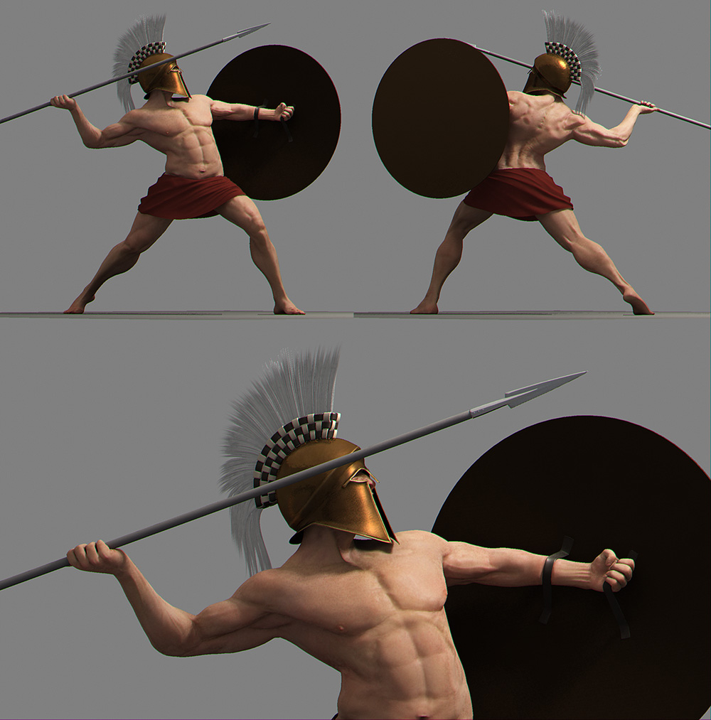
I really enjoy this sculpt. Very expressive and precise. But I have to say, the original pose was much, much better. You could really see the power in his leg and core. The new pose seems to be lacking balance and thrust.
I’m excited to see where this one goes !
The new pose looks perhaps more like a throw than a thrust like the other pose seemed, but I agree that it is somewhat less passionate.
Thanks everyone for the replies!
Chris Andrews- That’s just it. To me the old one looks like a mere pose but the new one looks more like a captured moment in time. I wanted to get some movement into it. I hope I’ve achieved it. Thanks.
nerveink- The skin is mentalray sss at default settings, no textures, just normal map, rendered with the physical sun/sky.
taemee- Thanks, I’m glad you think so. I’m about half way through this I reckon. Gotta make all the textures, some more pieces of armour, sandals and a patch of ground for him to stand on. I just like to take what I currently have into maya and render and light it with nice settings, as a small break from sculpting and texturing.
gb_havoc- Ah I see. We can have our two guys fighting each other, hehe. Glad you like it.
DAnconia- I guess then I’ll beef the legs up a bit. I think they grew slightly thinner after all the transposing. Thanks for pointing that out.
erichp & Twitchmonkey- You think so? Ah well I actually much prefer the new pose more. You are probably right in that the old pose has more power, but I think the new one has far more passion and life in it. But one reason I probably like it so much more is that it took me so many days to get it to this pose, being far harder than I expected, and am now attached to it. Besides this is really what I wanted from the start, a captured moment in time of this guy throwing his spear. Thanks for your input!
Hello again. Started texturing the skin, and have also changed the lighting. The model is now lit by a mental ray area light and a light emitting dome.
Here it is.
[ ](javascript:zb_insimg(‘89001’,‘Renders16.jpg’,1,0))
Hope you like it.
Attachments
Lookin’ good! Sculpting is coming along very nicely. I can really feel the energy it has. I think his elbows need more attention.
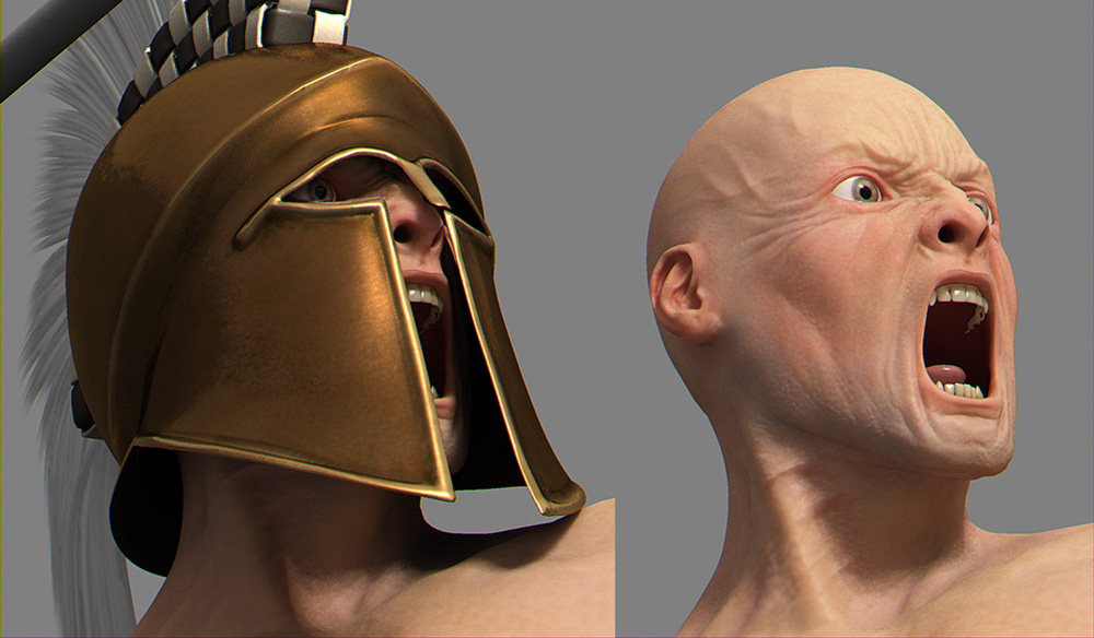
looking very nice! Only suggestion I have is he’s a little pale…perhaps a bit of a tan is in order 
amazing work.
This is very cool. I wish I could model like that.
Ah this is looking great dude, i’m still feeling the old pose but i’m still not going to kick the new one. Skin shader is looking nice, maybe some darker stubble to break up the areas of the face a bit more. Great expression too!
Chris.
Really cool Pap87! The front foot is definetly firmly on the ground and it adds a real sense of gravity. Congrats.  small_orange_diamondsmall_orange_diamond
Nice job. The anatomy is really good, and the facial expression is nice. Bring the bottom lip up a bit, and move the lower teeth down. People generally don’t expose much of the bottom teeth when they have their mouth wide open. Is the helmet done? I think it could use a dirt map, and a map to break the spec up. Add some uneveness in the metal too. Ma ke it look like it has seen a few battles.
Overall, great work.
KrakenCMT- Thanks very much! What is it about the elbows that looks off?
EvilSmiley- You’re right. I’ve darkened him a little now. Thanks.
mustan9- Aww thanks. I wish I could model and sculpt like some of the members of zbrushcentral.
ChrisAndrews- Stubble has been darkened a lot now (maybe too much?)
ryankingslien- I’m very happy you like it.
JesseGraffam- Thanks! More work will be done on the helmet. Your suggestions will be very heplful. About the lips, I’ve just basically copied what I could see in the mirror, so you may be right in that generally you don’t see so much of the bottom teeth, but I guess that just means I’m not normal, hehe.
Here is another update on the skin.
[[attach=89185]Renders17.jpg[/attach]](javascript:zb_insimg(‘89185’,‘Renders17.jpg’,1,0))
[[attach=89186]Renders18.jpg[/attach]](javascript:zb_insimg(‘89186’,‘Renders18.jpg’,1,0))
[ ](javascript:zb_insimg(‘89187’,‘Thumb1.jpg’,1,0))
Attachments


VERY nice!
I will only comment that the irises are a bit to large.
26mm sphere - 11-12mm iris (corneal bulge is 60% of globe dia. w/20% projection -roughly)
Really great work…love the textures…one thing…right arm is not to human…muscle in elbow isnt defined…just this…
keep moving.
Amazing work I´m loving this WIP, can´t wait to see it finished. Keep it up man
Looking good.
perhaps a little more definition on the inside of the hand. The muscle for the thumb should be a lot more pronounced then it is in that image.
Color is definatly a lot better now too.
Awesome work. Some of the best CG I have seen lately!
The only crit I have is that it’s not looking as if he is really grabbing that spear tightly, more like he is loosely holding it. Quite the opposite impression of what his left hand gives (though I think the thumb position is a bit unnatural). I think the fingers should wrap around the spear more tightly and the thumb should be clutched to the shaft of the spear. But that’s just me thinking…
As I said, amazing work. Keep going!
A suitably deadly looking Spartan!
Great work! 5*