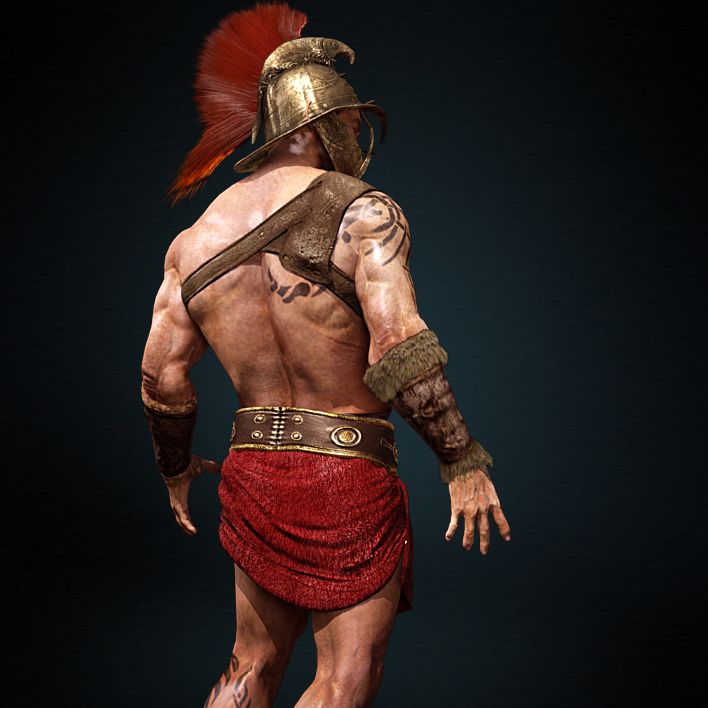
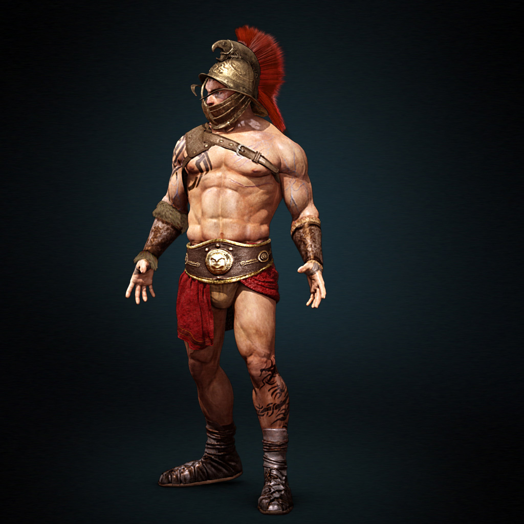
ZBrushCentral

Spartacus Model

hello,
this is our latest collaboration together,its a model for spartacus.
which was modelled textured and rendered, it was originally made for a game but didnt quite make it,
the credits are,
mohammed nabil:character and props modeller and he also handled the uv and texturing for the props and

designed the tattoo on the character.
ahmad nady:character texture artist.
omar mansour:shading lighting and render of the character and hair for the character as well.
please comment on the character and tell us what you think
cheers
Sparta_1hazoof.jpg

Attachments

Sparta_2hazoof.jpg

Really great. Could you post a less compressed version so I can put it in my reference folder? How did you (or your co-creator) accomplish the fur on the helmet?

thanks for the comment, as for the fur it was created using shave and haircut and the shader i used was puppet shader for the hair,the render setting was rasterizer hope that was helpful man

Its a nice looking model, the render does look a bit pixellated though

Because he has the helmet on, he is in the arena, he should have a lot more amour on than what you have given him and also the helmet should have more protection where the eyes are, The tattoos are wrong also, i feel you should get rid of them, he should also have some battle scares, below are some examples of how it should be

Usually I’m the one saying this about all the silly bikini chain-mail on female warriors. Ima keep quiet on this one though, and suggest you leave it exactly like it is.:wink:

thanks for the advice sparky…he had armour and a weapon but we didnt include them in the render, as for the pixelation its due to the low res texture resolution it was originally made for a game and we decided to render it in maya
urchinator,thanks for your comment

I say lift up the stomach guard to cover the abs a bit more.
Also his skin is far to light for a gladiator. This is a man who spent a majority of his time outside in the sun, his skin would be sun dried and dark. his veins wouldn’t show blue like that.

framed world thats a very nice tip you think i should make him a bit darker in color?

absolutely, not too too dark but definitely darker than you have now. and those veins aren’t necessary, match them to the base tone. and the tattoo is a nice touch but isn’t period accurate, I think scars and dirt would definitely bring more to this piece in terms of being “bad ass”

i will see what we can do about making him darker
thanks framed world