Hey thanks guys!
I did try this out on several different alphas and did what I could to remove noise, or to make sure there were not hard to see opaque edge pixels in my alpha which I did find adds to the distortion.
Increasing the size of the alpha seems to work best at removing most of the distortion. I made alphas of 8000x8000 and 10000x10000 and saw a lot of distortion drop out in this case. And then the Poly count of my make 3D shape gets way lower which is good. The 3D shape was almost perfect but not quite. There was still a tiny bit of distortion that I can’t seem to get rid of fully. But it is more manageable. And I think some of this may just be attributed to the imperfect nature of typefaces.
If you notice the ascenders on some of the letters are not perfectly straight but are actually wavy. There are these tiny variations in the edge pixels.
The Subtools Extract method on a plane does seem to work best. I used this before. I just tried it again and I think it’s the way to go.
…I have tried using type tools like Zara. My big issue with them is I don’t know how to adjust the kerning in the programs. Words usually look bad if things like kerning are not adjusted. I tried Maya also but I don’t really like it for type. Unless it’s on like a letter by letter basis.
I don’t think I know of any other type tools?
Does anyone know if there are any other good tools that allow you to adjust things like Kerning?
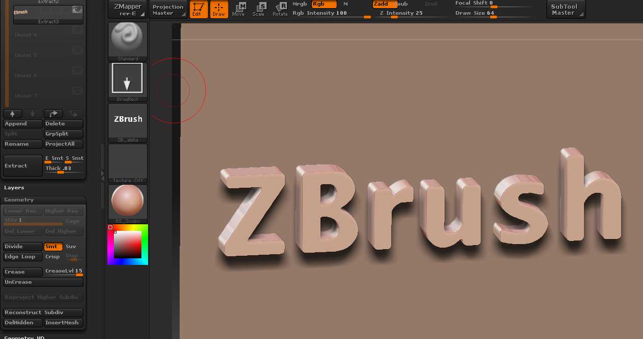
…And this example I’m showing is of the face Bembo. But ZBrush is doing a pretty bad job at making Bembo 3D.
Using Make 3D.
And using Extract it’s still not perfect but I left some Edge Smoothness on so I will see what happens when I bring the E Smt slider down…