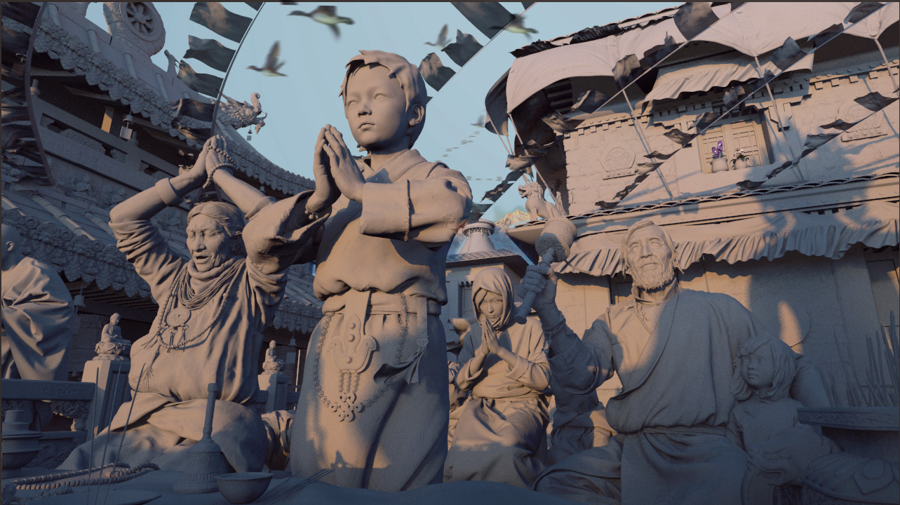
This is just fantastic! 
Top quality sculpting. Good texture work, but theres simply happening too much in this image.
My eyes almost hurts.
In this case I would say that less would be more. Blur some of the detail away using camera effetcs like Depth of Field, to guide our eyes to the essential parts of the image. Even small amounts of blur could help us a lot. For me it feels as if theres simplytoo much goodies to look at.
Awesome!! it is great! inspiring, love every detail on this work… congrats!
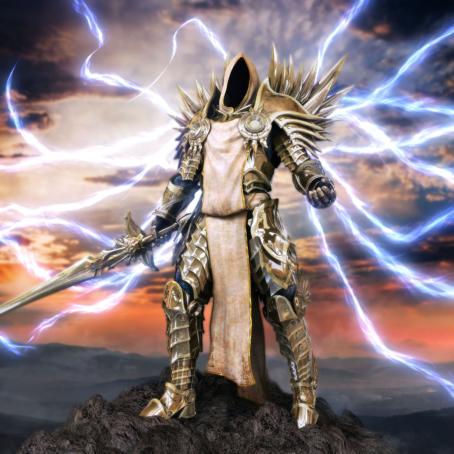
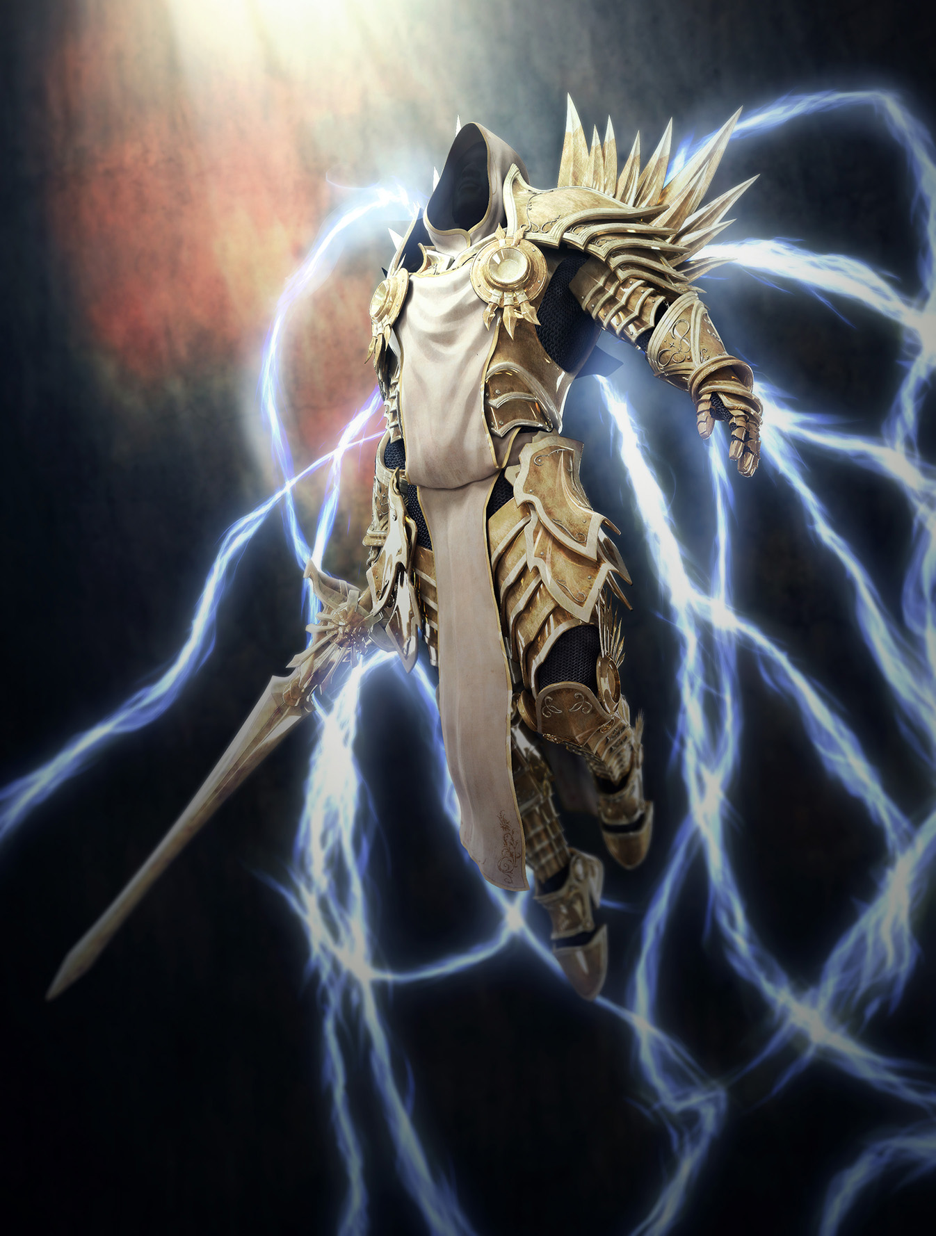
This is definitely not hand sculpted. It is simulated and most likely Marvelous Designer. In the image below you can see the triangulated mesh that is usually seen in simulated cloth from Marvelous Designer.
There is nothing wrong with using simulated cloth, but why hide about it and why say all hand sculpted ?
This is great work but I dont understand why xiaoD is taking the full credit for sculpting everything. The cloth is definitely not hand sculpted.
Guys what the the difference Marvelous Designer ,Poser or ZBrush ! Great work! My Computer what I have could be dead !
i’m sorry about i almost forgot this problem you
mentioned before,i used Marvelous Designer of course,but i have not say it clear
sorry.in fact I first create a simple model in MD, and then to add some details in the ZB every character and the scene.
i have not hide anything This is a trend of recent times
Anyway, still want to thank you mentioned this before I forget.
 werewolf454:I spent about four and a half months time to complete it.
Carsten Lind:I know what you mean.thank for your advise.
thank you all
Amazing work! So much time and thought and loving attention to every detail!
However, I think the composition gets lost in all that detail. It really needs a focus. For a such a grand composition some classic organization strategies would help to really capture the essence of what you are trying to show.
-
For all the focus on detail, there is no atmosphere. Perhaps using some fog or lighting to create a classic foreground, middle ground, and background with the boy being the main focus of the composition. He would receive the highest value contrast and the most saturation. The figures in the middle ground just behind him could be reduced in contrast and saturation. The background reduced even more. It’s basically choosing one element of the comp to be the star and everything else having a supporting role. This wouldn’t be taking anything away from your hard work, but it would just be prioritizing what you have.
-
To add some more dynamism to the atmosphere, perhaps a diagonal gradient (say, from the top left to bottom right) of a slight hue and value shift (maybe warm to cool). This would break up the sameness of each side of the wide composition. Maybe have the left side warmer and lighter because that is the area of the figures’ focus and then transition to cooler and slightly darker toward the right and into the background.
I’m thinking about Rembrandt’s Night Watch and how he had to deal with a composition with many figures.
Thanks for posting such inspiring work!
Unbelievable work! Reminds me of being in Nepal many years ago.
Nothing more than … MASTERPIECE!  small_orange_diamond
Awesome work!! small_orange_diamond
Excellent work! I love all the detailing. 
Excellent Work…Speechless …
***22823;***31070;
Absolute magnificent!
Hello guys,it’s Chinese New Year before,I almost have to rest for a month,and now Ii want to send image.
This is another light type of my work,finally, although I did not use this program, but I really like it.Here are more power maybe…
Attachments
This is my only thread,so i want show you some work i did half year ago
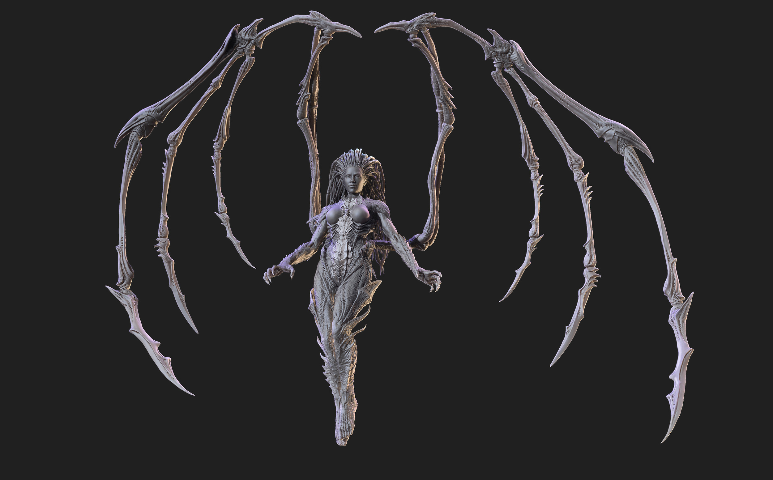
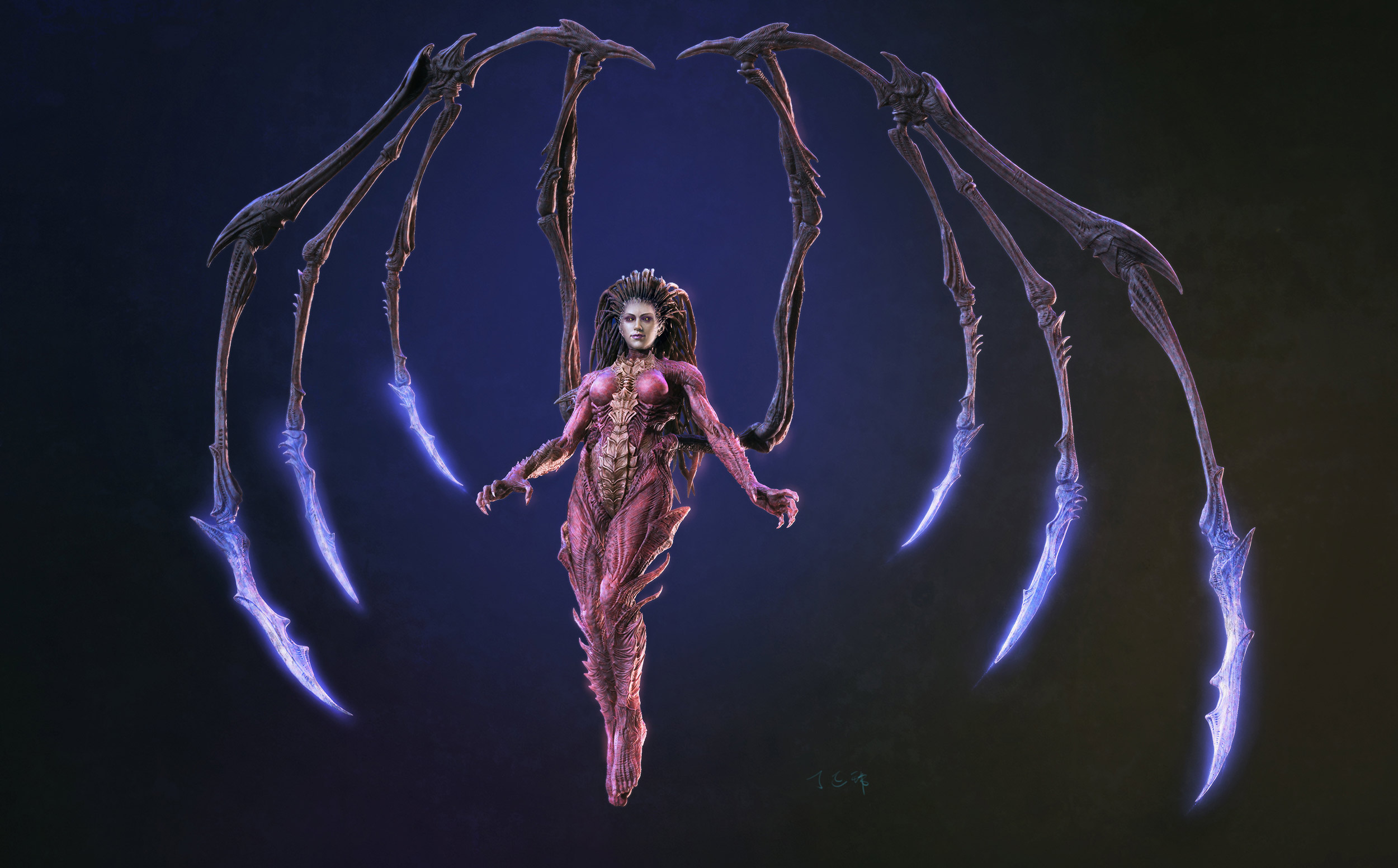
I am a Blizzard fan,here are two fanart Archangel and Zerg Queen.Zerg Queen is render in Zbrush,just have fun  my
my

Attachments
1 Like
everything looks great,details,expressions…
a little suggestion,the kid’s hands look like a little huge?
The Zerg Queen is outstanding!
A litte huge,I also felt now thank you belindakang ,Takai:p
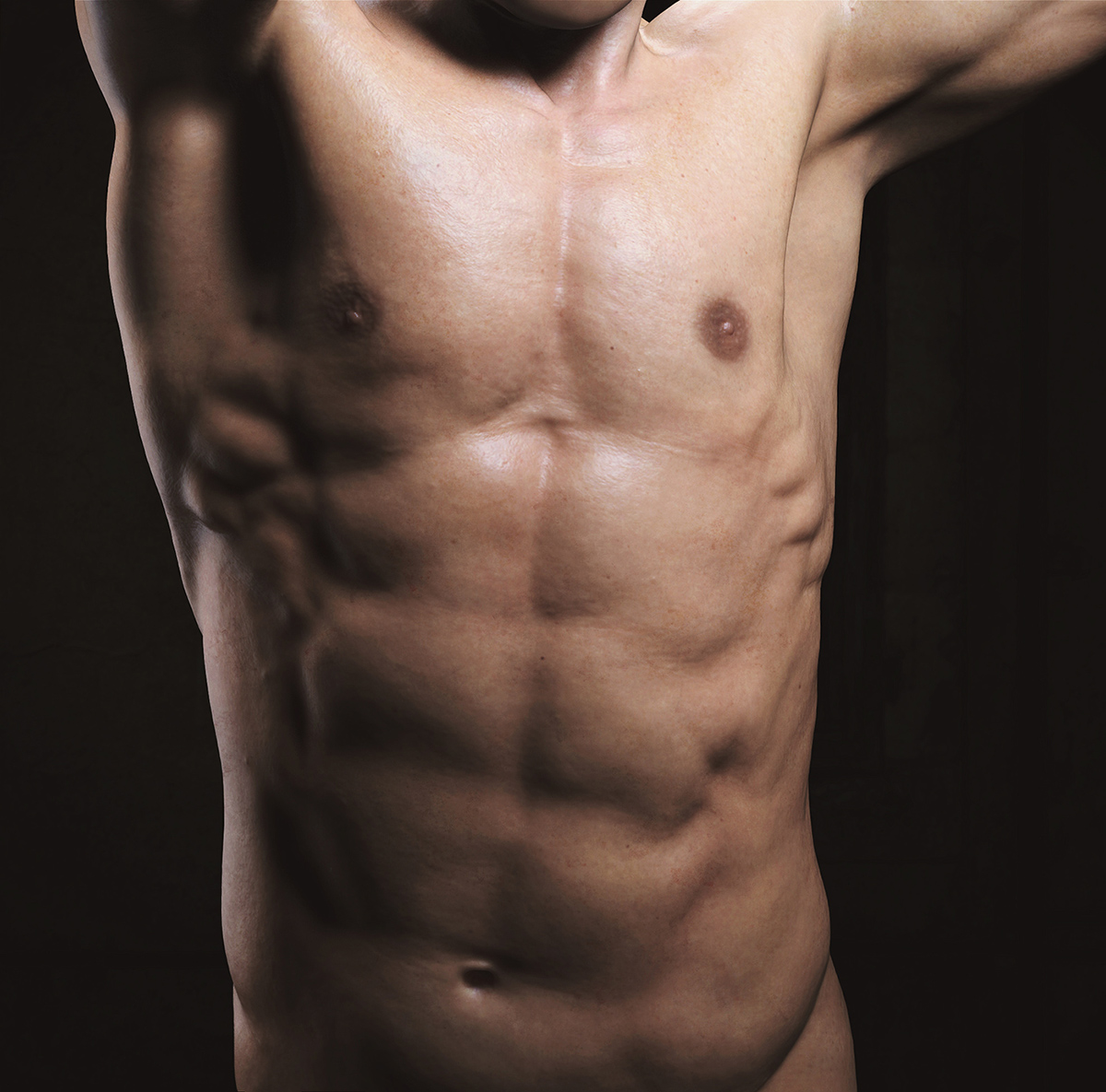
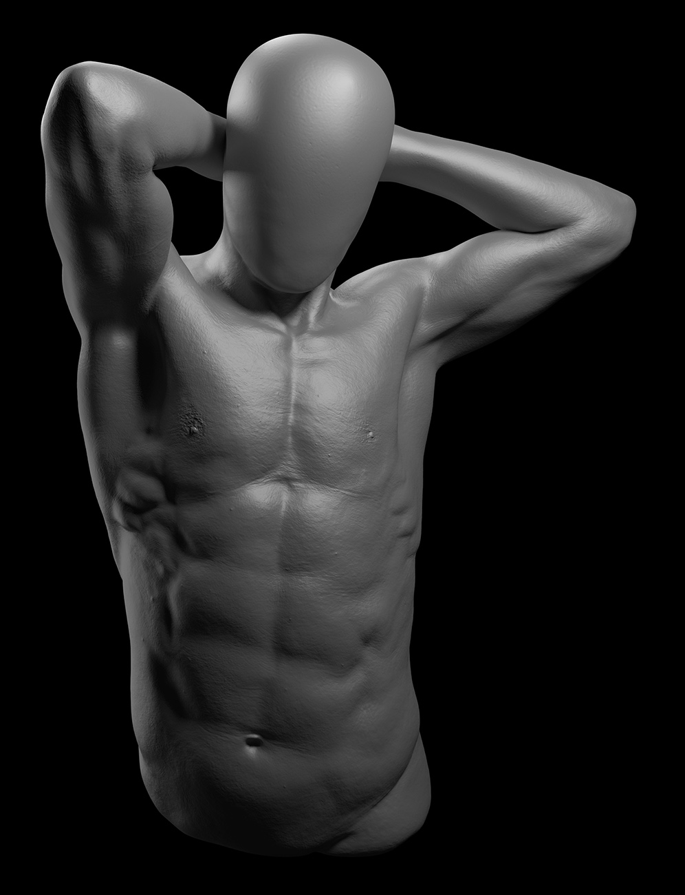
anatomy study
Attachments