ZBrushCentral

Observatory

Hello,
here is my first contribution to the ZBrush produced body of art.
I would be grateful for your feedback and questions.

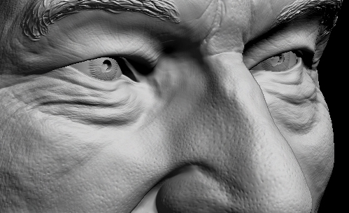
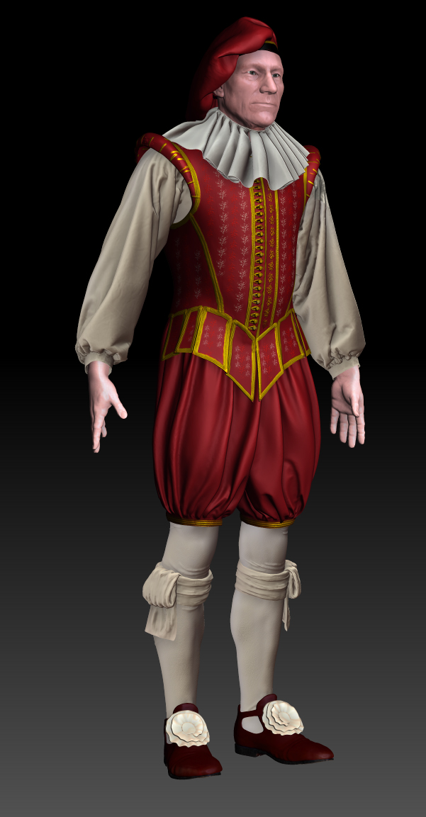
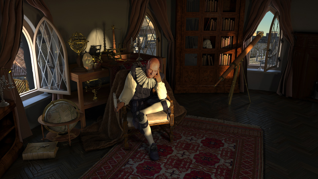
The subject is Patrick Stewart, cast as the Elizabethan Natural Philosopher, Francis Bacon. The are references to Holbeins paintings.

The software used:
ZBrush for Modelling,
Maya/Mental Ray for scene set up, fur, and sss shaders,
3D coat Modelling and retopo,
Clo3D for garment design and draping.
CityEngine to create the background model outside the windows.

There is only one light source in the scene, this caused issues but it produced the look and feel of a naturally lit space.

Thanks
Dan Hughes-McGrail

Attachments

Full Observatory Scene reduc.jpg

ohhhhhhhhhhhh what a picture:+1:small_orange_diamond:+1:small_orange_diamond:+1:small_orange_diamond:+1:, when i look at it it seems i go back in time!!! Well done!!!:+1:small_orange_diamond:+1:small_orange_diamond:+1:small_orange_diamond:+1:small_orange_diamond:+1:small_orange_diamond:+1:small_orange_diamond:+1:small_orange_diamond:+1:
gr. Silberdenar

Just amazing … great sculpt, render, atmosphere Etc, Etc, This one has Top Row written all over it! :lol: Cheers, David :smiley:

Nice render and models:+1: Everything could be more soft, it looks too much 3d. Maybe some more attention to the textures and (special) the shape of the curtains.
You worked a long time at this, let it rest for some time and go on later. It’s a beautiful scene but it needs more work:+1:small_orange_diamond:+1:

Fantastic job so far on this piece :+1:…I have to agree with Bas about looking at it with fresh eyes though…Sometimes one can get too caught up in every little detail while working on a major scene such as yours, and lose sight of the big picture so to speak…Princibles of atmosphereic perspective…more blue in the distance…hard versus soft edges surounding forms and volumes…creating an illusion of depth perception…ect…Study the works of Da Vinci…notice how the edges on his forms vanish into the shadow through the use of shading…You have alot of those princibles going on in your piece at the moment, but there are alot of areas that are lacking those princibles such as the curtains as Bas pointed out.
If you look at the main figure also, you will see the the outter edge of the figure has the same crispness all the way around the figure…which goes against the princibles of the illussion of depth that Da Vinci put forth in his writings and examples on painting…These are just some thoughts on my part that may or may not be useful to you, and are no way a criticism, and I hope they are taken as such…just thoughts meant to be useful and helpful…nothing more…:slight_smile:
Keep pushing it further…It’s deffenitly worth it in this case…Beautiful work :+1:small_orange_diamond:)
Keep Inspired and Inspiring…:):+1:
Glenn

Thank you so much.

This forum is great, I wish I had put up some of the process work earlier. feedback like this on the would have improved the piece much quicker

You are right, Many of the shaders need to be tweaked up. there are a lot of them! I have some limitations on this as it is going to be animated. the render times are fairly large already.
The curtains are an attempt at velvet, but with your feedback I think the scale of the shader is wrong and the quality of the curtain’s modelling is not up the the rest of the scene. Some of the spatial depth issues can be addressed with the lens settings. and the introduction of haze. I would like to introduce some dust, dirt and noise too. It is a bit clean for a workspace.
I am in two minds about the hard edged aesthetic, I agree that it imposes a digital quality onto the image, and removes some of the visual elements like softened edges that help create compositional heirarchy in pictorial traditions.
I am not sure that the digital quality need to be obscured. The Medium of paint has qualities that interfere with the content, as does sculpture. I think that although digital tools allow the possibility of perfect illusion, This may not necessarily be desirable. The 3D look is potentially useful as an aesthetic tool.
However, as your feedback shows- in this case- it is interfering wrongly with the intention of the scene.
Thanks again,
A critical view is worth it’s weight in gold.

Attachments

very high detail.jpg

patclothed.jpg

Close up
very high detail.jpg
The full dress
patclothed.jpg
I’d appreciate your thoughts

any more feedback would be great

I didn’t know that you were going to animate this piece…Way out of my leaque in that department, which is not my department…:smiley:
I was just thinking while admiring this piece, that it might look really great and even more dramatic if it were night time, with all of the secondary elements in deep muted light/shade and shadow, with the focus of attension cast on the focus point, the human figure with the use of candle light mixed with a little moon light maybe…Kind of like the way that Rembrandt did it in his later works…Might give an added sense of and to the theme of the piece…Maybe have the moon light casting it’s light on the telescope in the window as it should be the secondary element of interest in the piece to complete the theme.
Just passing thoughts on my part that may be useful to you…who knows…I just thought them worth mentiong, just in case they may be useful to you in some way.:slight_smile:
Keep Inspired and Inspiring :+1:small_orange_diamond:)
Glenn

Thanks,
Sorry for the delay in responding,
Yes the need to animate imposes some restrictions on the modelling and the rendering methods you can use. but these days not too much.
your feedback is good, I chose a dawn scene for the symbolics of a new day coming.
I like the moonlit idea though. and will try that out when I get the time.
Cheers
Dan