ZBrushCentral

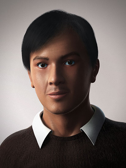
Nico (Portrait)

Hi, long time no post here…
I’ve done an artwork. Is there anything that I need to improve?
Any comments would be appreciated…
Sorry for my English, not my primary language :smiley:

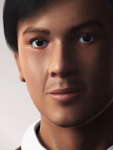
Zoom 25%
[Nico_Zoom25_Full.jpg]Nico_Zoom50_Partial.jpg

Hi, I made this to improve my portfolio as I looking for a job, hope can hear any 2 cents from you guys…

This is a nice render. Some areas are looking very good, but there are a number of things that I’ll point out that may or may not help.

  • The number one issue with this seems to have to do with the eyes. I think there is more than one contributing factor, and for the most part, it is minor enough that it isn’t obvious what is wrong.
  • Overall, there seems to be too little variation in tone in the face, and that which is there is not convincing. try some cooler hues around the eyes, some warmer ones on the nose and cheeks. Easy does it, though!
  • The skin noise is too evenly distributed. It looks like you used a noise generator to create most of the texture. Right now he looks like he’s wearing a huge amount of caked foundation makeup. the worst seems to be on the forehead. The nose and lit cheek do look good here.
  • proportions might be off (Although they are within the realm of believability). Eyes too small, nose too long, mouth too thin, chin too big. if you adjust these, do it gently and one at a time, they feed into each other.
  • Eyes seem amateur; make sure they stand up to some reference. There does not seem to be enough eyelid for your model to blink. The inner corner of the eye could use a larger dedication to the pink area. The eyelashes have a gap on both sides just over the iris, which is calling attention to the symmetry. Also, the eyelashes seem to be growing from beneath the eyelid instead of on top. I’m convinced the entire structure is too small.
  • Lips and nasolabial folds are also not convincing. They seem to be placed there because you know they should be there rather than a representation of the forms they depict. work on adding some volume and depth to the lips, and pay some more attention to the corners of the mouth. Also, pull back on the lip wrinkles – his lips look very dry.
  • This is a male face, so overall try to sculpt with angles rather than curves. The softness is giving me a very feminine impression, which clashes with the little mustache. Along the same lines, he has an awful lot of ‘peachfuzz’ along his jaw. If that’s stubble from a beard, it should be darker. (note that is impressive rendering of peachfuzz though :slight_smile: Note that if that is the chin hair of youth, other age signals are sending a mixed message: pores too big, crow’s feet too prominent, nose and ears too big, and a touch-o-gray in the hair.

hope that helps.