ZBrushCentral

New Zsketchbook & Custom Shader Testing

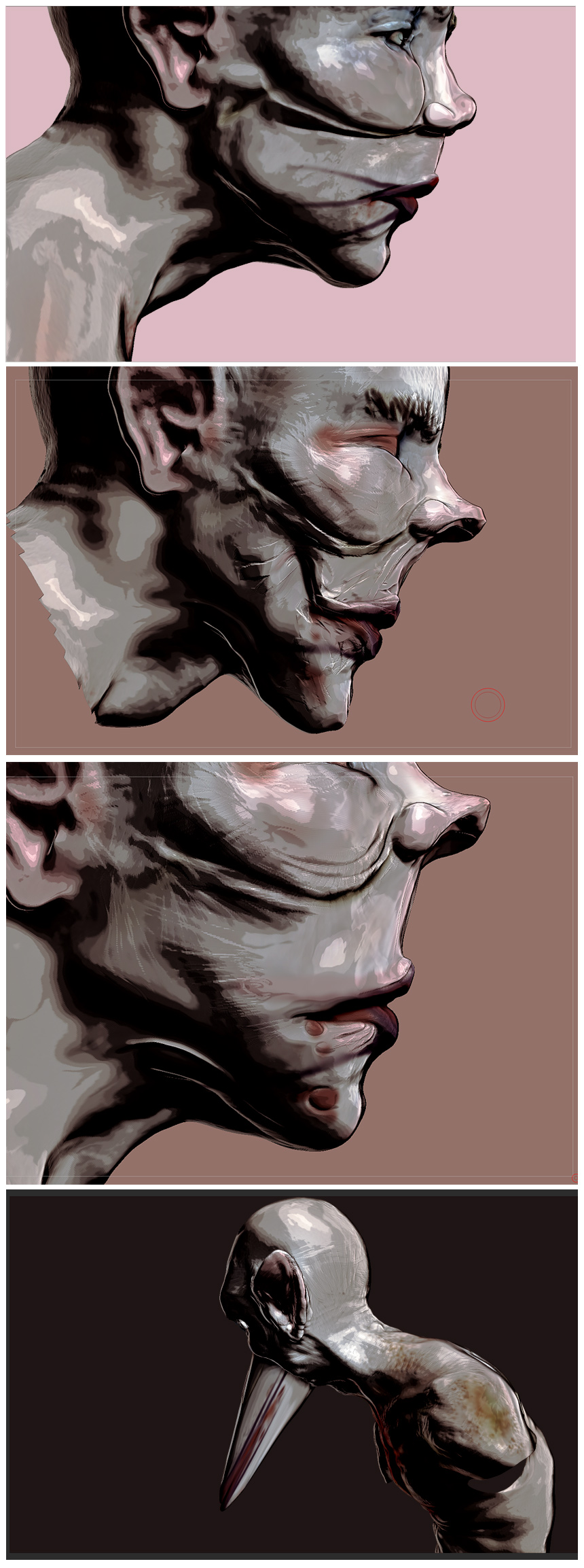
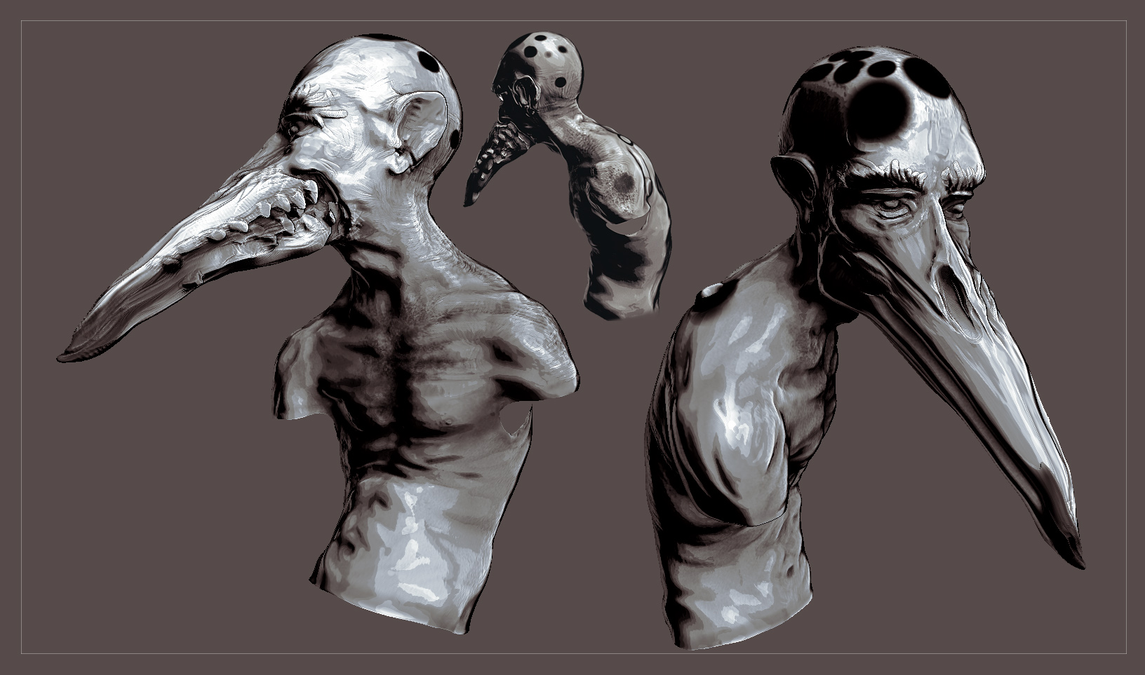
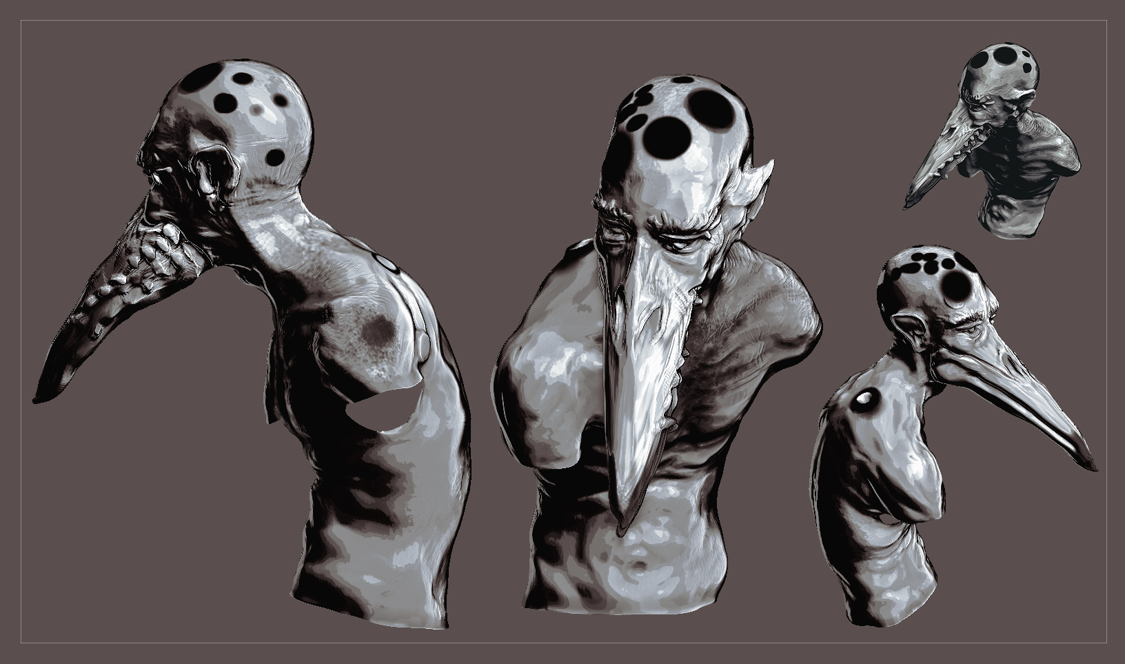
I thought I’d share some images that coming out of of look & style development process for a personal project of mine. The initial idea is to create a series of illustrated short stories, or possibly a graphic novel if I can find an efficient pipeline, or enough material, to warrant it.

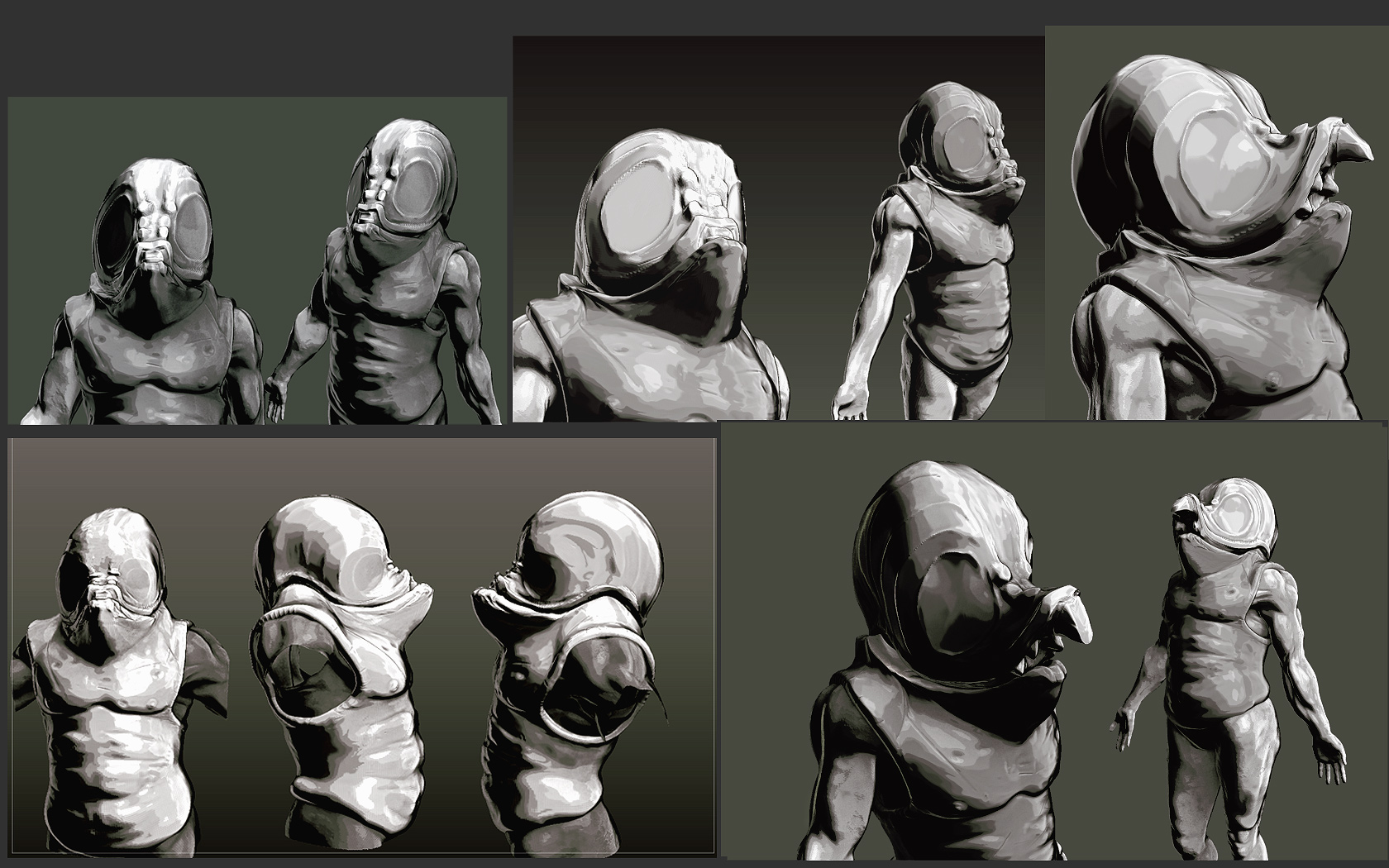
For this project, I want the images to evoke rather than represent, so the ultimate goal is to keep things relatively fast and loose and not spend too much time with details such as skin pores etc. while at the same time, trying to keep as much of the look rendered from within ZB.

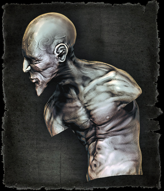
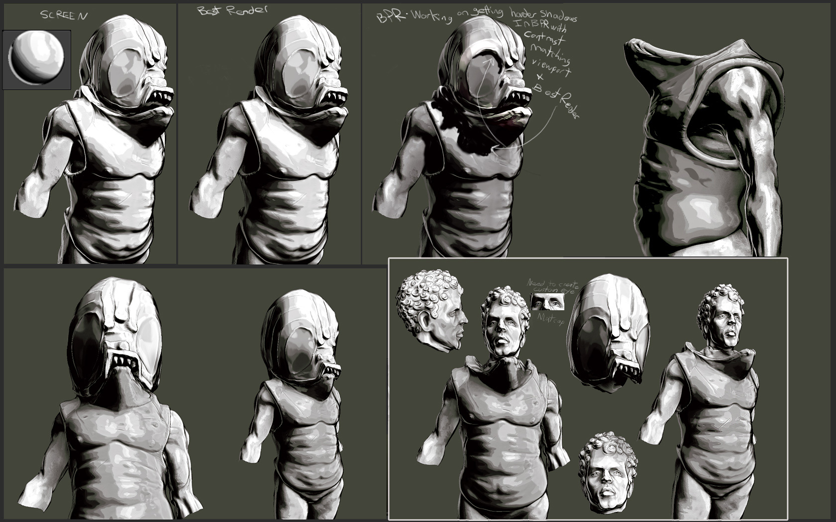
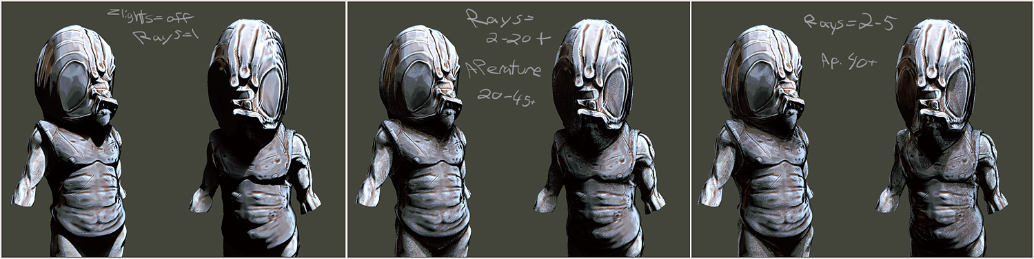
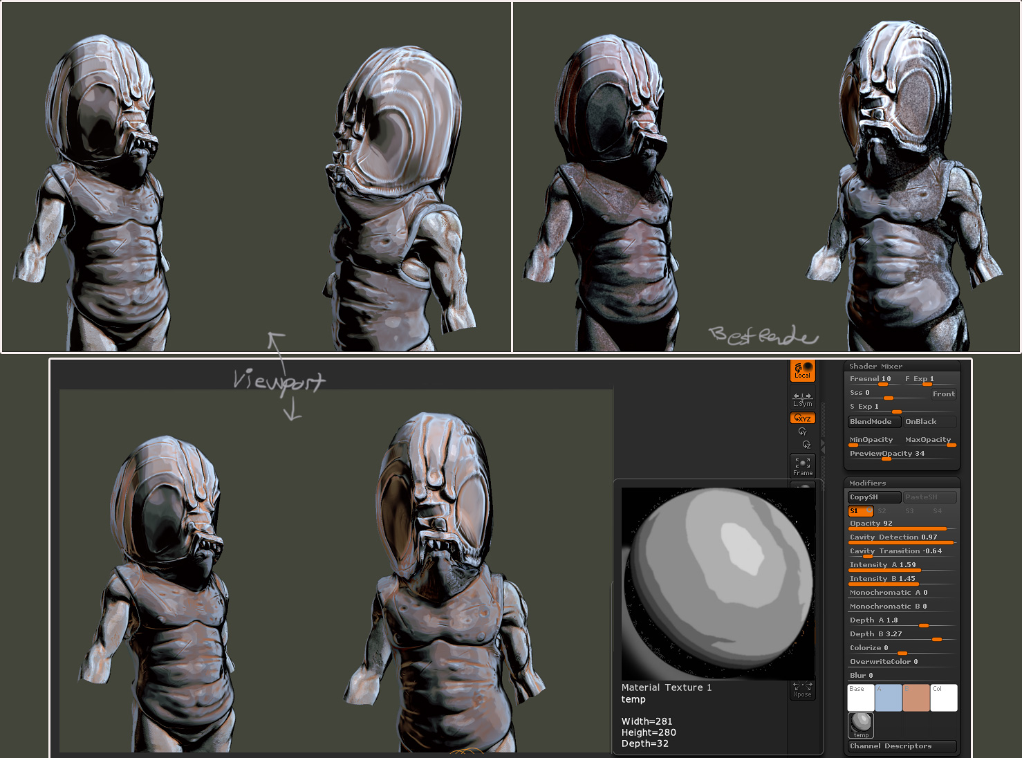
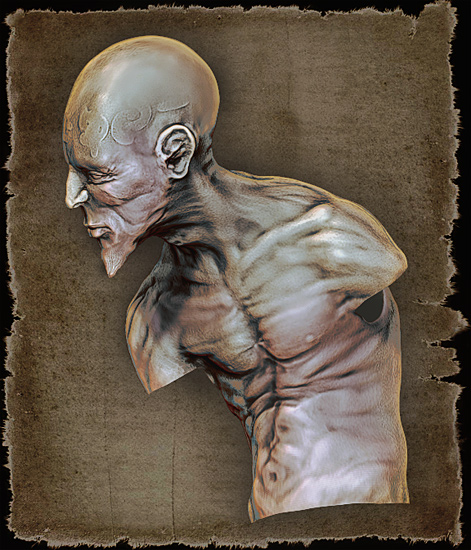
Anyway…here’s a model with the first couple shaders that seemed to turn out pretty nice. The first image is truer to the ZB render screengrab, (BPR), with only a few tweaks in PS: added parchment background, level tweak, minor shadow color change.

Any thoughts appreciated.

KR_Sketchman_B_550.jpg

Attachments

KR_Sketchman_C.jpg

nice i like the way of presentation
:+1: :+1:

Love it :wink:

Any chance you could share your materials and comps that you used to achieve this effect :smiley:

Looking forward to more on this project.

I like the style that is developing in the second image. I think the almost monochromatic rendering really works well with the black background. My first thought on seeing this image was ‘graphic novel’. Upon reading the rest of your post I see this is where you’re aiming - so congratulations on your progress towards that. With a little tweaking I think you’ll have found an interesting and distinctive style.

Looking forward to seeing more.

More images!

KR_FalseKing_A_100_red.jpg

MadHead: ty
Mouthrax: Yep, I’ll post a link to any mats once I’m happy with them.
Hmphhh: ty. I tend to gravitate to monochrome prints, although I do love the odd vibrant splash of color.

Thank you

Loving the updates :wink:

Just wanted to post a few more images. Testing out a more ink heavy cel type shader. Seems to work well with the black and white images. Straight up Zbrush screen grabs, no post work in PS other than very slight levels boost for the B&W.

Zbrush_GraphicNovel_TestA.jpg

For the amount of time spent on the birdman, which is not much at all…like 10 min on the face, I’m liking how a few silhouettes turned out. Also if you put any other shader on it, you can tell how utterly horrible the sculpt is! lol. So I’m pretty happy with the black and white one for now.

Let me know what you think!

Attachments

Zbrush_Birdman_C.jpg

Zbrush_Birdman_B.jpg

Excellent and interesting thread here. :+1:

amazing

Really cool effects here. I look forward to you posting these matcaps.

these creatures are art pieces, as far as i can see. The style is strong. cool.

These have a cool rough style. It works well with whatever material you’re using and the high contrast. Fine concept pieces. Is the first one Kratos in his elder years?

nwargasm: ty. ah nope that guy is just one incarnation of my test bust. Can you believe I haven’t even played one GoW game? And I call myself a gamer…
ravis: ty. Yeah i’ll be posting the matcaps soon. (well for the B&W one anyways, it’s pretty close to where I want it)
rest: ty

Check out these vids on youtube for some in Zbrush action.

http://www.youtube.com/watch?v=7F8lhd45O7c

http://www.youtube.com/watch?v=ecJUDvLJsrM

Helmet and character designs. Well, the character is actually a WIP statue…Will post that next in a few renders. Ignore the text, I wrote that before finding the rays option in lighting. 1 gives hard shadows…It’s nice having a new computer to experiment with settings in real-time. My last one was a P4 :frowning:

Zbrush_Centurion_A_graphicpenMat.jpg

Going to experiment with some cross hatching in the matcap. Stay tuned.

Attachments

Zbrush_Centurion_B_graphicpenMat.jpg

More images. Added some color to the A&B slots of the matcap.

Cavity and Depth Settings change.
Zbrush_Centurion_D_graphicpenMat_ABvalues.jpg

Attachments

Zbrush_Centurion_C2_graphicpenMat_LightLocation.jpg

Zbrush_Centurion_D_graphicpenMat_LightRays.jpg

Zbrush_Centurion_C_graphicpenMat_ViewportShaderSettings.jpg

Still watching both concepts and shader experiments with interest.

I don’t know if you are aiming for a fairly specular result or not, but if not, have you tried diffusing/blurring the highlight in the matcap? I suppose that would reduce the posterising though - which I guess would be contrary to what you’re aiming for?

Good stuff anyway.

Very well done.

woah that is so cool, the characters, the lighting and the shader. Can u share the shader please.

Hmphh: Yeah I tested out a few where the posterization is kept to a minimum.

The posterization can get a little cheesy in some shots depending on the angle and what not so I’m aware of it, but it seems to work really well with sculpts that have very visible and rough brush strokes(like the creepy bird humanoid) as it breaks up the highlights and shadows in interesting textured ways.

On the list is to create a watercolor kind of look where at the edges of the posterization there is a ramp in luminosity/color…kindof like a coffee stain on paper or something to that effect. I will look into blurring just the highlights though…that might be interesting.

very nice, i’d like to get my hands on that shader