ZBrushCentral

New Portrait for my new Website

Hello guys, I set up my website www.vikramvr.com recently and decided to make a portrait for it. Please have a look at my site as well, and tell me how it looks. Here are the images.

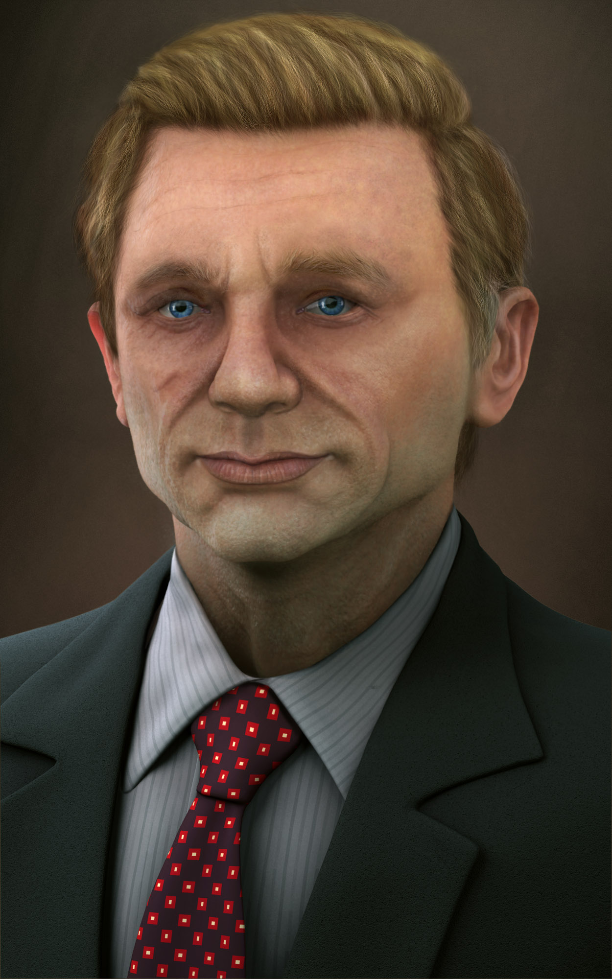
[attach=159311]Render.JPG[/attach]

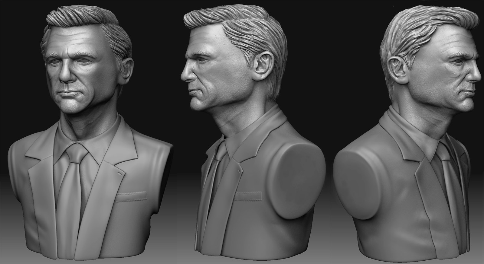
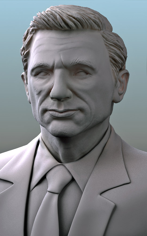
[attach=159305]clay shader.jpg[/attach]

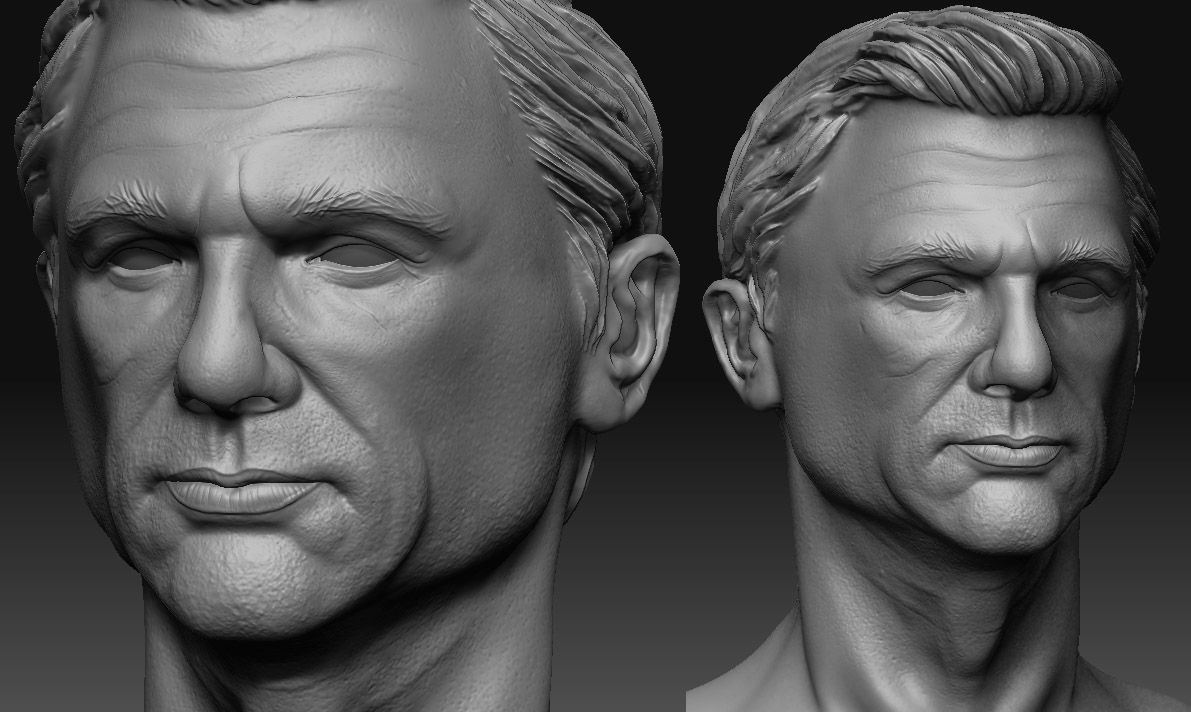
[attach=159304]zbrush.JPG[/attach]

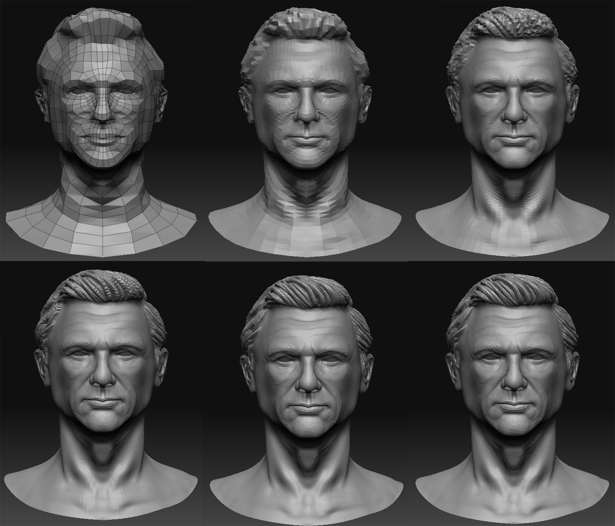
The sculpt was started from a very rough base. Once I went to a high level, I retpologized the model, to continue sculpting. It was later exported to 3dsmax for rendering and textures. Photoshop was used for colour correction, and painting some hair.

It took me a long time to figure out how to get the bump right…and I plan to share with you guys my process of creating it. I’ll upload that soon. I’ll also post more snapshots of him later on.

Hope you guys like it.

Attachments

zbrush.JPG

clay shader.jpg

Render.JPG

Looks flat at the moment,likeliness need more work.keep posting

I think it could be there’s a tad too much space between the eyes? Making the face looking a bit odd?

Definitly recognizable i find.
Maybe a little tweaking here and there.
Final render is very blurry and has no focuspoint at the moment.

Hello guys, thank you for the replies. I figured out it is the chromatic abberation that blurred out the eyebrows and the hair, also the eyes. I removed it, and I have replaced the image.

Well, It’s not an attempt at a celebrity face, certainly not Daniel Craig. Definitely drew inspiration from him though. Please don’t compare this portrait with any celebrity. :slight_smile:

Some more zbrush snapshots

subd's.jpg

Attachments

snap.jpg

I think your ear needs a bit of work…as well as your outfit (tie/jacket/etc)They feel really flat, lacking in definition. The tie pattern wouldn’t run the same way if it was tied. The knot usually will have the pattern running diagonally. Sorry if I sound knit picking, I usually look at these little details. I do think if you add more shadows on your render, the facial features will be displayed better. :+1:

Hey Shadowscheme, Thanks for the reply. I added a layer of Ambient occlusion, to the render, and adjusted the bumps a little bit and completely removed the chromatic abberation. I have three layers of bump for this image - A normal map, a cellular texture, and a noise texture. I rendered three levels of bump and masked unwanted areas from each render

Portrait.JPG

Second render is far better than the first mentioned render,but still the quality is not happening man.don’t feel bad but this is my personal opinion on this piece,as i m also not comparing this with DANIEL CRAIG,at some extent one can get familiar with the clothes but still one can feel the flatness in overall render,i have seen ur sculpts they all are different from each others,with different level of qualities,but the artwork is lacking somewhere,ur surface quality proportions need some work to enhance the grading of sculpts.This is not abt sharing ur artwork but try to get the feel of the sculpt right first,may be acc to my personal opinion u shuld study some anatomy references to get the level which an artist always opt for.i hope u will understand please don’t take it with the negative prompt.:+1: all the best.i like ur website.