ZBrushCentral

Mutant Model

Hey guys
i’ll try to add one of my work
in this icredible forum,
i’m italian then i’m sorri
for little english :D,
this is a mutant model that i’ll going to
colorize.

(basic mesh in 3max sculpt in ZB ) :+1:

I hope can it like to you
http://fc09.deviantart.com/fs44/f/2009/161/e/b/mutant_material_test_2_by_INVERTVISION.jpg

[attach=144441]mutant material B.jpg[/attach]

Attachments

mutant material B.jpg

this is a mapping process
of this model
tnks

then the final render.
i hope you like this
[attach=144760]umanoide mutante.jpg[/attach]

Attachments

umanoide mutante.jpg

damn he looks really cool :slight_smile:

I like it!

Really great.

I like it! :smiley:

really liked the design!

It looks like what I imagine Evangelion could/would look like without all the armor.

awesome indeed!

thanks guys
i think it similar to EVA too

Hey man
Are you sure this is final? I mean it’s dfinitly a great concept and sculpt but it could use some more details: wear, pores, wounds, something to age it a bit and make it a believable creature?

Good luck with this!

i dont know what else can i ghive it
have you some alpha
or concil?

there is more detail

It reminded me of the EVAs too. Nice job.

cheers,
Matthias

Can I see the base mesh?

Whiteash
you can see basick mesh is on the link below
http://INVERTVISION.deviantart.com/art/mutant-model-layout-125559180

bohemond

more details: wear, pores, wounds, something to age it a bit and make it a believable creature

you are right
it is half finish
but i need really some concil apout skin detail

i need comment on this
mutant thegreathall.jpg

I like your model.

But this is a poor treatment of it.

The light from the environment is coming from behind with some, pouring in from the upper right of the creature. This should make the creature mostly silhouetted.

Unfortunately that would be counterproductive to the goal of staging your model. So maybe a different environment would be better.

But if you are going to stick with this scene I’d recommend the following.

If you are rendering from within zbrush try using radial lights to show the rear lighting. I would kill a lot of the ambiant light. He’s just to brightly lit for that scene, like he’s sitting by a reading lamp or something. I’d do some photoshop composting and try to pull some of the colors in the background into the figure to make him look like he belongs in the scene.

Hope this only helps and not disheartens. I envy your sculpting ability.

'ello mate,

First the good. I think this is a great design anf I would run like a girl if that guy came after me. Also I really like your skin map. The colour and the detail in it is lovely. There’s a lot of potential for this model and I’d hate to see it wasted.

I agree with the lighting issue in your scene but I assume that’s just a test to see how he looks against a background.

Now the critique:

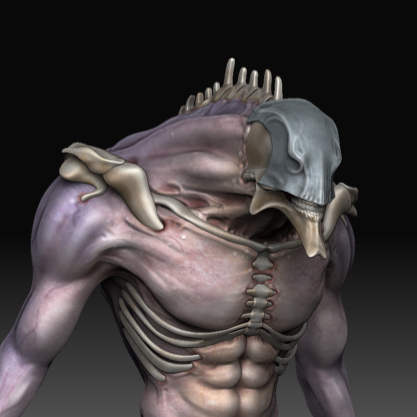
I think the major problem is that there are a lot of smooth areas on your model still. The colours are great and your skin is wonderfully detailed with little veins and such. But now it’s time to bring those details out on your mesh, try making some of the major veins in his arms stand out, up, and away from his smooth skin. He looks like a muscley kind of guy and normally there’s very visible vein bulge. Check out some body builder reference pics if you don’t know what I mean. The areas on his torso where his abs bulge should feel stretched more I think. Right now they look like little wads modelled out of his skin rather than bulges from under the skin.

The hands need a lot of work. Are those claws like finger nails or talons of bone that extent his finger¿ It’s hard to tell, though you may not be finished with that part. Protions of stretched skin, wrinkles at the base of the thumb, veins, and perhaps some skin fold where the talons extend (like the skin near your fingernail, the eponychium) will all give more realism and credibility to your model.

The bones are way too smooth and generic. Try adding stiations and small scratches and chips randomly in order to break apart the symmetry and bland look. You’ve a good start with his mandible area near his lower teeth. Refine that detail and then bring that sort of attention over his entire body.

The edge of his mask looks unfinished. It just sort of ends in an almost srtaight line. I’d mess with that a bit, pushing in the indented areas slightly and giving it more flow around the face. Just my opinon but that straight line doesn’t work very well. Also is his mask bone, stone, or metal¿ At the moment it just has a sort of generic grey look to it. If it’s metal make it shinier to define it a bit better and try to give it more weight. At the moment it looks like it’s floating just over the characters head, you could try pulling the back area in and around his head more. It would look like it’s fitted more onto his head rather than ready to slide off the second he leaps at his victem.

Please don’t take my critique personally, there just the ramblings of a Zbrush Lurker. :wink: Your design is fantastic and I would love to see it move to the next level. Good luck mate, can’t wait to see what you come up with in the future.

Tore’alos,
~Wyrm

Really like the ribs and clavicles. Very different.

The skull/hat thing seems a little strange - but thats a minor critique.

If you take the clay brush and put on spray stroke, Z add intensity 12 and use alpha 04, 15, 20 or 24 I have found that this gives the skin a nice bumpy texture. I think that it would give it just a bit more texture without taking away. Also I would suggest giving the nails a bit more detail. Right now they look too smooth. It looks really awesome right now tho. I really like the background too

very glad to recive some critique,
ill’try to improove the model.

Lartist_Formerly_Known_As_+
i’ll try this teknique

reverendwyrm
thank a lot
your critique will to be costuctive.
:wink: