ZBrushCentral

Michelangelo - TMNT (1990)

Hey guys!

I started working on a 3D model of Michelangelo from the Teenage Mutant Ninja Turtles, specifically, the original film. Still very early on in the modeling stages. Mostly just basemeshes and proprtional stuff.

He is already rigged, unwrapped and ready for texture detailing. No real Zbrush progress yet, but soon to follow!

COWABUNGA!

  • Ralph

Attachments

Rigged_Mikeyzbc.jpg

Nice one man

Thanksman! I’ve created a facial rig system for him using morph targets that I created in Zbrush. I tried to stay true to the way that Jim Henson’s creature suit articulated.

Here’s a link to the video:
https://www.youtube.com/watch?v=sBGDjsL4eEg&feature=youtube_gdata_player

Very cool! Congratulations!

Wonderful work on the model and rig!!

Does MAX’s viewport show displacement? How many polys is Mikey? Loved TMNT 1.

Cheers,
Josh

Thanks guys!

@ VFXdaily: I don’t think MAX’ viewport supports accurate, real-time displacement. As of right now, I only have normal bumps, spec maps and baked diffuse maps in mind for this guy. As of right now, he clocks in at a total of 12k in quads. :slight_smile:

Looking very nice. How accurate do you plan to make him? I have collected a lot of reference material from that movie and can post it here if you want.

Thank you very much!

And yes, I am definitely going for that movie-realism, so any reference would be great!

Here’s anoter set of WIP shots:
Mikey_woohoo.jpg

And here’s a wireframe (still could use some optimizing, but he’s for animation not real-time/game purposes). So I might keep things the way they are:

  • R.

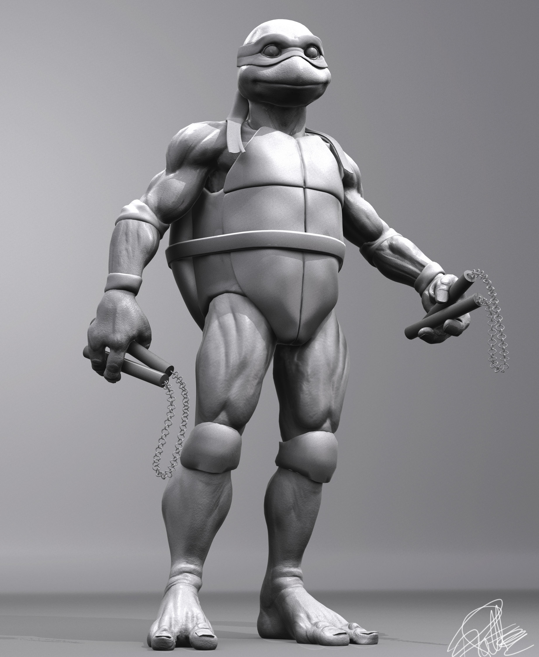
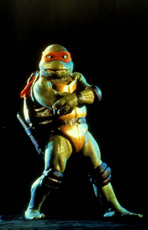
The update already looks tons better. It has a bit of the more sanitized look of the TMNT3 costumes, instead of the rougher, more real life detailed looking costumes of the first movie. One thing with Mikey was that he was short and rather skinny, so his chest was slimmer than the others’, but his neck was a slightly more fatter than you have it. The teeth are a bit more crooked - teeth in the bottom mouth had the sides be a little straight, with the two center teeth, being angled in towards each other and raised a bit, giving him a slightly more goofy look, compared to the others where the two center teeth are more level with the rest. The upload to this site is too time consuming, if you could pm me your e-mail address I could forward the imageshack links to my pictures.

Thanks man! Yeah, he’ll totally get the gritty treatment when I sculpt all of his detail in Zbrush. Definitely going for the part 1 look :slight_smile:

I’ll shoot you a PM with my email. Thanks for the pointers and help! :slight_smile:

  • R.

really nice… :smiley:

Dude, you totally nailed this. I remember seeing this in the theater on opening day. Thanks for the great memory!

Nice Mikey!.. The eyes are creeping me out, but thats not necessarily a bad thing. Keep up the good work :slight_smile:

Sent you a pm.

Something else I noticed: it seems the torso is too short and his limbs - arms and legs - are too long and too skinny. And his nunchakus are octagonal - probably sanded a squared rod at the corners - and is connected with leather string that goes into the hollowed out top of the pole.

Attachments

TMNT1-Promo-Mikey-02.jpg

Very nice! :slight_smile: :+1:

Thanks so much for the kind words everyone!

Too much Garlic: Thank you so much for the reference and advice. I definitely see where you’re coming from. I think it’ll be easier to see the proportional changes for me now that I’ve added some color:


Still changing pretty much everything. Back to proportions :slight_smile: Consider this a test :stuck_out_tongue:

  • R.

Hope you got the e-mail and could open the pictures all right.