ZBrushCentral

Marc's Sketchbook (nudity)

I think it’s beautifully posed the way it is. I think as 3D artists people tend to want to show too much when a piece like this is more about conveying the emotion. Putting the hand on the other side of the face we’d loose some of the tenderness in my opinion.

The bright fog is the only thing that personally bothers me but it’s a subjective choice. It doesn’t look bad, it just calls more attention to it than IMO it should to tell the story.

Actually, I was thinking of artistic composition, since I was trained in traditional media (oils, acrylic, ink, pencil, and watercolor) for many years before I did anything digitally, but whatever. rolls his eyes

WOW, that is an amazing image. One of my favs I’ve seen in a while. I personally love the pose and composition of the piece. Like Julian said there a few thing that could be improved to make this a stand out piece. I would say it could definatly be top row worthy.
Actually I like it that much I’d say it is top row now. Top Row it.

I wanted to make it my wallpaper, so I hope you don't mind I did a little colour correction in photoshop. It was a little bit to colourful for me to be prefect. Just personal oppinion and what do I know :P [Colour corrected image](http://i451.photobucket.com/albums/qq238/NoddyJnr/baTCAT.jpg)

posted as a suggestion of direction.

Would love to see you take this further and give us a nice high res render. Great work :D

edited to change image to external link as to no pull attention away form the original piece.

great job man! love the style of batman in that shot.
Btw,Noddy Jnr’s version with reduced saturation fit’s more in the dark atmosphere of batman.
Really awesome nonetheless :slight_smile:

Noddy Jnr’s version is too bloomy (like a blurred screened layer in photoshop) in my opinion. Anyway, it’s Marc’s thread I think no one should really post modified pictures of his work. I wouldn’t blame him if he got a little bit offended (even if he probably didn’t).

I would also love to see a higher resolution version!

I hope that Marc doesn’t take any offence by me editing and reposting his image. Was meant in the best intent. It was just for personal preference, so I could use his excelent piece of work as a wallpaper. As they say a picture speaks a 1000 words. And I thought it portrayed my thought about where it could be taken without having to write an essay trying to describe it. As I said all persoanl opinion and Marc doesn’t have to take on board anything I say, as at the end of the day who am I to say what is good and what is not.

I will happily remove the edited image if Marc wishes me to.

Agree with Genc,Noddy Jr and the desaturated artwork looks more suited to batman indeed.Just cause you got your panties in a twist dont blame Noddy Jr for it,get a life.

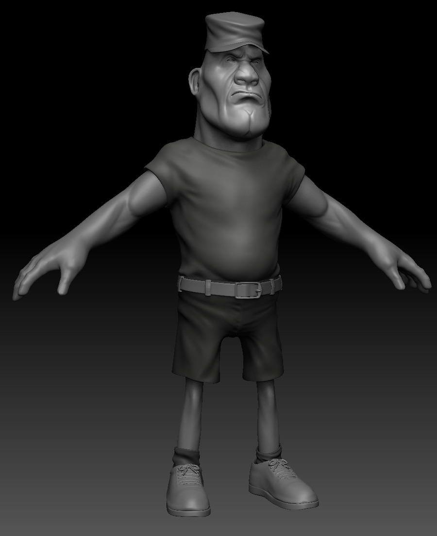
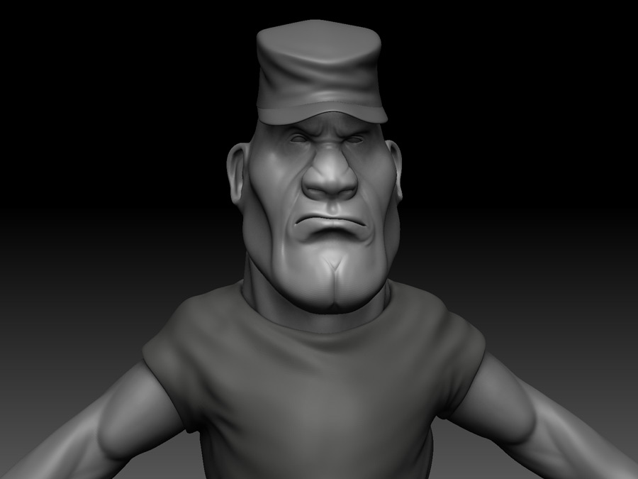
Noddy Jnr- Hey thanks. I really appreciate that you actually went ahead and spent the time and effort to do it. I like that you managed to bring forth a really gothic mood and feel to it.

As an artist, I am always appreciative of people who actually took the time to analyse and make helpful suggestions which at the end of the day will only help me to improve. Constructive criticisms are always welcomed. So in no way am I offended by it. Infact I am quite thankful for it.

tobbeo- I am just an artist still trying to get better at what I do. If I do get offended, than I probably shouldn’t be posting my work here but thanks for speaking up for me.

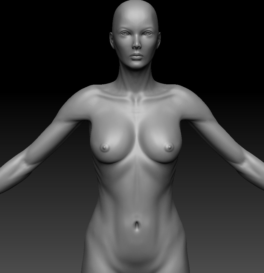
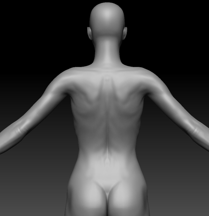
I just want to thank everyone who took the time to offer their critiques and support. I had alot of fun making this, certainly took some of the drudgery off from making weapons and accessories all day long :lol:

Its all about getting better and having fun along the way.

Great work !
I dont know you made so much personal work. you are so hard working.I love the elf hero a lot .a lot of detail on it . and I can not wait to see what happen next to batman and catgirl

Great work! man .

Arachnia001.jpg

A remade of an old design.

helm006.jpg

:+1:

This is looking good!

helm012.jpg

Latest update- changed the design of the shoulder guard.

anatomy0005.jpg
[attach=197446]anatomy0006.jpg[/attach]

A quickie anatomy study.

Attachments

anatomy0006.jpg

Did you have a reference for this? I’m seeing some things that look like issues to me that didn’t seem to be visible in your awesome catwoman model. Specifically, the lower ribcage, belly, upper back and shoulders seem to need additional attention.

Made some additional tweaks to the model- rendered in 3ds max with fast skin shader.

A quick 2 hour sculpt for demo purposes.

Sarge.jpg
[attach=198941]Sarge1.jpg[/attach]

Attachments

Sarge1.jpg

Some really lovely work! I love the Steam-punk Batman/Catwoman images