I sent you a PM on what to do, hopefully its good advice. Thanks for the kind words. 
thank to u to send me some uesfull things from the tressureof ur knowledge you reffer me the name of the person Jason Belec i cantfind it on z brushplz send me the linkof theperson i mvery thankful to u
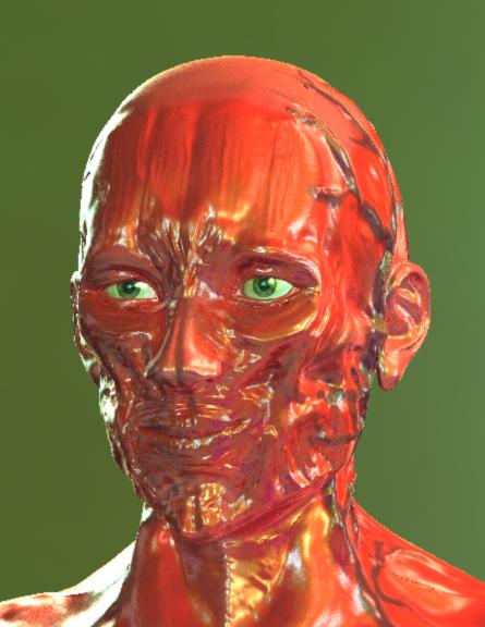
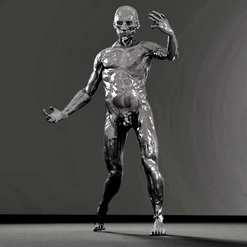
A material update. Does this feel wet to you?

 “singing in his Vanilla Ice Baby voice” Wet, wet baby…
Was just back thru this thread once again, because it is very enjoyable seeing the progress you have made and huge amounts of time and effort…and it is definitely paying off. Love your model…getting better all the time, truly.
Sorry for the lack of news. Been busy with the animation. I will post an update to the body later today or tomorrow. However I think I migh hold off on finishing this until zbrush 3.0 comes out. I think I can still take it to another level. 
Here’s some of the latest work. I will be starting a new project soon so this may have to go on hold longer, but with zbrush 3.0 tools and lack of school at the time, I think the results are going to be much better! I’m just using the basic shiny material for this.
[attach=50972]almostfinishback.jpg[/attach]
![[attach=50972]almostfinishback.jpg[/attach]](http://javascript%3Cb%3E%3C/b%3E:zb_insimg('50972','almostfinishback.jpg',1,0))
[attach=50973]almostfinishfront.jpg[/attach]
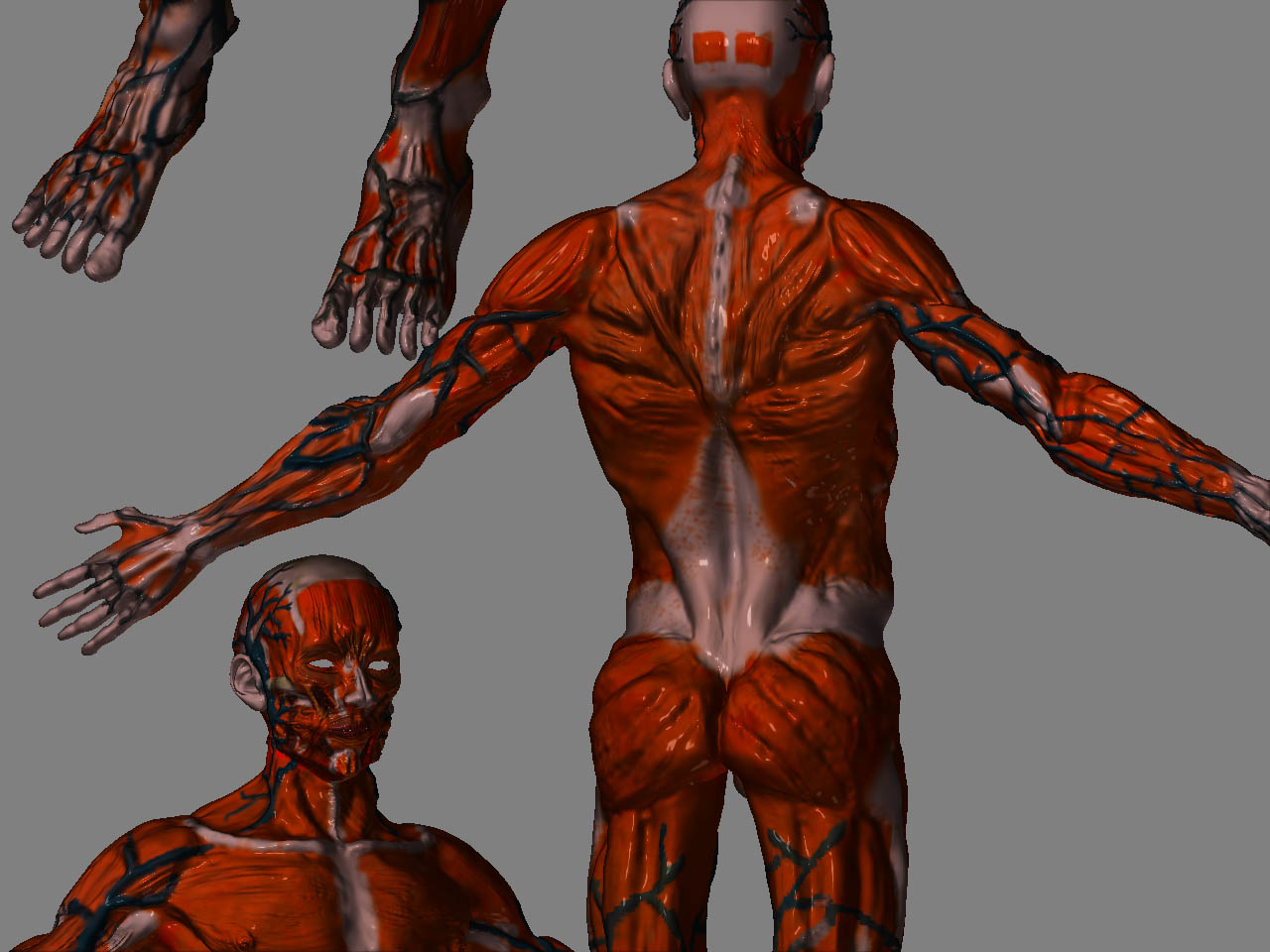
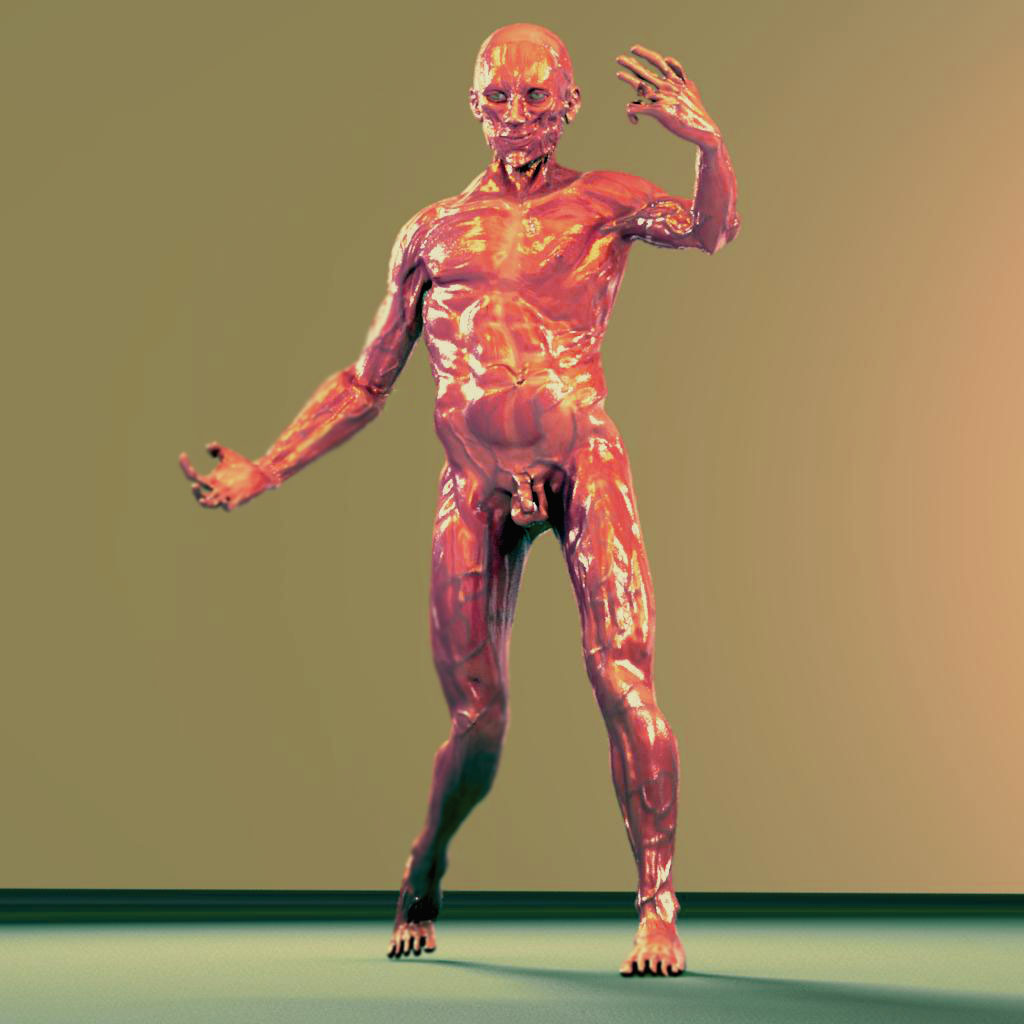
Colors are reallyu rough, I’m curious if you like this palatte?
[attach=50974]almostfnishcolor.jpg[/attach]
Attachments
Here is an XSI quick render. Open to suggestions on the material. I may have to use HDRI images again.
[attach=50978]rendertest6.jpg[/attach]
Attachments
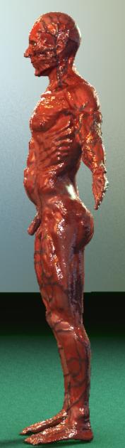
Batch of new renders. Made a great discovery, kitchen probe hdr is amazing! Or one of my settings seems to love HDR images on halfdomes. I’m using colored lights too.
Comments and crits are more than welcome. 
Attachments
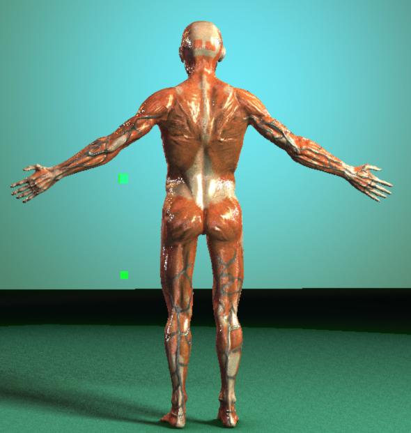
I got him rigged in some spare time! Just needs some tweaks to the pose and weighting. Can’t wait to see how well I can define the forms in zbrush 3.0! And to give him a decent color map!
Color test.
Attachments
looks good man came a long way so far. great work.
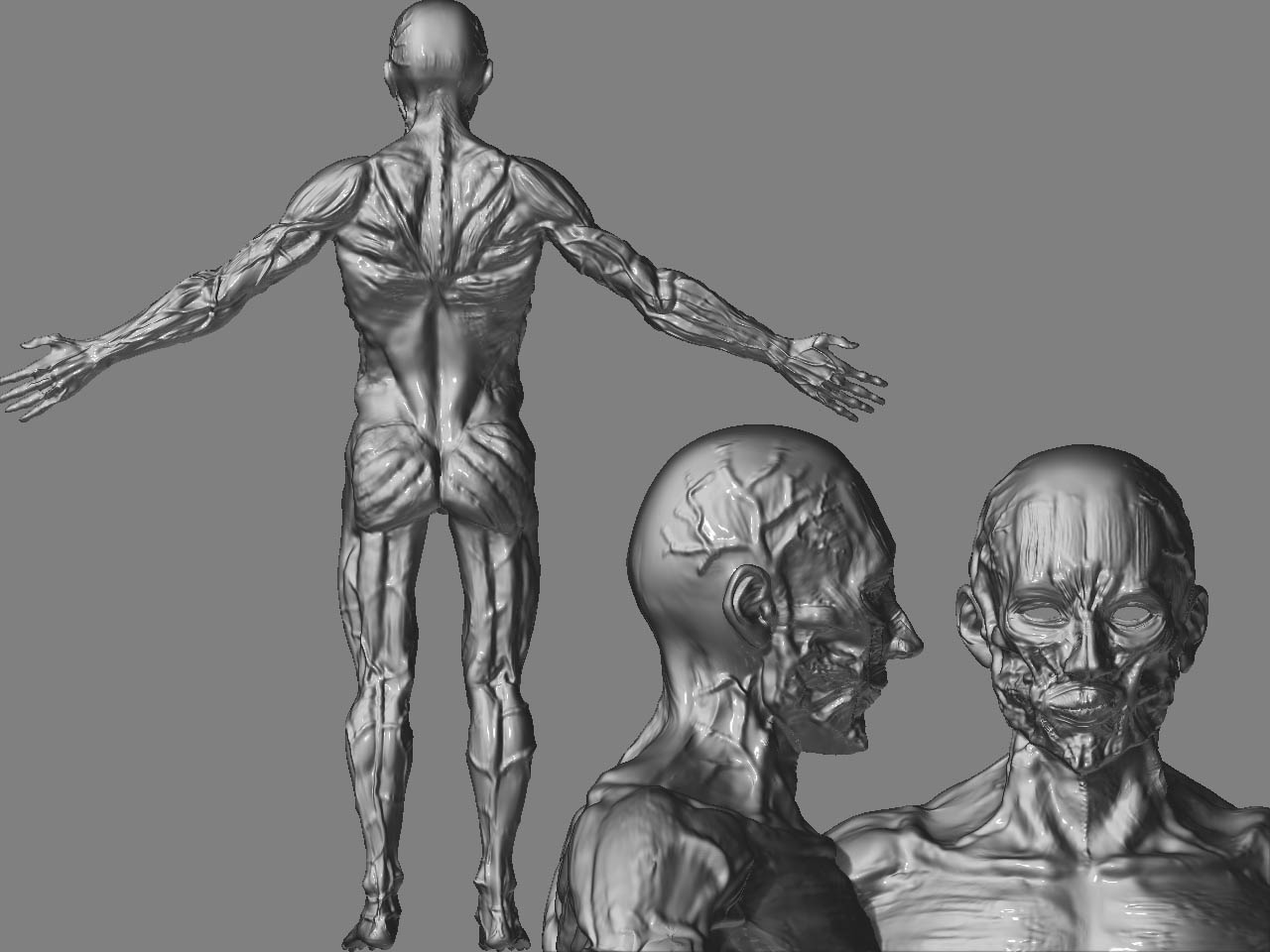
Thanks for the kind words! I am getting close to finishing it, since I’m finally getting sick of seeing it.  The lazy mouse is great for veins and muscles. Also good for painting veins too. And the color spray helps with breaking up the color. I think he looks good with a material called raw chicken. It was posted awhile ago in a mat-cap pack.
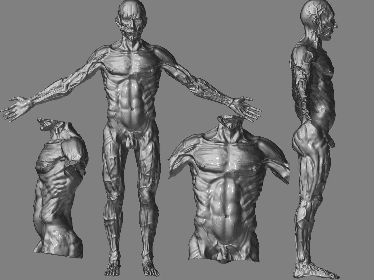
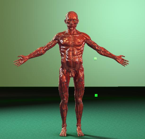
Final Render.
[attach=60291]anatomystudybeauty.jpg[/attach]
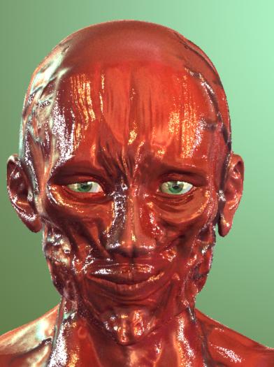
Close up face
[attach=60293]facecloseup.jpg[/attach]
Attachments
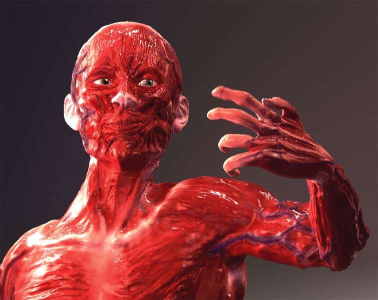
I know you had said “final render” but if I may impose some C&Cs. This is mainly regarding the pose. First off, nice contrapposto. Second, the way his neck is sitting on his shoulders feels more snake like than human, if you don’t mind I’ve included a pic.

The yellow path shows what you’ve done and the green path shows the assumed direction of the head based on the anatomy. I’m glad you fixed the back foot from your last render though. I know no one said anything so that must only mean you have a good eye. Everyone just needs a moment to step away from their work to see it with new eyes.
I know the transpose tool takes a bit to figure out but it sure is handy. 
Overall, good study. Do you plan on doing a more detailed area at any time and push the poly limit?
Se7enthcin- I definitely agree, womball and I talked late last night briefly in the meebo chat conference for zbrush users and the neck to head alignment being off was also what I mentioned. The specularity also reminds me of toy plastic though I know he is trying to include a glossy type of membrane of sorts to give it the “Wet” look. As I mentioned though overall his hard work is paying off in dividends as he continues to wrap up this project making small changes here and there. Glad you took to the time to help give him food for thought, getting feedback is crucial here.
Wasn’t using transpose, that would have been easier. I was using XSI’s basic rig. I figured out finally how to get a stronger displacement map effect too. I don’t know how to create materials in zbrush 3 and how to use the lights effectively yet. So I stuck with mental ray.
Someday I will begin a study where I will start with bones and build a seductive (relatively) female from that. That will probably push the poly limit and layer limit. No veins next time around, but I may do the muscles you don’t generally see.
AngelJ
oh cool, what’s meebo?
womball
Sometimes it’s good to stick to what you know. I’m still getting use to the shaders as well. 
Really nice work. His pointer finger looks a lot like a *****, but seriously, really nice work. I am curious how many hours you have invested in this project.
Hour wise? I worked on him over a year so it could be between 500-1000 hours. I would sometimes just tweak settings for hours (materials seem to take a bit of effort to get right, especially sss shaders). I did a new take on this with one month of work involved. I wasn’t going to go into veins and coloring though. Just raw structure. I think I have achieved better fingers too, more skeletal (less stuff on them).
I think you should move on to a new project to learn more. It looks like you’ve been staring at the same one too long. It’s always hard to work on one thing for a very long time, you start to think things look right when they don’t. If you really want to keep working on it, these are my crits:
I think the proportions look right and you’ve def made a lot of fixes on it since the last post. Don’t take this post to mean that I absolutely hate your model. I just think my main problem with this is that the details don’t look like they’re part of something bigger. They look kind of ambiguous. Also a lot of your detail looks like it’s muddy; like it hasn’t been refined. Not to say there isn’t a lot of detail in there. It just looks like it’s random.
-The fingers look really noodly, like they have no bone or tendons. I can’t really tell where they would bend.
-Look at your hand so you’re staring down the length of the fingers. Right now your hands are flat like a board, but it should actually be arched.
-The neck angle has already been addressed, but I agree with that crit.
-Overall, like I mentioned earlier, try and tighten up a lot of the detail you have and drop the specularity so it doesn’t look completely disgusting. Anatomy doesn’t have to be gross as hell.
Def a nice start though. : )