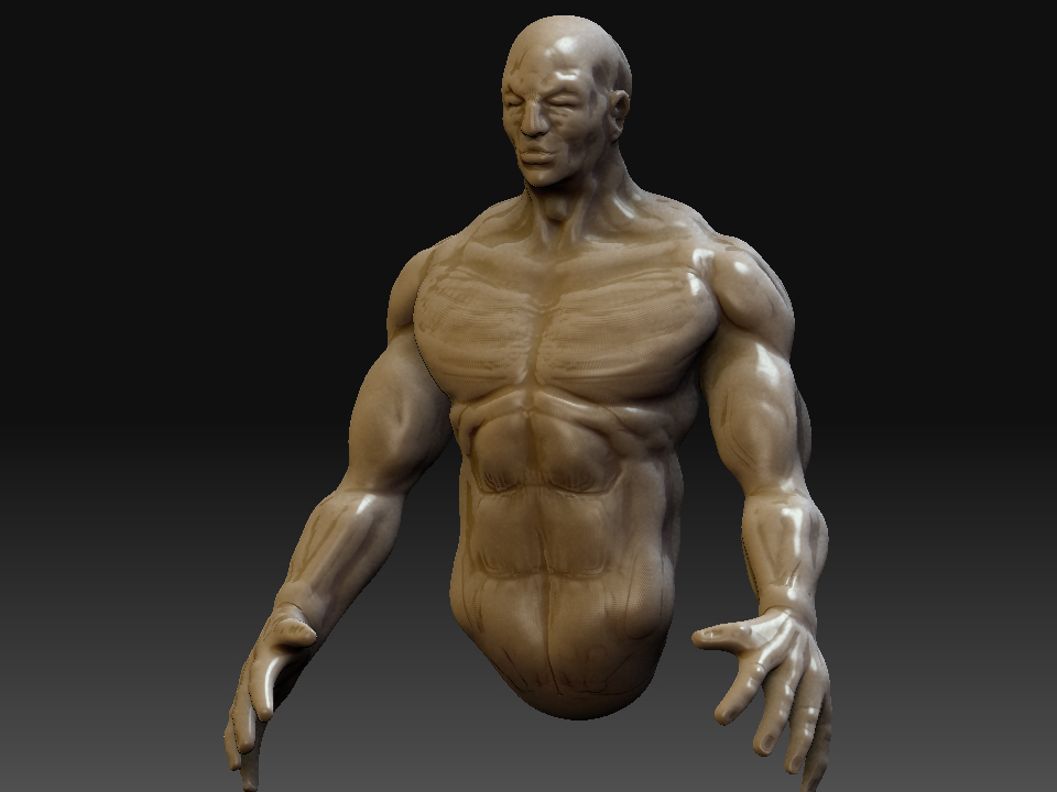
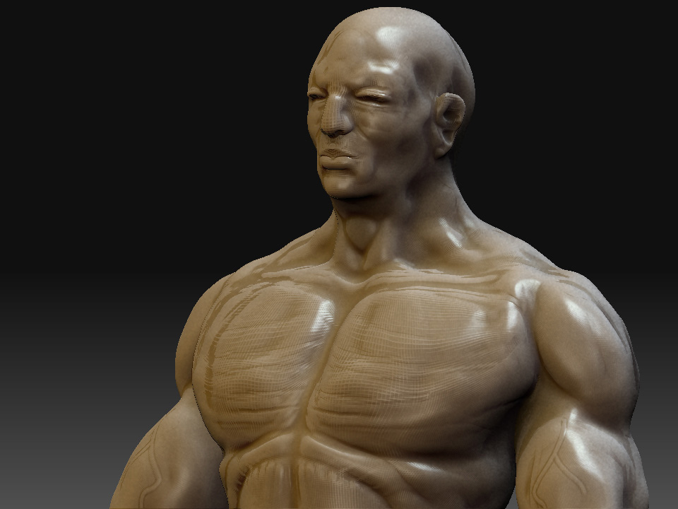
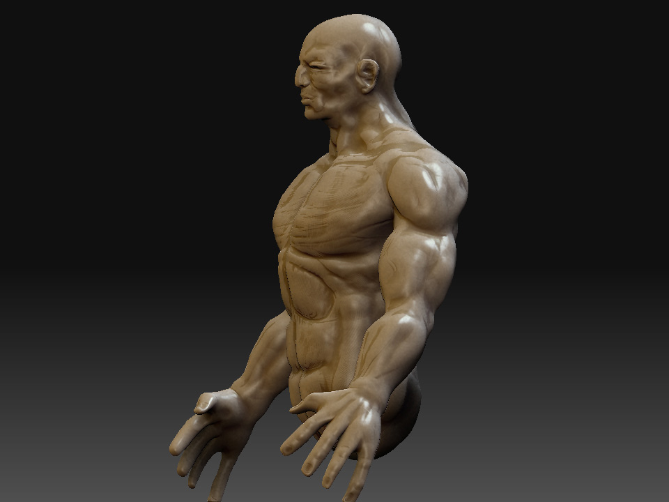
hi, i continue training on bust from zsphere because i think i’m gonna improve my anatomy skill this way.
Here are the four views of my new model…
[ ]
]
hope you like it C&C welcome
Attachments
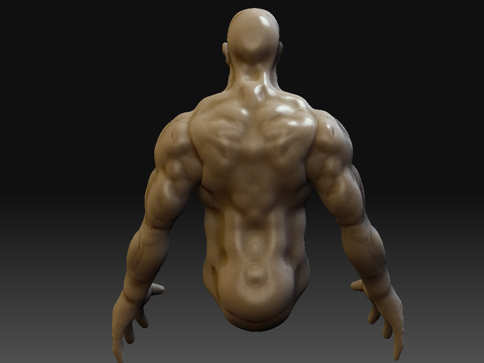
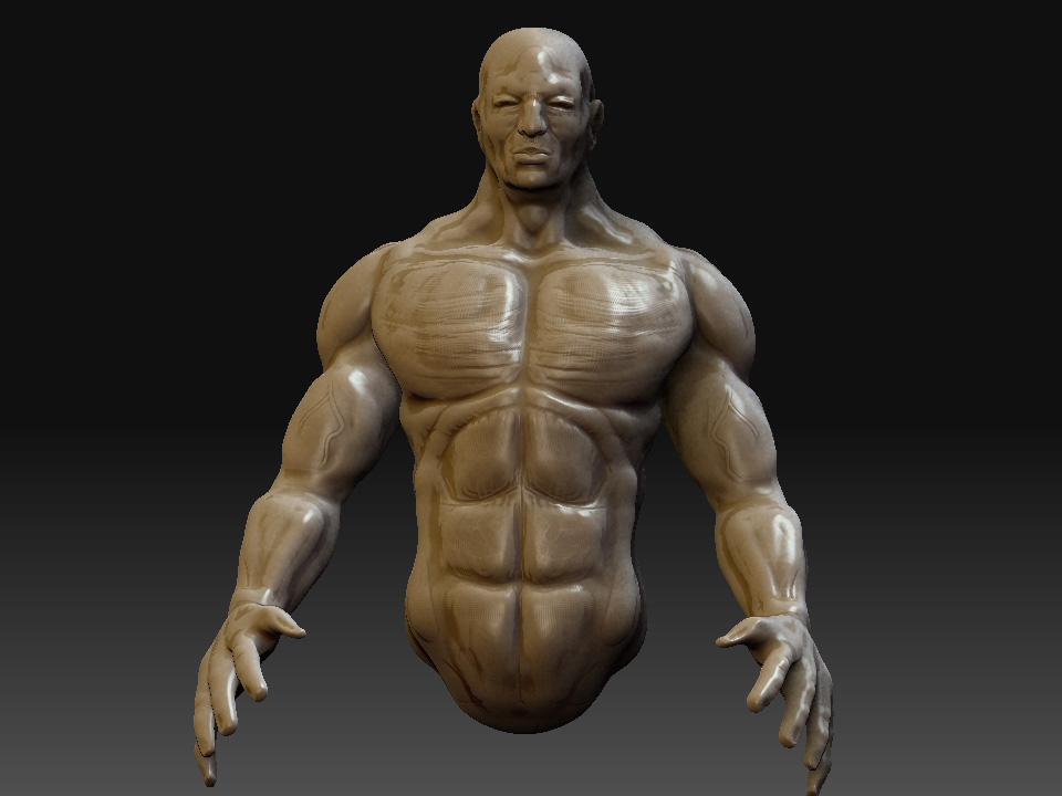
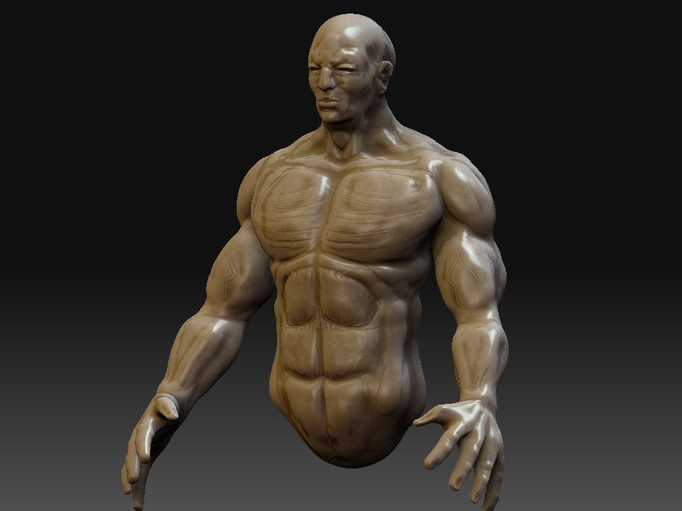
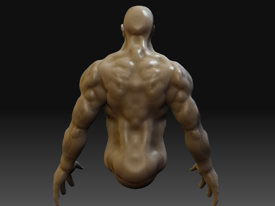
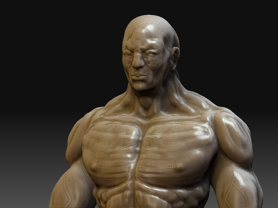
hi, i continue training on bust from zsphere because i think i’m gonna improve my anatomy skill this way.
Here are the four views of my new model…
[]
hope you like it C&C welcome
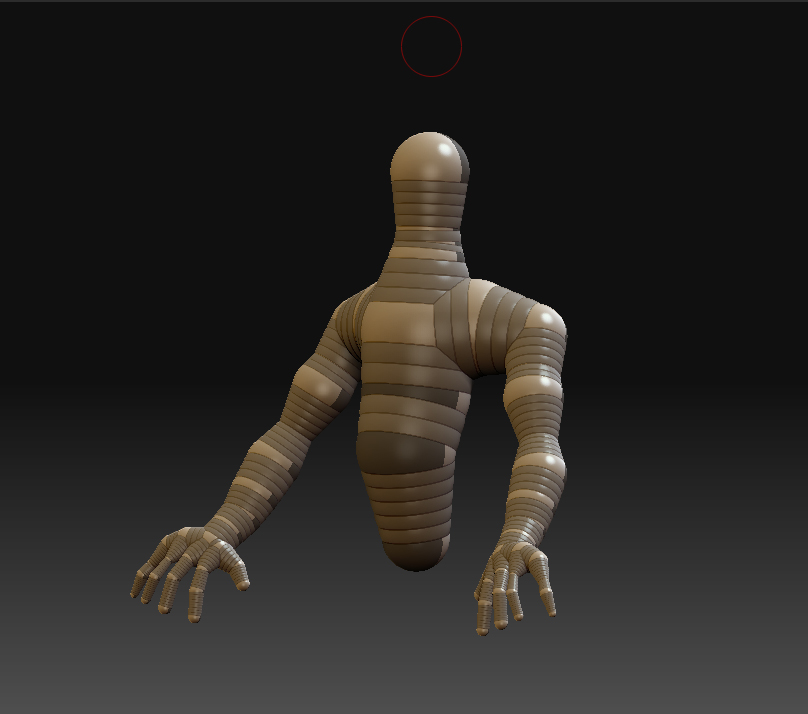
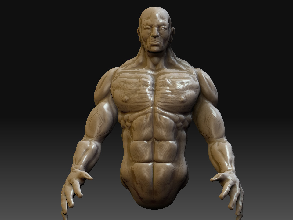
Hi, this is the second step of this modeling session, I think the character looks better.
thx for viewing C&C welcome
[ ](javascript:zb_insimg(‘73028’,‘render_humano3.jpg’,1,0))
Nice!
Keep going he’s looking great, like an old ivory carving, what material is that you are using
!?
Keep on Z-ing

Fishadder
thx for your comment fishadder, I’m gonna work this model again to get closer to reality I’ll post another step soon.
Concerning the material it’s Jaycephus (shinyoldskull) material which can be found in this thread.
It’s just one of my favorite material.
keep zbrushing
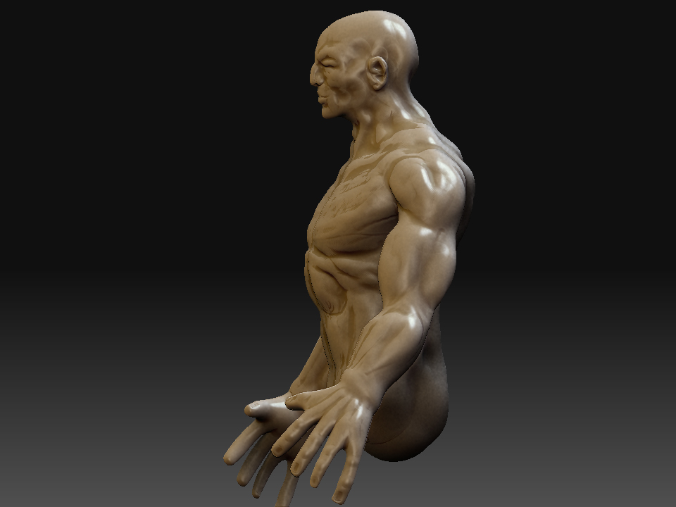
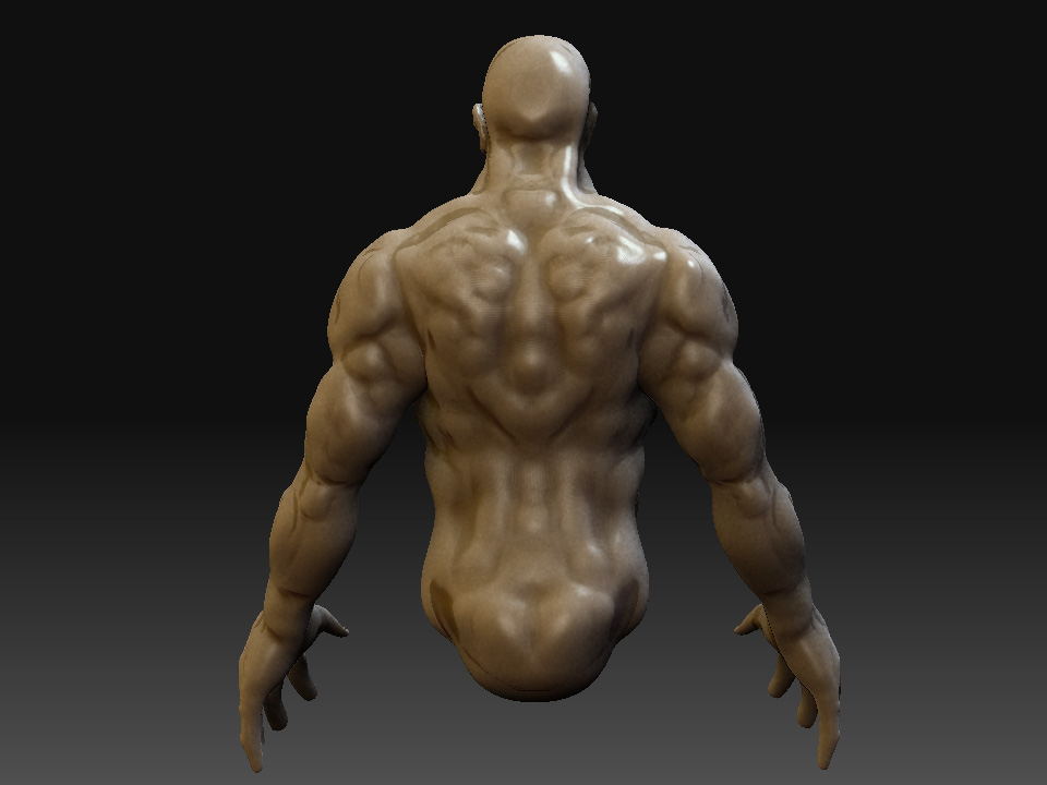
A new step, I’ve add many details on the face and the body, trying to make it better and better each steps.
Thx for viewing, another step is coming soon…
[ ](javascript:zb_insimg(‘73070’,‘humano2.jpg’,1,0))
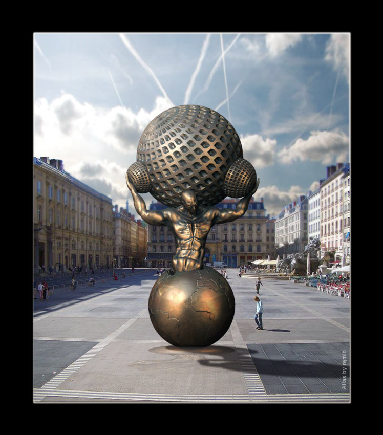
hi, i made another version of this bust and i’ve try to use bronze mat to make a compositing but the result is not very realistic because of the light and the shadows. I’ll make another picture soon with a better light.
The model is posed using transpose tool and it’s an attempt to represent ATLAS with the sky on his shoulder.
there is a lot of post work in photoshop for the second image
Hope you like it
[[ATm=73078]render_atlas.jpg[/attach]]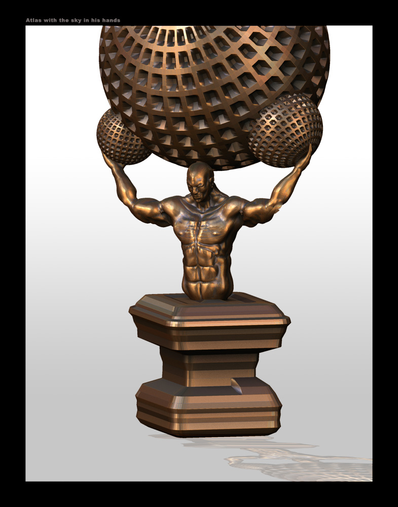
[[attach=73079]render_atlas2.jpg[/attach]]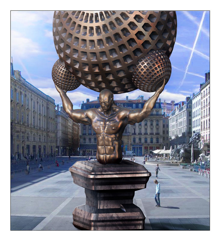
here is another attempt to make a compositing…
[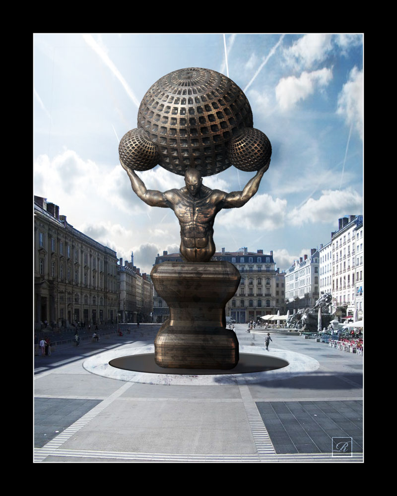 ](javascript:zb_insimg(‘73089’,‘atlas1.jpg’,1,0))
Nice!
Like how he’s developing, Love the globes! How do you do that kind of Meshwork?
Thanks for the link to the bone material!
He looks really cool in Bronze as well though
and I Like what you are doing with the backgrounds too.
My only crit would be the statue as a whole looks a bit big in the one where it’s in the town square! I’d scale it sown a bit and also thin the podium considerally as it looks a bit wide to me but those are only my thoughts! lol!
Good stuff though! Aint Z-Brush the nuts!!!
Keep on Z-ing
Fishadder
This is getting better and better. Statue position is not lined up correctly to match the background pic. It doesn’t look as if it is line up with the pics horizon. It’s leaning to the right and forward.
Fix that and this will be very convincing.
Thx for your comments the final render, is coming soon.
I wish I could get a very realistic render and fix the positions. 
For the globe it s a basic sphere divide 4 times on which I apply an entire mask then press the col and row button (setup on 1) from the mask menu and make a negative inflat, it’s an easy way to produce such a mesh.
keep zbrushing
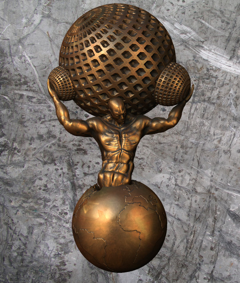
hi, i’ve got a new render with a new piedestal and i’m trying to increase the realism.
I’ve also reworked the pose and smooth some body parts.
[attach=73342]atlas_final_world3.jpg[/attach]
and the simple view
[attach=73343]atlas_final_world_solo.jpg[/attach]
That’s much better!
More dynamic pose and he looks like he’s actually taking the weight more now on his shoulders now rather than it just resting on his head!
Within the scene i still think its a bit big but it would be most impressive in real life and you’d need quite a bit of Bronze!!!
Keep on Z-ing
Fishadder
Thx fo your comment fishadder :lol: , i’m gonna make another render soon but i have to find the image that match my need (a large place with the light coming from front) I’ll certainly obtain a better result with that kind of background.
Keep zbrushing
very cool man!
thing that gets me tho is his biceps. for such a weight you’d think there’d be more of a crease in his arm
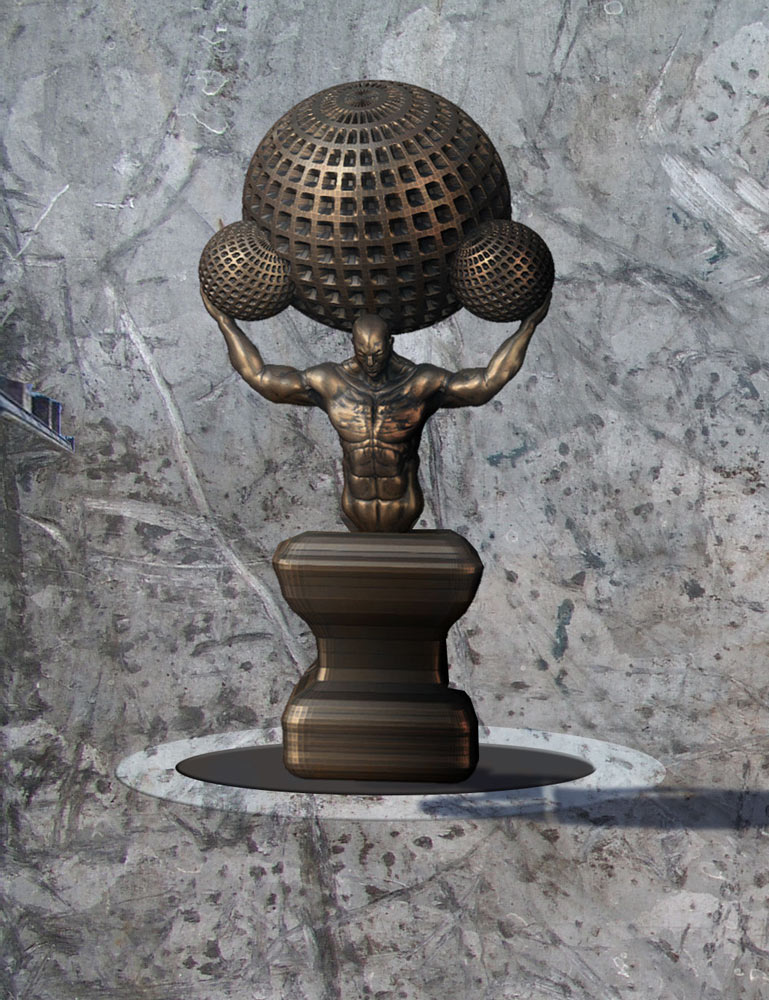
I rendered a new image which is quiet satisfying after a long post work in photoshop.
Please let me know what you think
[attach=73348]_atlas.jpg[/attach]
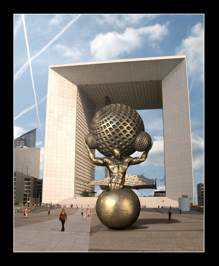
sigh I hate to be the one to point this out… but… wince the shadow is going the wrong way haha! also… give it some more grime on the undersides of the model and maybe a patina on the upper side looking very cool tho man
I made a second render which appears to be the good one, the background is my window view I add the complete photograph, hope you like it…

(home sweet home)

better but the shadow on the ground should be following the slope of the ground more… and make it alot lighter and grainier would help. also in that bright light. your model should have alot stronger highlights. and maybe sink into the ground a smidge. definatly needs grime since it’s out in a park. nice photoedit btw
Hi altermind thx for your comment, you’re right i definitivly have some problems with shadows I’m gonna work a little bit more my render 