Sorry cause my reply lead you to wrong way.
Just dont understand people, “experienced artists”, when fixing and making things in applications primary specialized for 2d (photoshop), not doing that in sculpting app. like zbrush where you can immediately see results and…so on
Not You, keep on reading 
Should write just this last sentence:
Quote myself:
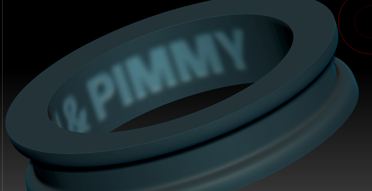
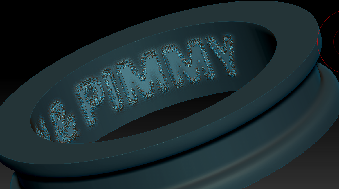
If you want crisp transition, like 90° engraving you should use some other techniques, something that will ad additional geometry between inflated and (in this case) masked poligons.
There is lot of options how to do it in Zbr., so here’s one from the beginning in tool palete:
Tool -> Geometry -> Edgeloop
There you have more options, you can try GroupsLoops with Lopps number 1 or 2, that will give you enough new geometry where you need it.
GPolish leave on default, lover it if it smooth your borders too match.
When satisfied with resoulth, mask your ring polygroup (or letters and ctrl+I to mask other groups) and perform some negative inflation.
You can make inflation in more steps and polish/smooth indented groups if necessary.
Of course, you have to make 2 polygroups before this procedure with group masked (letters).
And i think your letters are just fine for this, dont have to smooth them. In most cases problem is in underlying topology and method for applying alphas/mask.
Applying it with UVs is always best option but can be most complicated thing in all this, presuming you used uv master, because of way it threads uv islands, deforming them trying to maximize usage of uv space. Really much more complicated than all procedures for making text engravings:D
As for tutorials i sugest you first read zbrush help docs, than watch all basic staff from AskZbrush, so after that and lot of practice you can recognize some other good stuff on web. Well, at least, not waste time on “Easiest way” and “Best way” type of stuff.
Holding Ctrl key when hoovering buttons in zbrush also very helpful.
And for masking, polypainting, polygroups, experiment little on some regular lowpoly mesh with some white mat. and polyframe on.
Selection is basic and one of most important thing in any 3d app., unless you want just push an pull dynamesh clay