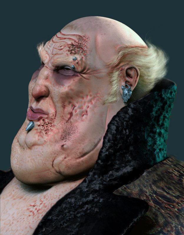
the general shape is done, now testing the leper look with standar alphas.
to Ralf Stumpf: if u see this, please be gentle, i know it has a little Lynch´s look :lol: . was my first reference, before seeing Craig Mullin´s artworks

the general shape is done, now testing the leper look with standar alphas.
to Ralf Stumpf: if u see this, please be gentle, i know it has a little Lynch´s look :lol: . was my first reference, before seeing Craig Mullin´s artworks
Hi abraXas,
no worry I like it. Like the form the suit and the hair.
And he is pierced, very fashionable.
Hope you has one or two level more to
avoid the poly-artefact on the cheeks.
Maybe you take a look on the lower lip.
Cheers
Ralf Stumpf
Fantastic work man  The other Harkonnen work posted recently is great, but looked a little to ‘pleasant’ for the Baron, your model on the otherhand, even at this stage looks like a genuinely evil fat slob, and he has some nice potmarking and blistering on his skin.
In my opinion this could be top row work when finished! 
ralf: tyvm for your kind words and crits, i´ll work on that lip a little more (and eyelids too )
angelstein: “even at this stage looks like a genuinely evil fat slob”…yup, that´s exactly the way i see our friend the baron, an evil and sensual bastard. thx a lot
:lol: :lol: :lol:
Very nice character 

Ahh, the flying fat man himself, great job!
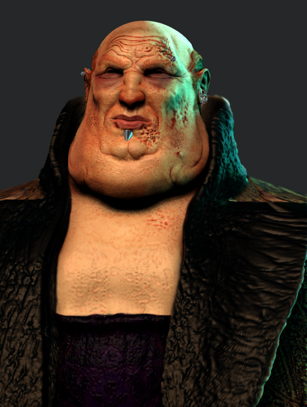
color test

Very nice texturing so far!! Maybe the wrinkles around the eyes could be a bit darker.
greetings and move on, it´s still a great fatty
xbucket
This really reminds me of some work through the late 70s and early 80s in Heavy Metal Magazine. Very nice style. 
Nice skintones He looks suitably sickly, greasy and lecherous!
Still heading for the top row I’d say
not finished at all, but there it goes

Nice work so far! He just looks a little saturated, but lookin’ very good otherwise. Keep it up!
He just needs more “Spice”!!!
a couple more, some hair and scrap this time
[attach=38470]harkonnen_06.jpg[/attach]
[attach=38471]harkonnen_05.jpg[/attach]
two more ZB renders, no PS retouch
[attach=38495]harkonnen_07.jpg[/attach]
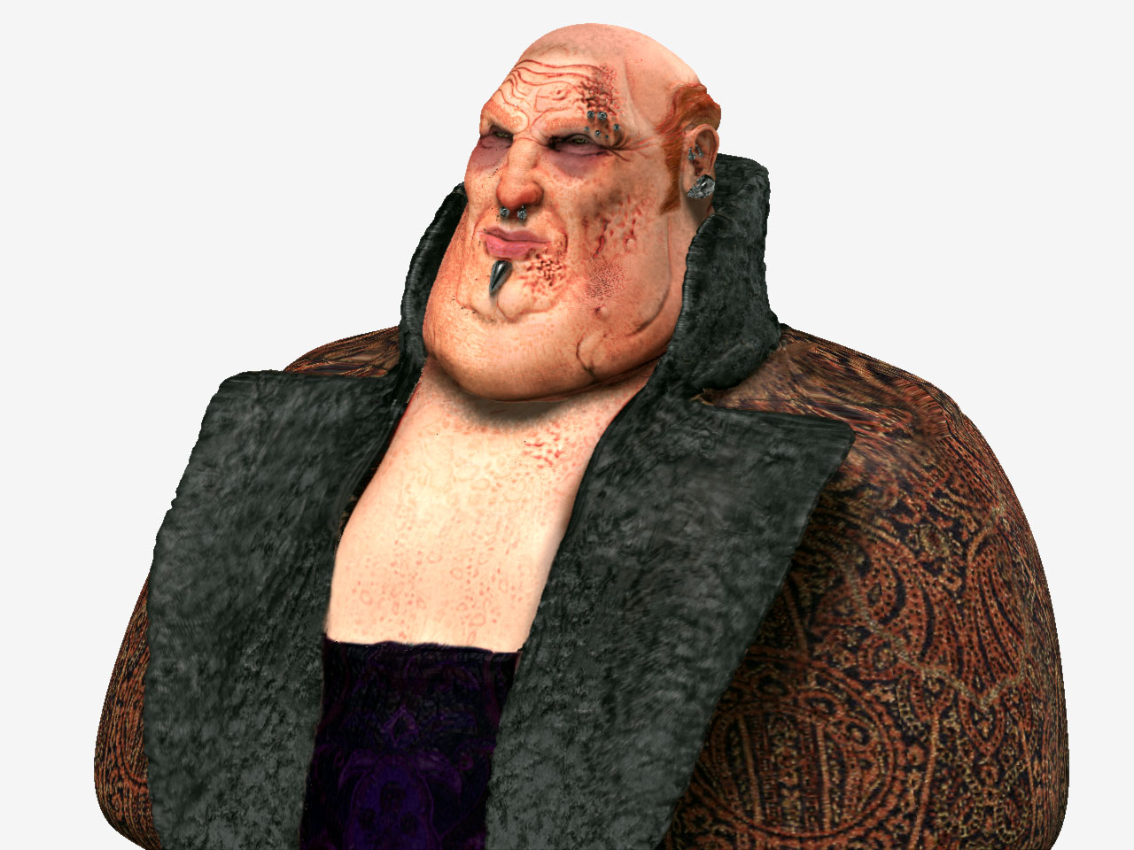

Sorry mate, but for me at least, the colours just look a little harsh and almost cartoonish. I actually had his overcoat down as some kind of skin like material before you coloured it? It would have looked awesome if you simulated tatooed skin for his coat!!
Just my opinion of course. I may be in the minority, just wait for a few others opinions
angelstein: it´s ok mate, you know, texturing is not my favourite task, and i´ve never been too sure what i´d want to get with this model. it´s all experimentation, i guess. i´ll try to get the right level of color blend and saturation of skin. about the coat, maybe a change of textures will be good. thx for your crit.
I think it’s because you’ve modeled this to such a high standard, the texturing would probably look fine on a lesser quality model, but not with this! Those first skin renders were really natural and subtle, very well done.
Maybe you rushed the texturing a little to give us some updates?
I’m sure you’ll come through with some fine texturing/colour choices in the end mate  You have great talent that’s for sure!