ZBrushCentral

Fisherman

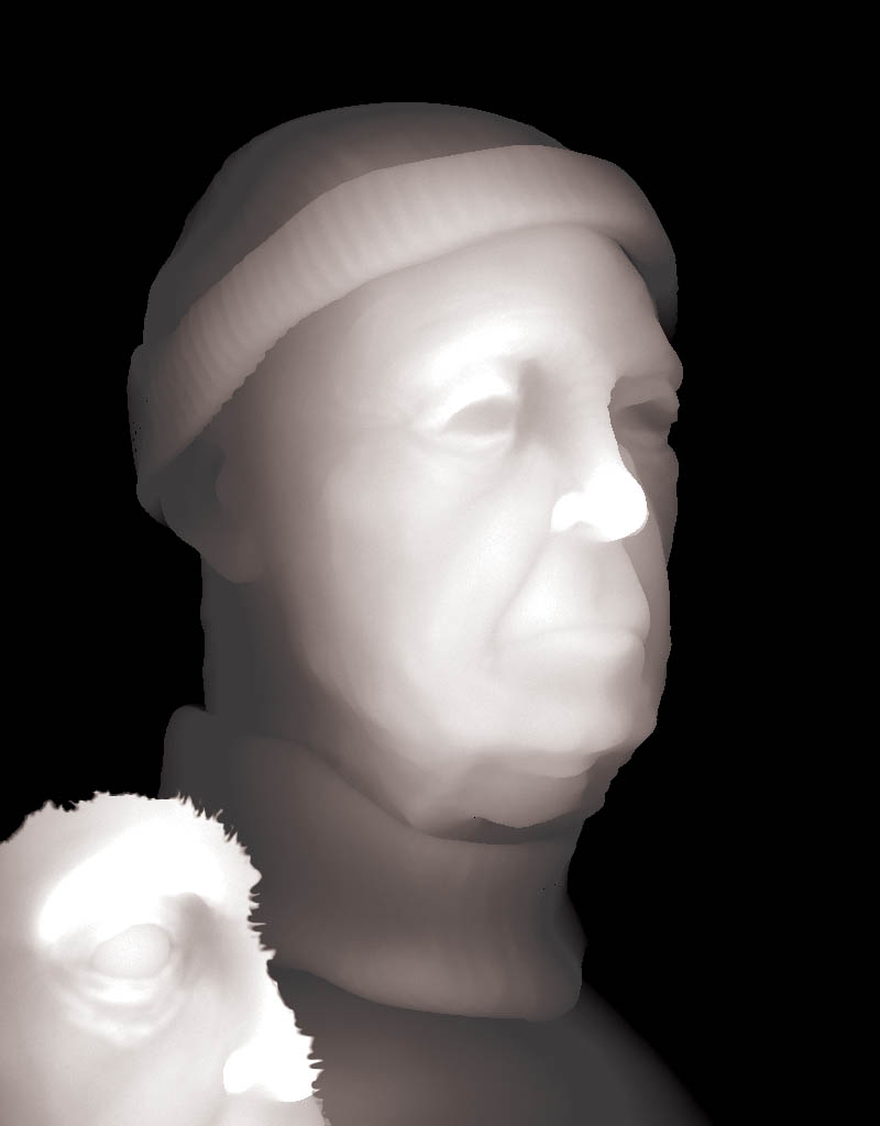
This is the first post of a character based off a concept from the nightfall mod. I got this image by messing with a test render in photoshop.

i’ll need lotsa help with the hair if anyone caes to offer. my plan is to get as much done in z as possible

fisherman.jpg

Fantastic Work - like an old Painting - but with a touch more ZB-realistic

:+1: :+1: :+1:

thank you,

this isn’t the most origional task to take, but i hhope the ending composition will be very nice. ATM im just working in 2.5d, most the head is detailed in 3d, but its so much faster to add the details i need once its 2.5

if anyone can offer some lighting suggestions, i want a nighttime or early morning scene with him on the ocean and a ship in the distance

here is another update with a composition inspired by the concept art. ill see if i can post it here as well.

ish.jpg

did some extra compositing in photoshop.

comments and crits please. as at this stage I generally get stuck without some words of advice fisherman.jpg

I love this compositing in ps, you can get so much done

i used my depth map from my image in z to create this fog like i saw in the ebook of ps and zbrush, its a great d-load.

anyways, here is the new version

fog.jpg

The first one, is, imho, the best, the lighting and the texturing REALLY ocme together to show of the intricaies of the model.

Duse, it must have taken YEARS of chacter study to get that good at approximating faces like that :smiley:

thanks HJ

here is another update, i don’t like the fog, used a depth map to get it which works great if you ever want some when compositing.

In this update, I took him into paint effects for some eyebrows and a bit of hair on the side

fisherman2.jpg

any comments?

…the first render in old-holland-masta-style is absolutelly GREAT…:cool:

-cheerZ-

I like your first composite the best. In the others the partial figure in the bottom left takes over and pulls my eye away from the subject. It also seems to bright for the image. Great work:+1:

the first render i pretty much duplicated the image and changed the type of layer it was, ill have to see how i did that :P.

good suggestions, i only put the image in the lower left to simulate how the origional concept artist did his layout in pencil for this character.

ill work on some new ones

ok, I got it fixed, must be rgb i reakon

anyways, here is the depth map that i used to create the image this way, then did some layer effects and recreated the image to look better then the first imo.

what ya’ll think?

depth
fisherdepth.jpg

Attachments

fisher.jpg

:+1: :+1: :+1: :+1: :+1:

:+1: :+1: :+1: :+1: :sunglasses:

WOW - cool :+1: :+1: :+1:

HI Polyguns, thuought I’d returne a compliment, as this work is outstanding. I love the emotions in the face. The compostition and Texturing 5*:+1:small_orange_diamond:+1:small_orange_diamond:+1:small_orange_diamond:+1:small_orange_diamond:+1:, is very profeshional. Same with your work here, why is not Top Row.!!

Thanks alot man. Kinda glad its not top row, it encourages me to keep on trying :wink:

this place is soooooooooo full of masters its scary

Nice post - great to see the progression of ideas.